Statistical Analysis
Lab 9: Bivariate Regression
Bogdan G. Popescu 
John Cabot University
Coefficient Plot: The Problem
Show code
ggplot(results, aes(x = estimate, y = term)) +
  geom_point(color = terracotta, size = 3) +
  geom_errorbar(
    aes(
      xmin = estimate - 1.96 * std.error,
      xmax = estimate + 1.96 * std.error
    ),
    linewidth = 1, width = 0, color = sage
  ) +
  geom_vline(xintercept = 0, linetype = "dashed", color = stone) +
  labs(
    title = "Coefficient Plot (Unscaled)",
    x = "Estimate", y = ""
  ) +
  theme_meridian()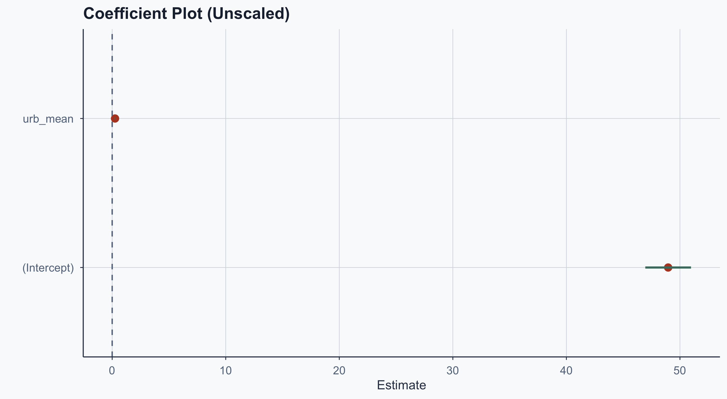
The intercept dwarfs the urbanization coefficient — hard to compare. Solution: standardize the variables.
Coefficient Plot: Scaled
Show code
results_scaled <- tidy(model2)

ggplot(results_scaled, aes(x = estimate, y = term)) +
  geom_point(color = terracotta, size = 3) +
  geom_errorbar(
    aes(
      xmin = estimate - 1.96 * std.error,
      xmax = estimate + 1.96 * std.error
    ),
    linewidth = 1, width = 0, color = sage
  ) +
  geom_vline(xintercept = 0, linetype = "dashed", color = stone) +
  labs(
    title = "Coefficient Plot (Scaled)",
    x = "Estimate (Std. Deviations)", y = ""
  ) +
  theme_meridian()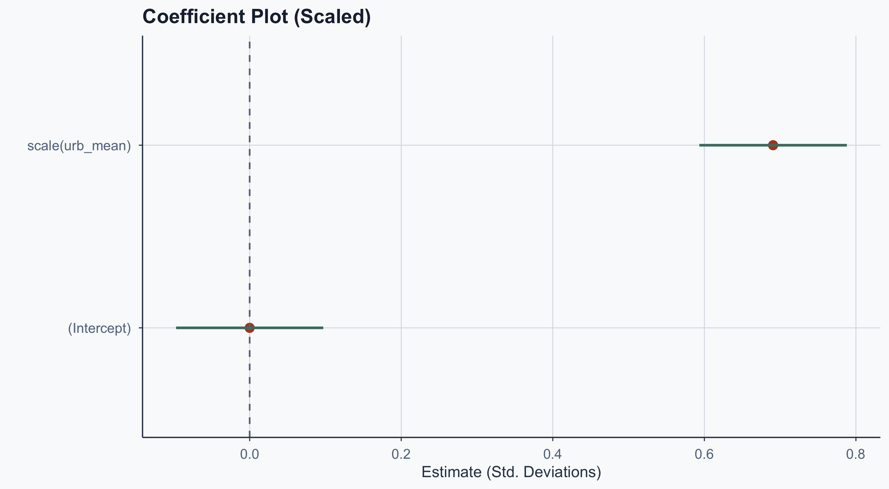
Now both coefficients are on the same scale. The intercept is ~0 (as expected for standardized data) and urbanization’s effect is clearly visible.
Observed vs Predicted
Show code
sample1 <- subset(merged_data2, select = c(Code, life_exp_mean, urb_mean))
sample1$type <- "Observed"

sample2 <- subset(merged_data2, select = c(Code, y_hat, urb_mean))
sample2$type <- "Predicted"
names(sample2)[names(sample2) == "y_hat"] <- "life_exp_mean"

sample_both <- rbind(sample1, sample2)
sample_both <- sample_both[order(sample_both$Code), ]

ggplot(sample_both, aes(
  x = urb_mean, y = life_exp_mean,
  color = type, shape = type
)) +
  scale_color_manual(values = c(graphite, terracotta)) +
  scale_shape_manual(values = c(16, 17)) +
  geom_point(size = 2.5, alpha = 0.7) +
  geom_smooth(method = 'lm', se = FALSE, linewidth = 0.8) +
  scale_x_continuous(
    name = "Urbanization (%)", breaks = seq(0, 100, 20),
    limits = c(0, 100)
  ) +
  scale_y_continuous(
    name = "Life Expectancy", breaks = seq(0, 100, 20),
    limits = c(30, 100)
  ) +
  labs(
    title = "Observed vs Predicted Life Expectancy",
    color = "", shape = "",
    caption = "Source: Our World in Data"
  ) +
  theme_meridian()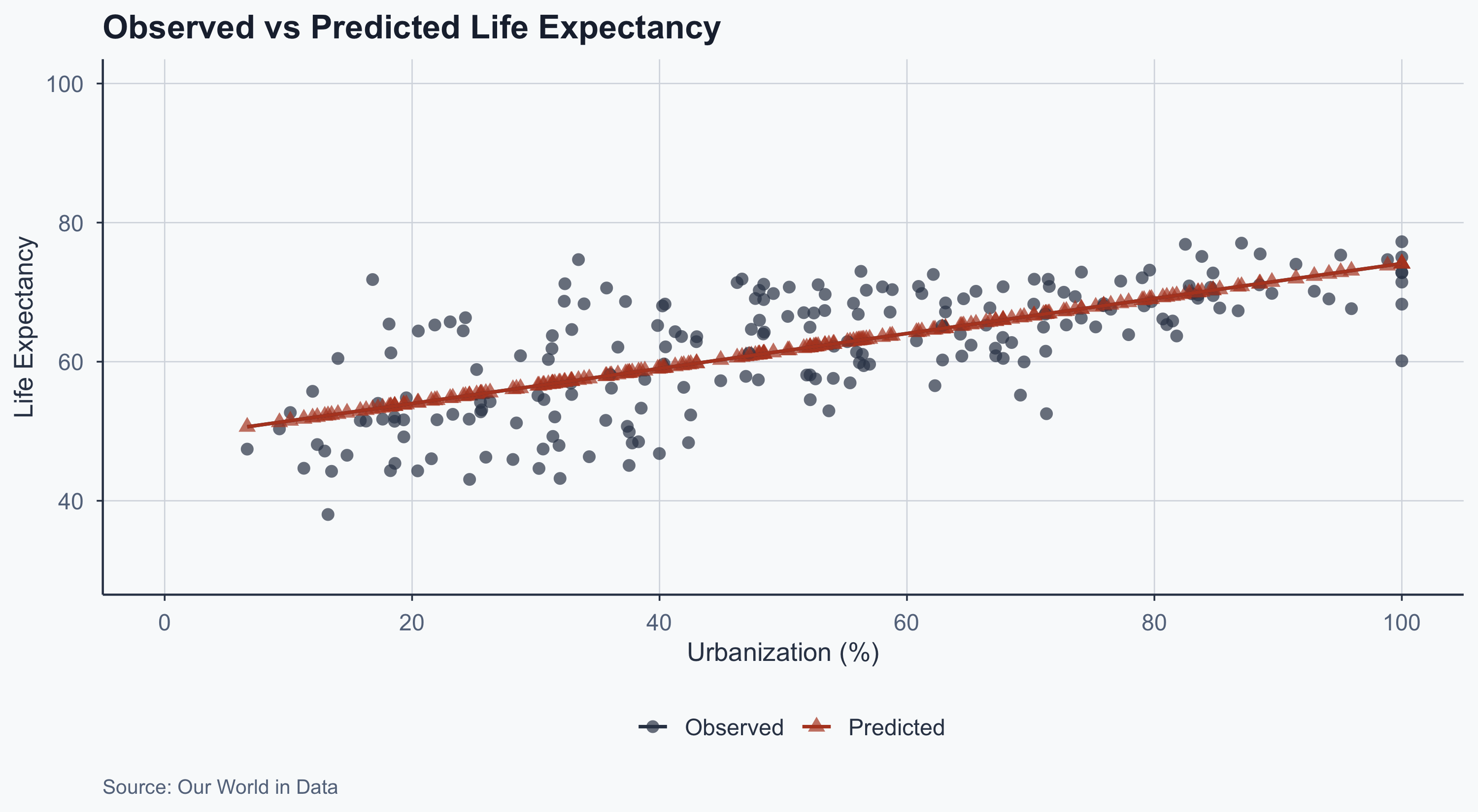
The predicted values (red triangles) fall exactly on the regression line. The observed values (black dots) scatter around it — that scatter is the residuals.
Residual Plot: High-Deviation Countries
Show code
ggplot(merged_data2, aes(
  x = urb_mean, y = life_exp_mean,
  color = deviation, shape = deviation
)) +
  scale_color_manual(values = c(terracotta, graphite)) +
  scale_shape_manual(values = c(18, 16)) +
  geom_point(size = 2.5) +
  geom_segment(
    aes(
      x = 0, y = model1$coefficients[1],
      xend = 100,
      yend = model1$coefficients[["urb_mean"]] * 100 + model1$coefficients[1]
    ),
    color = sage, linewidth = 0.8
  ) +
  geom_text(
    aes(label = name_deviation),
    size = 2.5, check_overlap = TRUE,
    position = position_nudge(y = 3), color = terracotta
  ) +
  scale_x_continuous(
    name = "Urbanization (%)", breaks = seq(0, 100, 20),
    limits = c(0, 100)
  ) +
  scale_y_continuous(
    name = "Life Expectancy", breaks = seq(0, 100, 20),
    limits = c(30, 100)
  ) +
  labs(
    title = "Countries That Deviate Most from the Prediction",
    color = "Deviation", shape = "Deviation",
    caption = "Source: Our World in Data"
  ) +
  theme_meridian()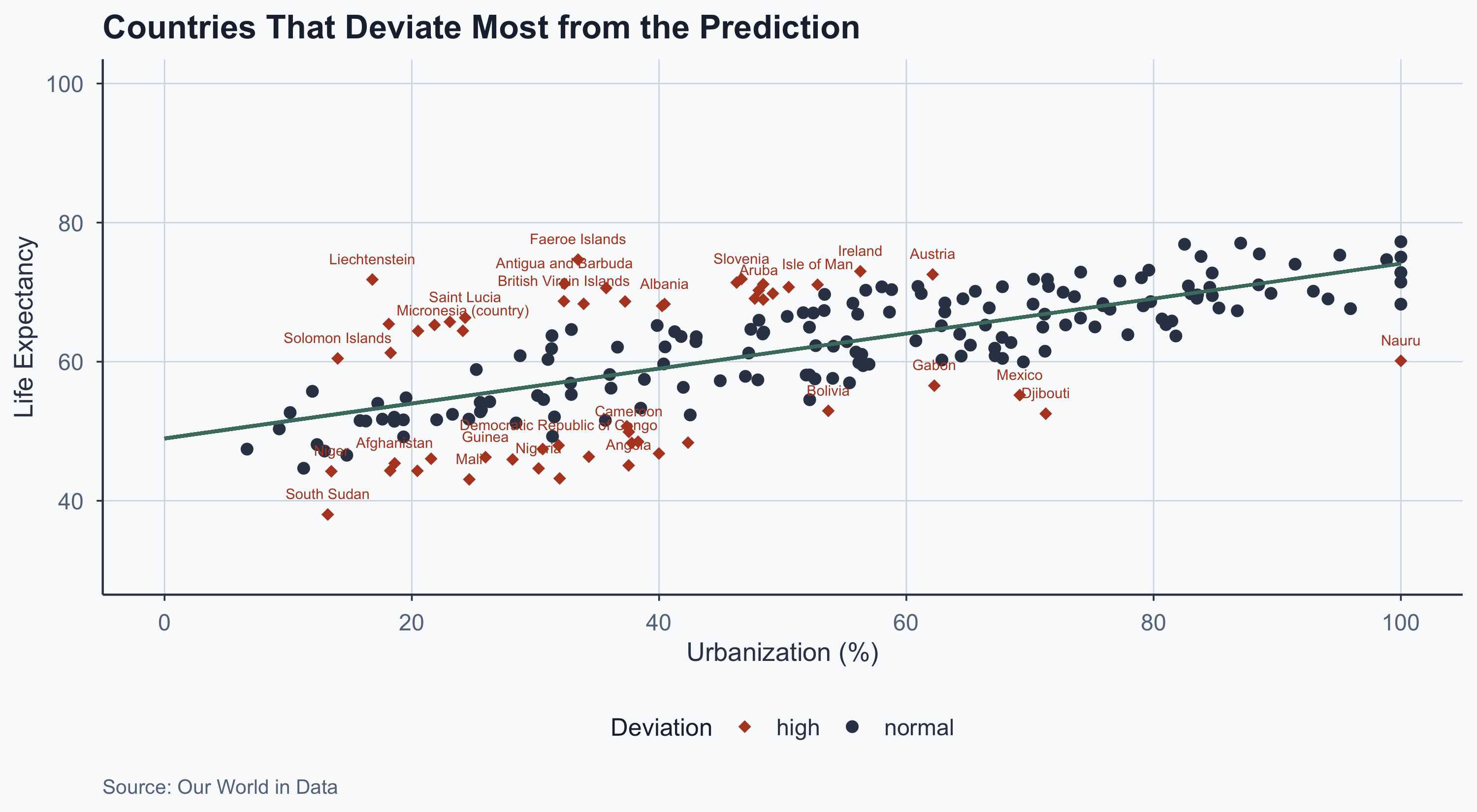
1970
Show code
ggplot(merged_1970, aes(x = urb_yearly, y = life_exp_yearly)) +
  geom_point(color = graphite, alpha = 0.6) +
  geom_smooth(method = "lm", se = FALSE, color = terracotta) +
  scale_x_continuous(
    name = "Urbanization (%)", breaks = seq(0, 100, 20),
    limits = c(0, 100)
  ) +
  scale_y_continuous(
    name = "Life Expectancy", breaks = seq(0, 100, 20),
    limits = c(0, 100)
  ) +
  labs(title = "1970", caption = "Source: Our World in Data") +
  theme_meridian()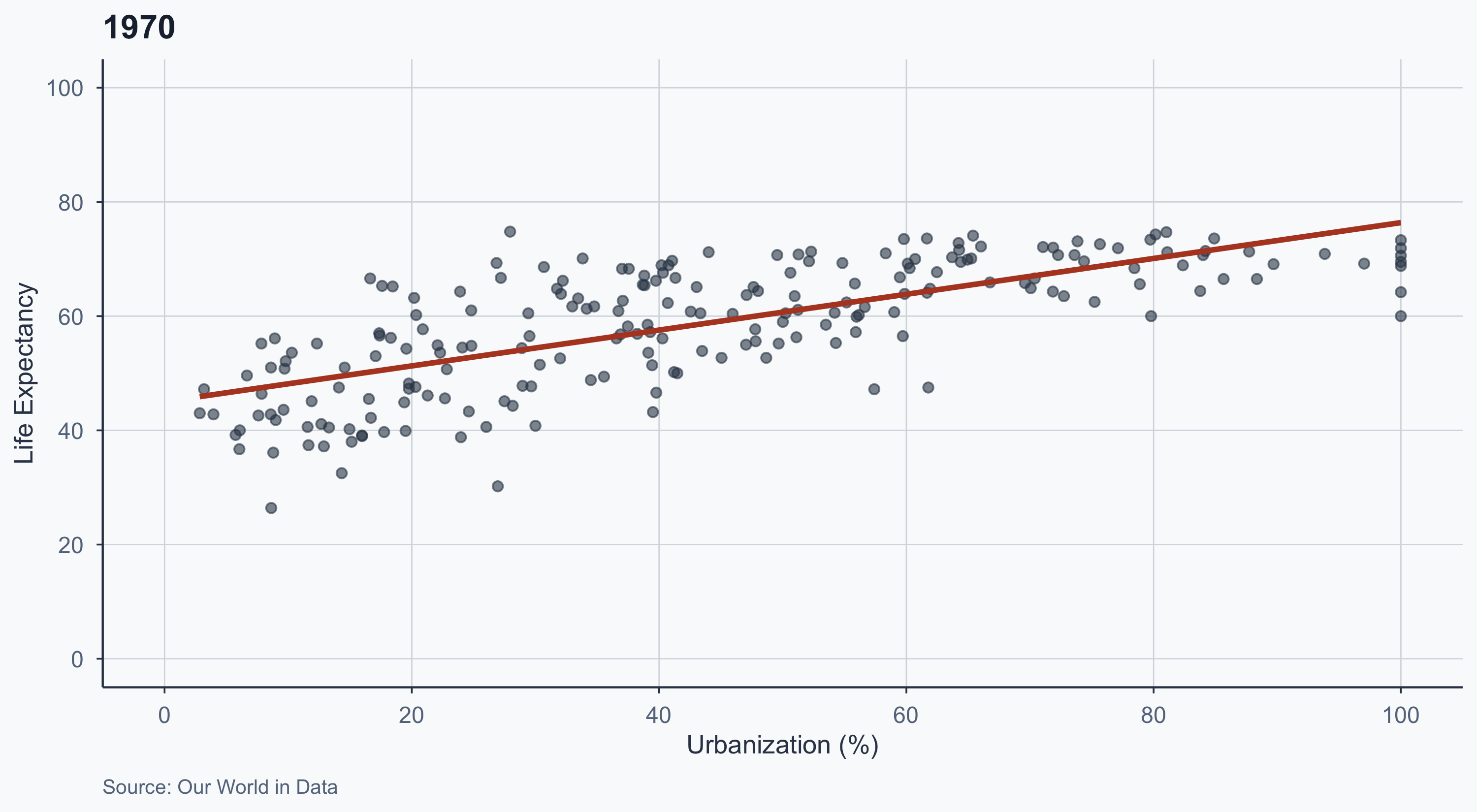
1990
Show code
ggplot(merged_1990, aes(x = urb_yearly, y = life_exp_yearly)) +
  geom_point(color = graphite, alpha = 0.6) +
  geom_smooth(method = "lm", se = FALSE, color = terracotta) +
  scale_x_continuous(
    name = "Urbanization (%)", breaks = seq(0, 100, 20),
    limits = c(0, 100)
  ) +
  scale_y_continuous(
    name = "Life Expectancy", breaks = seq(0, 100, 20),
    limits = c(0, 100)
  ) +
  labs(title = "1990", caption = "Source: Our World in Data") +
  theme_meridian()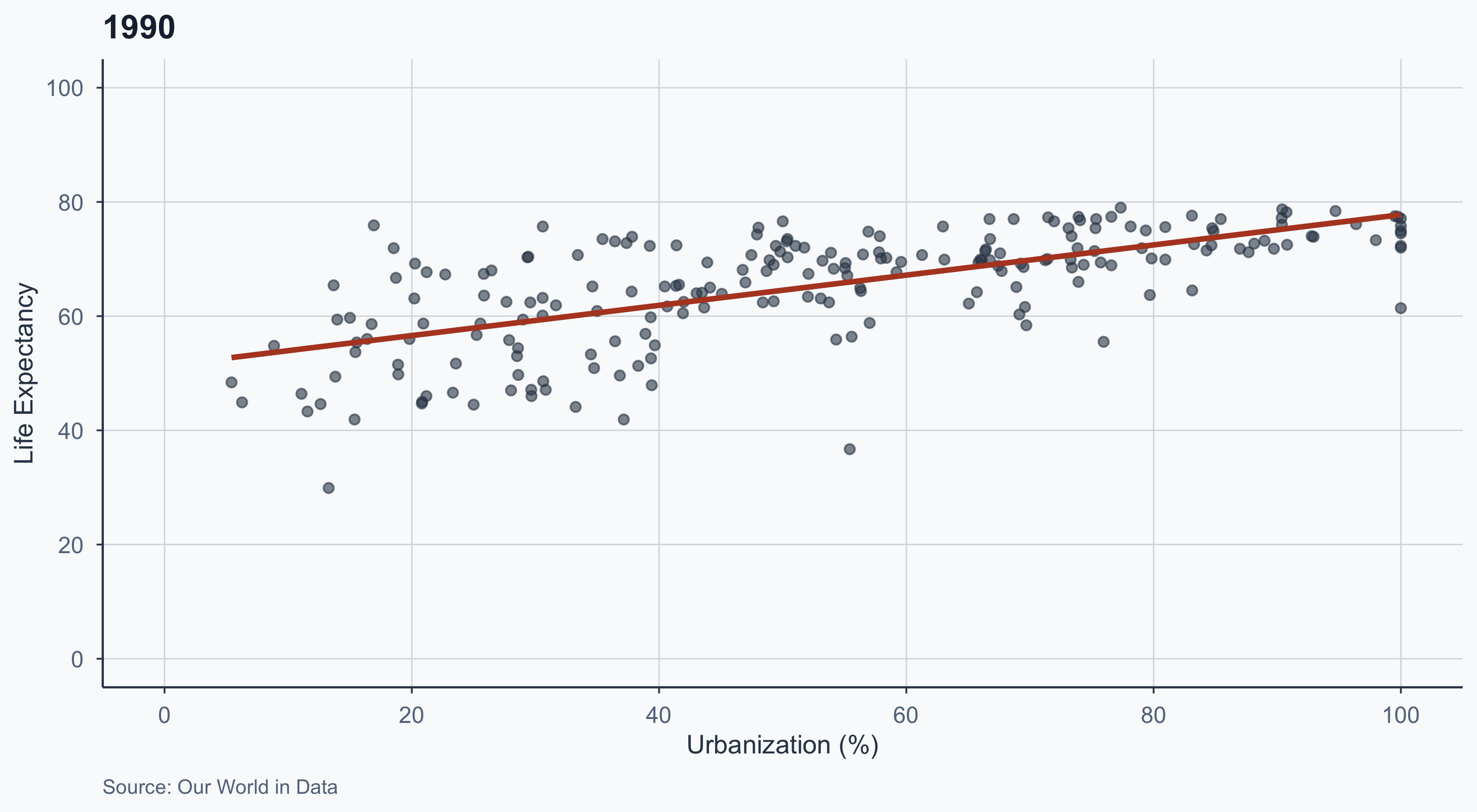
2000
Show code
ggplot(merged_2000, aes(x = urb_yearly, y = life_exp_yearly)) +
  geom_point(color = graphite, alpha = 0.6) +
  geom_smooth(method = "lm", se = FALSE, color = terracotta) +
  scale_x_continuous(
    name = "Urbanization (%)", breaks = seq(0, 100, 20),
    limits = c(0, 100)
  ) +
  scale_y_continuous(
    name = "Life Expectancy", breaks = seq(0, 100, 20),
    limits = c(0, 100)
  ) +
  labs(title = "2000", caption = "Source: Our World in Data") +
  theme_meridian()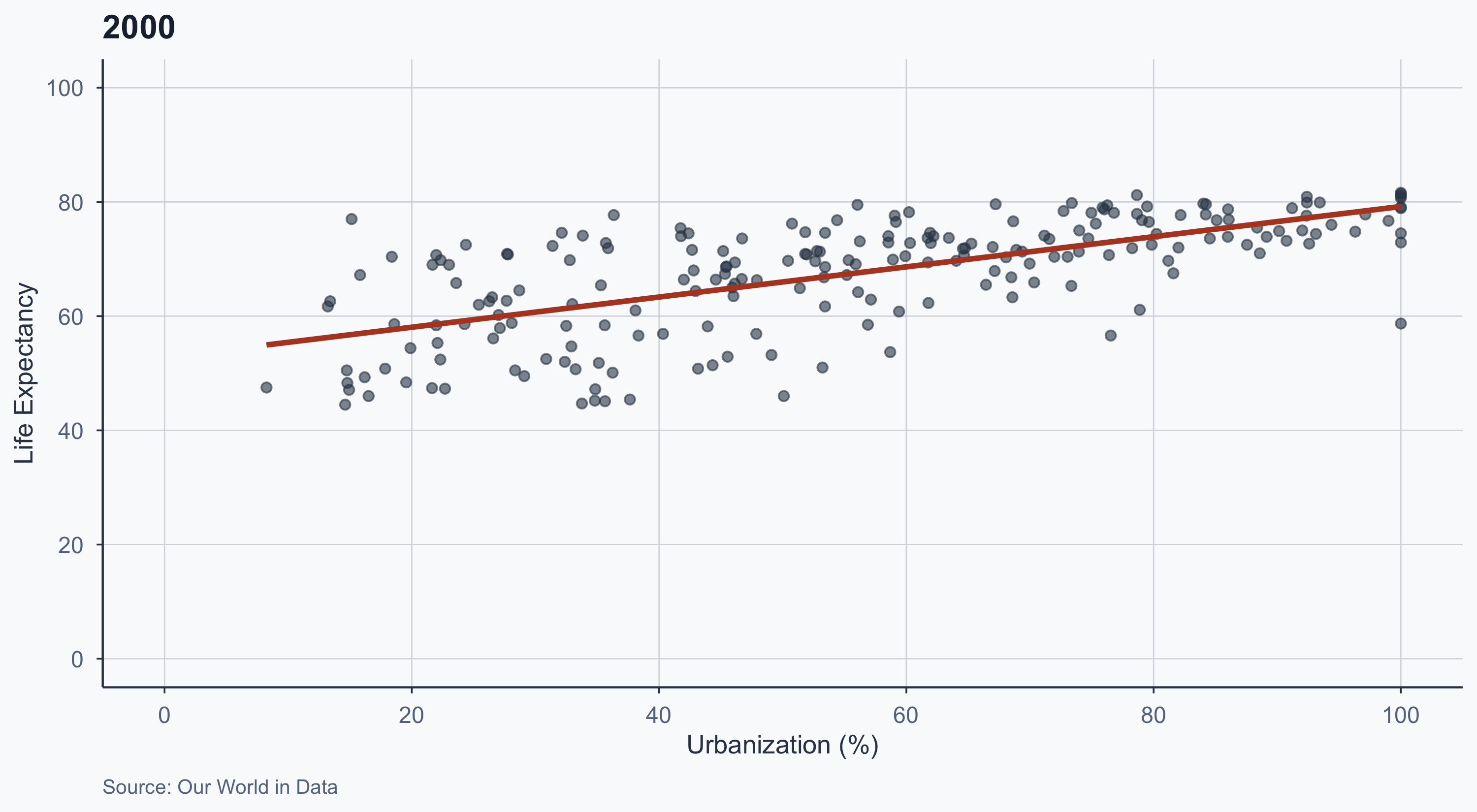
2020
Show code
ggplot(merged_2020, aes(x = urb_yearly, y = life_exp_yearly)) +
  geom_point(color = graphite, alpha = 0.6) +
  geom_smooth(method = "lm", se = FALSE, color = terracotta) +
  scale_x_continuous(
    name = "Urbanization (%)", breaks = seq(0, 100, 20),
    limits = c(0, 100)
  ) +
  scale_y_continuous(
    name = "Life Expectancy", breaks = seq(0, 100, 20),
    limits = c(0, 100)
  ) +
  labs(title = "2020", caption = "Source: Our World in Data") +
  theme_meridian()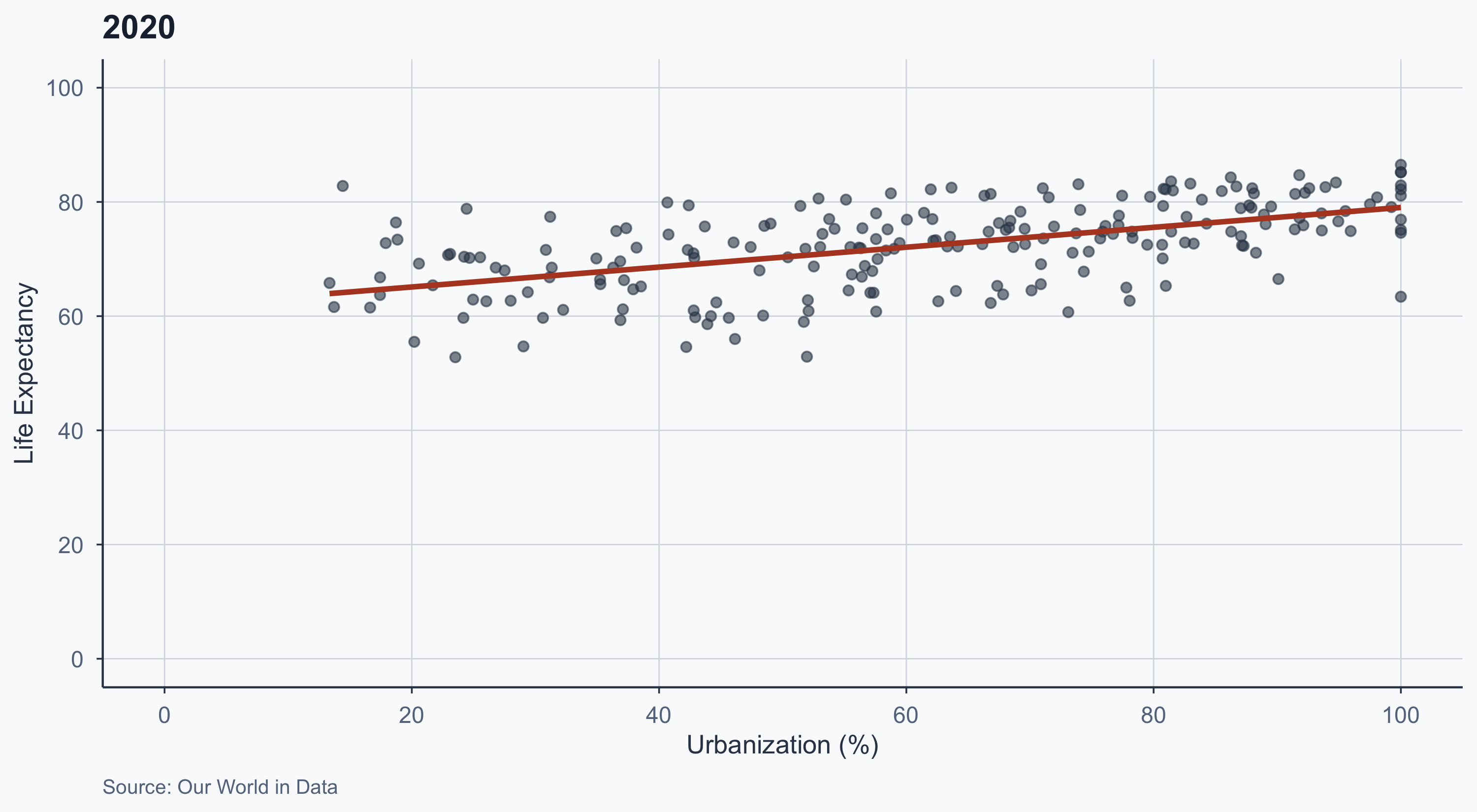
Animated: 1950–2020
Show code
merged_year_1950on <- subset(merged_df_year, Year > 1950)

figure_animated <- ggplot(
  merged_year_1950on,
  aes(x = urb_yearly, y = life_exp_yearly)
) +
  geom_point(color = graphite, alpha = 0.5) +
  geom_smooth(method = "lm", se = FALSE, color = terracotta) +
  scale_x_continuous(
    breaks = seq(0, 100, by = 20), limits = c(0, 100)
  ) +
  scale_y_continuous(
    breaks = seq(0, 100, by = 20), limits = c(0, 100)
  ) +
  labs(
    title = 'Year: {frame_time}',
    x = 'Urbanization (%)',
    y = 'Life Expectancy'
  ) +
  theme_meridian() +
  transition_time(as.integer(Year))

figure_animated