Statistical Analysis
Lab 6: Hypothesis Testing
Bogdan G. Popescu 
John Cabot University
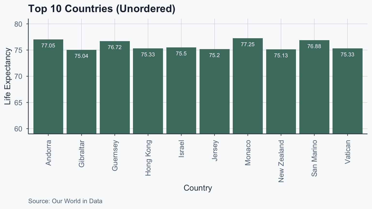
Barplot: Unordered
Show code
life_exp_top10 <- head(clean_life_expectancy_sorted_df, n = 10)

ggplot(life_exp_top10, aes(x = Entity, y = life_exp_mean)) +
  geom_bar(stat = "identity", fill = sage) +
  coord_cartesian(ylim = c(60, 80)) +
  geom_text(
    aes(label = round(life_exp_mean, 2)),
    vjust = 2, colour = "white", size = 3
  ) +
  labs(
    title = "Top 10 Countries (Unordered)",
    x = "Country", y = "Life Expectancy",
    caption = "Source: Our World in Data"
  ) +
  theme_meridian() +
  theme(axis.text.x = element_text(
    angle = 90, vjust = 0.5, hjust = 1
  ))
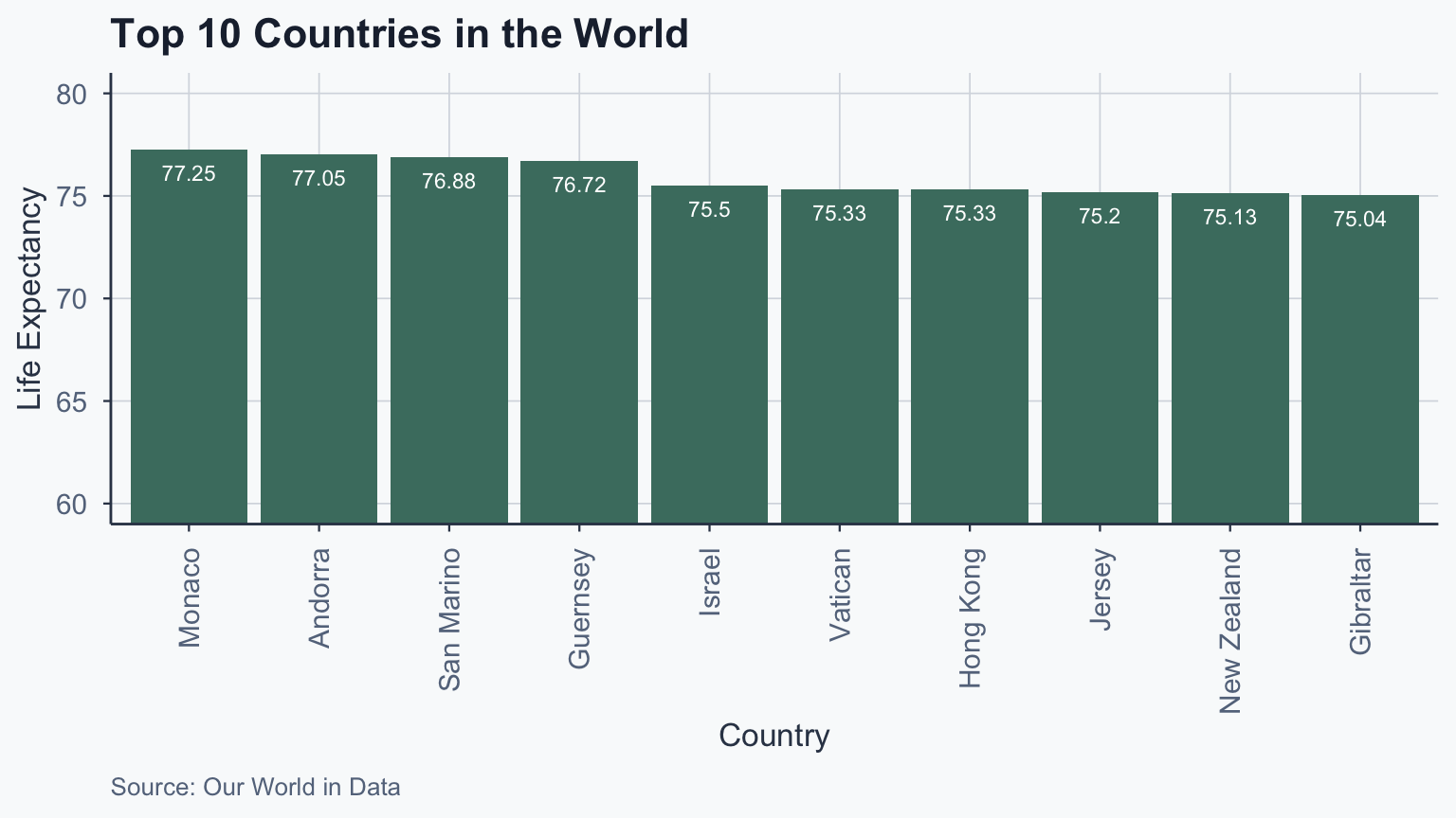
Top 10 Countries: Ordered
We use reorder() to sort bars by value:
Show code
ggplot(life_exp_top10, aes(
  x = reorder(Entity, -life_exp_mean),
  y = life_exp_mean
)) +
  geom_bar(stat = "identity", fill = sage) +
  coord_cartesian(ylim = c(60, 80)) +
  geom_text(
    aes(label = round(life_exp_mean, 2)),
    vjust = 2, colour = "white", size = 3
  ) +
  labs(
    title = "Top 10 Countries in the World",
    x = "Country", y = "Life Expectancy",
    caption = "Source: Our World in Data"
  ) +
  theme_meridian() +
  theme(axis.text.x = element_text(
    angle = 90, vjust = 0.5, hjust = 1
  ))
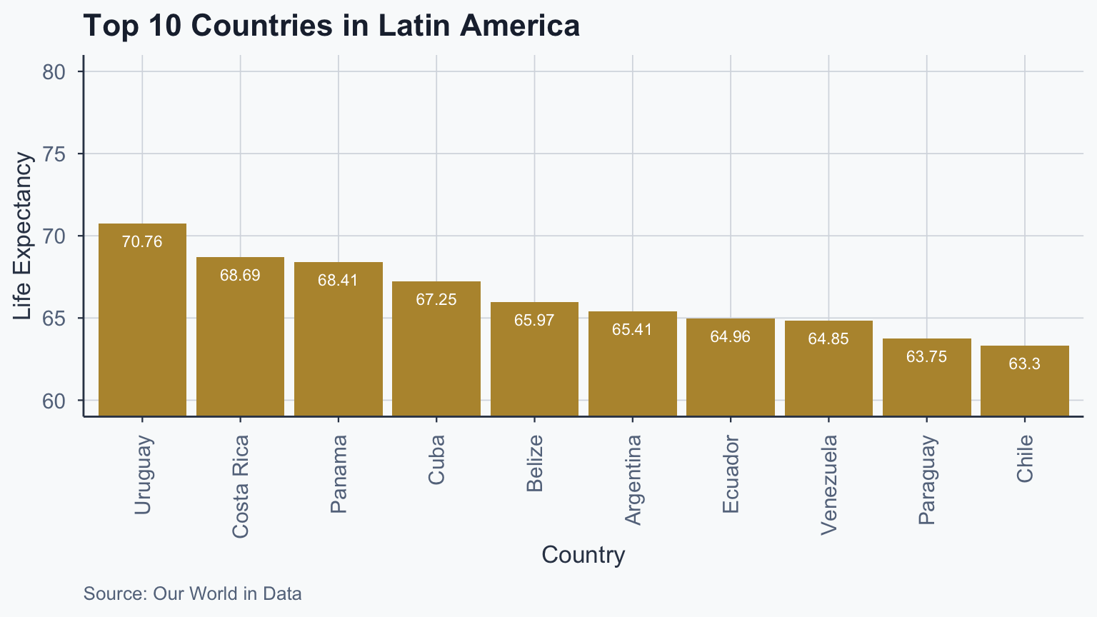
Top 10 Latam: Barplot
Show code
life_exp_top10_latam <- latam_countries_df[
  order(-latam_countries_df$life_exp_mean),
]
life_exp_top10_latam <- head(life_exp_top10_latam, n = 10)

ggplot(life_exp_top10_latam, aes(
  x = reorder(Entity, -life_exp_mean),
  y = life_exp_mean
)) +
  geom_bar(stat = "identity", fill = gold) +
  coord_cartesian(ylim = c(60, 80)) +
  geom_text(
    aes(label = round(life_exp_mean, 2)),
    vjust = 2, colour = "white", size = 3
  ) +
  labs(
    title = "Top 10 Countries in Latin America",
    x = "Country", y = "Life Expectancy",
    caption = "Source: Our World in Data"
  ) +
  theme_meridian() +
  theme(axis.text.x = element_text(
    angle = 90, vjust = 0.5, hjust = 1
  ))
Side-by-Side Comparison
Show code
figure_3 <- ggplot(life_exp_top10, aes(
  x = reorder(Entity, -life_exp_mean),
  y = life_exp_mean
)) +
  geom_bar(stat = "identity", fill = sage) +
  coord_cartesian(ylim = c(60, 80)) +
  geom_text(
    aes(label = round(life_exp_mean, 2)),
    vjust = 2, colour = "white", size = 2
  ) +
  labs(title = "World Top 10", x = "Country", y = "Life Expectancy") +
  theme_meridian() +
  theme(axis.text.x = element_text(
    angle = 90, vjust = 0.5, hjust = 1
  ))

figure_4 <- ggplot(life_exp_top10_latam, aes(
  x = reorder(Entity, -life_exp_mean),
  y = life_exp_mean
)) +
  geom_bar(stat = "identity", fill = gold) +
  coord_cartesian(ylim = c(60, 80)) +
  geom_text(
    aes(label = round(life_exp_mean, 2)),
    vjust = 2, colour = "white", size = 2
  ) +
  labs(title = "Latam Top 10", x = "Country", y = "") +
  theme_meridian() +
  theme(axis.text.x = element_text(
    angle = 90, vjust = 0.5, hjust = 1
  ))

grid.arrange(figure_3, figure_4, ncol = 2)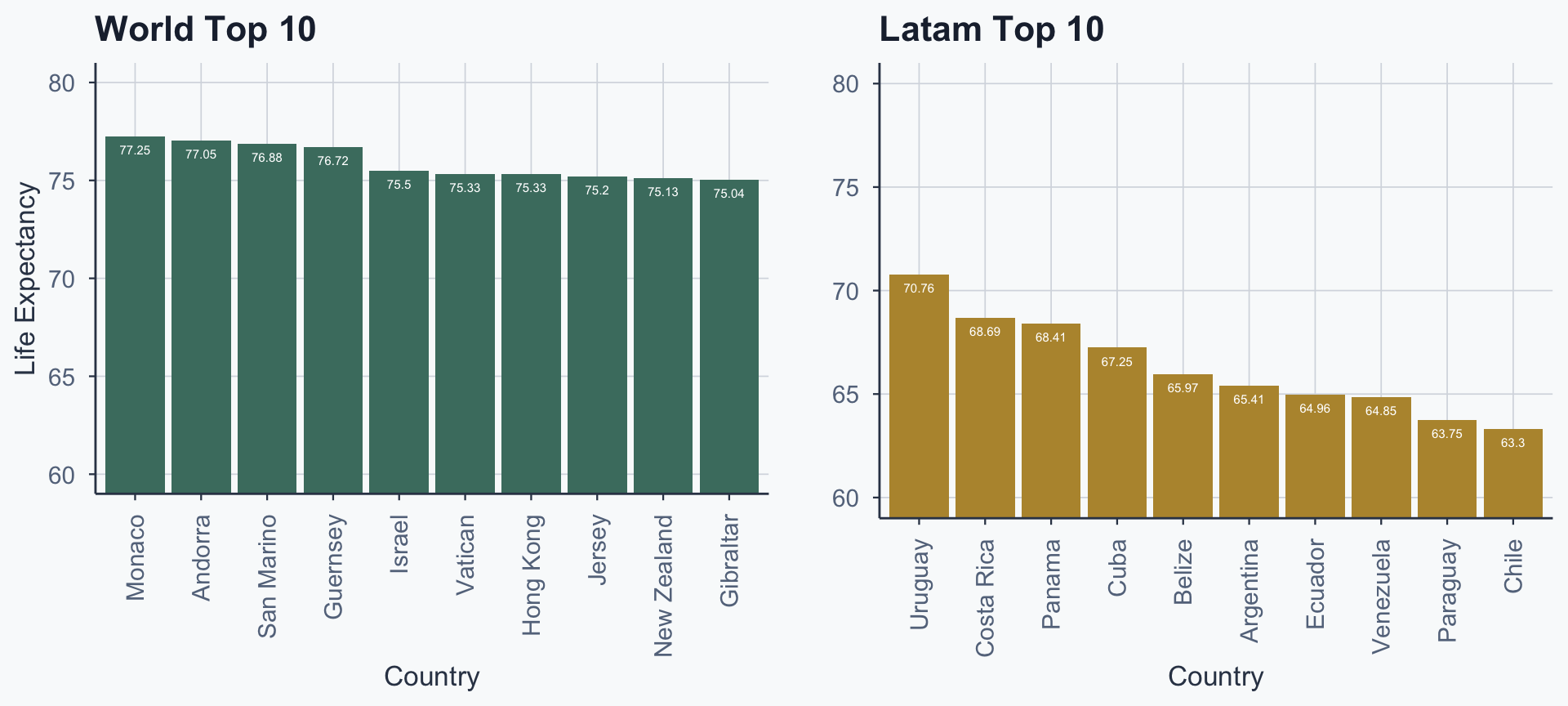
Boxplot: Latam vs Rest
Show code
clean_life_expectancy_df_continent <- clean_life_expectancy_df
clean_life_expectancy_df_continent$sample <- "Rest"
clean_life_expectancy_df_continent$sample[
  clean_life_expectancy_df_continent$Entity %in% latam_countries
] <- "Latam"

ggplot(clean_life_expectancy_df_continent, aes(
  x = sample, y = life_exp_mean, color = sample
)) +
  geom_boxplot(linewidth = 0.8) +
  coord_cartesian(xlim = c(0, 3), ylim = c(40, 80)) +
  scale_color_manual(values = c("Latam" = gold, "Rest" = sage)) +
  labs(
    title = "Life Expectancy: Latam vs Rest of World",
    x = "", y = "Life Expectancy",
    caption = "Source: Our World in Data"
  ) +
  theme_meridian() +
  theme(legend.position = "none")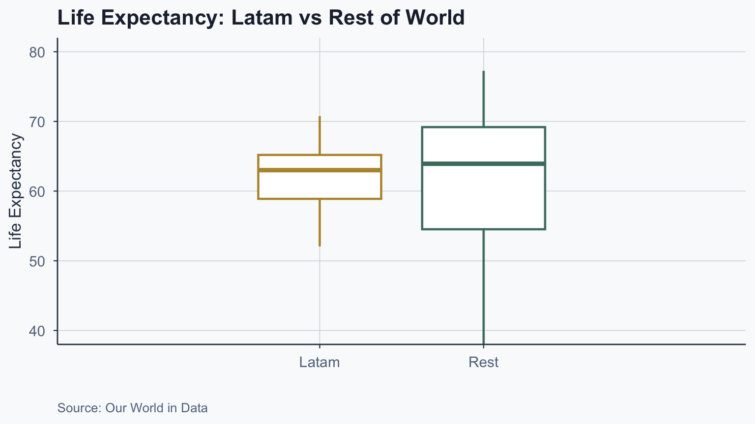
Interpreting a Boxplot
Show code
merged_latam <- subset(
  clean_life_expectancy_df_continent, sample == "Latam"
)
hwy_50 <- quantile(merged_latam$life_exp_mean, 0.5)
hwy_25 <- quantile(merged_latam$life_exp_mean, 0.25)
hwy_75 <- quantile(merged_latam$life_exp_mean, 0.75)
sd_bp <- sd(merged_latam$life_exp_mean, na.rm = TRUE) / 4
hwy_iqr <- hwy_75 - hwy_25

merged_all <- subset(
  clean_life_expectancy_df_continent, sample != "Rest"
)
hwy2_25 <- quantile(merged_all$life_exp_mean, 0.25, na.rm = TRUE)
hwy2_75 <- quantile(merged_all$life_exp_mean, 0.75, na.rm = TRUE)
hwy2_min <- boxplot.stats(merged_all$life_exp_mean)$stats[1]
hwy2_max <- boxplot.stats(merged_all$life_exp_mean)$stats[5]

ggplot(clean_life_expectancy_df_continent, aes(
  x = sample, y = life_exp_mean, color = sample
)) +
  geom_boxplot() +
  coord_cartesian(xlim = c(0, 3), ylim = c(40, 80)) +
  scale_color_manual(values = c("Latam" = gold, "Rest" = sage)) +
  # Median label
  annotate("text", y = hwy_50 - sd_bp, x = 2,
           label = "Median", color = terracotta, fontface = 2) +
  # 25th percentile
  annotate("text", y = hwy_25 - 4, x = 3,
           label = "25th percentile", color = terracotta, fontface = 3) +
  annotate("segment", y = hwy_25 - 4, yend = hwy_25 - 4,
           x = 2.6, xend = 2.4, color = terracotta,
           arrow = arrow(length = unit(0.3, "lines"))) +
  # 75th percentile
  annotate("text", y = hwy_75 + 4, x = 3,
           label = "75th percentile", color = terracotta, fontface = 3) +
  annotate("segment", y = hwy_75 + 4, yend = hwy_75 + 4,
           x = 2.6, xend = 2.4, color = terracotta,
           arrow = arrow(length = unit(0.3, "lines"))) +
  # IQR
  annotate("text", y = hwy_25 + 0.5 * hwy_iqr, x = -0.1,
           label = "Interquartile\n range (IQR)", color = sage) +
  annotate("segment", y = c(hwy2_25, hwy2_75),
           yend = c(hwy2_25, hwy2_75), color = sage,
           x = 0.2, xend = 0.6,
           arrow = arrow(length = unit(0.3, "lines"))) +
  annotate("segment", y = hwy2_25, yend = hwy2_75,
           x = 0.2, xend = 0.2, color = sage) +
  # Maximum whisker
  annotate("text", y = hwy2_max, x = 0.8,
           label = "Maximum\n75% + (1.5 \u00d7 IQR)",
           hjust = 1, lineheight = 1, color = sage) +
  annotate("segment", y = hwy2_max, yend = hwy2_max,
           x = 1, xend = 0.8, color = sage,
           arrow = arrow(length = unit(0.3, "lines"))) +
  # Minimum whisker
  annotate("text", y = hwy2_min, x = 0.8,
           label = "Minimum\n25% - (1.5 \u00d7 IQR)",
           hjust = 1, lineheight = 1, color = sage) +
  annotate("segment", y = hwy2_min, yend = hwy2_min,
           x = 1, xend = 0.8, color = sage,
           arrow = arrow(length = unit(0.3, "lines"))) +
  labs(
    title = "Anatomy of a Boxplot",
    x = "", y = "Life Expectancy",
    caption = "Source: Our World in Data"
  ) +
  theme_meridian() +
  theme(legend.position = "none")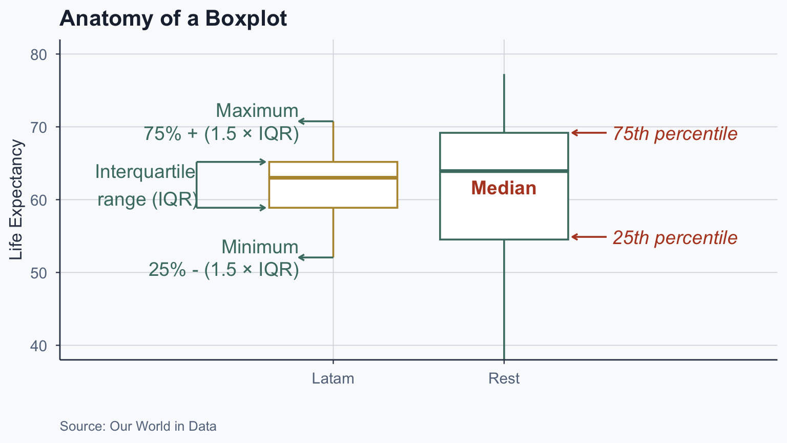
Standard Normal Distribution
Show code
set.seed(42)
generated_data <- data.frame(value = rnorm(10000, mean = 0, sd = 1))

ggplot(generated_data, aes(x = value)) +
  geom_histogram(bins = 50, fill = sage, color = "white") +
  scale_x_continuous(breaks = seq(-4, 4, by = 1), limits = c(-4, 4)) +
  annotate(
    "text", x = -3, y = 600,
    label = "Mean (\u03BC): 0\nSD (\u03C3): 1",
    color = terracotta, size = 5
  ) +
  labs(
    title = "Standard Normal Distribution (10,000 draws)",
    x = "Value", y = "Count"
  ) +
  theme_meridian()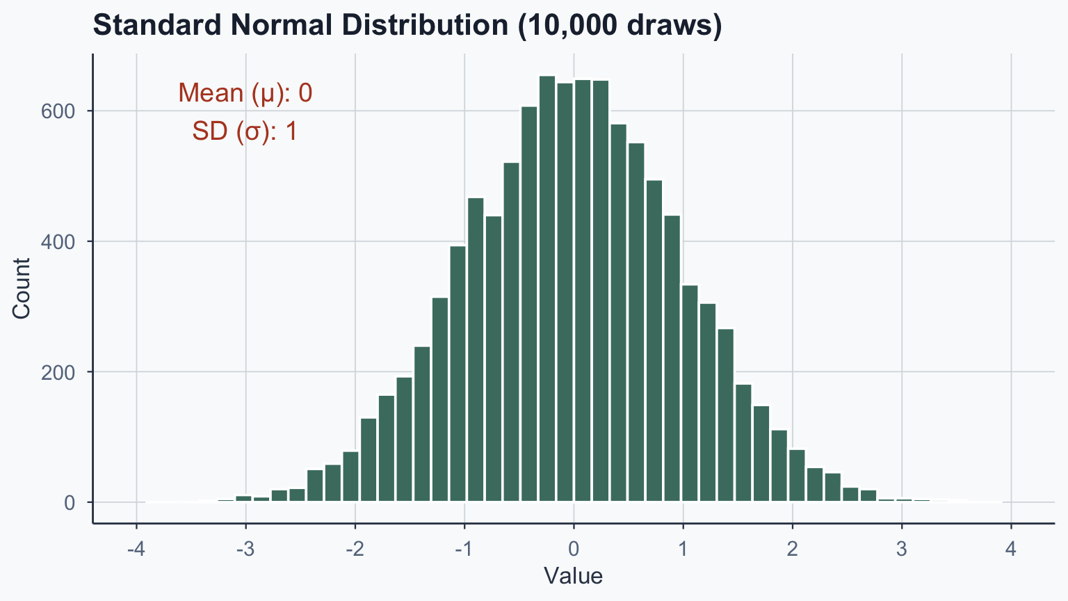
Life Expectancy Distribution
Show code
life_exp_df <- read.csv(file = './data/life-expectancy.csv')
names(life_exp_df)[4] <- "life_exp_yearly"

mean_life_exp <- mean(life_exp_df$life_exp_yearly, na.rm = TRUE)
sd_life_exp <- sd(life_exp_df$life_exp_yearly, na.rm = TRUE)

lines_label <- paste0(
  "Mean (\u03BC): ", round(mean_life_exp, 2),
  "\nSD (\u03C3): ", round(sd_life_exp, 2)
)

ggplot(life_exp_df, aes(x = life_exp_yearly)) +
  geom_histogram(bins = 50, fill = sage, color = "white") +
  annotate(
    "text", x = 20, y = 1000,
    label = lines_label,
    color = terracotta, size = 5
  ) +
  labs(
    title = "Life Expectancy Distribution (All Countries, All Years)",
    x = "Life Expectancy", y = "Count",
    caption = "Source: Our World in Data"
  ) +
  theme_meridian()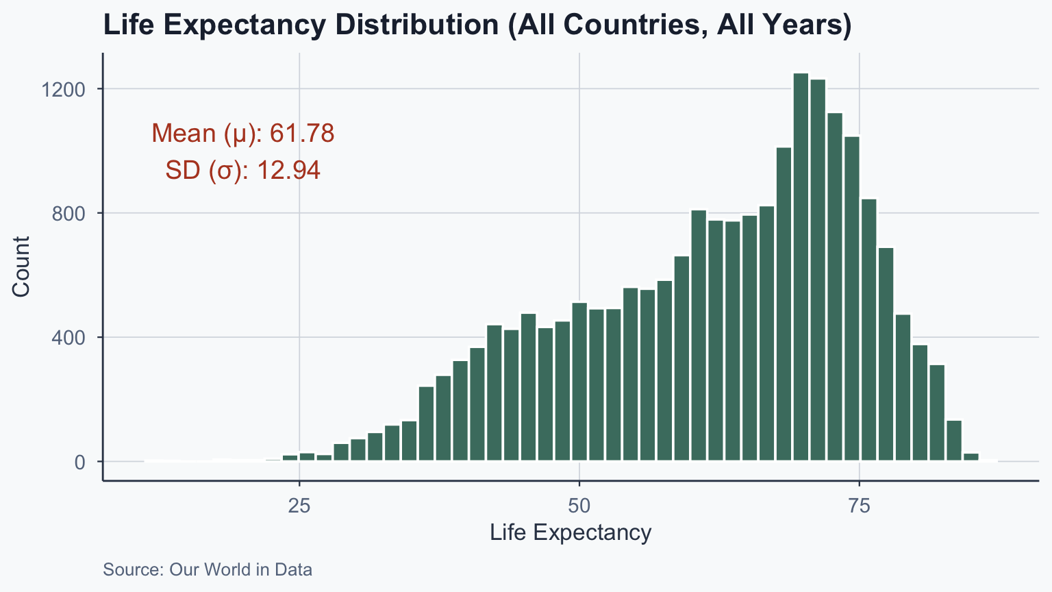
Historical Time Series
Show code
ggplot(historical_df, aes(x = Year, y = life_exp_yearly, color = Entity)) +
  geom_line(linewidth = 0.8) +
  scale_color_manual(values = c(sage, gold, terracotta, stone, slate)) +
  labs(
    title = "Life Expectancy Before 1800",
    x = "Year", y = "Life Expectancy",
    caption = "Source: Our World in Data"
  ) +
  theme_meridian()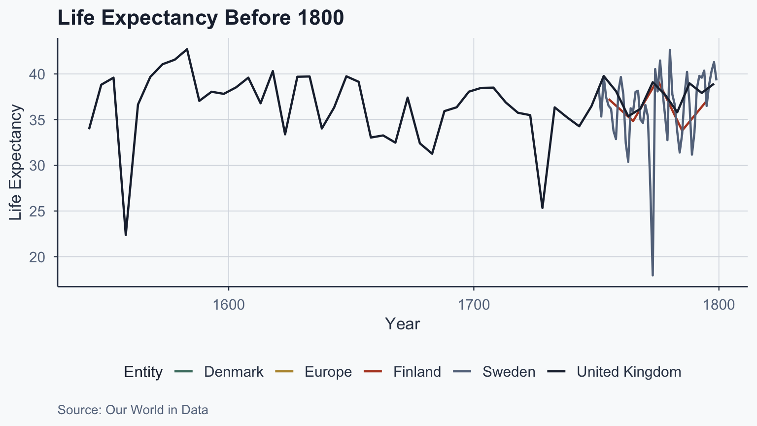
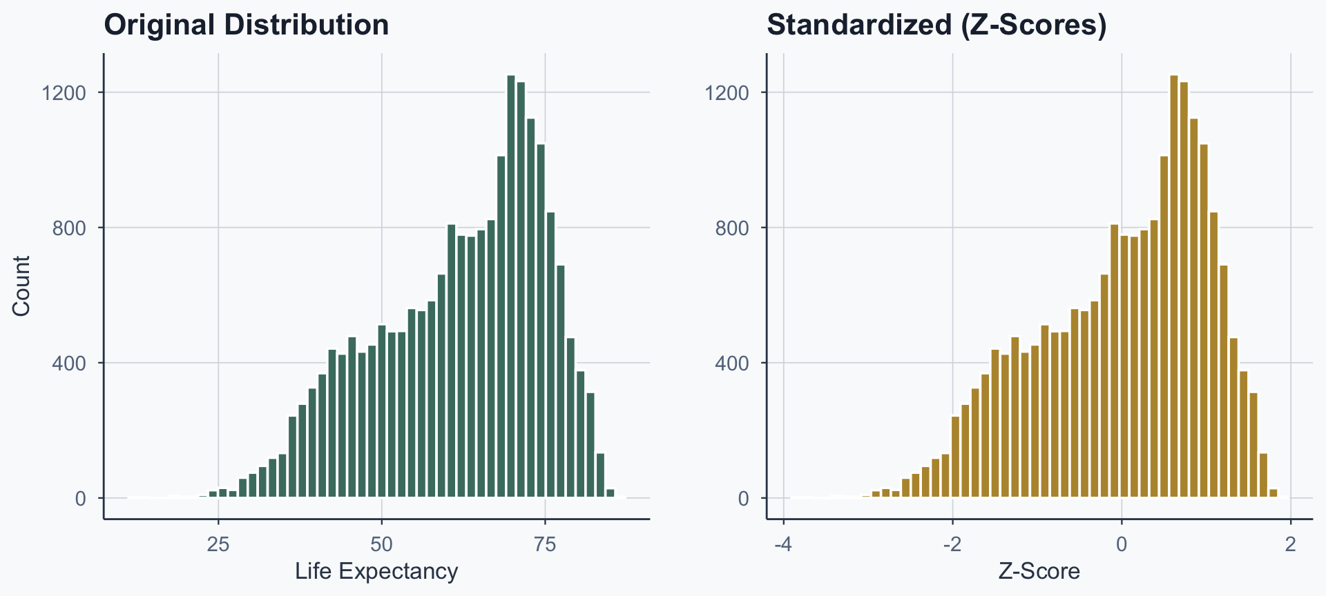
Before and After
Show code
fig_before <- ggplot(life_exp_df, aes(x = life_exp_yearly)) +
  geom_histogram(bins = 50, fill = sage, color = "white") +
  labs(title = "Original Distribution", x = "Life Expectancy", y = "Count") +
  theme_meridian()

fig_after <- ggplot(life_exp_df, aes(x = z_score)) +
  geom_histogram(bins = 50, fill = gold, color = "white") +
  labs(title = "Standardized (Z-Scores)", x = "Z-Score", y = "") +
  theme_meridian()

grid.arrange(fig_before, fig_after, ncol = 2)