Statistical Analysis
Lab 5: Normal Distribution & R Functions
Bogdan G. Popescu 
John Cabot University
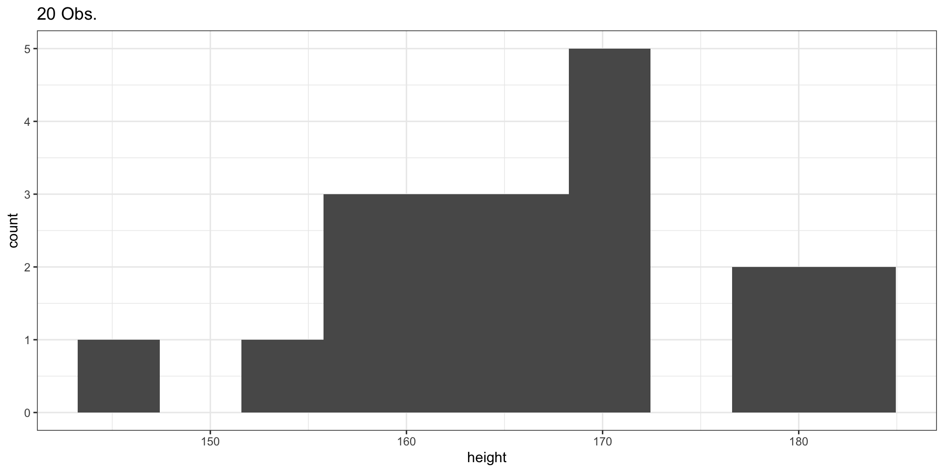
Sample of 20 Observations
Plotting the Histogram
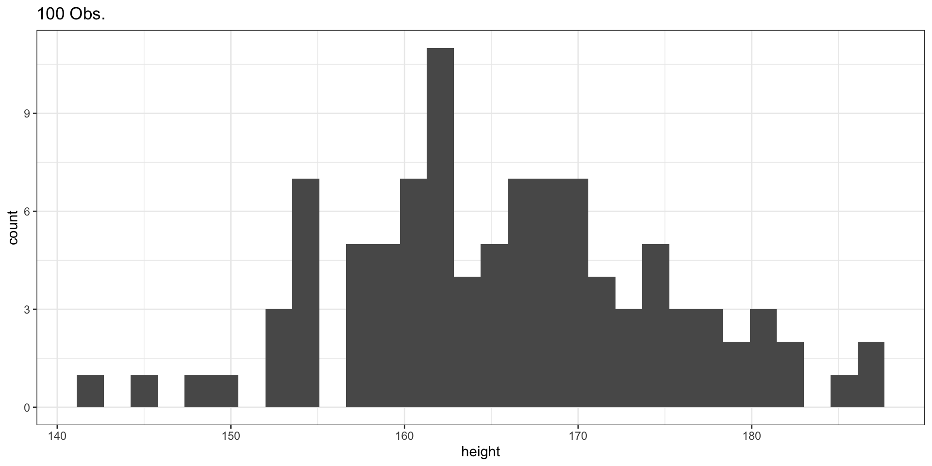
Sample of 100 Observations
Sample of 1000 Observations
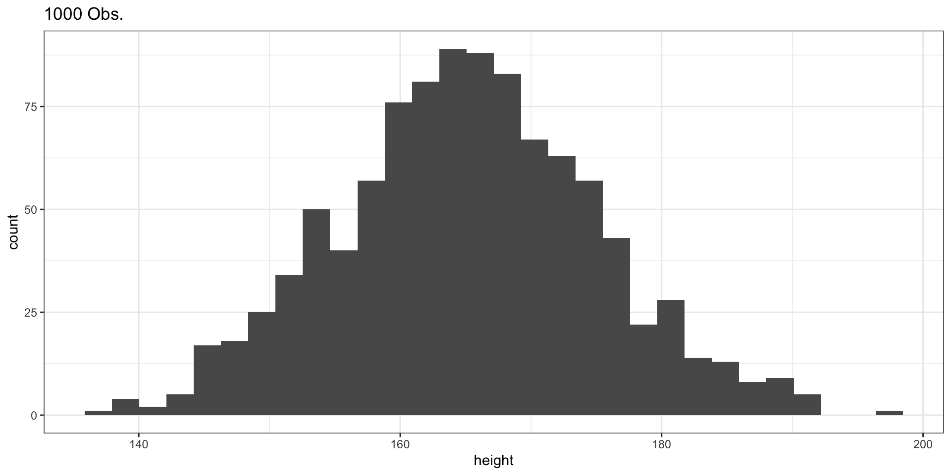
Comparing the Three Samples
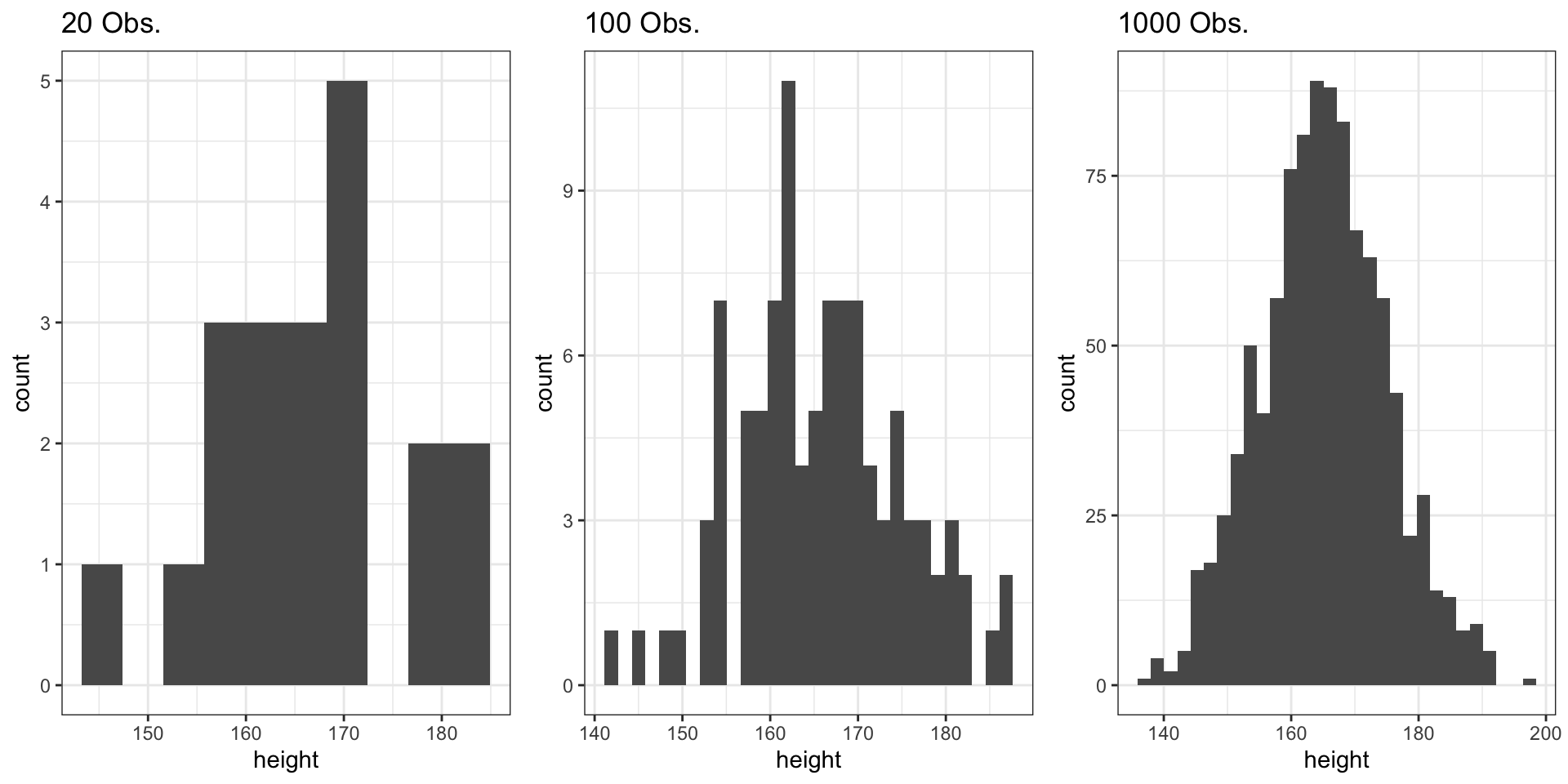
- Small samples (n = 20): More variability, less smooth
- Large samples (n = 1000): Converges to theoretical normal distribution
- Law of Large Numbers: As n increases, the sample distribution approximates the population distribution
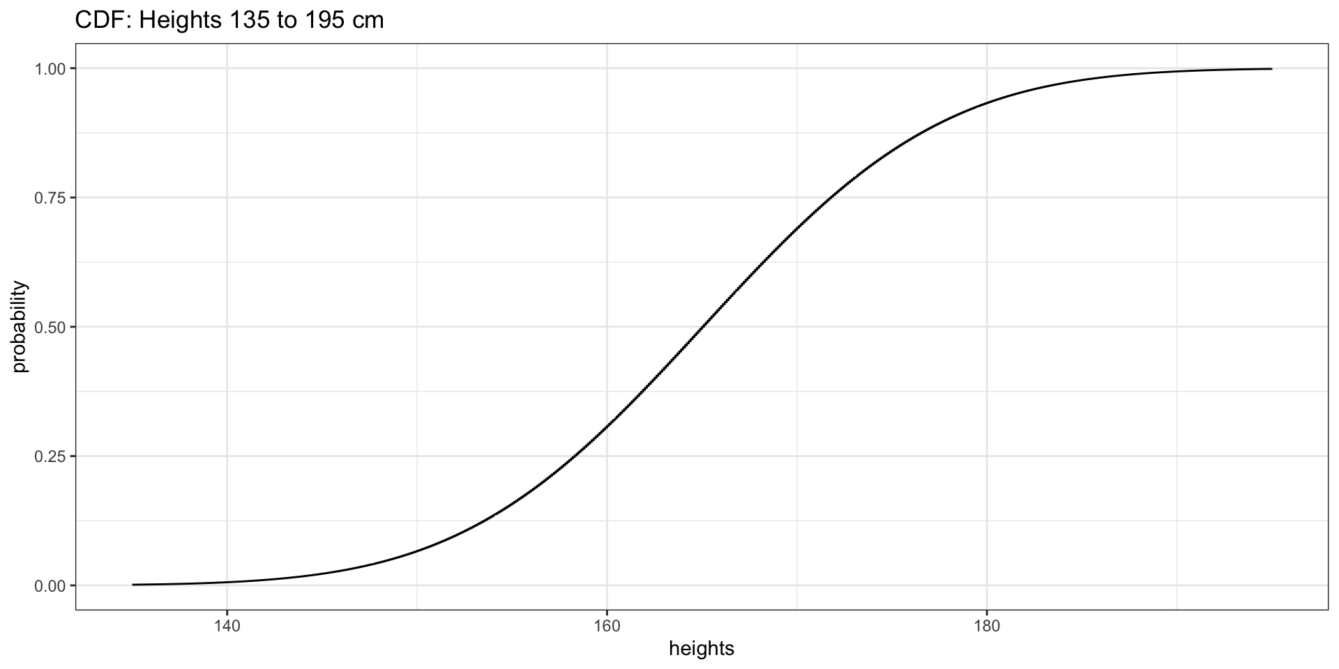
Heights of Women: CDF
Setting Up the Data
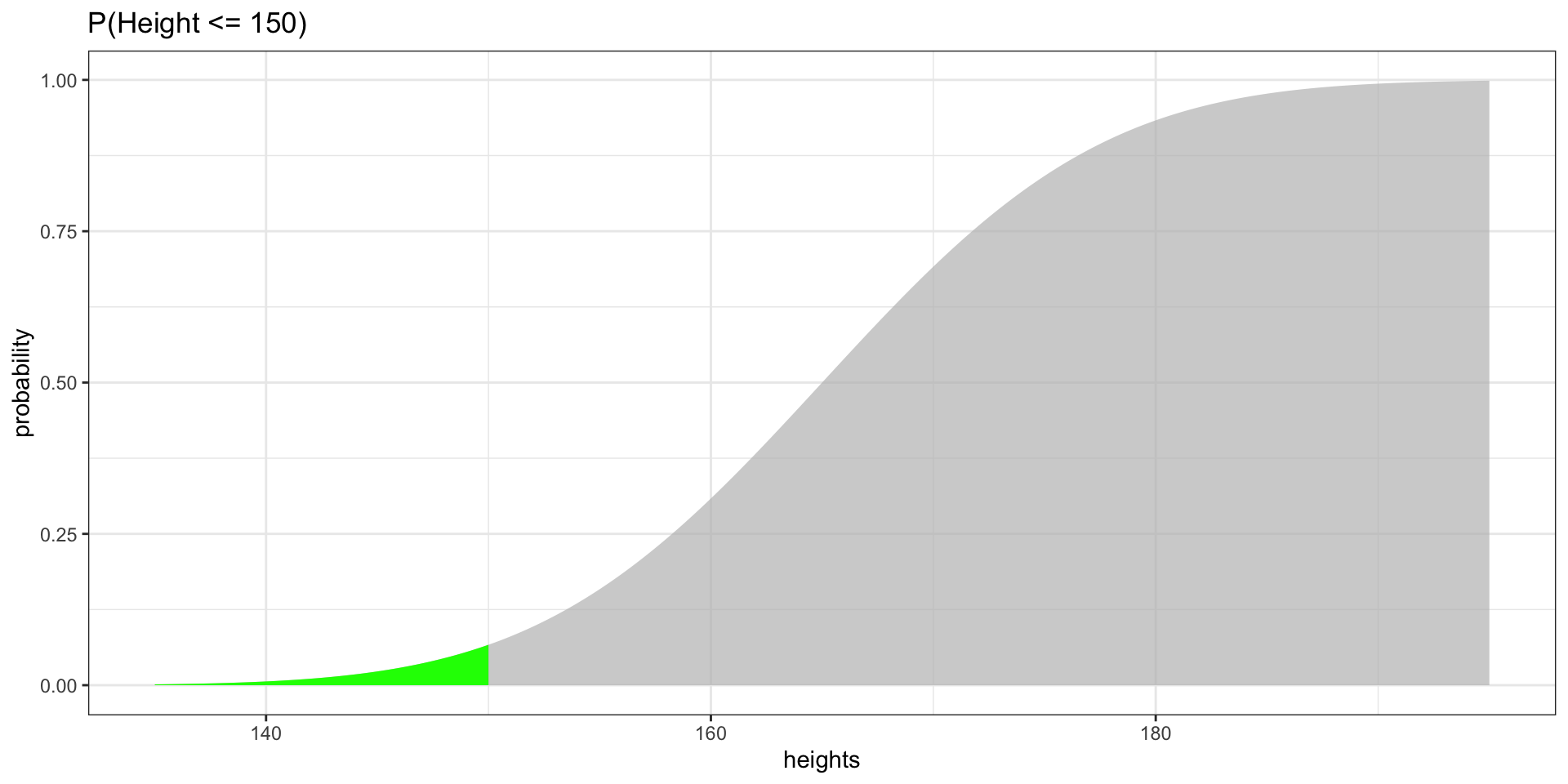
Highlighting Probabilities
P(Height \(\leq\) 150)
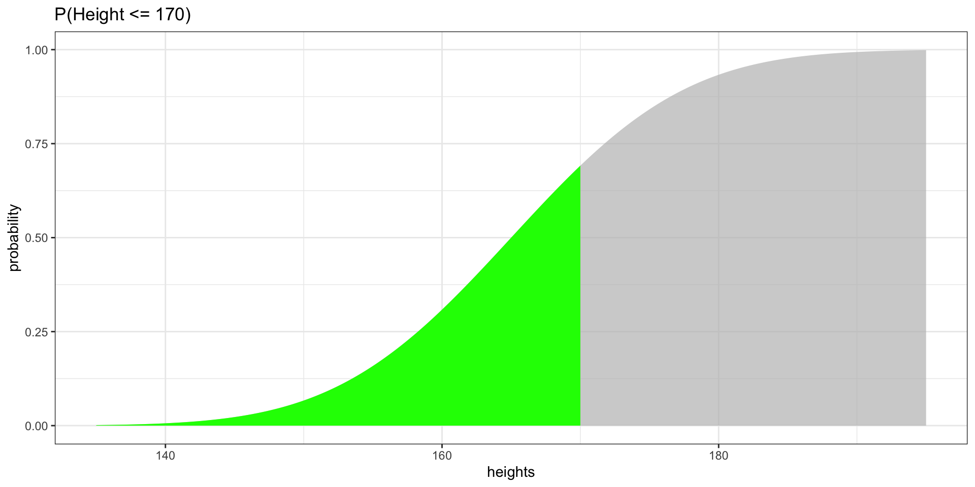
Highlighting Probabilities
P(Height \(\leq\) 170)
Effect of Increment Size
How Granularity Affects the CDF Shape
Show Code
df_01 <- data.frame(heights = seq(135, 195, by = 0.1),
                    probability = pnorm(seq(135, 195, by = 0.1), 165, 10))
df_1 <- data.frame(heights = seq(135, 195, by = 1),
                   probability = pnorm(seq(135, 195, by = 1), 165, 10))
df_10 <- data.frame(heights = seq(135, 195, by = 10),
                    probability = pnorm(seq(135, 195, by = 10), 165, 10))
fig_inc1 <- ggplot(df_01, aes(x = heights, y = probability)) +
  geom_step() + theme_bw() + ggtitle("by = 0.1")
fig_inc2 <- ggplot(df_1, aes(x = heights, y = probability)) +
  geom_step() + theme_bw() + ggtitle("by = 1")
fig_inc3 <- ggplot(df_10, aes(x = heights, y = probability)) +
  geom_step() + theme_bw() + ggtitle("by = 10")
grid.arrange(fig_inc1, fig_inc2, fig_inc3, ncol = 3)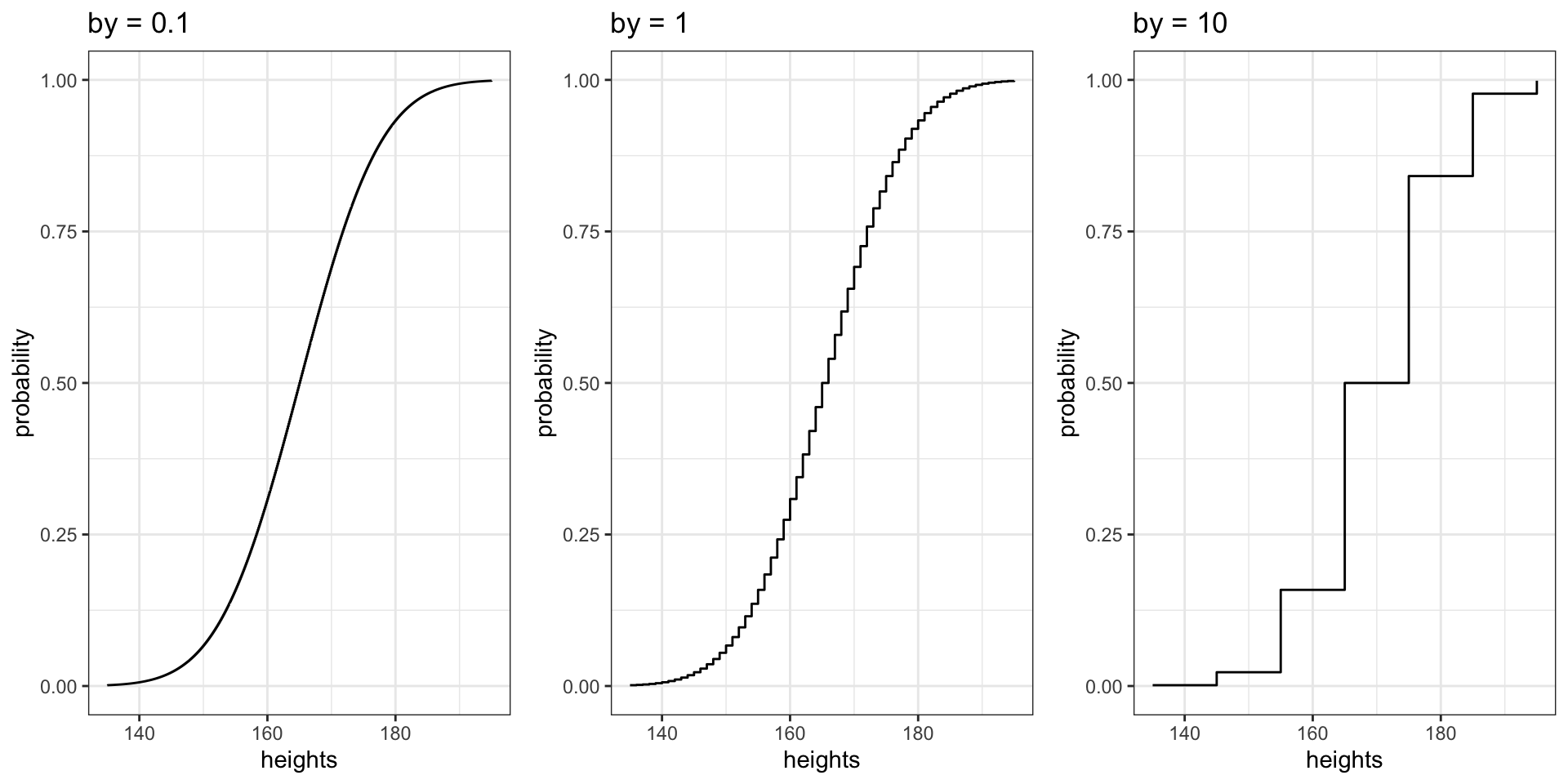
Smaller increments produce more data points, creating a smoother curve. With by = 10, the CDF is “jumpy.”
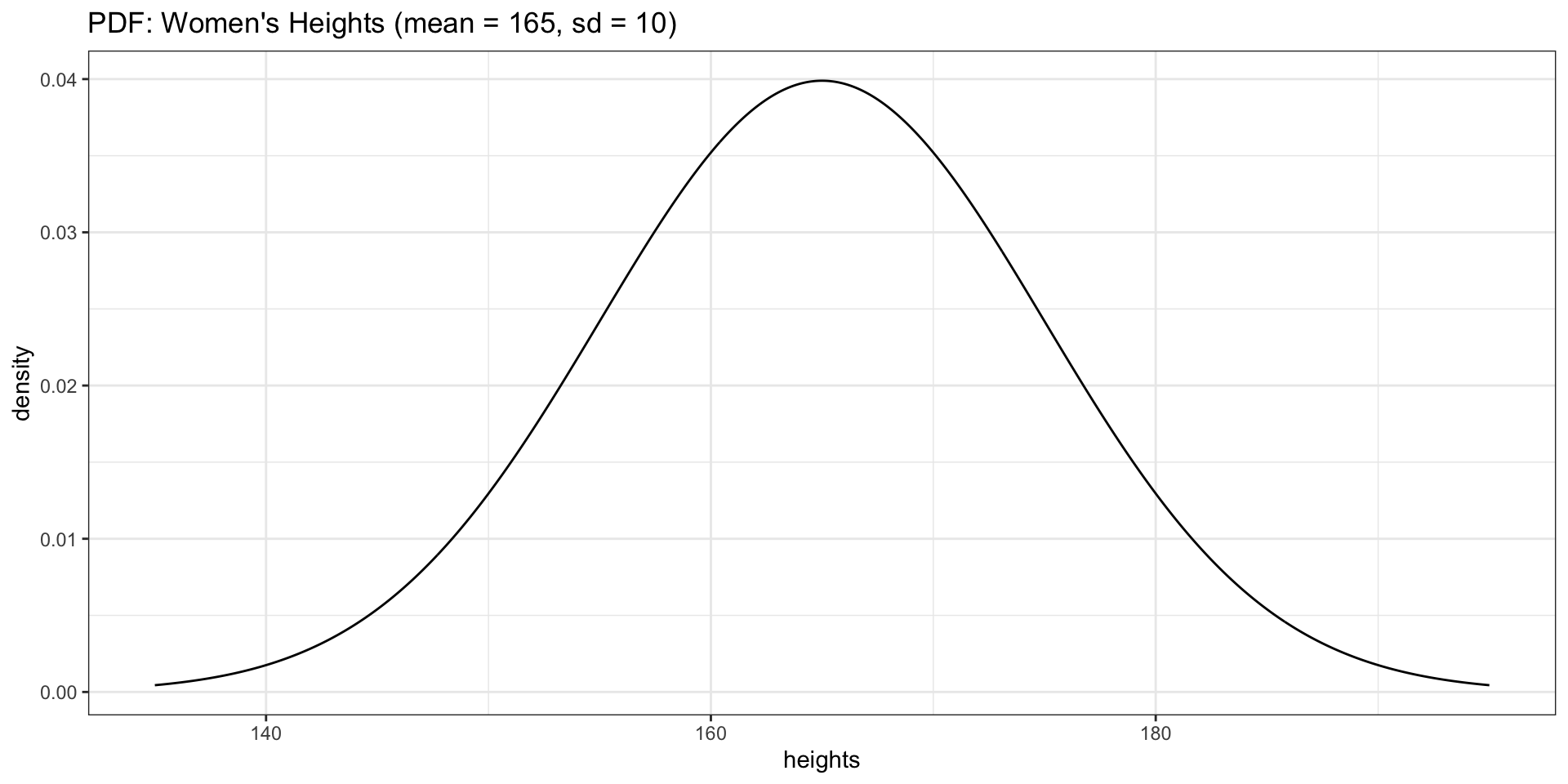
PDF for Heights
Overlaying the PDF on a Histogram
Connecting rnorm and dnorm
Show Code
ggplot(data = generated_heights_1000obs, aes(x = height)) +
  geom_histogram(aes(y = after_stat(density)), bins = 30, fill = "grey80", color = "white") +
  geom_line(data = dnorm_df2, aes(x = heights, y = density), color = "red", linewidth = 1) +
  theme_bw() +
  ggtitle("Histogram (1000 obs.) with Theoretical PDF Overlay")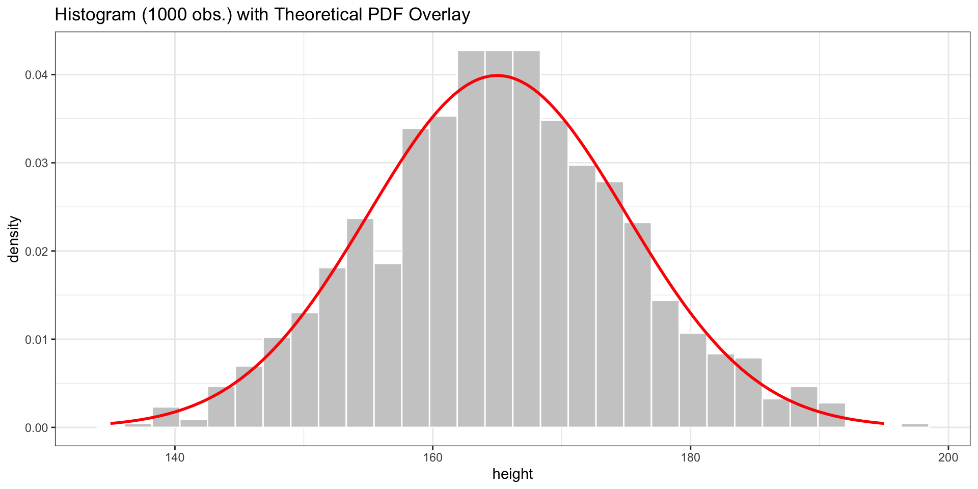
The red curve is the theoretical normal distribution. The histogram of our rnorm sample approximates it.
Histogram of Empirical Data
Show Code
lines <- paste("Mean:", round(mean_empirical, 0),
               "\nSD:", round(sd_empirical, 2))

fig_hist1 <- ggplot(data = clean_life_exp_mean_df, aes(x = life_exp_mean)) +
  geom_histogram() +
  geom_density(aes(y = after_stat(count) * 1.5)) +
  theme_bw() +
  geom_vline(xintercept = mean_empirical, linetype = "dashed", col = "red") +
  ggtitle("Life Expectancy\n(Empirical Data)") +
  annotate("text", x = mean_empirical - 10, y = 17, label = lines, color = "red")
fig_hist1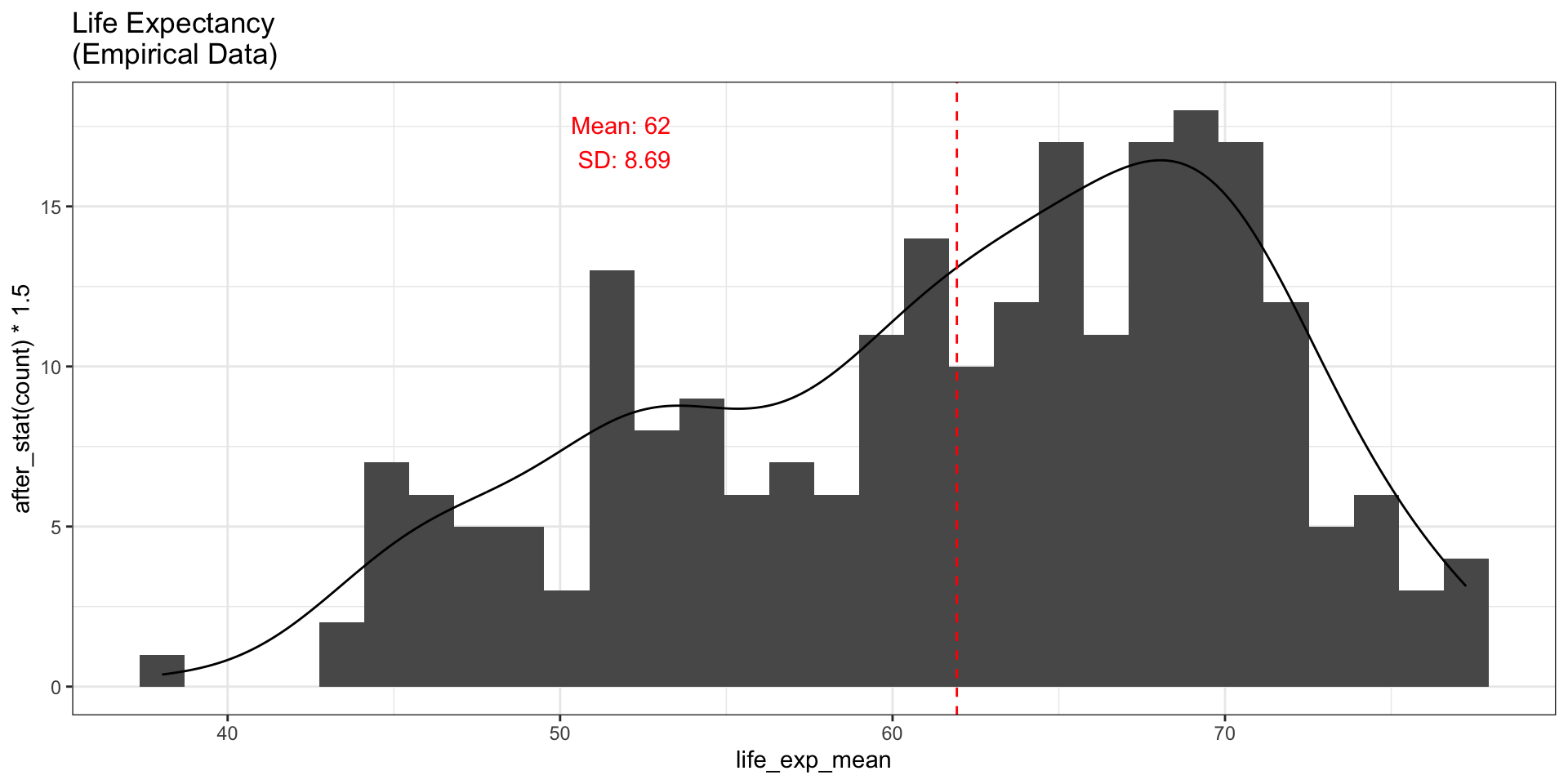
Comparing Empirical vs. Generated
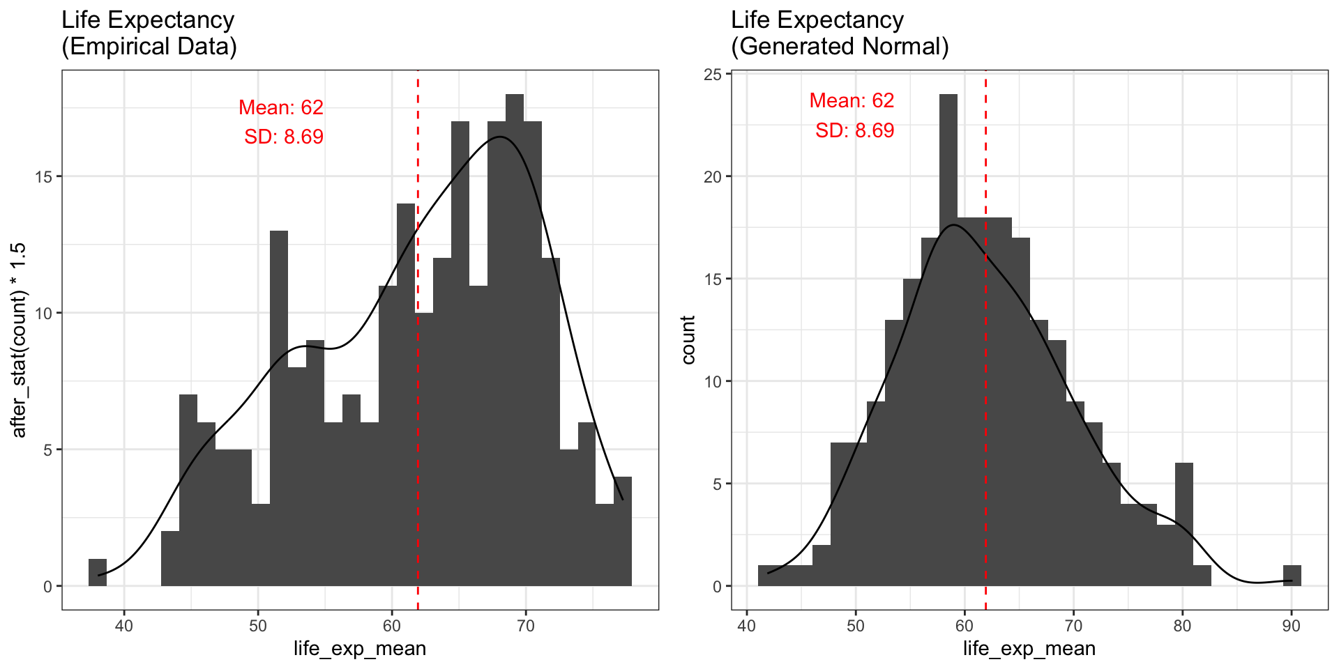
The empirical data is not normally distributed — it is left-skewed.
Generating More Observations
1000 Observations
Show Code
fig_hist3 <- ggplot(data = generated_data_1000obs, aes(x = life_exp_mean)) +
  geom_histogram() +
  geom_density(aes(y = after_stat(count) * 1.5)) +
  theme_bw() +
  geom_vline(xintercept = mean_empirical, linetype = "dashed", col = "red") +
  ggtitle("Generated Normal\n(1000 Obs.)") +
  annotate("text", x = mean_empirical - 10, y = 17, label = lines, color = "red")
fig_hist3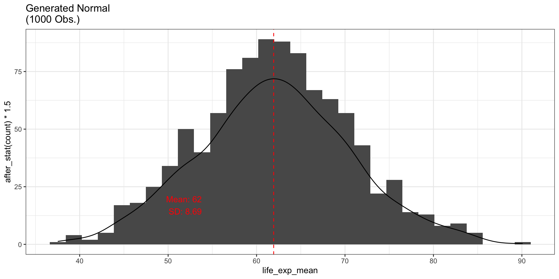
With more observations, the generated data looks increasingly like a bell curve.
Problem 1 (cont.)
Visualizing with CDF
Show Code
new_data2 <- life_expectancy_df2
new_data2$life_exp_mean_rounded <- round(new_data2$life_exp_mean, 0)
freq_table <- table(new_data2$life_exp_mean_rounded)
freq_table <- data.frame(freq_table)
names(freq_table) <- c("life_exp_mean_rounded", "count")
freq_table$life_exp_mean_rounded <- as.numeric(as.character(freq_table$life_exp_mean_rounded))
freq_table$sum_frequency <- sum(freq_table$count)
freq_table$pmf <- freq_table$count / freq_table$sum_frequency
new_data2$cdf <- ecdf(new_data2$life_exp_mean_rounded)(new_data2$life_exp_mean_rounded)

# Deduplicated datasets for clean plots
cdf_unique <- new_data2 %>%
  distinct(life_exp_mean_rounded, .keep_all = TRUE) %>%
  arrange(life_exp_mean_rounded)
pmf_unique <- freq_table %>%
  select(life_exp_mean_rounded, pmf) %>%
  arrange(life_exp_mean_rounded)

# PMF with highlighted region
fig_pmf <- ggplot(data = pmf_unique, aes(x = life_exp_mean_rounded, y = pmf)) +
  geom_area(fill = "green") +
  gghighlight(life_exp_mean_rounded <= 50) +
  theme_bw() +
  ggtitle("PMF: P(X <= 50)")

# CDF with highlighted region using step-function rectangles
ecdf_fn <- ecdf(new_data2$life_exp_mean_rounded)
cdf_plot <- data.frame(x = sort(unique(new_data2$life_exp_mean_rounded)))
cdf_plot$cdf <- ecdf_fn(cdf_plot$x)
cdf_sub <- subset(cdf_plot, x <= 50)
cdf_rects <- data.frame(
  xmin = cdf_sub$x,
  xmax = c(cdf_sub$x[-1], 50),
  ymin = 0,
  ymax = cdf_sub$cdf
)
fig_cdf <- ggplot() +
  geom_step(data = cdf_plot, aes(x = x, y = cdf)) +
  geom_rect(data = cdf_rects,
            aes(xmin = xmin, xmax = xmax, ymin = ymin, ymax = ymax),
            fill = "green", alpha = 0.5) +
  theme_bw() +
  ggtitle("CDF: P(X <= 50)")

grid.arrange(fig_pmf, fig_cdf, ncol = 2)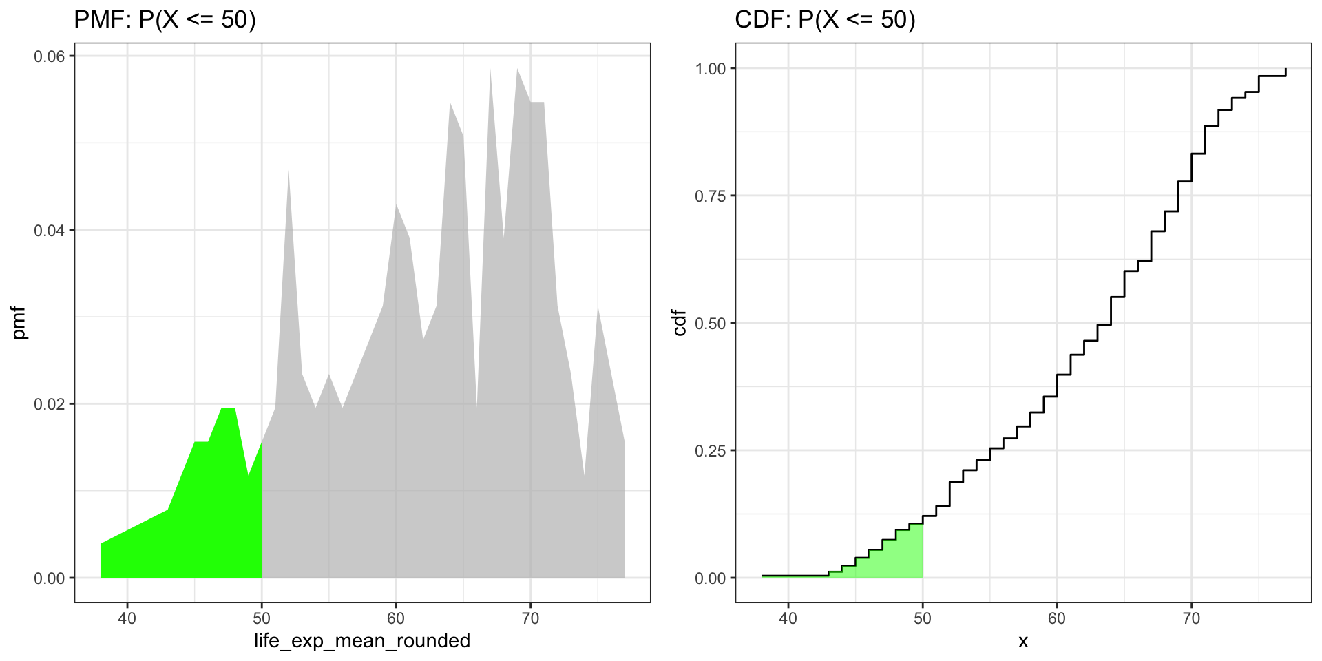
Problem 2 (cont.)
Visualizing P(X > 70)
Show Code
fig_cdf_full <- ggplot(data = cdf_plot, aes(x = x, y = cdf)) +
  geom_step() +
  theme_bw() +
  ggtitle("Full CDF")

cdf_sub_70 <- subset(cdf_plot, x > 70)
cdf_rects_70 <- data.frame(
  xmin = cdf_sub_70$x,
  xmax = c(cdf_sub_70$x[-1], max(cdf_sub_70$x)),
  ymin = 0,
  ymax = cdf_sub_70$cdf
)
fig_cdf_70 <- ggplot() +
  geom_step(data = cdf_plot, aes(x = x, y = cdf)) +
  geom_rect(data = cdf_rects_70,
            aes(xmin = xmin, xmax = xmax, ymin = ymin, ymax = ymax),
            fill = "green", alpha = 0.5) +
  theme_bw() +
  ggtitle("CDF: P(X > 70)")

grid.arrange(fig_cdf_full, fig_cdf_70, ncol = 2)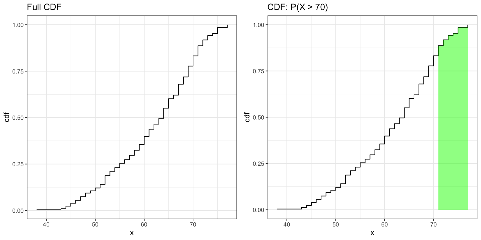
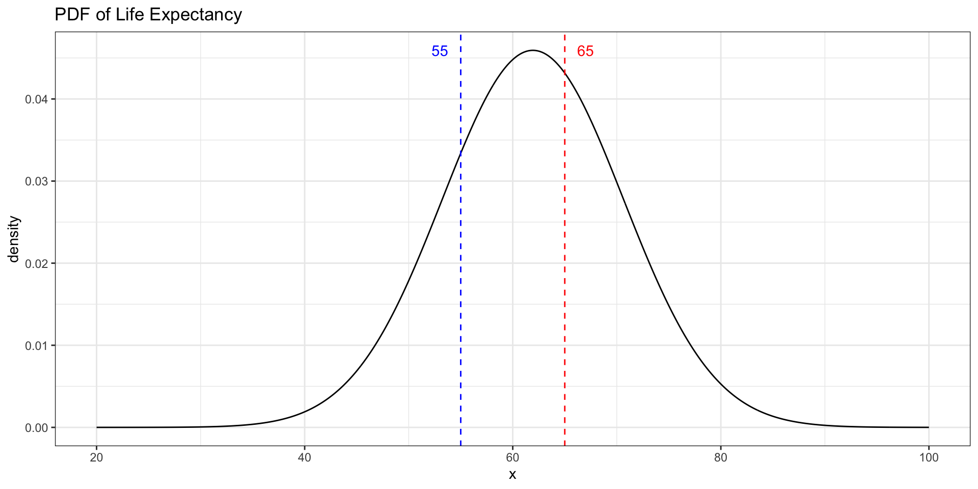
Problem 3: Using dnorm
Where Is Life Expectancy Most Concentrated?
Which value has a higher density — a life expectancy of 55 or 65?
d_55 <- dnorm(55, mean = mean_empirical, sd = sd_empirical)
d_65 <- dnorm(65, mean = mean_empirical, sd = sd_empirical)
data.frame(life_exp = c(55, 65), density = c(d_55, d_65))
. . .