Statistical Analysis

Lab 13: Differences in Differences

Bogdan G. Popescu

John Cabot University

Intro

Setup

Open a new Quarto document and use this preamble:

---
title: "Lab 13"
author: "Your Name"
date: today
format:
  html:
    toc: true
    number-sections: true
    colorlinks: true
    smooth-scroll: true
    embed-resources: true
---

Render and save under “week13” in your “stats” folder.

Background

The Research Question

The World Bank provided insecticide-treated bed nets only to City B from 2017 to 2020. They selected 24 individuals (over 3 years) from City B to investigate whether nets reduce malaria risk.

This is a Difference-in-Differences (DiD) design:

  • Treatment group: City B (received nets)
  • Control group: City A (did not receive nets)
  • Before: pre-2017
  • After: 2017 onward

The DiD Equation

We want to estimate \(\beta_3\) from:

\[Y_{it} = \beta_0 + \beta_1 \text{Group}_i + \beta_2 \text{Time}_t + \beta_3 (\text{Group}_i \times \text{Time}_t) + \epsilon_{it}\]

where:

  • \(\beta_0\) — mean of the control group in the pre-treatment period
  • \(\beta_1\) — the difference across groups (City B vs. City A)
  • \(\beta_2\) — the change over time (post vs. pre)
  • \(\beta_3\) — the difference-in-differences (the causal effect)

In Our Context

\[\text{Malaria Risk}_{it} = \beta_0 + \beta_1 \text{City B}_i + \beta_2 \text{Post-2017}_t + \beta_3 (\text{City B}_i \times \text{Post-2017}_t) + \epsilon_{it}\]

\(\beta_3\) captures the additional change in malaria risk for City B after the intervention, beyond any trend shared with City A.

The Causal Model

Show code
malaria_dag <- dagify(
  malaria_risk ~ net + year + city,
  net ~ year + city,
  exposure = "net",
  outcome = "malaria_risk",
  labels = c(
    malaria_risk = "Malaria Risk",
    net = "Mosquito Net",
    year = "Year",
    city = "City"
  ),
  coords = list(
    x = c(malaria_risk = 3, net = 1, year = 2, city = 2),
    y = c(malaria_risk = 2, net = 2, year = 3, city = 1)
  )
)

bigger_dag <- data.frame(tidy_dagitty(malaria_dag))
bigger_dag$type[bigger_dag$name == "malaria_risk"] <- "Outcome"
bigger_dag$type[bigger_dag$name == "net"] <- "Intervention"

min_x <- min(bigger_dag$x); max_x <- max(bigger_dag$x)
min_y <- min(bigger_dag$y); max_y <- max(bigger_dag$y)

col <- c("Outcome" = sage, "Intervention" = terracotta, "Confounder" = stone)
order_col <- c("Outcome", "Intervention", "Confounder")

ggplot(bigger_dag, aes(x = x, y = y, xend = xend, yend = yend, color = type)) +
  geom_dag_point() +
  geom_dag_edges() +
  coord_sf(xlim = c(min_x - 1, max_x + 1), ylim = c(min_y - 1, max_y + 1)) +
  scale_colour_manual(values = col, name = "Group", breaks = order_col) +
  geom_label_repel(
    data = subset(bigger_dag, !duplicated(bigger_dag$label)),
    aes(label = label), fill = alpha("white", 0.8)
  ) +
  labs(x = "", y = "") +
  theme_meridian()

Mapping the Study Area

Loading & Processing Spatial Data

Show code
# Load shapefiles
mwi <- st_read("./data/malawi-latest-free/gadm41_MWI_0.shp", quiet = TRUE)
mwi1 <- st_read("./data/malawi-latest-free/gadm41_MWI_1.shp", quiet = TRUE)
mwi3 <- st_read("./data/malawi-latest-free/gadm41_MWI_3.shp", quiet = TRUE)
select_comm <- st_read("./data/malawi-latest-free/selected_communes3.shp", quiet = TRUE)
elev <- read_stars("./data/elev.tif")
world <- ne_countries(scale = "medium", returnclass = "sf")
sf::sf_use_s2(FALSE)

# Simplify for faster rendering
mwi <- st_simplify(mwi, dTolerance = 0.005)
mwi1 <- st_simplify(mwi1, dTolerance = 0.005)
mwi3 <- st_simplify(mwi3, dTolerance = 0.005)
select_comm <- st_simplify(select_comm, dTolerance = 0.0005)
world <- st_simplify(world, dTolerance = 0.005)

# Zoom extent + bounding polygon
mwi_extent <- st_bbox(mwi)
min_lon_x <- mwi_extent["xmin"]; max_lon_x <- mwi_extent["xmax"]
min_lat_y <- mwi_extent["ymin"]; max_lat_y <- mwi_extent["ymax"]
error <- 5
sp_df <- data.frame(
  lon = c(min_lon_x - error, max_lon_x + error,
          min_lon_x - error, max_lon_x + error),
  lat = c(min_lat_y - error, min_lat_y - error,
          max_lat_y + error, max_lat_y + error)
)
poly <- sp_df %>%
  st_as_sf(coords = c("lon", "lat"), crs = st_crs(mwi)) %>%
  st_bbox() %>% st_as_sfc()

# Crop elevation raster
elev2 <- st_warp(elev, st_as_stars(st_bbox(elev), dx = 0.05, dy = 0.05))
elev2[elev2 > 2000] <- NA
dem_mwi <- st_crop(elev2, poly)

Download links:

Malawi on the World Map

Show code
ggplot() +
  geom_sf(data = world, fill = NA, color = "black", linewidth = 0.3) +
  geom_sf(data = mwi, fill = terracotta, color = terracotta, linewidth = 0.7) +
  geom_sf(data = poly, fill = NA, color = terracotta, linewidth = 0.9) +
  labs(x = "Longitude", y = "Latitude", title = "Malawi on the World Map") +
  theme_meridian()

Nkhata Bay in Malawi

Show code
mwi1_lab <- subset(mwi1, NAME_1 == "Nkhata Bay")
grey_palette <- colorRampPalette(c("grey90", "grey30"))
grey_colors <- grey_palette(10)

error <- 0.2
ggplot() +
  geom_stars(data = elev2, show.legend = FALSE) +
  scale_fill_gradientn(colours = grey_colors) +
  geom_sf(data = select_comm, fill = sage, color = sage, linewidth = 0.4) +
  geom_sf(data = mwi1, fill = NA, color = "blue", linewidth = 0.2) +
  geom_sf(data = mwi1_lab, fill = NA, color = "blue", linewidth = 0.9) +
  geom_sf_text(data = mwi1_lab, aes(label = NAME_1), size = 3.5) +
  labs(x = "Longitude", y = "Latitude", title = "Nkhata Bay in Malawi") +
  coord_sf(
    xlim = c(min_lon_x - 5 * error, max_lon_x + 5 * error),
    ylim = c(min_lat_y - error, max_lat_y + error)
  ) +
  ggspatial::annotation_scale(location = 'tr') +
  theme_meridian()

Zooming In: Study Individuals

Show code
# Re-read shapefiles at higher resolution for zoom
mwi_extent2 <- st_bbox(select_comm)
min_lon_x <- mwi_extent2["xmin"]; max_lon_x <- mwi_extent2["xmax"]
min_lat_y <- mwi_extent2["ymin"]; max_lat_y <- mwi_extent2["ymax"]

mwi <- st_read("./data/malawi-latest-free/gadm41_MWI_0.shp", quiet = TRUE)
mwi1 <- st_read("./data/malawi-latest-free/gadm41_MWI_1.shp", quiet = TRUE)
mwi3 <- st_read("./data/malawi-latest-free/gadm41_MWI_3.shp", quiet = TRUE)
select_comm <- st_read("./data/malawi-latest-free/selected_communes3.shp", quiet = TRUE)
dem <- read_stars("./data/elev.tif")
elev2 <- st_warp(dem, st_as_stars(st_bbox(elev), dx = 0.02, dy = 0.02))
elev2[elev2 > 2000] <- NA
error <- 0.5
sp_df <- data.frame(
  lon = c(min_lon_x - error, max_lon_x + error,
          min_lon_x - error, max_lon_x + error),
  lat = c(min_lat_y - error, min_lat_y - error,
          max_lat_y + error, max_lat_y + error)
)
poly <- sp_df %>%
  st_as_sf(coords = c("lon", "lat"), crs = st_crs(mwi)) %>%
  st_bbox() %>% st_as_sfc()
dem_mwi <- st_crop(elev2, poly)
sf::sf_use_s2(FALSE)

# Load roads
roads <- st_read("./data/malawi-latest-free/gis_osm_roads_free_1_crop2.shp", quiet = TRUE)
roads2 <- st_combine(roads)
roads3 <- st_as_sf(roads2)
roads_crop1 <- sf::st_intersection(roads3, select_comm)

Map: Start Year (2013)

Show code
diff_data <- read.csv(file = './data/did_data_geo_malawi.csv')
mwi1_lab <- subset(mwi1, NAME_1 == "Nkhata Bay")

error <- 0.05
ggplot() +
  geom_sf(data = mwi1_lab, fill = NA, color = "blue", linewidth = 0.9) +
  geom_point(data = subset(diff_data, year == 2013),
             aes(x = lon, y = lat, color = city, size = malaria_risk),
             alpha = 0.3) +
  scale_color_manual(values = c(sage, terracotta)) +
  scale_size_continuous(range = c(1, 6)) +
  coord_sf(
    xlim = c(min_lon_x - 3 * error, max_lon_x + 3 * error),
    ylim = c(min_lat_y - error, max_lat_y + error)
  ) +
  ggspatial::annotation_scale(location = 'tr') +
  labs(title = "Year: 2013 (Pre-Intervention)", x = "Longitude", y = "Latitude") +
  theme_meridian()

Map: End Year (2020)

Show code
ggplot() +
  geom_sf(data = mwi1_lab, fill = NA, color = "blue", linewidth = 0.9) +
  geom_point(data = subset(diff_data, year == 2020),
             aes(x = lon, y = lat, color = city, size = malaria_risk),
             alpha = 0.3) +
  scale_color_manual(values = c(sage, terracotta)) +
  scale_size_continuous(range = c(1, 6)) +
  coord_sf(
    xlim = c(min_lon_x - 3 * error, max_lon_x + 3 * error),
    ylim = c(min_lat_y - error, max_lat_y + error)
  ) +
  ggspatial::annotation_scale(location = 'tr') +
  labs(title = "Year: 2020 (Post-Intervention)", x = "Longitude", y = "Latitude") +
  theme_meridian()

Data Analysis

The DiD Dataset

diff_data <- read.csv(file = './data/did_data_geo_malawi.csv')
glimpse(diff_data, n = 10)
Rows: 8,000
Columns: 10
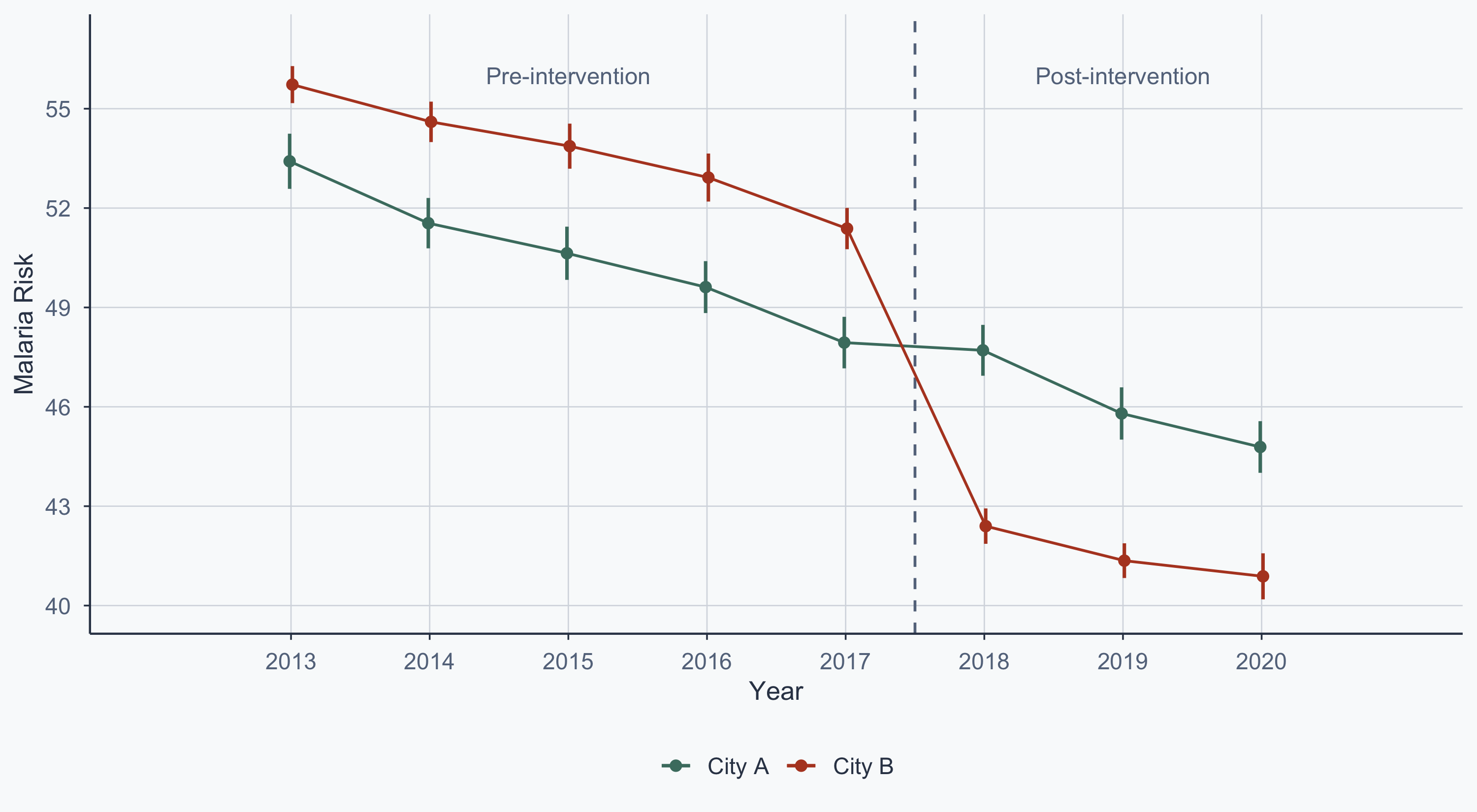
$ year         <int> 2013, 2014, 2015, 2016, 2017, 2018, 2019, 2020, 2013, 201…
$ income       <dbl> 1284.551, 1285.832, 1285.997, 1285.157, 1286.313, 1287.24…
$ age          <int> 33, 34, 35, 36, 37, 38, 39, 40, 51, 52, 53, 54, 55, 56, 5…
$ sex          <chr> "Woman", "Woman", "Woman", "Woman", "Woman", "Woman", "Wo…
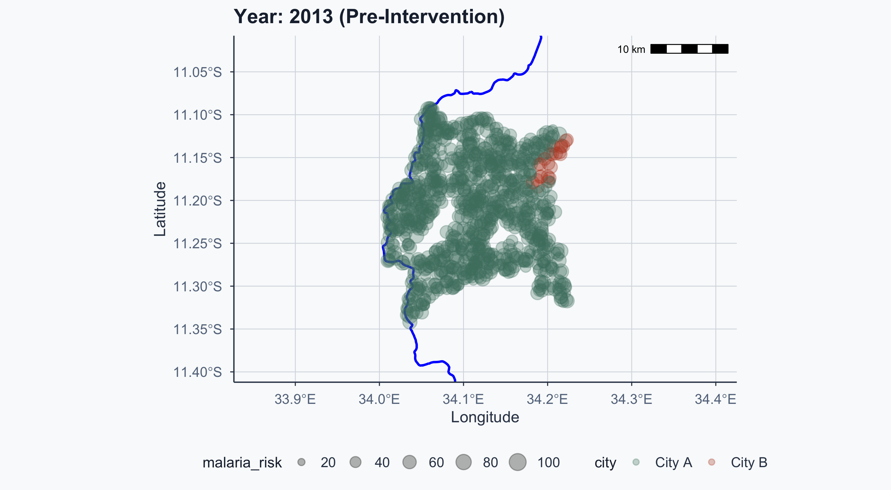
$ malaria_risk <dbl> 36.26529, 35.10382, 73.17664, 28.98390, 51.18721, 51.9071…
$ id           <int> 1, 1, 1, 1, 1, 1, 1, 1, 2, 2, 2, 2, 2, 2, 2, 2, 3, 3, 3, …
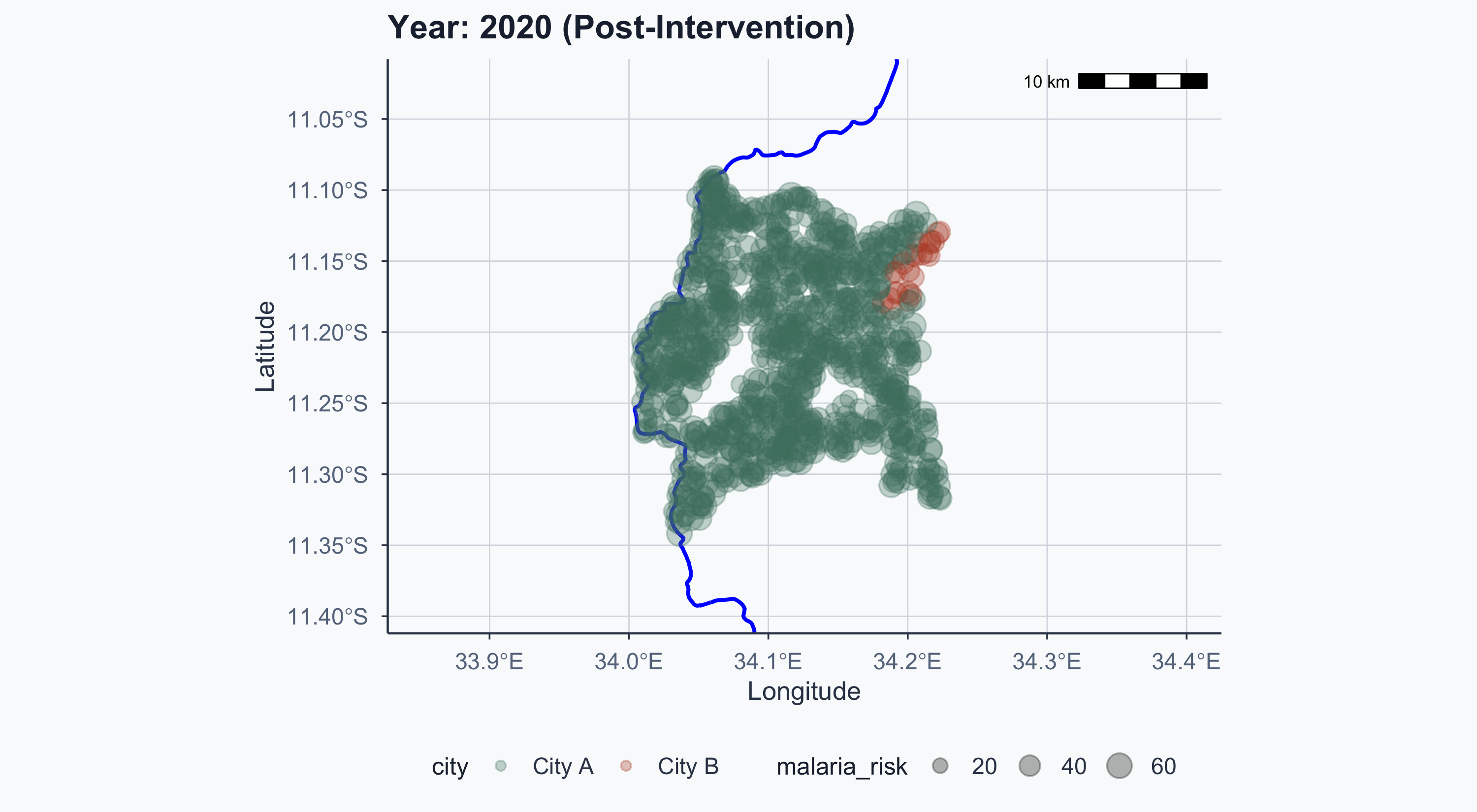
$ lat          <dbl> -11.27476, -11.27476, -11.27476, -11.27476, -11.27476, -1…
$ lon          <dbl> 34.03006, 34.03006, 34.03006, 34.03006, 34.03006, 34.0300…
$ after        <int> 0, 0, 0, 0, 0, 1, 1, 1, 0, 0, 0, 0, 0, 1, 1, 1, 0, 0, 0, …
$ city         <chr> "City A", "City A", "City A", "City A", "City A", "City A…

Summary Statistics

datasummary_skim(diff_data, output = "kableExtra") |>
  kableExtra::kable_styling(font_size = 18, full_width = FALSE)
Unique Missing Pct. Mean SD Min Median Max
year 8 0 2016.5 2.3 2013.0 2016.5 2020.0
income 8000 0 1249.9 160.6 836.3 1246.8 1710.7
age 87 0 32.3 16.0 1.0 31.0 87.0
malaria_risk 8000 0 48.9 12.7 0.0 49.0 100.0
id 1000 0 500.5 288.7 1.0 500.5 1000.0
lat 1000 0 −11.2 0.1 −11.3 −11.2 −11.1
lon 1000 0 34.1 0.1 34.0 34.1 34.2
after 2 0 0.4 0.5 0.0 0.0 1.0
  • malaria_risk and income look roughly symmetric — OLS mean-comparison is reasonable
  • net is binary (treatment indicator), after is binary (time indicator)
  • age is right-skewed — not a concern for DiD since it enters as a covariate, not the outcome

Estimating the DiD Effect

model_did <- lm(malaria_risk ~ city + after + city * after, data = diff_data)
modelsummary(model_did, stars = TRUE, gof_map = c("nobs", "r.squared"),
             output = "kableExtra") |>
  kableExtra::kable_styling(font_size = 18, full_width = FALSE)
&nbsp;(1)
(Intercept) 50.629***
(0.179)
cityCity B 3.071**
(1.155)
after −4.532***
(0.292)
cityCity B × after −7.623***
(1.886)
Num.Obs. 8000
R2 0.034
+ p < 0.1, * p < 0.05, ** p < 0.01, *** p < 0.001

We estimate \(\beta_3\) — the causal effect of the net program.

  • The interaction term city * after is \(\beta_3\)
  • This is the difference-in-differences estimate
  • It captures the additional change in malaria risk for City B after the intervention

The Event-Study Plot

plot_data <- diff_data %>%
  group_by(year, city) %>%
  summarize(
    mean_risk = mean(malaria_risk),
    se_risk = sd(malaria_risk) / sqrt(n()),
    upper = mean_risk + (1.96 * se_risk),
    lower = mean_risk - (1.96 * se_risk)
  )
head(plot_data)
# A tibble: 6 × 6
# Groups:   year [3]
   year city   mean_risk se_risk upper lower
  <int> <chr>      <dbl>   <dbl> <dbl> <dbl>
1  2013 City A      53.4   0.425  54.2  52.6
2  2013 City B      55.7   0.285  56.3  55.2
3  2014 City A      51.5   0.388  52.3  50.8
4  2014 City B      54.6   0.311  55.2  54.0
5  2015 City A      50.6   0.410  51.4  49.8
6  2015 City B      53.9   0.347  54.5  53.2

Event-Study Plot

Show code
ggplot(plot_data, aes(x = year, y = mean_risk, color = city)) +
  geom_vline(xintercept = 2017.5, linetype = "dashed", color = stone) +
  geom_errorbar(aes(ymin = lower, ymax = upper),
                linewidth = 0.8, width = 0,
                position = position_dodge(width = 0.04)) +
  geom_line(position = position_dodge(width = 0.04)) +
  geom_point(size = 2, position = position_dodge(width = 0.04)) +
  scale_color_manual(values = c(sage, terracotta)) +
  scale_y_continuous(breaks = seq(40, 57, by = 3), limits = c(40, 57)) +
  scale_x_continuous(breaks = seq(2013, 2020, by = 1), limits = c(2012, 2021)) +
  annotate("text", x = 2015, y = 56, label = "Pre-intervention",
           color = stone, size = 4) +
  annotate("text", x = 2019, y = 56, label = "Post-intervention",
           color = stone, size = 4) +
  labs(x = "Year", y = "Malaria Risk", color = NULL) +
  theme_meridian()

Parallel trends hold before 2017 — both cities show a decreasing trend. After the intervention, City B drops further.

DiD Assumptions

For \(\beta_3\) to be a valid causal estimate, we need:

  1. Parallel trends — absent treatment, City B would have followed the same trajectory as City A
  2. SUTVA — one city’s treatment doesn’t spill over to the other (e.g., nets aren’t shared across cities)
  3. No anticipation — City B didn’t change behavior before 2017 in expectation of receiving nets
  4. Stable composition — the same types of individuals are observed pre and post (no selective migration)

What would break the design? If City B was already investing in malaria prevention independently, the trend would diverge even without nets — and \(\beta_3\) would be biased.

Beyond This Example

This lab uses a clean two-group, single-treatment-date setup. Real-world DiD is messier:

  • Staggered adoption — different units receive treatment at different times (requires modern estimators like Callaway & Sant’Anna)
  • Anticipation effects — units may react before formal treatment (e.g., City B residents buy nets early)
  • Parallel trends violations — pre-trends may look parallel but diverge for unobserved reasons
  • Heterogeneous effects — the treatment effect may differ across subgroups or over time

The event-study plot is your first diagnostic — if pre-treatment trends diverge, the design is suspect.

Conclusion

Results

The provision of insecticide-treated nets reduces malaria risk by 7.62 units in City B relative to City A.

If the goal is to reduce malaria in the wider region, scaling up net distribution is supported by this evidence.

Key Takeaways

  1. DiD compares changes over time between treated and control groups
  2. The key assumption is parallel trends — both groups would have followed the same trajectory without the intervention
  3. The event-study plot lets us visually inspect whether parallel trends hold pre-treatment
  4. The interaction coefficient \(\beta_3\) is the causal estimate — the additional change in the treated group

Your Task

  1. Replicate the full analysis in your own Quarto document
  2. Add controls: re-run the DiD regression adding age and income as covariates — does \(\beta_3\) change? Why or why not?
  3. Falsification test: re-estimate the model using only pre-treatment data (2013–2016) with a fake cutoff at 2015 — if parallel trends hold, the placebo \(\beta_3\) should be near zero
  4. Interpret: write 2–3 sentences explaining what the event-study plot tells you about the plausibility of the parallel trends assumption
  5. Cluster standard errors: re-estimate the DiD model with clustered standard errors using library(lmtest); library(sandwich) and coeftest(model_did, vcov = vcovCL, cluster = ~city) — do the standard errors change? Is \(\beta_3\) still significant?