Statistical Analysis
Lab 12: DAGs

John Cabot University
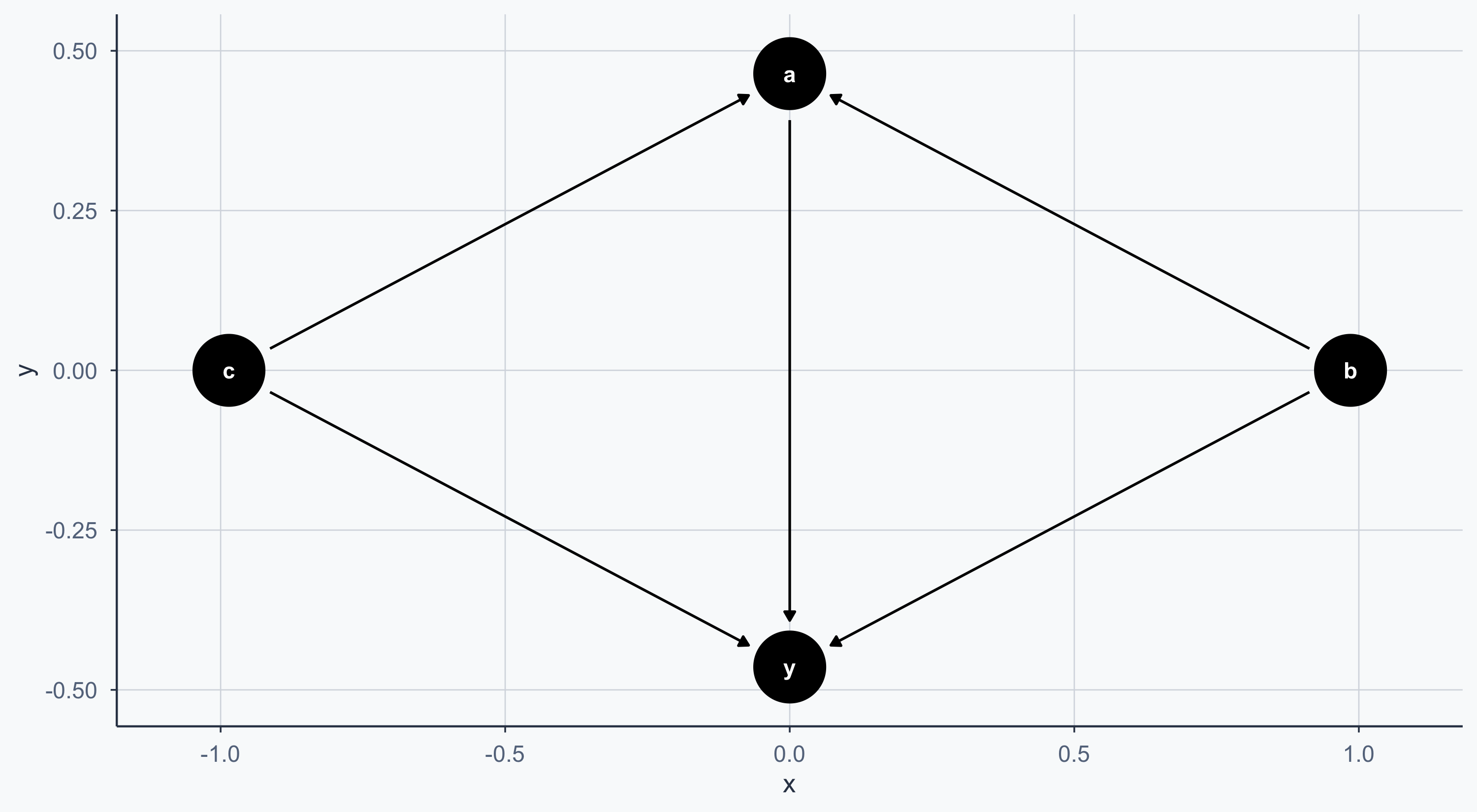
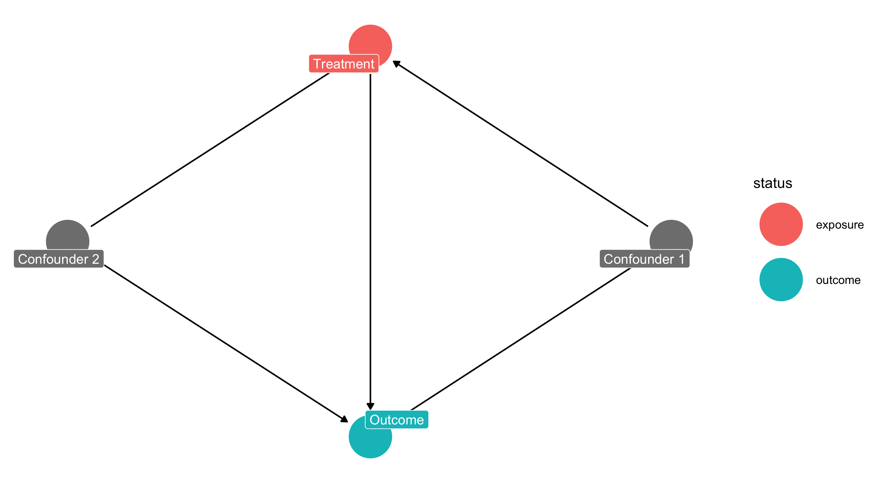
A Simple DAG
Controlling the Layout
We can convert the DAG to a dataframe with tidy_dagitty for more control:
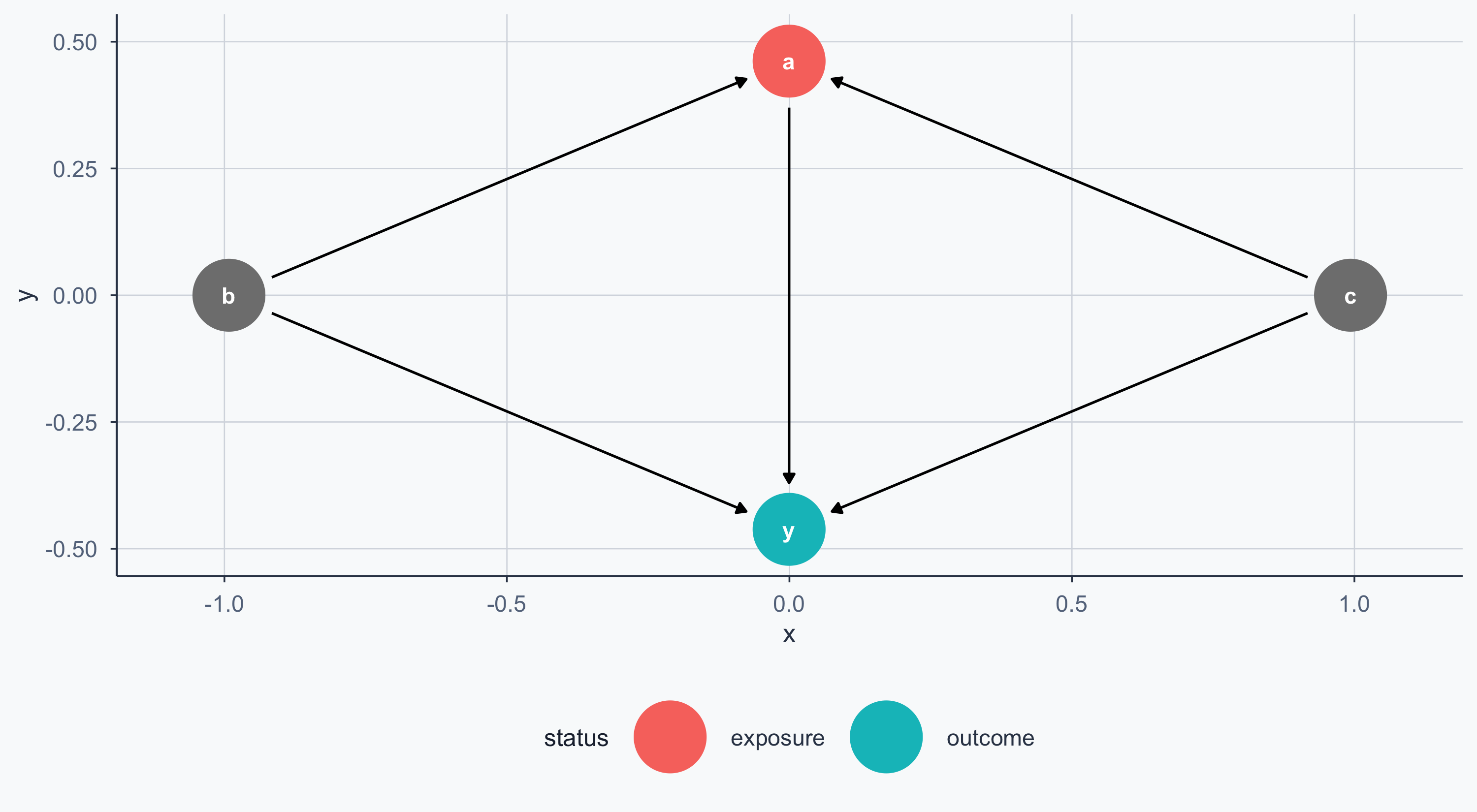
Exposure and Outcome
We can mark the exposure (treatment) and outcome nodes:
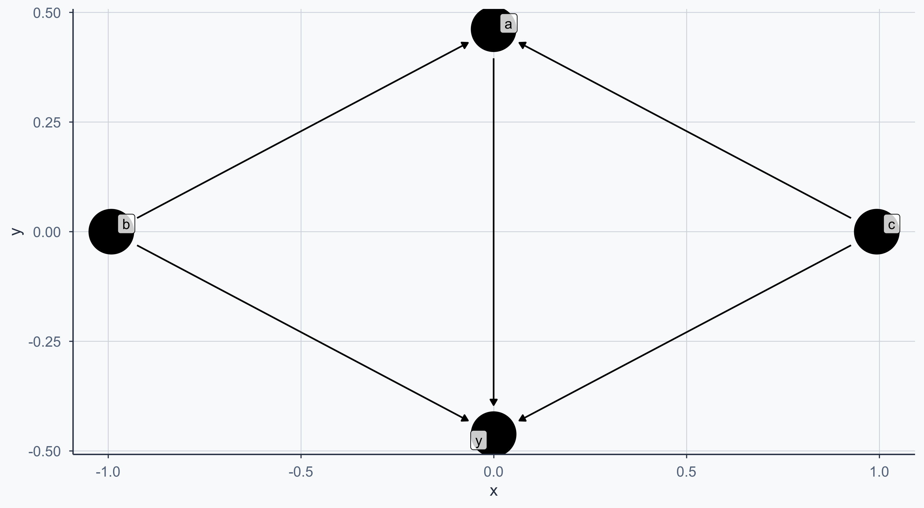
Custom Labels
Importing from DAGitty
You can draw your DAG at dagitty.net and export the code directly into R:
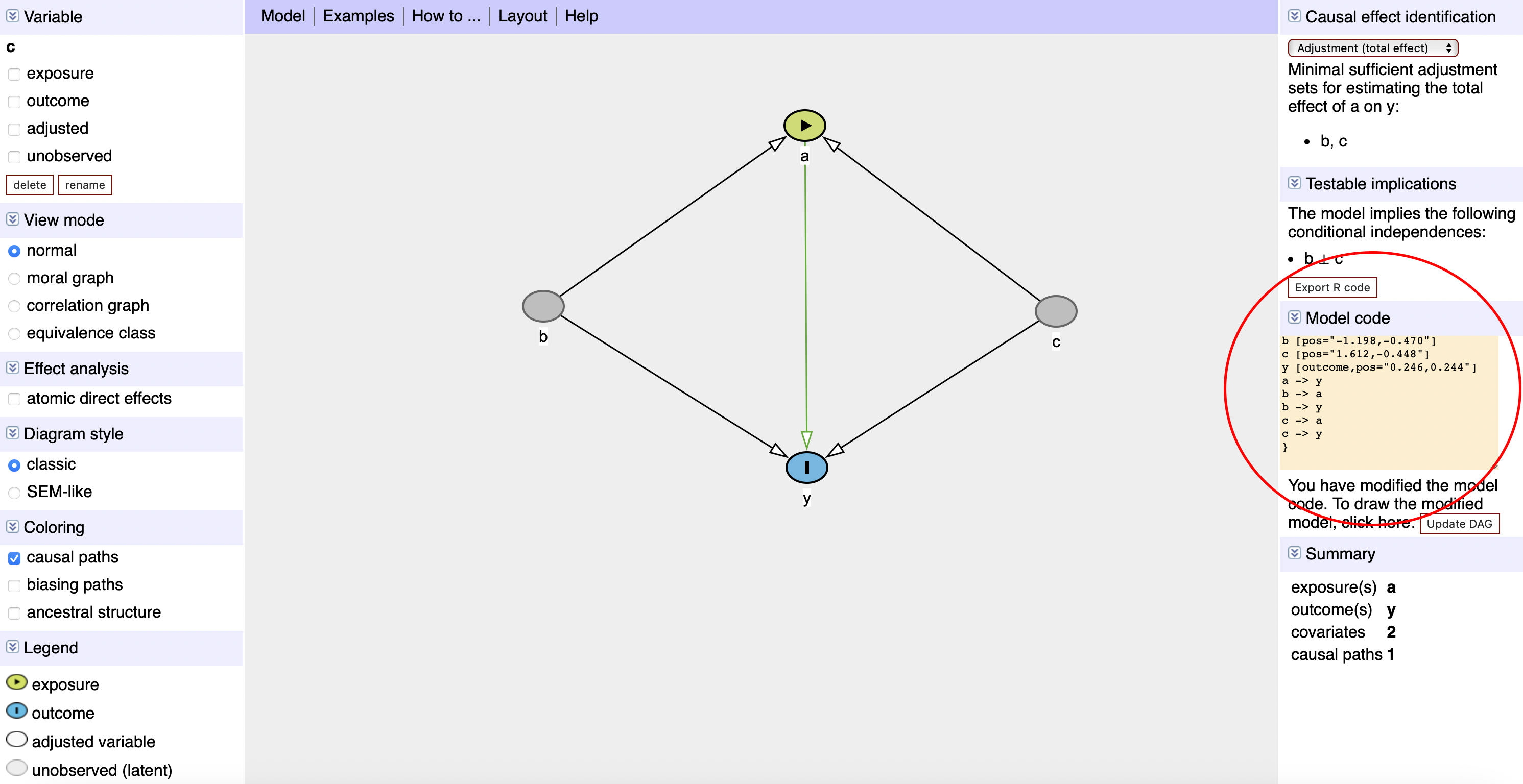
DAGitty Screenshot
DAGitty Code in R
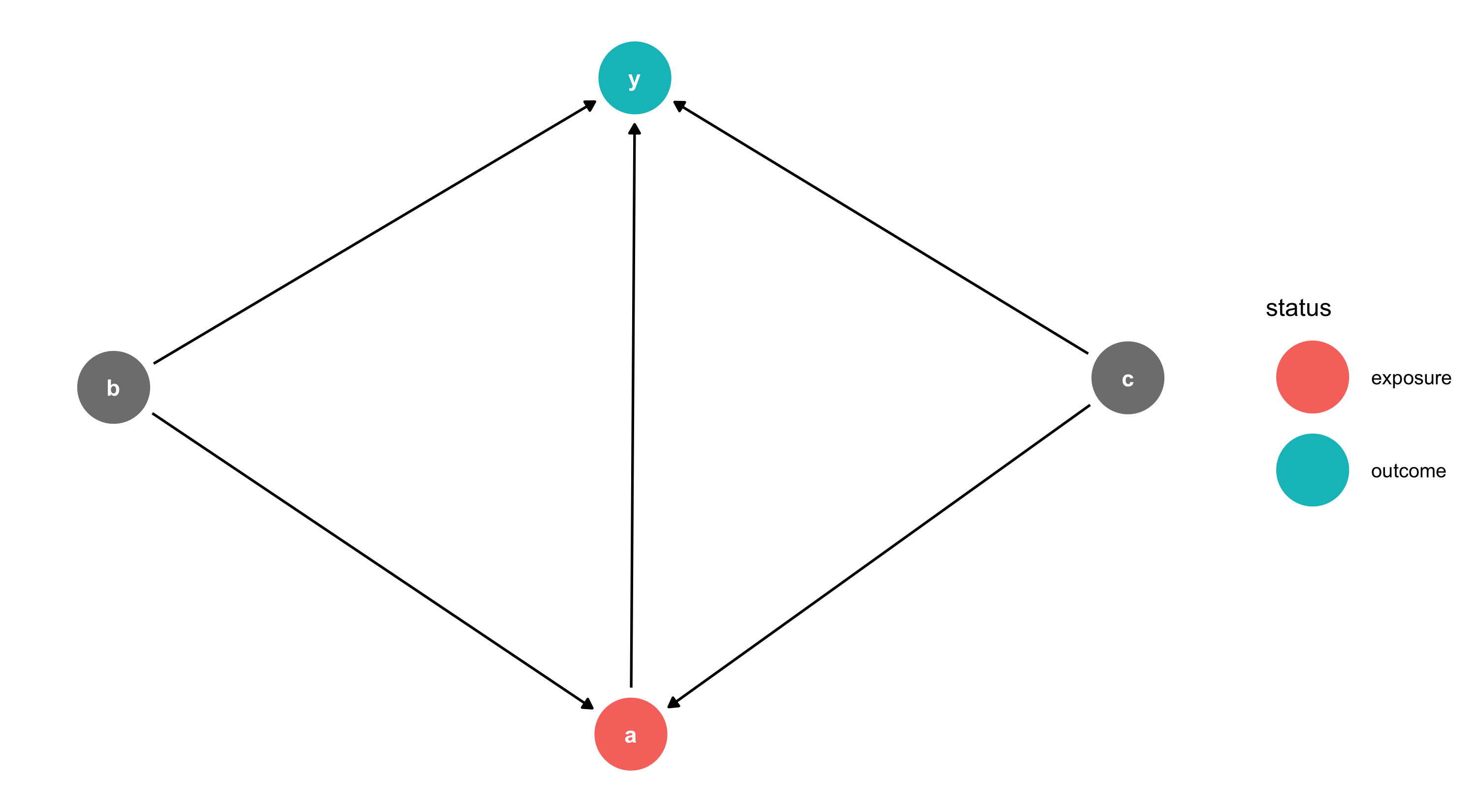
Each node has X/Y coordinates — adjust them to change the layout.
The Malaria DAG
From Lab 11: malaria risk is determined by nets, age, sex, income, and pre-malaria risk. Net usage is determined by income and pre-malaria risk.
Show code
malaria_dag <- dagify(
  post_malaria_risk ~ net + age + sex + income + pre_malaria_risk,
  net ~ income + pre_malaria_risk,
  exposure = "net",
  outcome = "post_malaria_risk",
  labels = c(
    post_malaria_risk = "Post Malaria Risk",
    net = "Mosquito Net", age = "Age", sex = "Sex",
    income = "Income", pre_malaria_risk = "Pre Malaria Risk"
  ),
  coords = list(
    x = c(net = 2, post_malaria_risk = 7, income = 5,
          age = 2, sex = 4, pre_malaria_risk = 6),
    y = c(net = 3, post_malaria_risk = 2, income = 1,
          age = 2, sex = 4, pre_malaria_risk = 4)
  )
)

bigger_dag <- data.frame(tidy_dagitty(malaria_dag))
bigger_dag$type <- "Confounder"
bigger_dag$type[bigger_dag$name == "post_malaria_risk"] <- "Outcome"
bigger_dag$type[bigger_dag$name == "net"] <- "Intervention"

min_x <- min(bigger_dag$x); max_x <- max(bigger_dag$x)
min_y <- min(bigger_dag$y); max_y <- max(bigger_dag$y)

col <- c("Outcome" = sage, "Intervention" = terracotta, "Confounder" = stone)
order_col <- c("Outcome", "Intervention", "Confounder")

ggplot(bigger_dag, aes(x = x, y = y, xend = xend, yend = yend, color = type)) +
  geom_dag_point() +
  geom_dag_edges() +
  coord_sf(xlim = c(min_x - 1, max_x + 1), ylim = c(min_y - 1, max_y + 1)) +
  scale_colour_manual(values = col, name = "Group", breaks = order_col) +
  geom_label_repel(
    data = subset(bigger_dag, !duplicated(bigger_dag$label)),
    aes(label = label), fill = alpha("white", 0.8)
  ) +
  labs(x = "", y = "") +
  theme_meridian()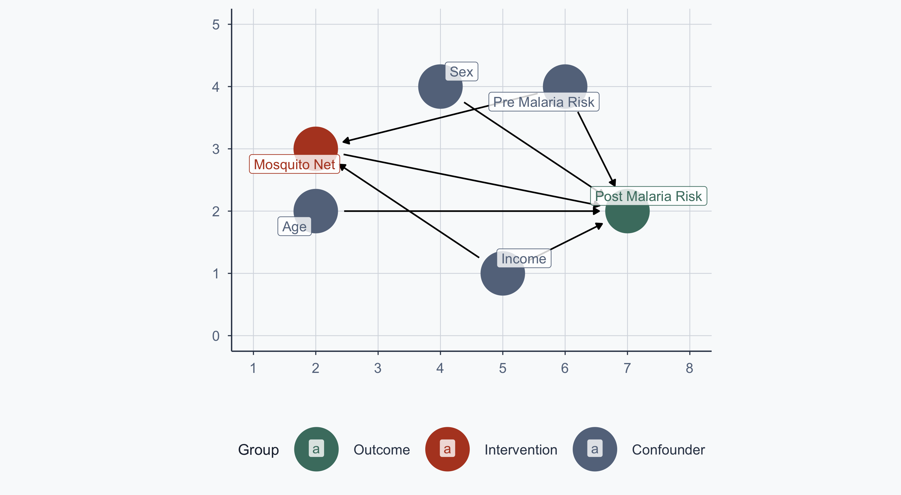
From RCT to Observational Data
In Lab 11, treatment was randomized — no arrows into the net node:
Show code
malaria_dag2 <- dagify(
  post_malaria_risk ~ net + age + sex + income + pre_malaria_risk,
  exposure = "net",
  outcome = "post_malaria_risk",
  labels = c(
    post_malaria_risk = "Post Malaria Risk",
    net = "Mosquito Net", age = "Age", sex = "Sex",
    income = "Income", pre_malaria_risk = "Pre Malaria Risk"
  ),
  coords = list(
    x = c(net = 2, post_malaria_risk = 7, income = 5,
          age = 2, sex = 4, pre_malaria_risk = 6),
    y = c(net = 3, post_malaria_risk = 2, income = 1,
          age = 2, sex = 4, pre_malaria_risk = 4)
  )
)

bigger_dag2 <- data.frame(tidy_dagitty(malaria_dag2))
bigger_dag2$type <- "Confounder"
bigger_dag2$type[bigger_dag2$name == "post_malaria_risk"] <- "Outcome"
bigger_dag2$type[bigger_dag2$name == "net"] <- "Intervention"

ggplot(bigger_dag2, aes(x = x, y = y, xend = xend, yend = yend, color = type)) +
  geom_dag_point() +
  geom_dag_edges() +
  coord_sf(xlim = c(min_x - 1, max_x + 1), ylim = c(min_y - 1, max_y + 1)) +
  scale_colour_manual(values = col, name = "Group", breaks = order_col) +
  geom_label_repel(
    data = subset(bigger_dag2, !duplicated(bigger_dag2$label)),
    aes(label = label), fill = alpha("white", 0.8)
  ) +
  labs(x = "", y = "") +
  theme_meridian()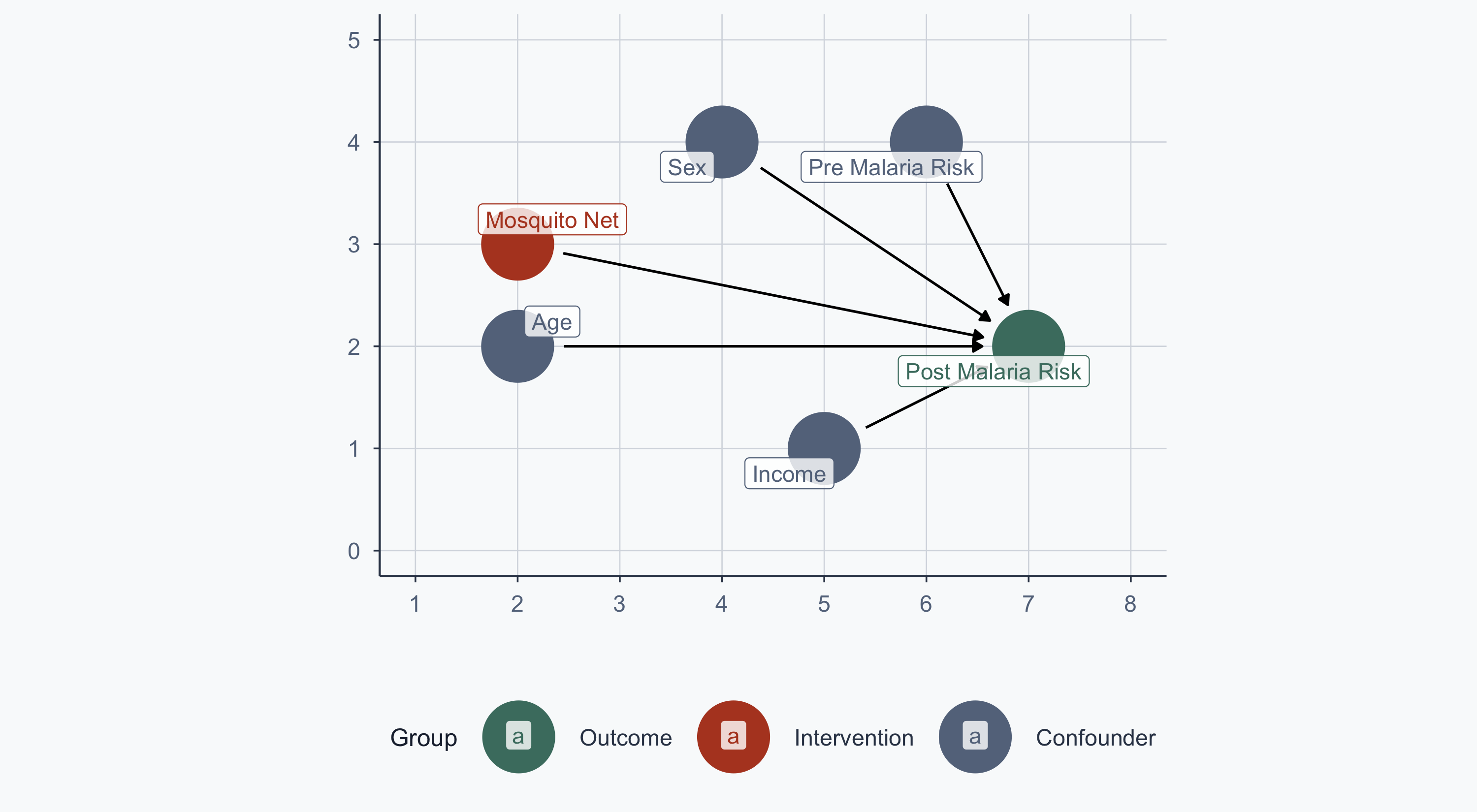
The Observational Problem
Now assume people choose whether to use a net. The confounding arrows return:
Show code
ggplot(bigger_dag, aes(x = x, y = y, xend = xend, yend = yend, color = type)) +
  geom_dag_point() +
  geom_dag_edges() +
  coord_sf(xlim = c(min_x - 1, max_x + 1), ylim = c(min_y - 1, max_y + 1)) +
  scale_colour_manual(values = col, name = "Group", breaks = order_col) +
  geom_label_repel(
    data = subset(bigger_dag, !duplicated(bigger_dag$label)),
    aes(label = label), fill = alpha("white", 0.8)
  ) +
  labs(x = "", y = "") +
  theme_meridian()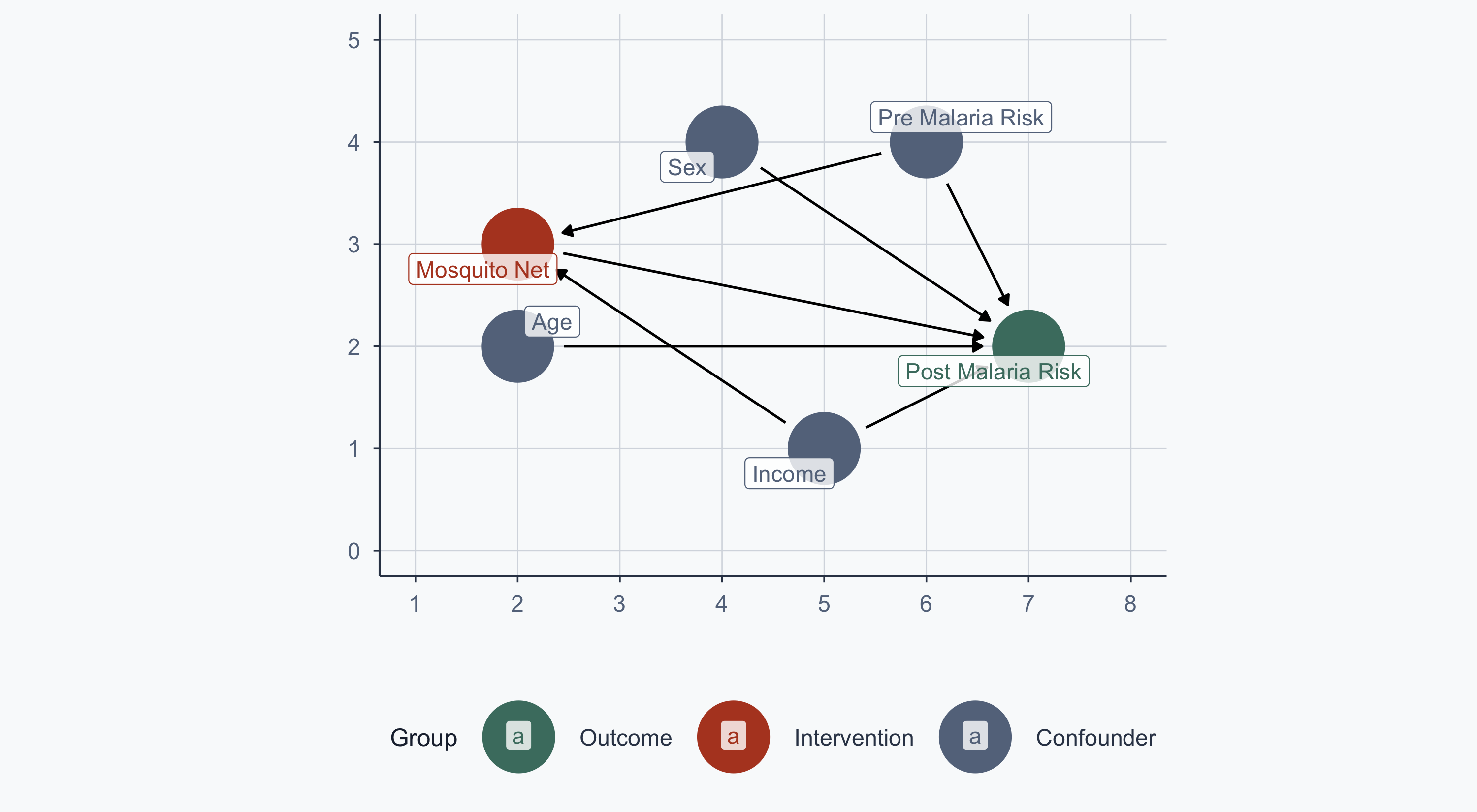
We want to estimate: \(\text{Malaria Risk} = \beta_0 + \beta_1 \text{Income} + \beta_2 \text{Treatment}\)
Scatterplot: Pooled Regression Line
Show code
rct_data$type <- "Control\n Don't Use Nets"
rct_data$type[rct_data$net == 1] <- "Treatment\n Use Nets"

cols <- c("Control\n Don't Use Nets" = graphite,
          "Treatment\n Use Nets" = terracotta)

x <- lm(malaria_risk_post ~ income, data = rct_data)
a <- x$coefficients[1]
b <- x$coefficients[2]

ggplot(rct_data, aes(x = income, y = malaria_risk_post, group = type)) +
  geom_point(aes(shape = type, color = type), size = 2, alpha = 0.6) +
  scale_shape_manual(name = "", values = c(16, 17)) +
  scale_color_manual(name = "", values = cols) +
  geom_segment(aes(x = min(income), y = a,
                   xend = max(income), yend = b * max(income) + a),
               color = slate, linewidth = 0.8) +
  scale_x_continuous(name = "Income") +
  scale_y_continuous(name = "Malaria Risk") +
  theme_meridian() +
  theme(legend.position = c(0.15, 0.15))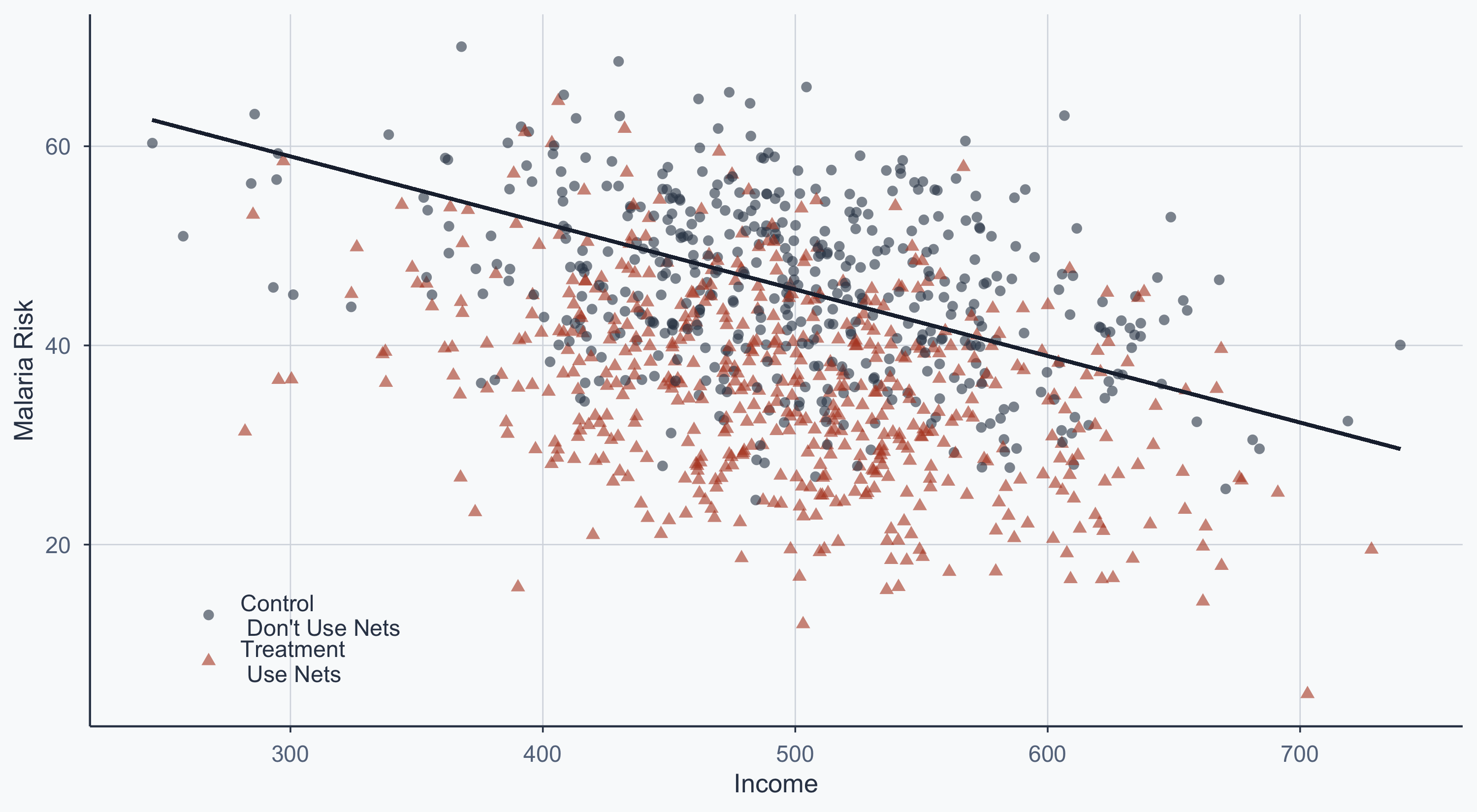
Scatterplot: Separate Group Lines
Show code
x1 <- lm(malaria_risk_post ~ income, data = subset(rct_data, net == 0))
a1 <- x1$coefficients[1]
b1 <- x1$coefficients[2]

x2 <- lm(malaria_risk_post ~ income, data = subset(rct_data, net == 1))
a2 <- x2$coefficients[1]
b2 <- x2$coefficients[2]

ggplot(rct_data, aes(x = income, y = malaria_risk_post, group = type)) +
  geom_point(aes(shape = type, color = type), size = 2, alpha = 0.6) +
  scale_shape_manual(name = "", values = c(16, 17)) +
  scale_color_manual(name = "", values = cols) +
  geom_segment(aes(x = min(income), y = a1,
                   xend = max(income), yend = b1 * max(income) + a1),
               color = graphite, linewidth = 0.8) +
  geom_segment(aes(x = min(income), y = a2,
                   xend = max(income), yend = b2 * max(income) + a2),
               color = terracotta, linewidth = 0.8) +
  scale_x_continuous(name = "Income") +
  scale_y_continuous(name = "Malaria Risk") +
  theme_meridian() +
  theme(legend.position = c(0.15, 0.15))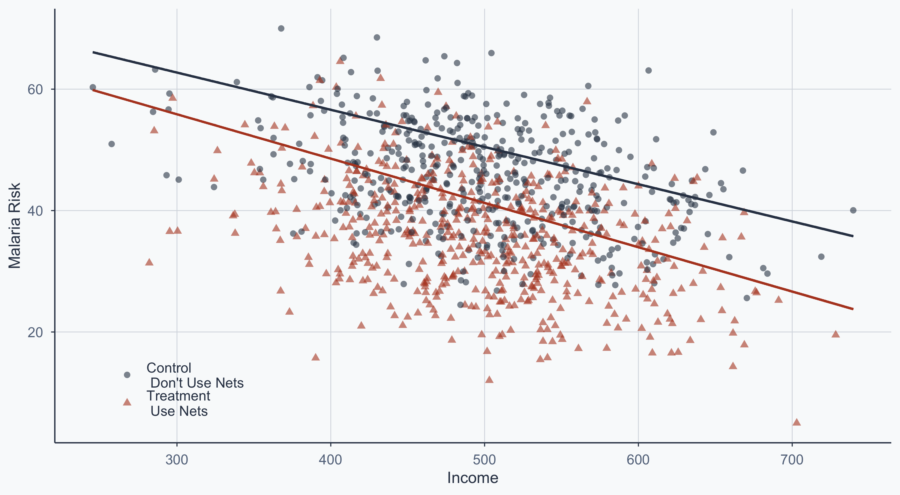
The vertical gap between the two lines is the treatment effect, conditional on income.
Matched Scatterplot
Blue points = dropped by matching. The remaining points are comparable pairs.
Show code
ggplot(rct2, aes(x = income, y = malaria_risk_pre, group = type_match_fin)) +
  geom_point(data = fixed_dropped, aes(shape = type),
             color = "steelblue", size = 4, alpha = 0.4) +
  geom_segment(aes(x = min(income), y = a1,
                   xend = max(income), yend = b1 * max(income) + a1),
               color = graphite, linewidth = 0.8) +
  geom_segment(aes(x = min(income), y = a2,
                   xend = max(income), yend = b2 * max(income) + a2),
               color = terracotta, linewidth = 0.8) +
  geom_point(data = fixed, aes(shape = type_match_fin, color = type_match_fin),
             size = 2) +
  scale_shape_manual(name = "", values = c(16, 17)) +
  scale_color_manual(name = "", values = cols) +
  scale_x_continuous(name = "Income") +
  scale_y_continuous(name = "Pre-Malaria Risk") +
  theme_meridian() +
  theme(legend.position = c(0.15, 0.15))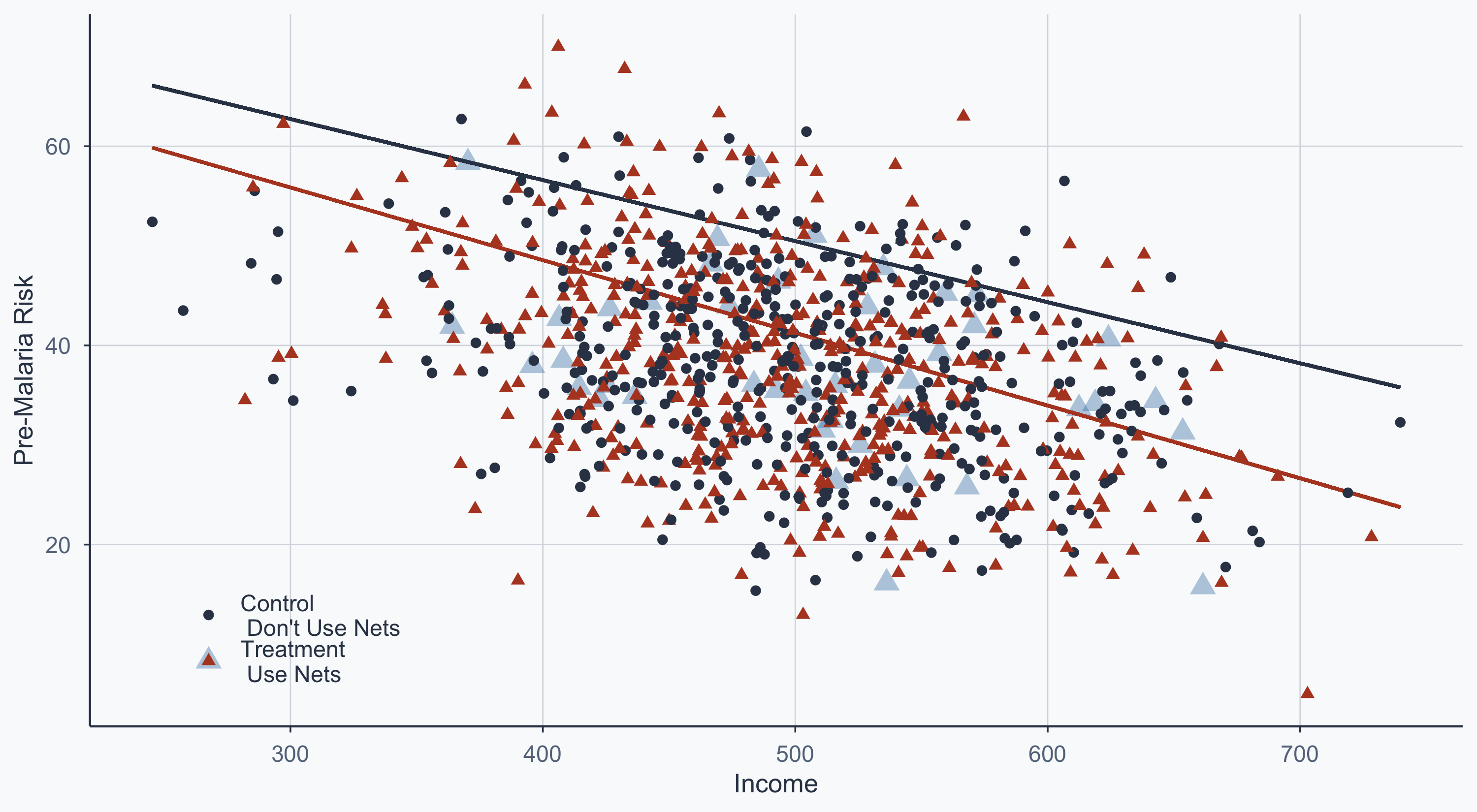
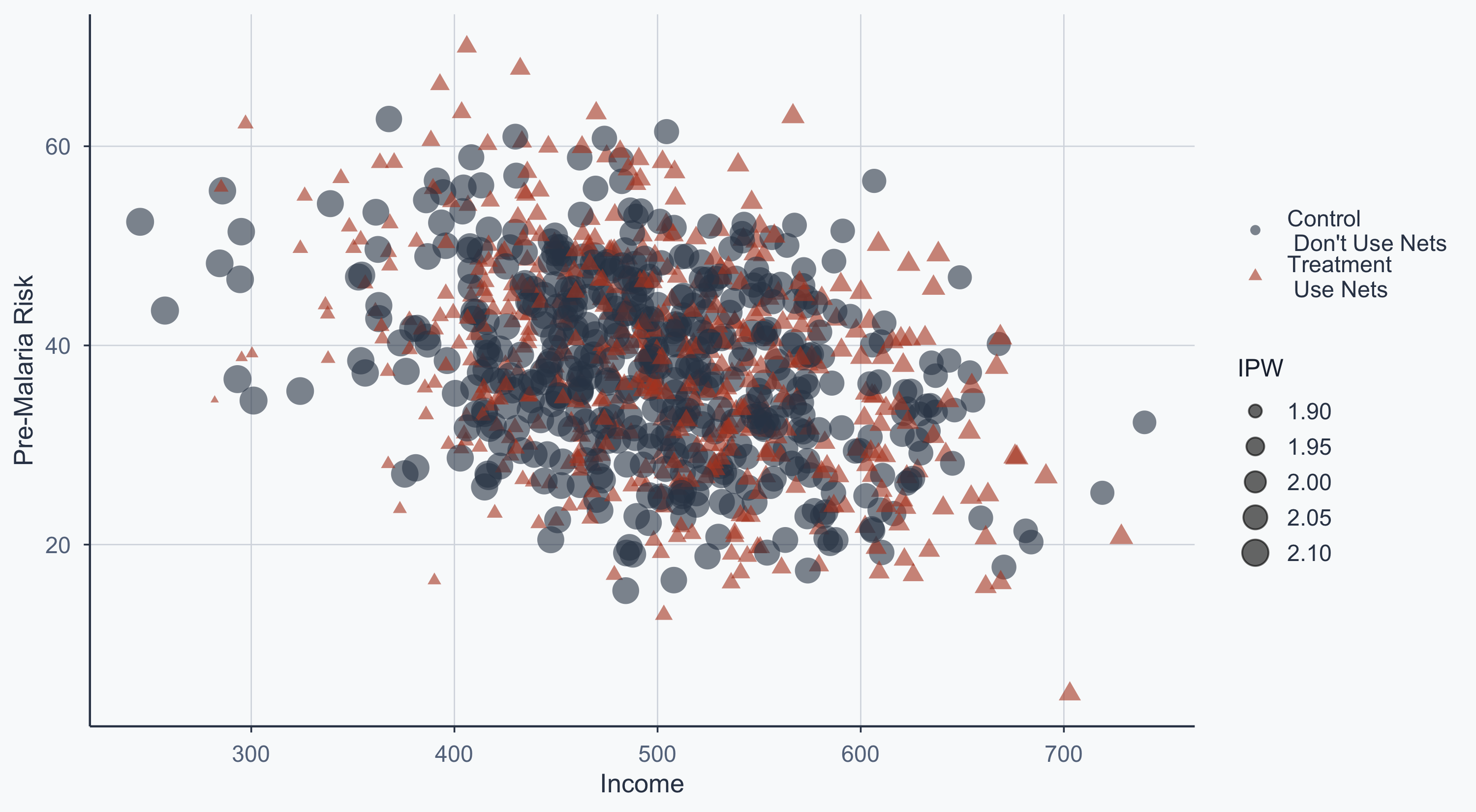
IPW Scatterplot
Point size reflects the inverse probability weight — unusual observations get more weight:
Show code
rct_ipw3 <- subset(rct_ipw2, select = c(id, ipw))
rct3 <- left_join(rct2, rct_ipw3, by = "id")

ggplot(rct3, aes(x = income, y = malaria_risk_pre)) +
  geom_point(aes(shape = type, color = type, size = ipw), alpha = 0.6) +
  scale_shape_manual(name = "", values = c(16, 17)) +
  scale_color_manual(name = "", values = cols) +
  scale_size_continuous(name = "IPW", range = c(1, 6)) +
  scale_x_continuous(name = "Income") +
  scale_y_continuous(name = "Pre-Malaria Risk") +
  theme_meridian() +
  theme(legend.position = "right")