Show code
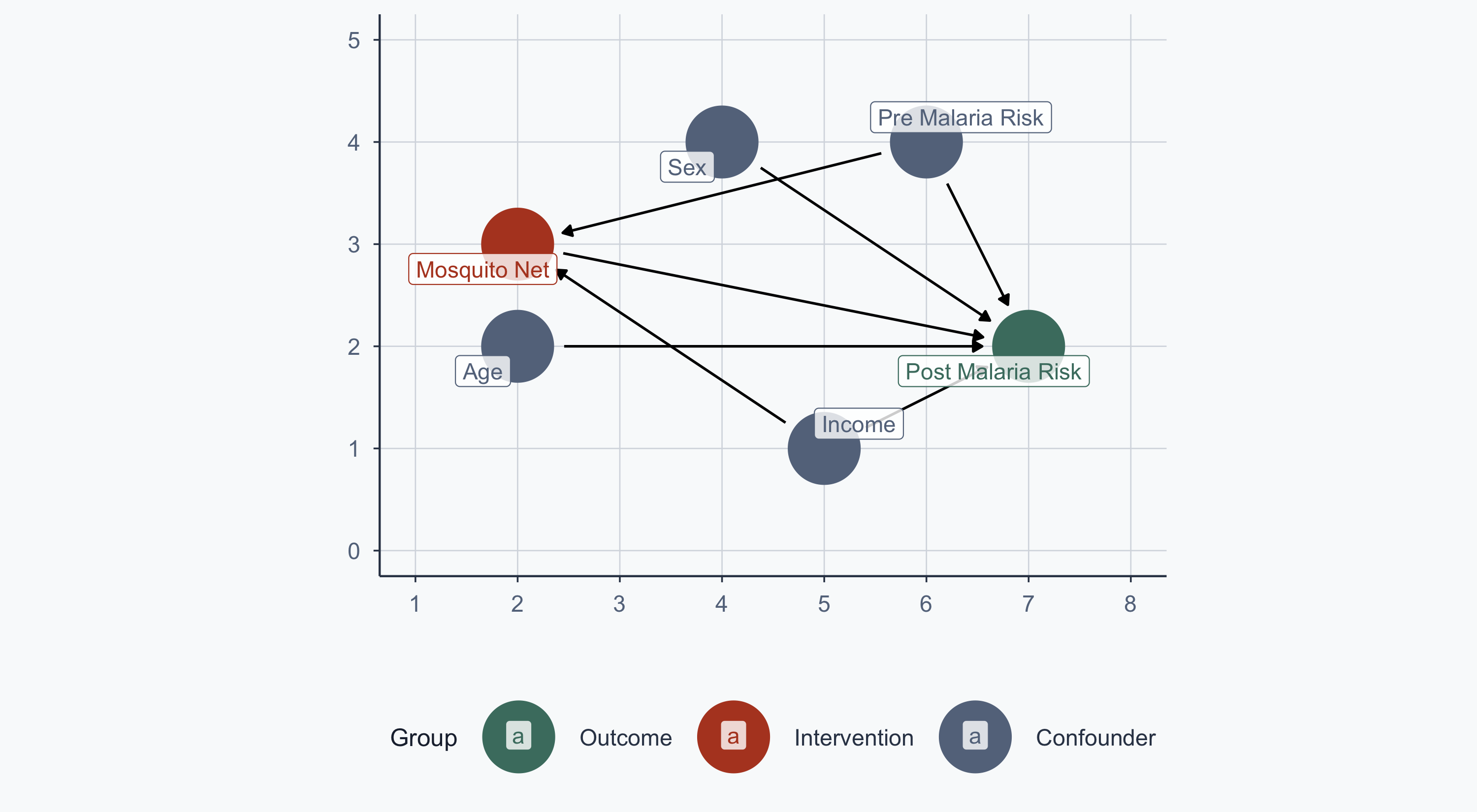
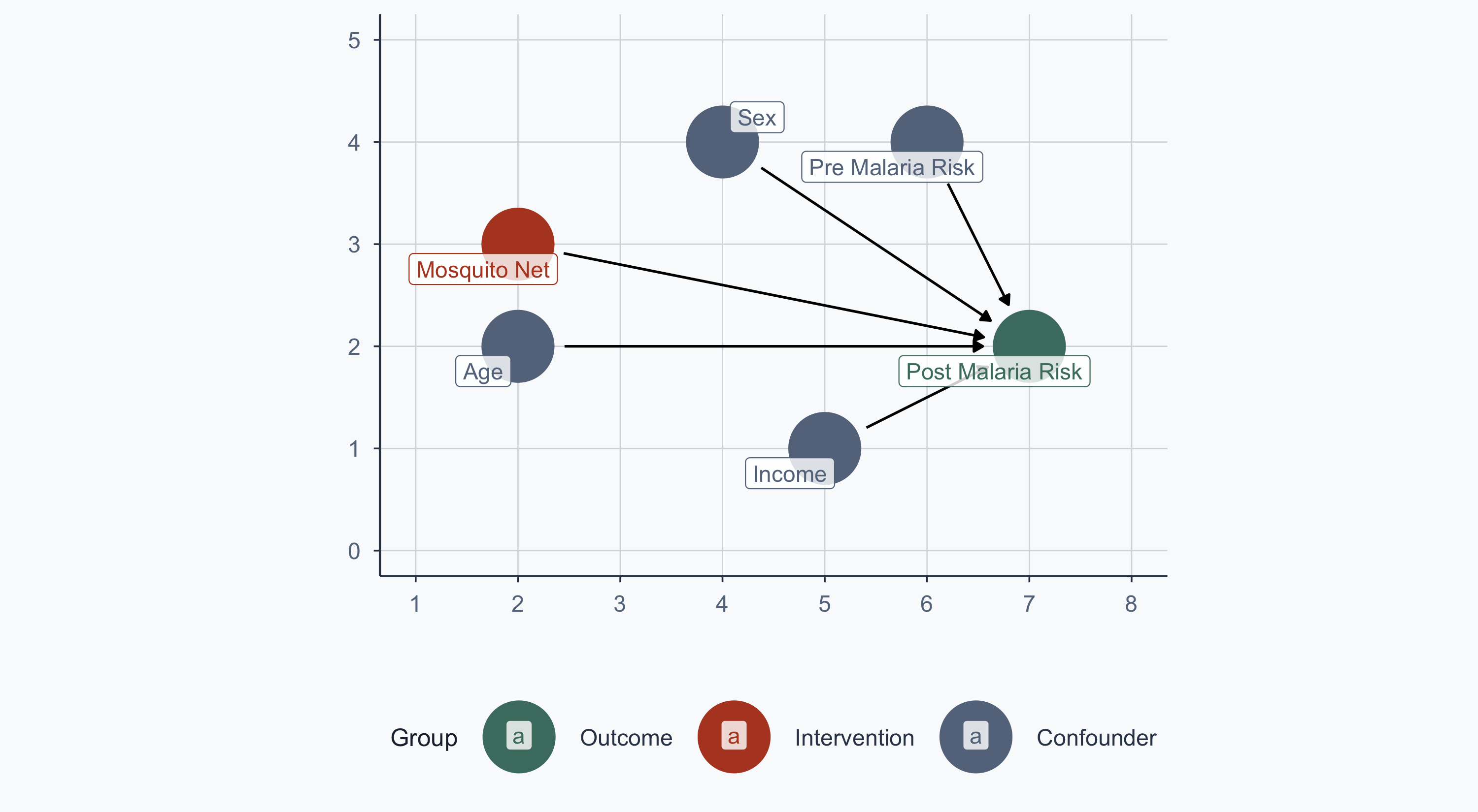
malaria_dag <- dagify(
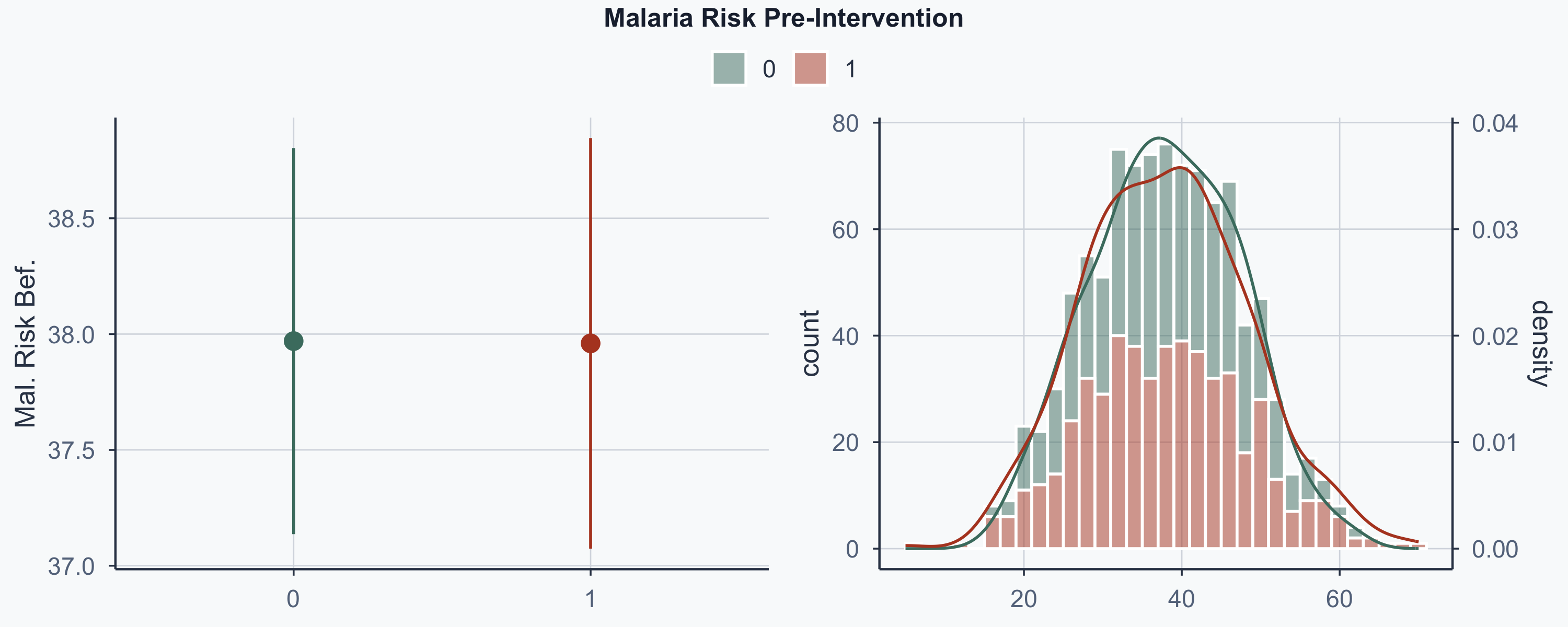
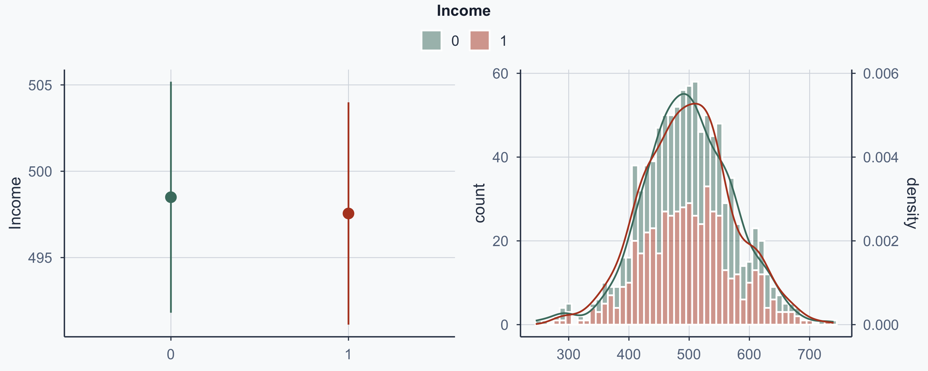
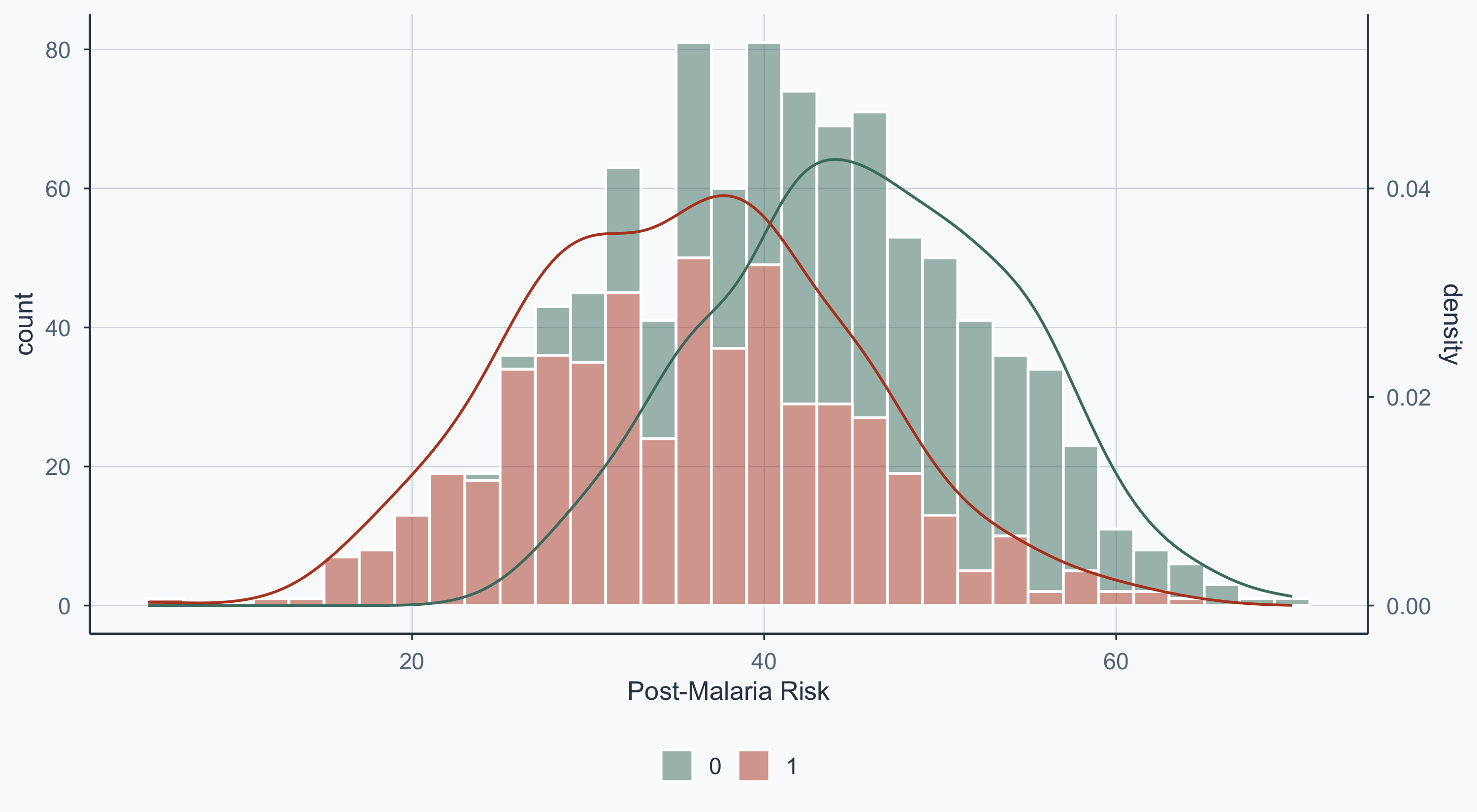
post_malaria_risk ~ net + age + sex + income + pre_malaria_risk,
net ~ income + pre_malaria_risk,
exposure = "net",
outcome = "post_malaria_risk",
labels = c(
post_malaria_risk = "Post Malaria Risk",
net = "Mosquito Net",
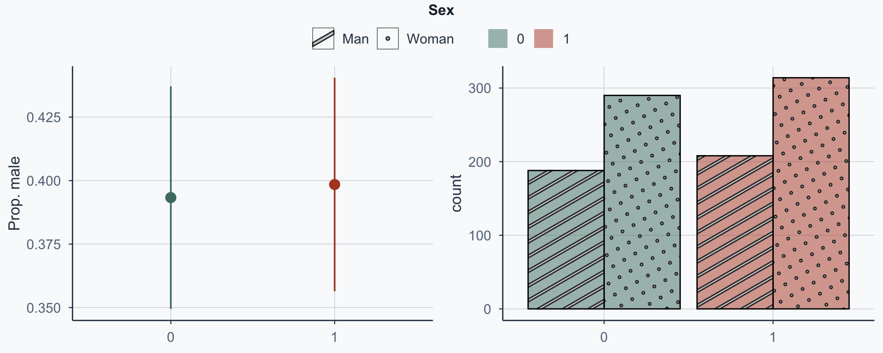
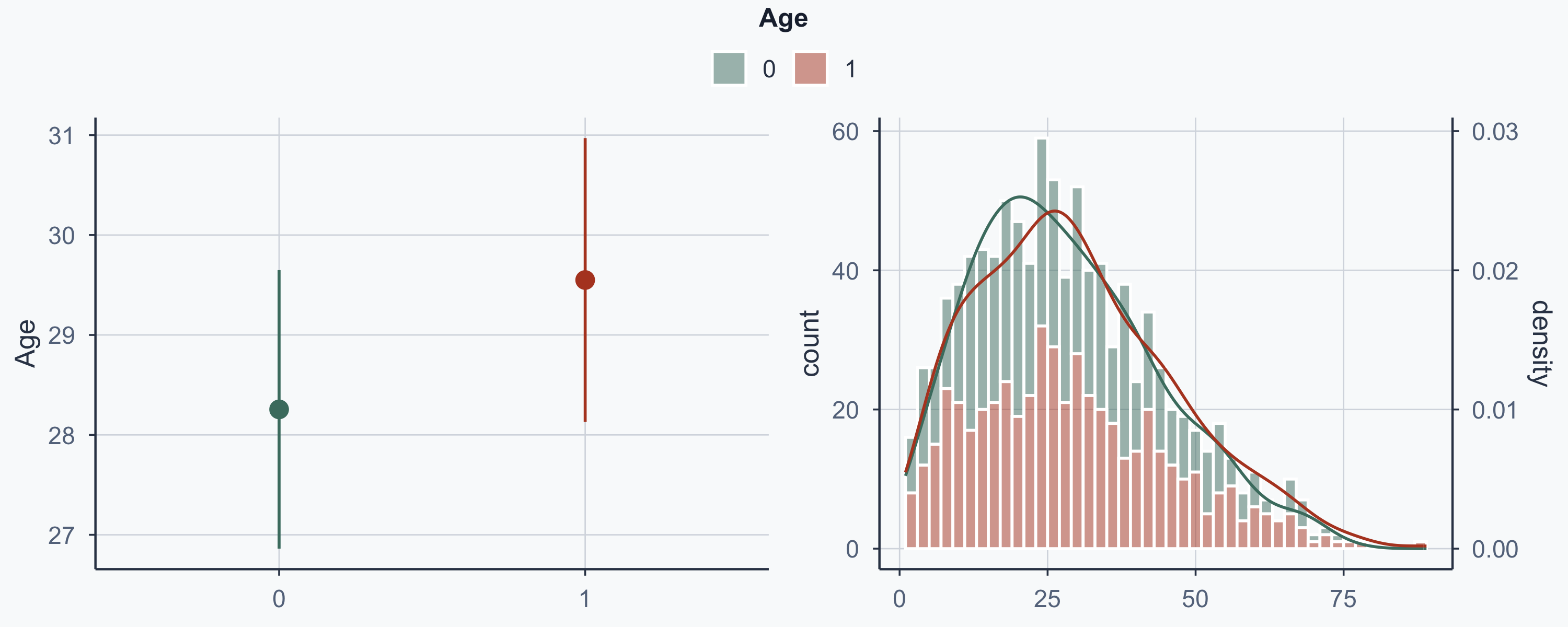
age = "Age",
sex = "Sex",
income = "Income",
pre_malaria_risk = "Pre Malaria Risk"
),
coords = list(
x = c(net = 2, post_malaria_risk = 7, income = 5,
age = 2, sex = 4, pre_malaria_risk = 6),
y = c(net = 3, post_malaria_risk = 2, income = 1,
age = 2, sex = 4, pre_malaria_risk = 4)
)
)
bigger_dag <- data.frame(tidy_dagitty(malaria_dag))
bigger_dag$type <- "Confounder"
bigger_dag$type[bigger_dag$name == "post_malaria_risk"] <- "Outcome"
bigger_dag$type[bigger_dag$name == "net"] <- "Intervention"
min_x <- min(bigger_dag$x)
max_x <- max(bigger_dag$x)
min_y <- min(bigger_dag$y)
max_y <- max(bigger_dag$y)
col <- c("Outcome" = sage, "Intervention" = terracotta, "Confounder" = stone)
order_col <- c("Outcome", "Intervention", "Confounder")
ggplot(bigger_dag, aes(x = x, y = y, xend = xend, yend = yend, color = type)) +
geom_dag_point() +
geom_dag_edges() +
coord_sf(xlim = c(min_x - 1, max_x + 1), ylim = c(min_y - 1, max_y + 1)) +
scale_colour_manual(values = col, name = "Group", breaks = order_col) +
geom_label_repel(
data = subset(bigger_dag, !duplicated(bigger_dag$label)),
aes(label = label), fill = alpha("white", 0.8)
) +
labs(x = "", y = "") +
theme_meridian()