Modeling Relationships Between Variables
From Correlation Coefficients to Regression Lines and Interpretation
Bogdan G. Popescu

John Cabot University
Table of Contents
- Correlation
- Simple Linear Regression
- Regression Output & Interpretation
Intro
A correlation coefficient is a statistic that measures the strength of the relationship between two variables.
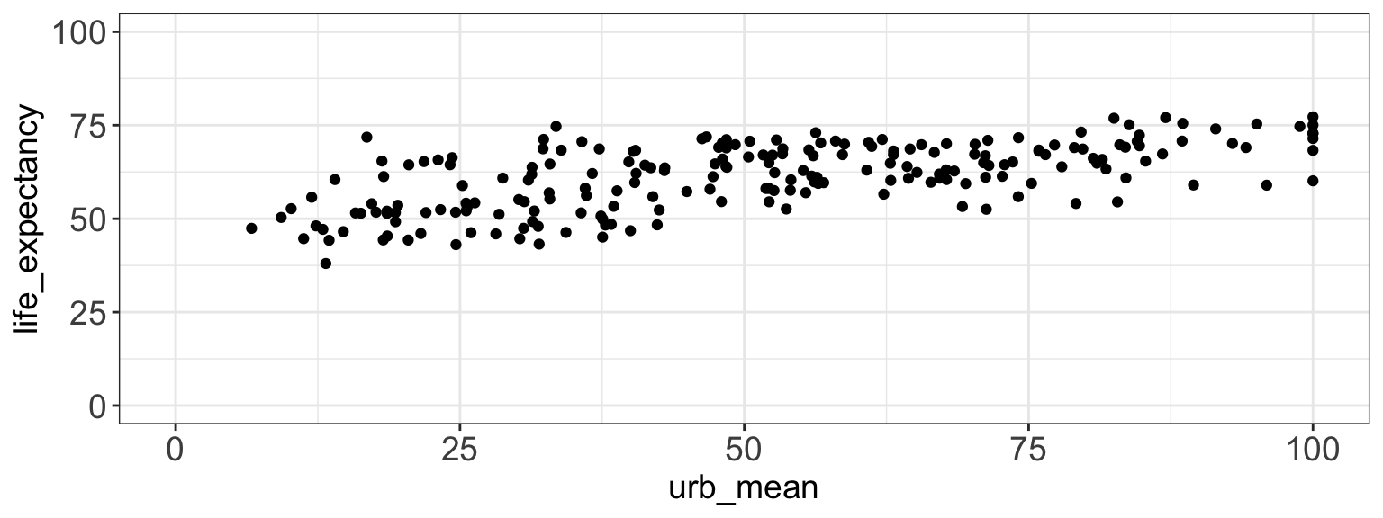
For example, urbanization could be positively correlated with life expectancy.
Show the code
library(dplyr)
library(ggplot2)
setwd("/Users/bgpopescu/Library/CloudStorage/Dropbox/john_cabot/teaching/research_workshop/lecture9/")

life_expectancy_df <- read.csv(file = './data/life-expectancy.csv')
urbanization_df <- read.csv(file = './data/share-of-population-urban.csv')

urbanization_df2<-urbanization_df%>%
  dplyr::group_by(Entity, Code)%>%
  dplyr::summarize(urb_mean=mean(Urban.population....of.total.population.))

life_expectancy_df2<-life_expectancy_df%>%
  dplyr::group_by(Entity, Code)%>%
  dplyr::summarize(life_expectancy=mean(Life.expectancy.at.birth..historical.))

weird_labels <- c("OWID_KOS", "OWID_WRL", "")
clean_life_expectancy_df<-subset(life_expectancy_df2, !(Code %in% weird_labels))

weird_labels <- c("OWID_KOS", "OWID_WRL", "")
clean_urbanization_df<-subset(urbanization_df2, !(Code %in% weird_labels))

clean_urbanization_df<-subset(clean_urbanization_df, select = -c(Entity))
merged_data<-left_join(clean_life_expectancy_df, clean_urbanization_df, by = c("Code"="Code"))
merged_data2<-na.omit(merged_data)

figure1<-ggplot(merged_data, aes(x=urb_mean, y=life_expectancy)) +
  geom_point() +
  theme_bw()+
  theme(axis.text.x = element_text(size=14),
        axis.text.y = element_text(size=14),
        axis.title=element_text(size=14),
        plot.title = element_text(hjust = 0.5))+
  xlim(0, 100) +
  ylim(0, 100)
figure1
Intro
It turns out that the correlation between urbanization and life expectancy is: 0.63
Show the code
library(dplyr)
setwd("/Users/bgpopescu/Library/CloudStorage/Dropbox/john_cabot/teaching/research_workshop/lecture9/")

life_expectancy_df <- read.csv(file = './data/life-expectancy.csv')
urbanization_df <- read.csv(file = './data/share-of-population-urban.csv')

urbanization_df2<-urbanization_df%>%
  dplyr::group_by(Entity, Code)%>%
  dplyr::summarize(urb_mean=mean(Urban.population....of.total.population.))

life_expectancy_df2<-life_expectancy_df%>%
  dplyr::group_by(Entity, Code)%>%
  dplyr::summarize(life_expectancy=mean(Life.expectancy.at.birth..historical.))

weird_labels <- c("OWID_KOS", "OWID_WRL", "")
clean_life_expectancy_df<-subset(life_expectancy_df2, !(Code %in% weird_labels))

weird_labels <- c("OWID_KOS", "OWID_WRL", "")
clean_urbanization_df<-subset(urbanization_df2, !(Code %in% weird_labels))

clean_urbanization_df<-subset(clean_urbanization_df, select = -c(Entity))
merged_data<-left_join(clean_life_expectancy_df, clean_urbanization_df, by = c("Code"="Code"))
merged_data2<-na.omit(merged_data)
cor(merged_data$life_expectancy, merged_data$urb_mean, use = "complete.obs")
This the the formal definition for a correlation:
\[
r = \frac{\frac{\sum (x_i - \bar{x})(y_i - \bar{y})}{n-1}}{s_x \cdot s_y}
\]
- The Pearson’s correlation coefficient r describes the strength and nature of the relationship between two variables.
The Correlation Coefficient
\[
r = \frac{\frac{\sum (x_i - \bar{x})(y_i - \bar{y})}{n-1}}{s_x \cdot s_y}
\]
- \(r\) is the sample Pearson correlation coefficient
- \(x_i\) and \(y_i\) are the values of variables X and Y for the same observation
- \(\bar{x}\) and \(\bar{y}\) are the sample means of variables X and Y
- \(s_x\) and \(s_y\) are the sample standard deviations of X and Y
Correlation vs. Causation
A correlation signifies the relationship between two variables.
It is tempting to argue that changes in one variable cause changes in the other.
This is problematic for three reasons:
- We do not know the direction of causation: does X produce changes in y, or does y produce changes in x?
- There might be a third variable z, which causes changes in both x and y.
- Both x and y could be measured with error.
Correlation vs. Causation
All of these problems suggest that there is endogeneity in the relationship between X and Y.
The lesson: Correlation does not imply causation.
Regression Line
- We will make predictions with the help of regressions.
\[
\hat{y}_i = b x_i + a
\]
- \(\hat{y}_i\) – individual predicted value on the dependent variable
- \(x_i\) – individual value of the independent variable
Regression Line
- We will make predictions with the help of regressions.
- These can be written as:
\[
\hat{y}_i = b x_i + a
\]
This is very similar to the formula \(y = mx + b\), which represents a linear equation in mathematics:
- \(m\) – slope
- \(b\) – y-intercept
Regression Line
Regression Example
In the urbanization and life expectancy example, we know:
- \(\bar{x} = \overline{\text{urbanization}} = 51.33\)
- \(\bar{y} = \overline{\text{life_expectancy}} = 61.259\)
- \(s_x = \text{standard deviation} = \sqrt{\frac{\sum (x_i - \bar{x})^2}{n}} = 24.18021\)
- \(s_y = \text{standard deviation} = \sqrt{\frac{\sum (y_i - \bar{y})^2}{n}} = 8.643744\)
- \(r = \frac{\frac{\sum (x_i - \bar{x})(y_i - \bar{y})}{n}}{s_x \cdot s_y} = 0.6303347\)
Regression Line
Calculating the Slope
We can plug in these numbers into the formula and obtain the following:
\[
b = r \cdot \frac{s_y}{s_x}
\]
\[
b = 0.6303347 \cdot \frac{8.643744}{24.18021}
\]
\[
b = 0.6303347 \cdot 0.3574718
\]
Regression Line
Calculating the Slope
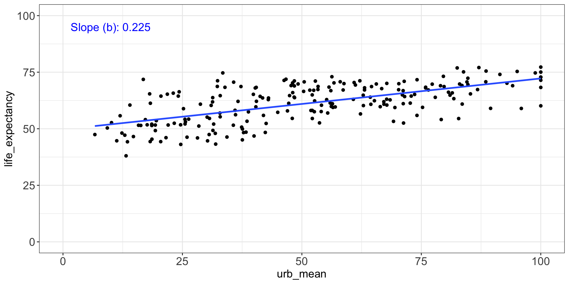
We can obtain the 0.2252918 in the following way:
x<-lm(life_expectancy~urb_mean, data=merged_data2)
summary(x)
Call:
lm(formula = life_expectancy ~ urb_mean, data = merged_data2)

Residuals:
     Min       1Q   Median       3Q      Max
-14.6442  -4.2065  -0.5017   5.0702  18.3283

Coefficients:
            Estimate Std. Error t value Pr(>|t|)
(Intercept) 49.69757    1.08225   45.92   <2e-16 ***
urb_mean     0.22529    0.01906   11.82   <2e-16 ***
---
Signif. codes:  0 '***' 0.001 '**' 0.01 '*' 0.05 '.' 0.1 ' ' 1

Residual standard error: 6.742 on 212 degrees of freedom
Multiple R-squared:  0.3971,    Adjusted R-squared:  0.3943
F-statistic: 139.7 on 1 and 212 DF,  p-value: < 2.2e-16
Regression Line
Calculating the Slope
This is what the slope looks like.
Show the code
# Fit model
x <- lm(life_expectancy ~ urb_mean, data = merged_data2)
coef_val <- round(coef(x)["urb_mean"], 3)

# Create label
coef_label <- paste("Slope (b):", coef_val)

# Create plot
figure1 <- ggplot(merged_data, aes(x = urb_mean, y = life_expectancy)) +
  geom_point() +
 geom_smooth(method = "lm", se = FALSE) +
  theme_bw() +
  theme(
    axis.text.x = element_text(size = 14),
    axis.text.y = element_text(size = 14),
    axis.title = element_text(size = 14),
    plot.title = element_text(hjust = 0.5)
  ) +
  xlim(0, 100) +
  ylim(0, 100) +
  annotate("text", x = 10, y = 95, label = coef_label, size = 5, color = "blue")

figure1
![]()
Regression Line
Calculating the Slope
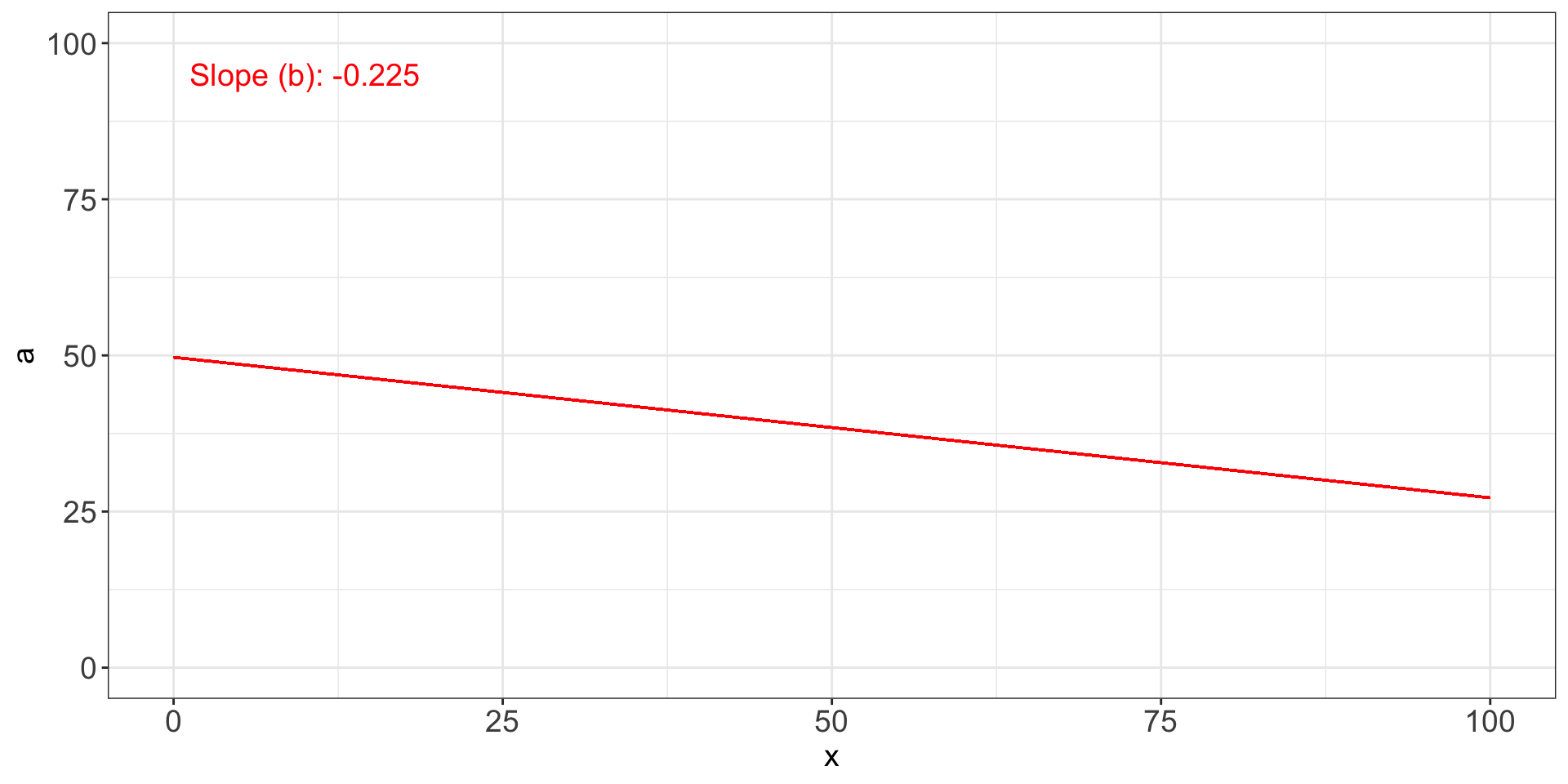
What if the slope was negative?
Show the code
# Simulate negative relationship
coef_val <- -round(coef(x)["urb_mean"], 3)

# Create label
coef_label <- paste("Slope (b):", coef_val)
a <-round(coef(x)["(Intercept)"], 3)

# Plot
figure1x <- ggplot(merged_data2, aes(x = urb_mean, y = life_expectancy)) +
#  geom_point() +
  geom_segment(aes(x = 0, y = a, xend = 100, yend = coef_val * max(merged_data2$urb_mean) + a), color = "red")+

  #geom_smooth(method = "lm", se = FALSE, color = "red") +
  theme_bw() +
  theme(
    axis.text.x = element_text(size = 14),
    axis.text.y = element_text(size = 14),
    axis.title = element_text(size = 14),
    plot.title = element_text(hjust = 0.5)
  ) +
  xlim(0, 100) +
  ylim(0, 100) +
  annotate("text", x = 10, y = 95, label = coef_label, size = 5, color = "red")

figure1x
![]()
Regression Line
Regression Example
The next step is to calculate \(a\) using the formula:
\[
\begin{align*}
a &= \bar{y} - b \bar{x} \\
a &= 61.259 - 0.2253269 \cdot 51.33 \\
a &= 61.259 - 11.56603 \\
a &= 49.69297
\end{align*}
\]
Regression Line
Regression Example
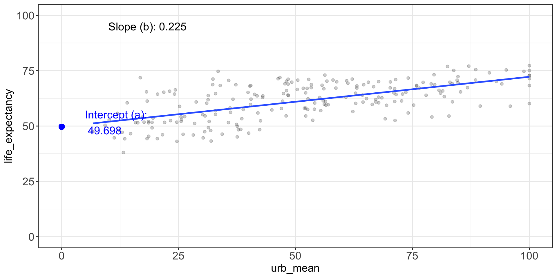
This is the \(a\).
Show the code
# Fit model
x <- lm(life_expectancy ~ urb_mean, data = merged_data2)

# Extract slope (b) and intercept (a)
slope_val      <- round(coef(x)["urb_mean"], 3)
intercept_val  <- round(coef(x)["(Intercept)"], 3)

# Labels
slope_label     <- paste("Slope (b):", slope_val)
intercept_label <- paste("Intercept (a):\n", intercept_val)

# Build plot
figure1 <- ggplot(merged_data2, aes(x = urb_mean, y = life_expectancy)) +
  geom_point(color = "black", alpha = 0.2) +
  geom_smooth(method = "lm", se = FALSE, alpha = 0.2) +  # color via aes

  # Mark the intercept on the y-axis
  geom_point(aes(x = 0, y = intercept_val), size = 3, color = "blue") +
  annotate("text",
           x = 5,
           y = intercept_val + 2,
           label = intercept_label,
           hjust = 0, color = "blue", size = 5) +

  # Show the slope label in the upper-left
  annotate("text",
           x = 10, y = 95,
           label = slope_label,
           hjust = 0, color = "black", size = 5) +

  # Axis & theme tweaks
  xlim(0, 100) +
  ylim(0, 100) +
  theme_bw() +
  theme(
    axis.text  = element_text(size = 14),
    axis.title = element_text(size = 14),
    plot.title = element_text(hjust = 0.5)
  )
figure1
![]()
Regression Line
Regression Example
Knowing \(a\) and \(b\), we can use them to calculate the predicted value for \(y\):
\[
\begin{align*}
\hat{y}_i = b x_i + a \\
\hat{y}_i = 0.2253269 \cdot x_i + 49.69297
\end{align*}
\]
We are missing \(x_i\), the individual’s independent variable value.
Regression Line
Regression Example
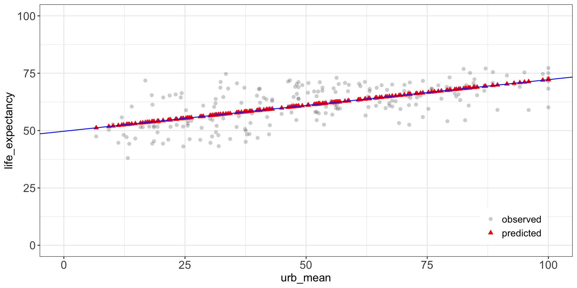
These are the predicted values for our \(y_i\)
![]()
Regression Line
Regression Example
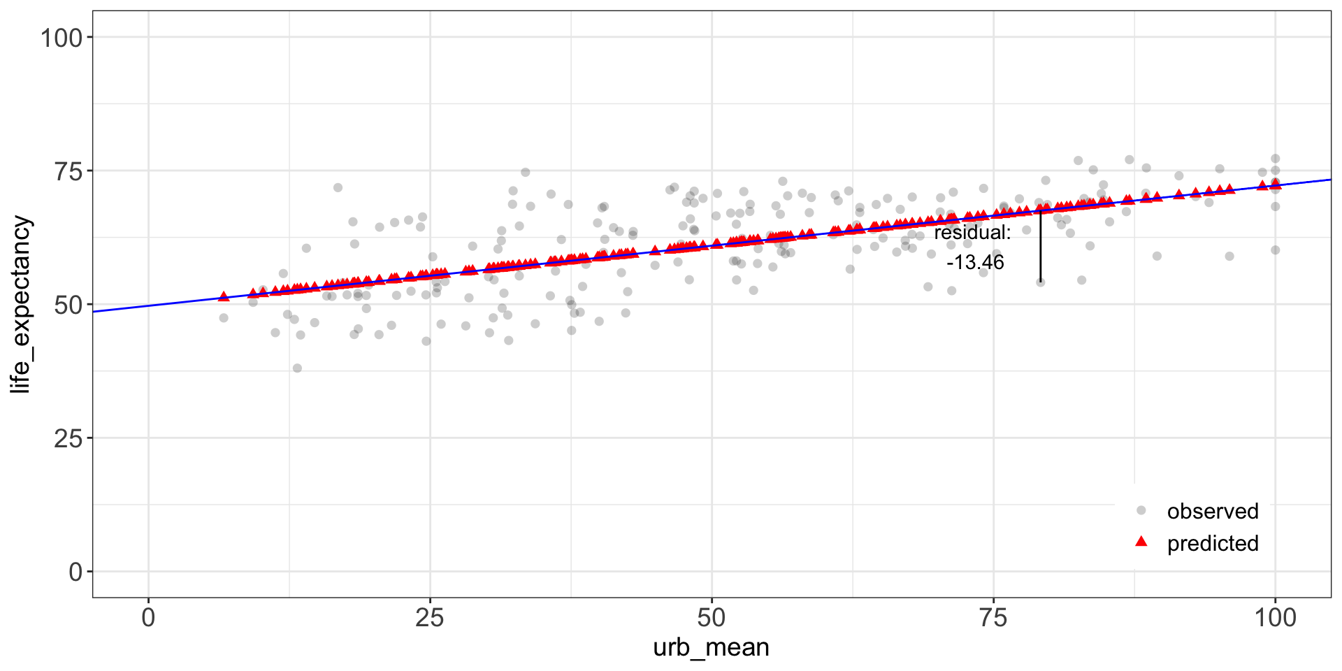
Actual (circles) - predicted value (triangles) = residual.
\[\text{residual}_i = y_i - \hat{y}_i\]
![]()
Regression Example
We note that there is a difference between \(y_i\) and \(\hat{y_i}\), where:
\(y_i\) is the country’s observed value on life expectancy
\(\hat{y_i}\) is the country’s predicted value on life expectancy
We can obtain each country’s \(\hat{y_i}\) by plugging their x-value into the regression equation.
The regression line is the straight line that minimizes the size of the residuals and makes them as small as possible.
This is why the regression line is sometimes called the line of best fit.
Regression Example
Interpretation
x<-lm(life_expectancy~urb_mean, data=merged_data2)
summary(x)
Call:
lm(formula = life_expectancy ~ urb_mean, data = merged_data2)

Residuals:
     Min       1Q   Median       3Q      Max
-14.6442  -4.2065  -0.5017   5.0702  18.3283

Coefficients:
            Estimate Std. Error t value Pr(>|t|)
(Intercept) 49.69757    1.08225   45.92   <2e-16 ***
urb_mean     0.22529    0.01906   11.82   <2e-16 ***
---
Signif. codes:  0 '***' 0.001 '**' 0.01 '*' 0.05 '.' 0.1 ' ' 1

Residual standard error: 6.742 on 212 degrees of freedom
Multiple R-squared:  0.3971,    Adjusted R-squared:  0.3943
F-statistic: 139.7 on 1 and 212 DF,  p-value: < 2.2e-16
Regression Example
Interpretation
This is how we create a professionally-looking table.
Show the code
library("modelsummary")
model<-lm(life_expectancy~urb_mean, data=merged_data2)

models<-list("DV: Life Expectancy" = model)

cm <- c('urb_mean'='Urbanization',
        "(Intercept)"="Intercept")

modelsummary(models, stars = TRUE, coef_map = cm, gof_map = c("nobs", "r.squared"))
| |
DV: Life Expectancy |
| + p < 0.1, * p < 0.05, ** p < 0.01, *** p < 0.001 |
| Urbanization |
0.225*** |
|
(0.019) |
| Intercept |
49.698*** |
|
(1.082) |
| Num.Obs. |
214 |
| R2 |
0.397 |
Regression Example
Interpretation
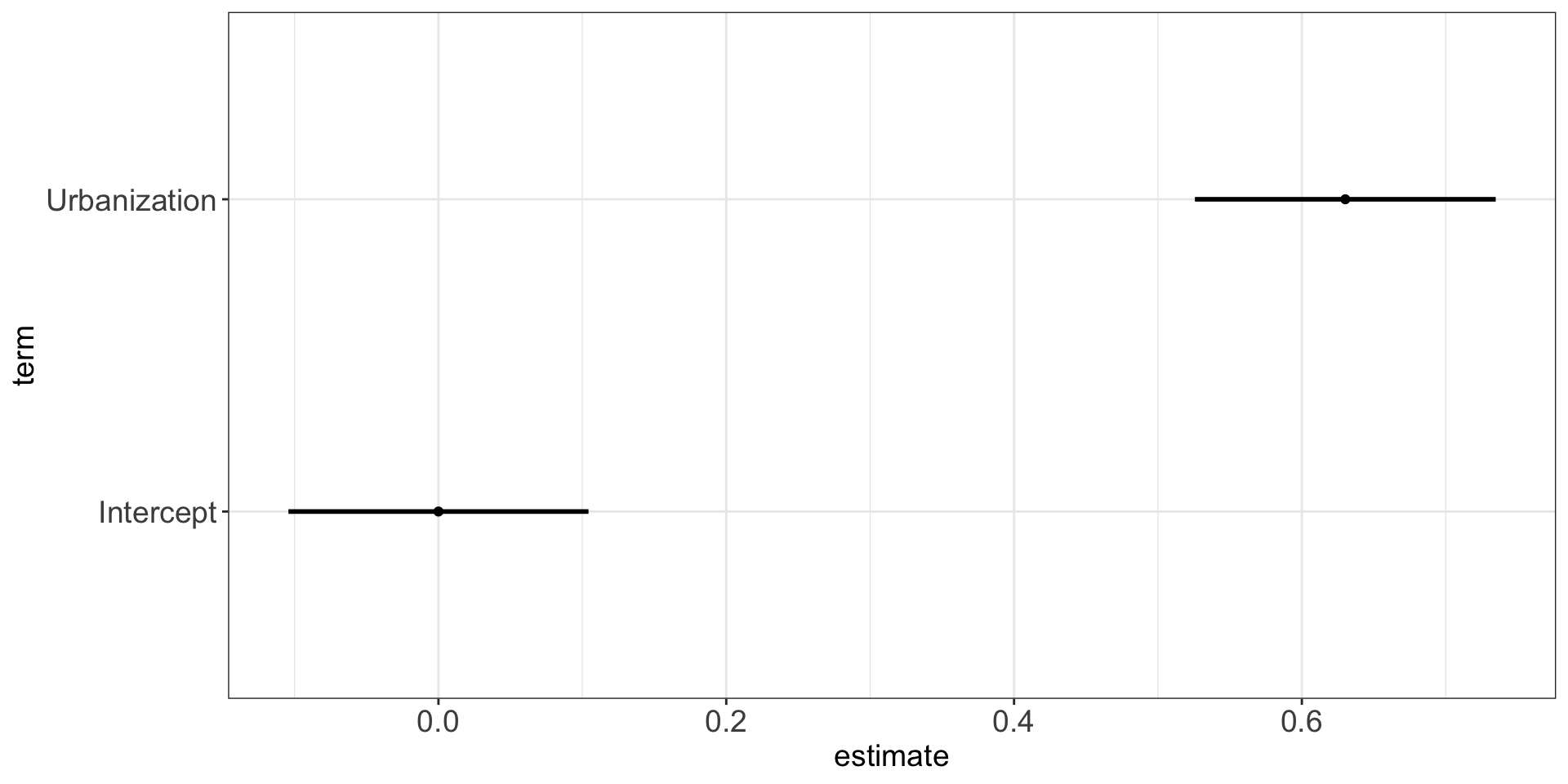
This is how we create a professionally-looking plot.
Show the code
library(broom)
model_scaled<-lm(scale(life_expectancy)~scale(urb_mean), data=merged_data2)
results<-tidy(model_scaled)

cm <- c('scale(urb_mean)'='Urbanization',
        "(Intercept)"="Intercept")

ggplot(results, aes(x = estimate, y = term)) +
      geom_point()+
      geom_errorbar(aes(xmin = estimate-1.96*std.error,
                        xmax = estimate+1.96*std.error),
                linewidth = 1, width=0)+
      scale_y_discrete(labels = cm) +  # this maps term names to nicer labels
      theme_bw()+
      theme(
        axis.text  = element_text(size = 14),
        axis.title = element_text(size = 14),
        plot.title = element_text(hjust = 0.5))
![]()
Regression Example
Interpretation: The Slope (b)
Show the code
library("modelsummary")
model<-lm(life_expectancy~urb_mean, data=merged_data2)

models<-list("DV: Life Expectancy" = model)

cm <- c('urb_mean'='Urbanization',
        "(Intercept)"="Intercept")

modelsummary(models, stars = TRUE, coef_map = cm, gof_map = c("nobs", "r.squared"))
| |
DV: Life Expectancy |
| + p < 0.1, * p < 0.05, ** p < 0.01, *** p < 0.001 |
| Urbanization |
0.225*** |
|
(0.019) |
| Intercept |
49.698*** |
|
(1.082) |
| Num.Obs. |
214 |
| R2 |
0.397 |
Interpretation:
For every 1 percentage point increase in urbanization (urb_mean), the model predicts an average increase of approximately 0.225 in life expectancy.
This relationship is statistically significant at the 0.1% level (p < 0.001), as indicated by the *** in the regression output.
Regression Example
Interpretation: The Standard Error (SE)
Show the code
library("modelsummary")
model<-lm(life_expectancy~urb_mean, data=merged_data2)

models<-list("DV: Life Expectancy" = model)

cm <- c('urb_mean'='Urbanization',
        "(Intercept)"="Intercept")

modelsummary(models, stars = TRUE, coef_map = cm, gof_map = c("nobs", "r.squared"))
| |
DV: Life Expectancy |
| + p < 0.1, * p < 0.05, ** p < 0.01, *** p < 0.001 |
| Urbanization |
0.225*** |
|
(0.019) |
| Intercept |
49.698*** |
|
(1.082) |
| Num.Obs. |
214 |
| R2 |
0.397 |
Interpretation:
SE for Urbanization = 0.019.
This tells you how much the estimate would vary across different samples. The smaller it is, the more precise your estimate.
Regression Example
Interpretation: The Intercept (a)
Show the code
library("modelsummary")
model<-lm(life_expectancy~urb_mean, data=merged_data2)

models<-list("DV: Life Expectancy" = model)

cm <- c('urb_mean'='Urbanization',
        "(Intercept)"="Intercept")

modelsummary(models, stars = TRUE, coef_map = cm, gof_map = c("nobs", "r.squared"))
| |
DV: Life Expectancy |
| + p < 0.1, * p < 0.05, ** p < 0.01, *** p < 0.001 |
| Urbanization |
0.225*** |
|
(0.019) |
| Intercept |
49.698*** |
|
(1.082) |
| Num.Obs. |
214 |
| R2 |
0.397 |
Interpretation:
Intercept = 49.698 When urbanization is 0%, the predicted life expectancy is 49.698 years.
This is not always meaningful in practice (e.g., no country has exactly 0% urbanization), but it’s mathematically necessary.
Regression Example
Interpretation: R Squared
The \(R^2\) is 0.397
It tells us the variance explained in our outcome variable by our predictor variable(s).
The interpretation is: “Our model explains 39.7% of the variance in our outcome variable.”
R squared ranges from 0 to 1: \(R\in [0,1]\)
- R sq = 0 means no variance is explained
- R sq = 1 means that all variance is explained
Notation
We now have the following equation:
\[
\hat{Y} = bX + a
\]
This can also be written as:
\[
\hat{y} = \hat{\alpha} + \hat{\beta}_1 x + \epsilon
\]
\[
\hat{y} = \hat{\beta}_0 + \hat{\beta}_1 x + \epsilon
\]
\(\epsilon\) = error term
Conclusion
- Correlation quantifies the strength and direction of a linear relationship between two variables.
- Regression models this relationship to make predictions.
- The slope (\(\beta_1\)) tells us the expected change in the outcome for a one-unit change in the predictor.
- The intercept (\(\beta_0\)) gives the expected value when the predictor is zero.
- \(R^2\) measures how well the model explains variation in the outcome.
- Correlation and regression do not imply causation.
