Visualizing Data Distributions in R
Histograms, Bar Plots, and the Logic of Central Tendency
Intro
Overview
Today, we’ll learn how to:
- Produce histograms to explore distributions
- Create bar plots from frequency tables
- Generate line plots to examine trends over time
Using R
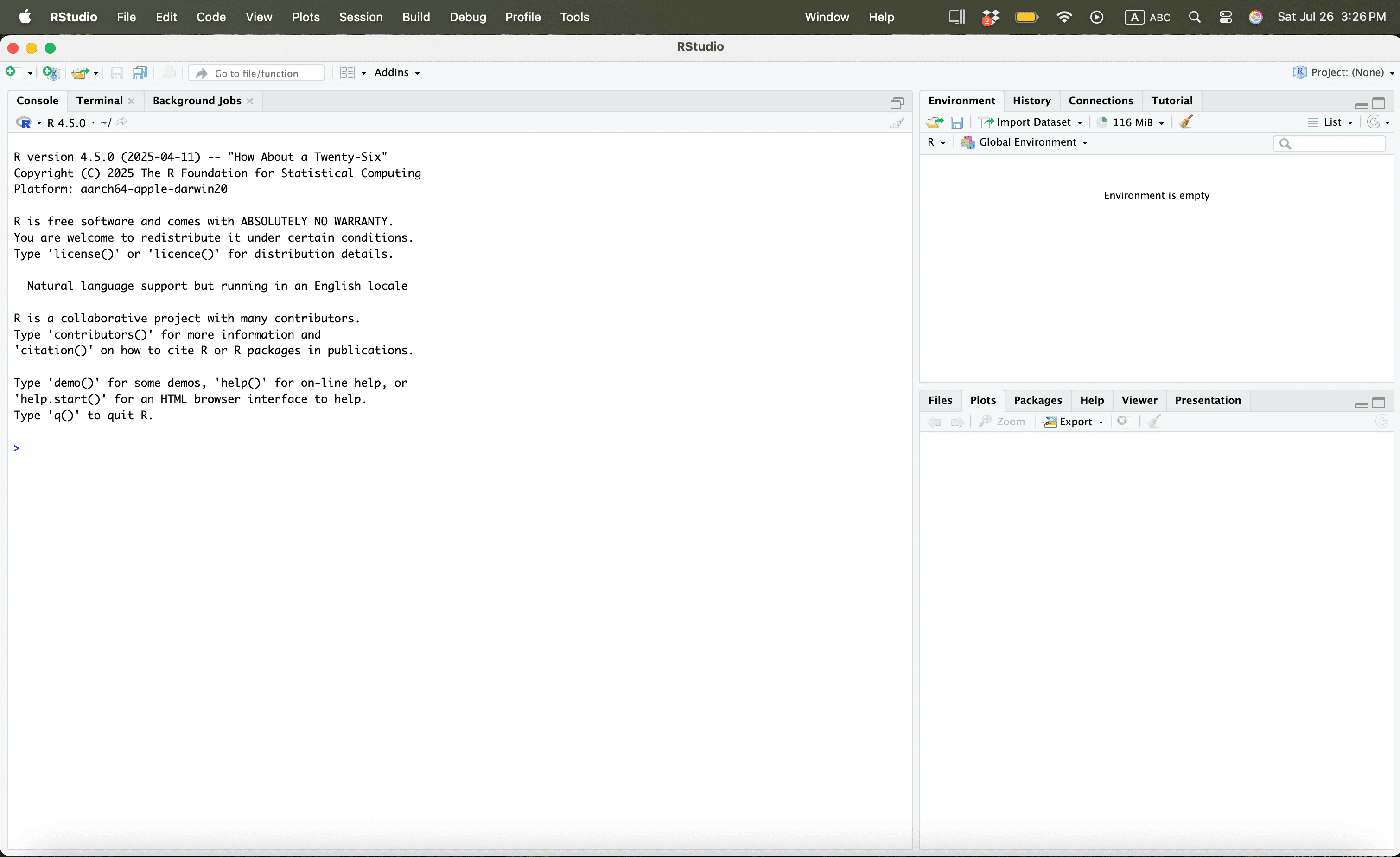
Using R
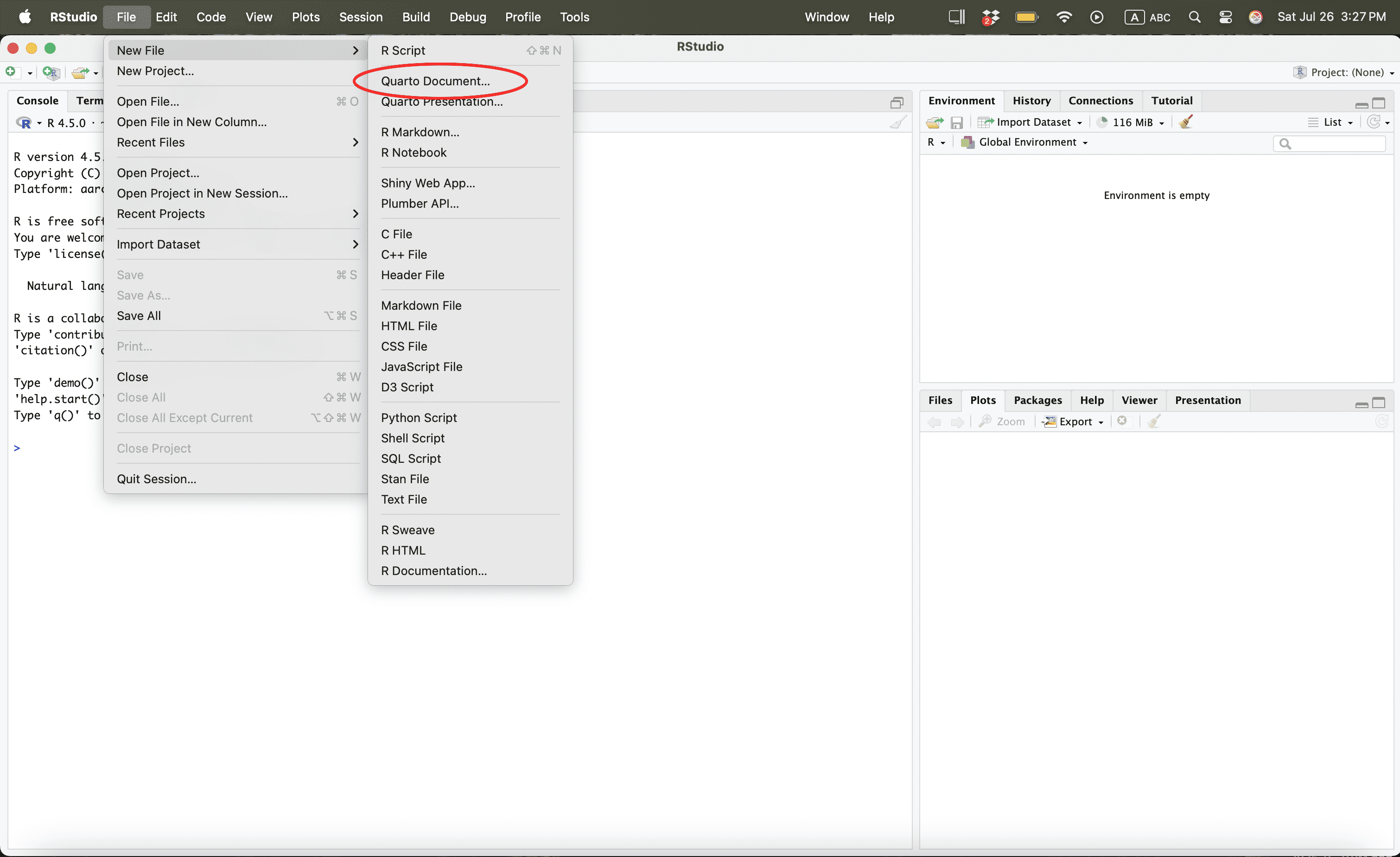
Using R
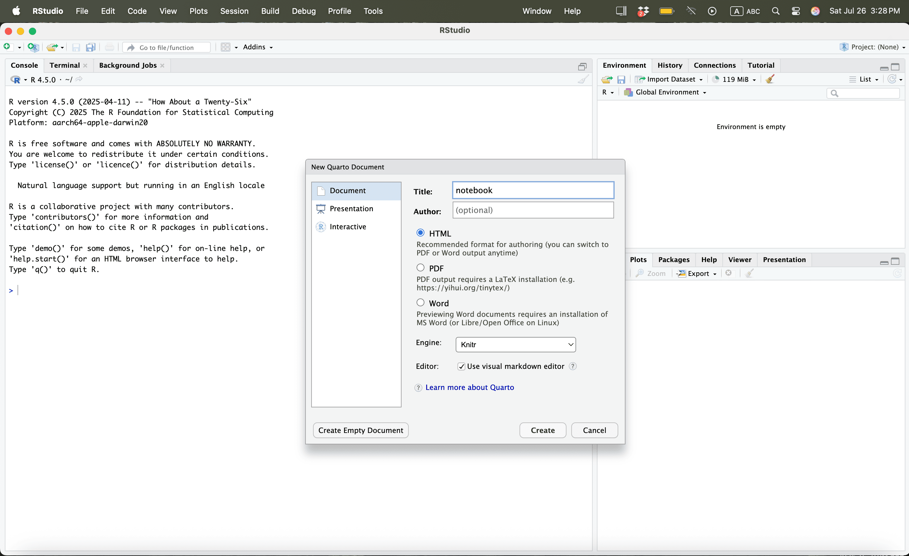
Using R
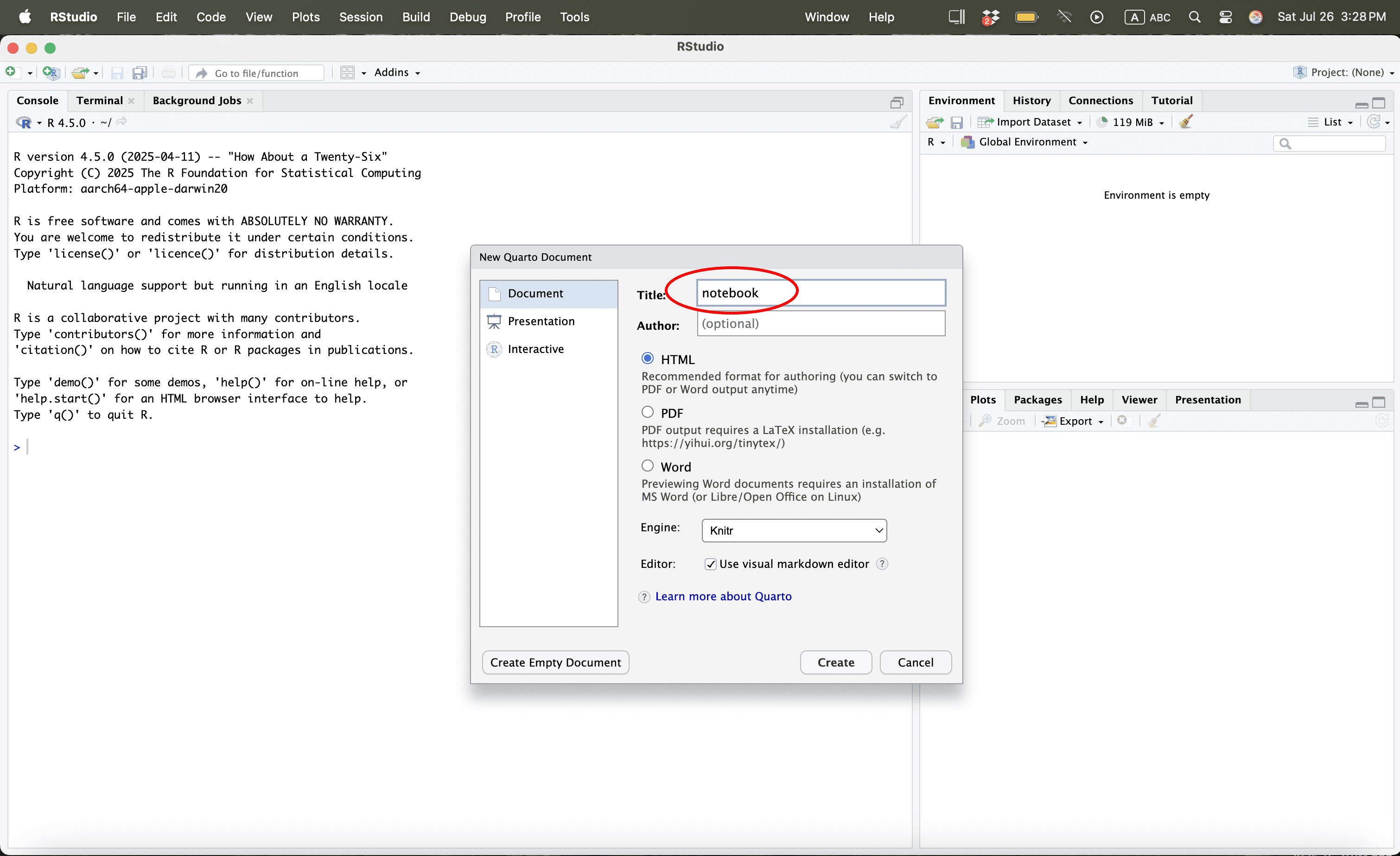
Using R
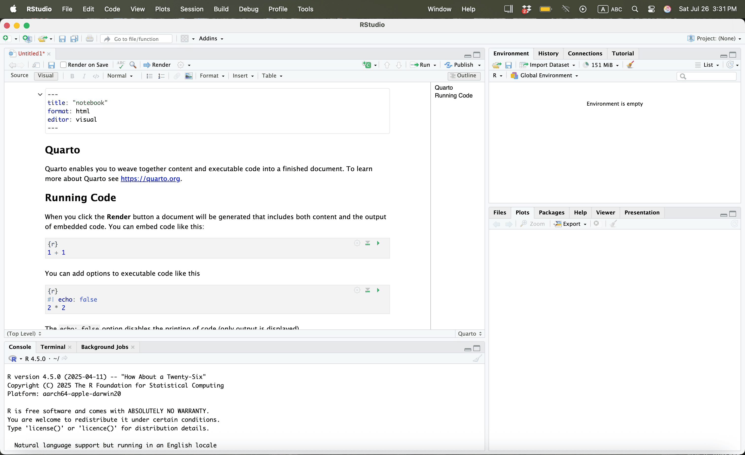
Using R
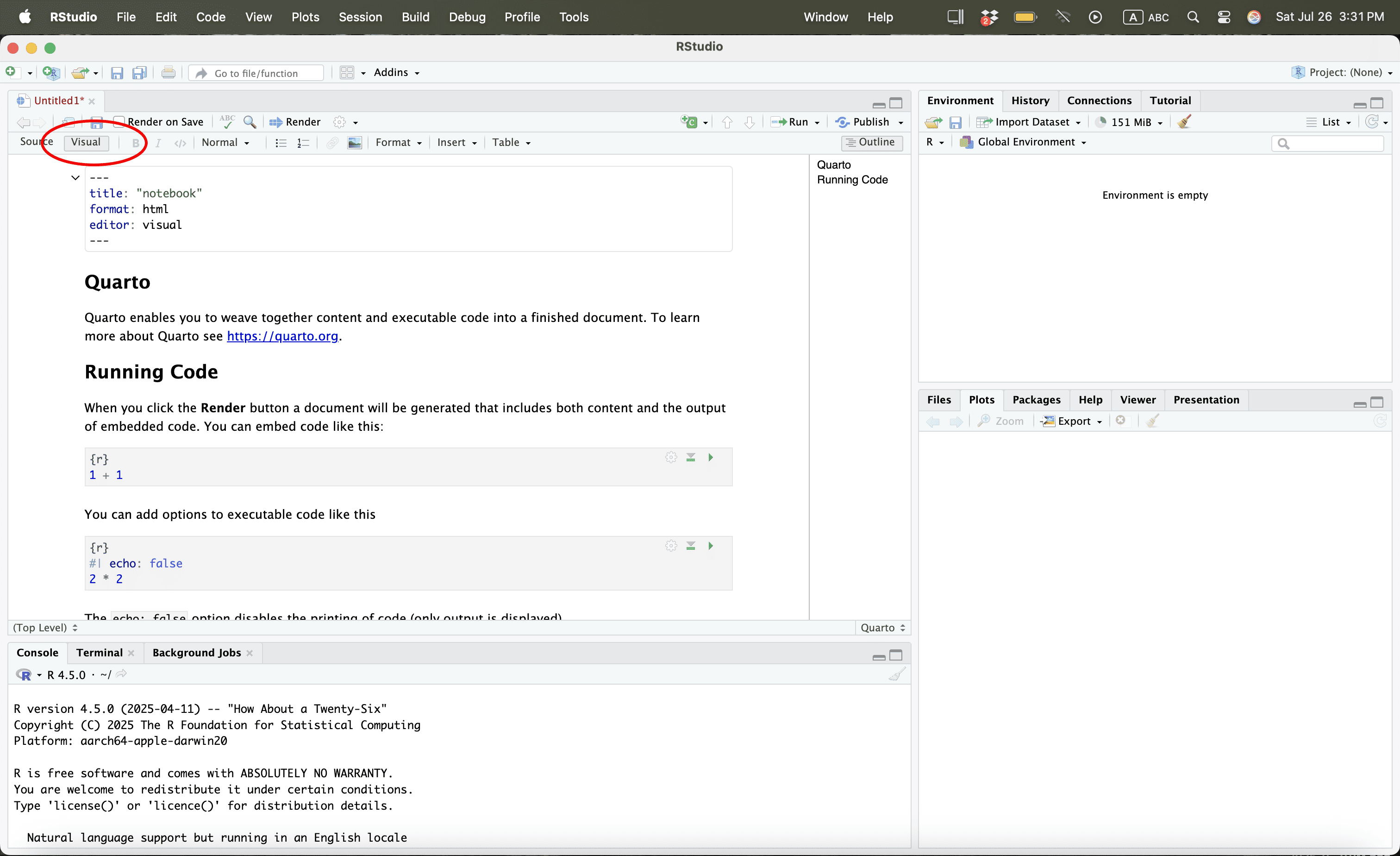
Using R
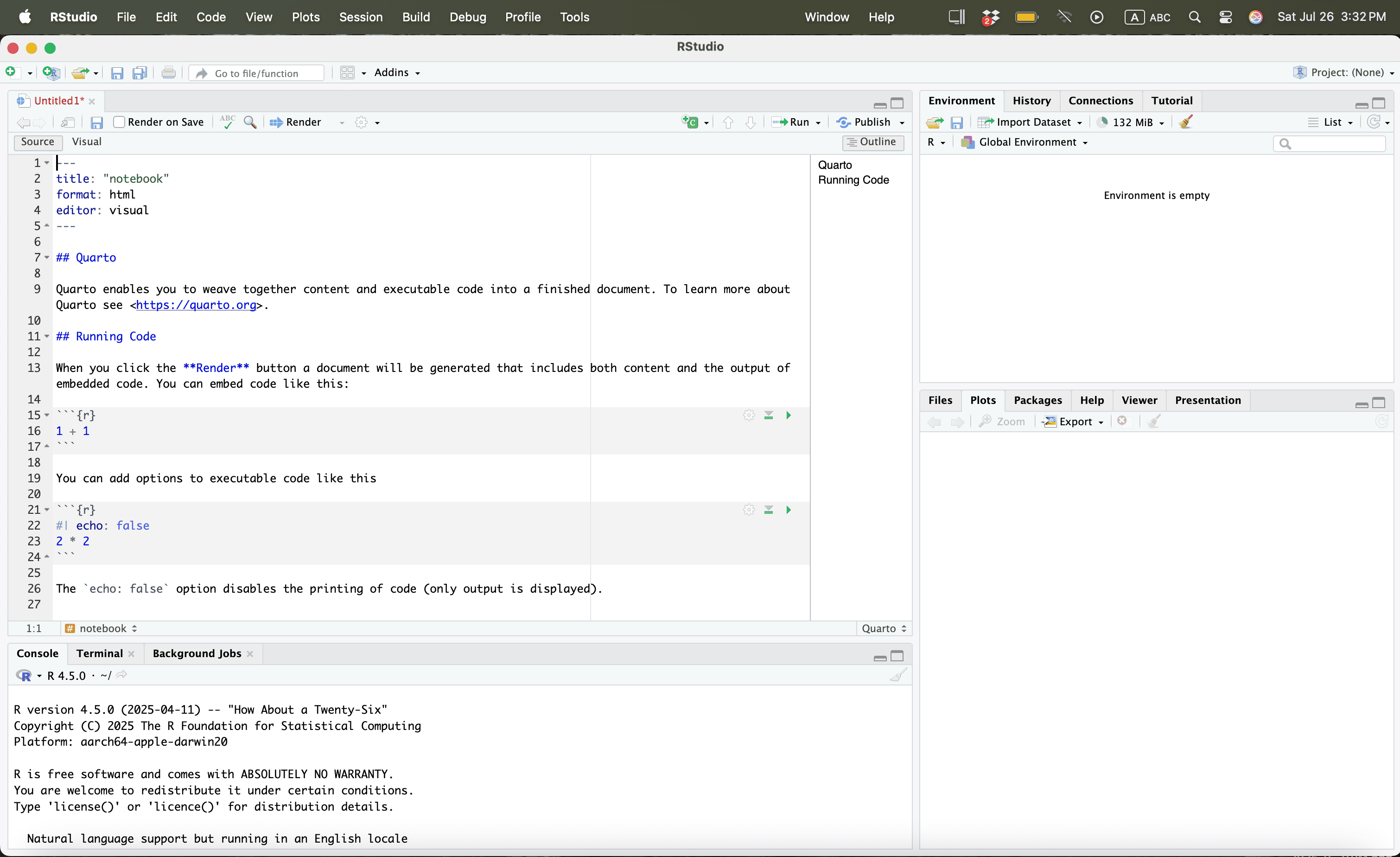
Using R
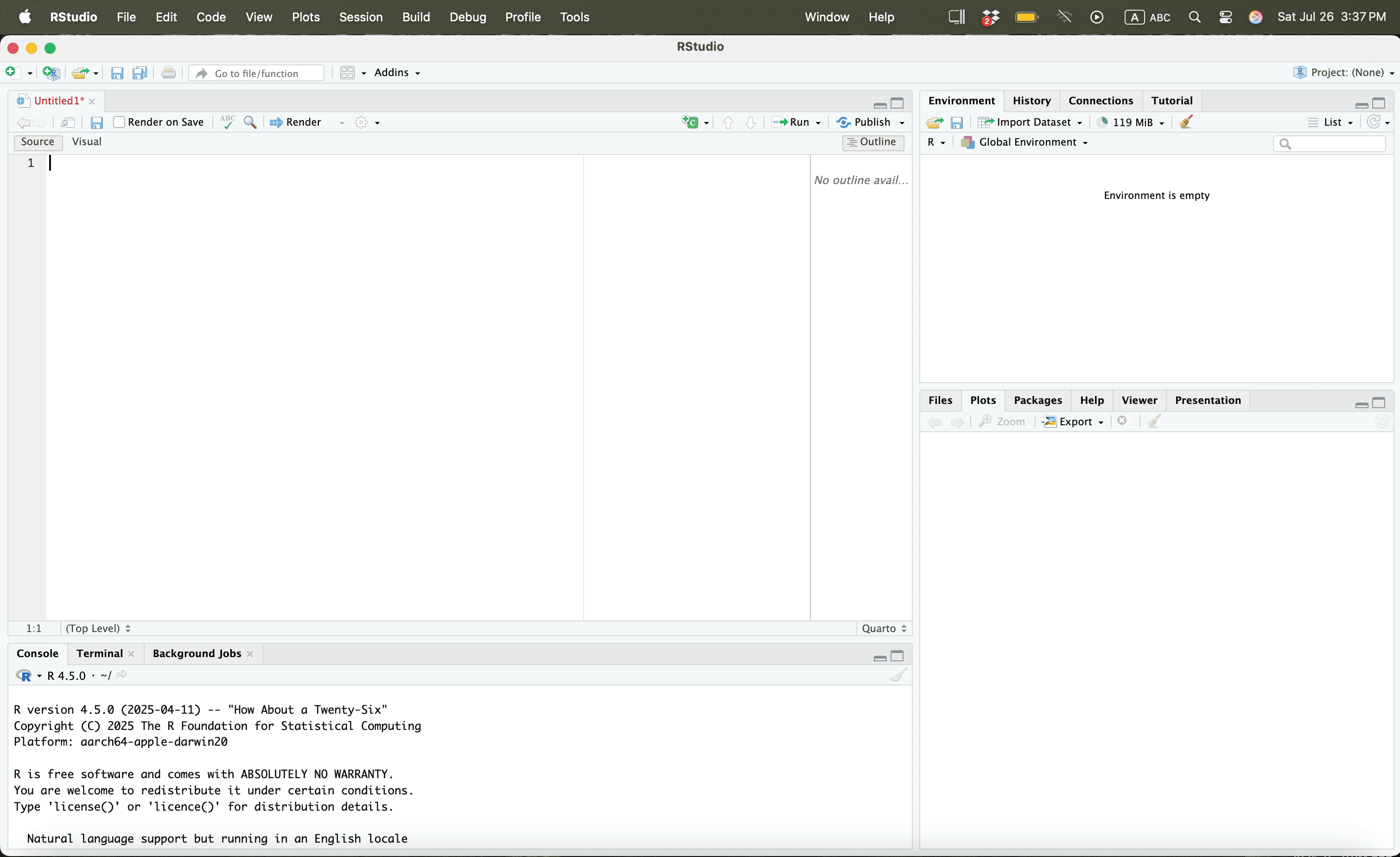
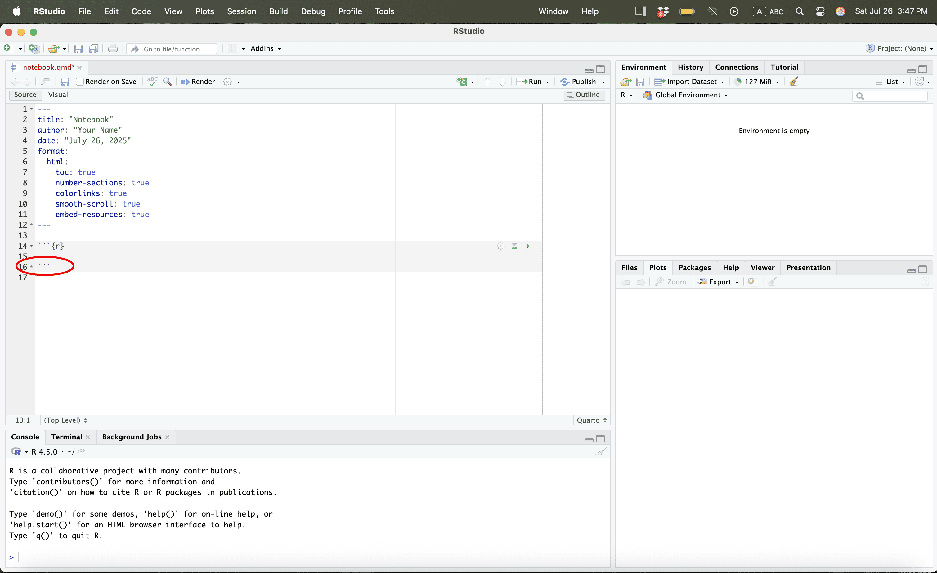
Press CMD + A or Ctrl + A and then Press Delete
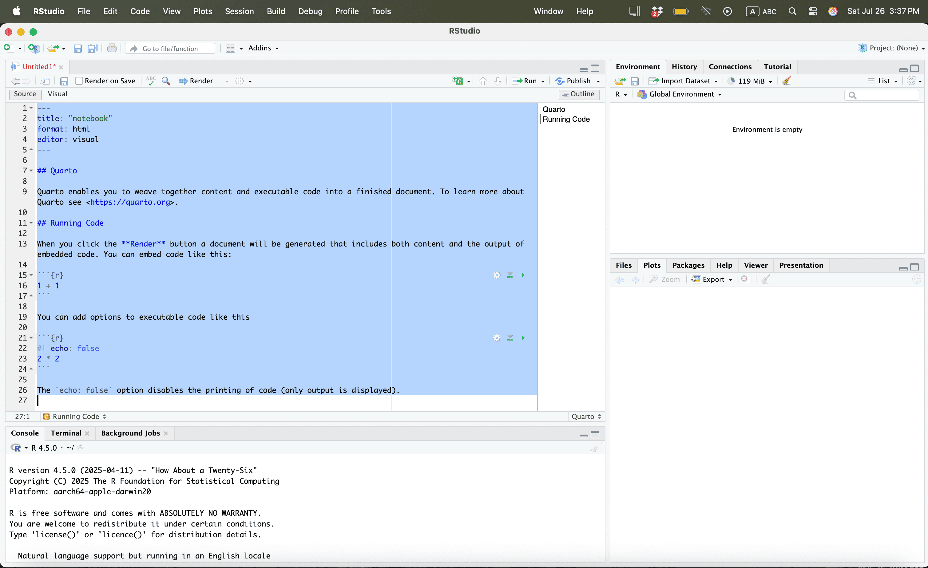
Using R
Using R
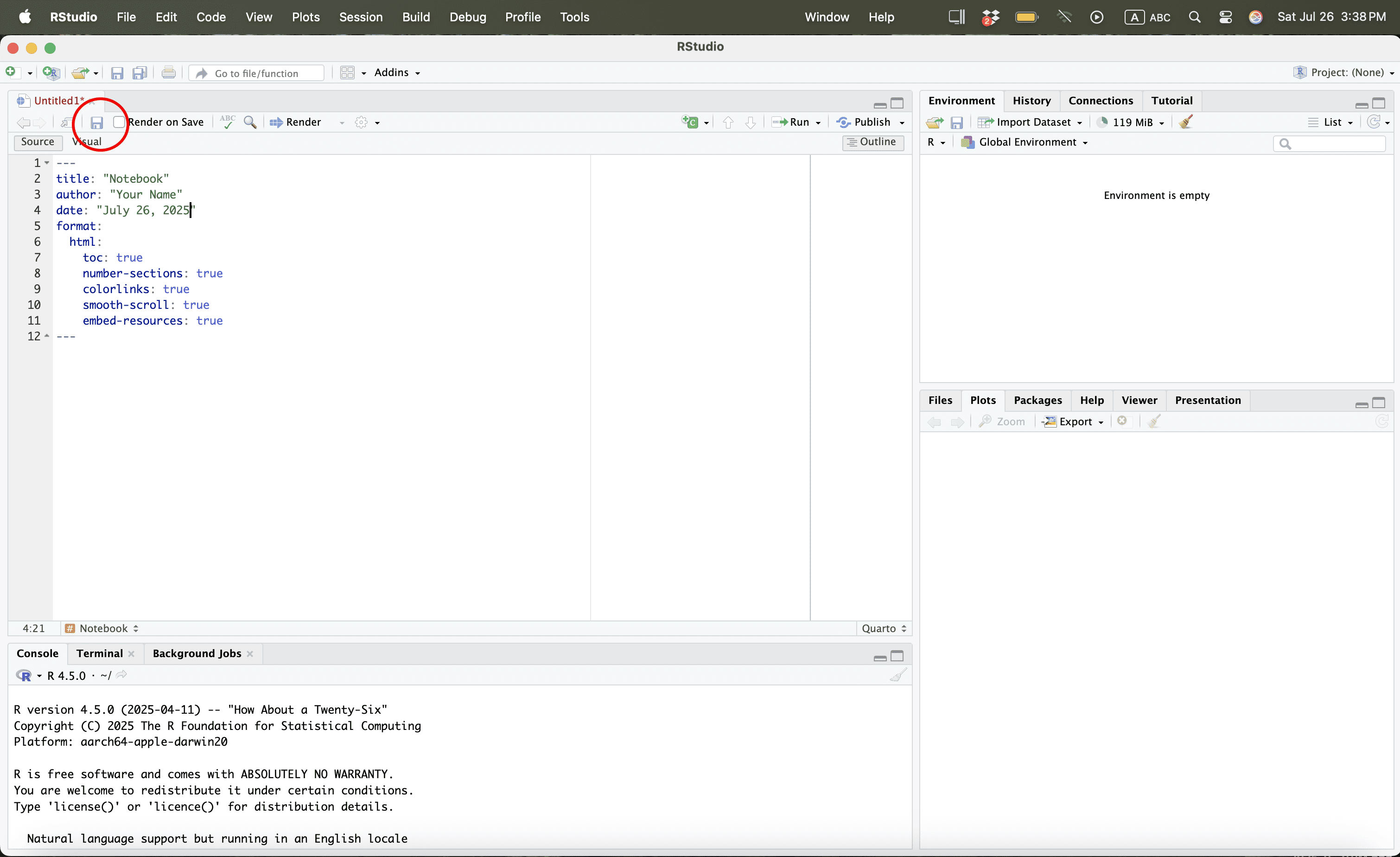
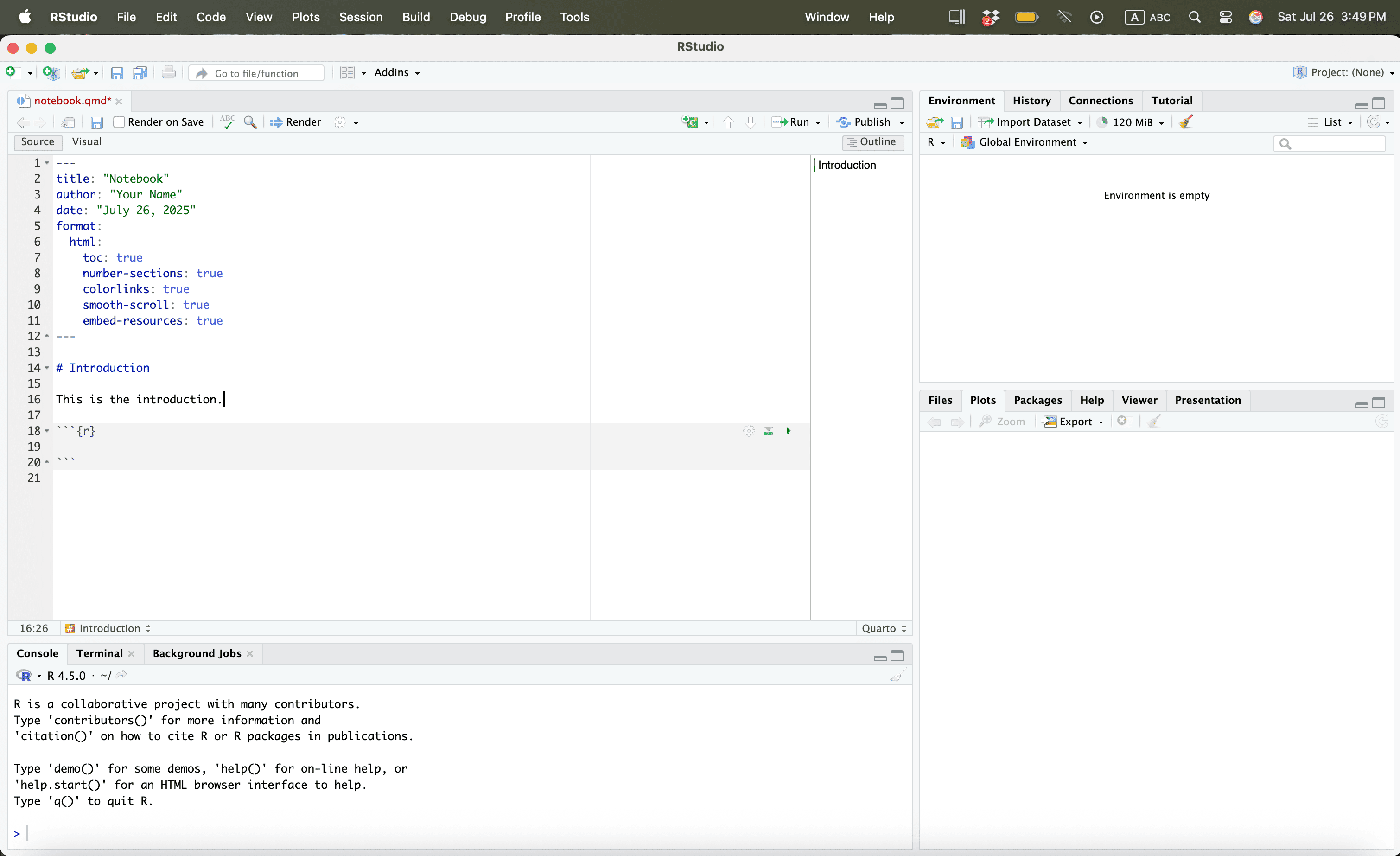
Then type:
Using R

Using R
Using R
Using R
Using R
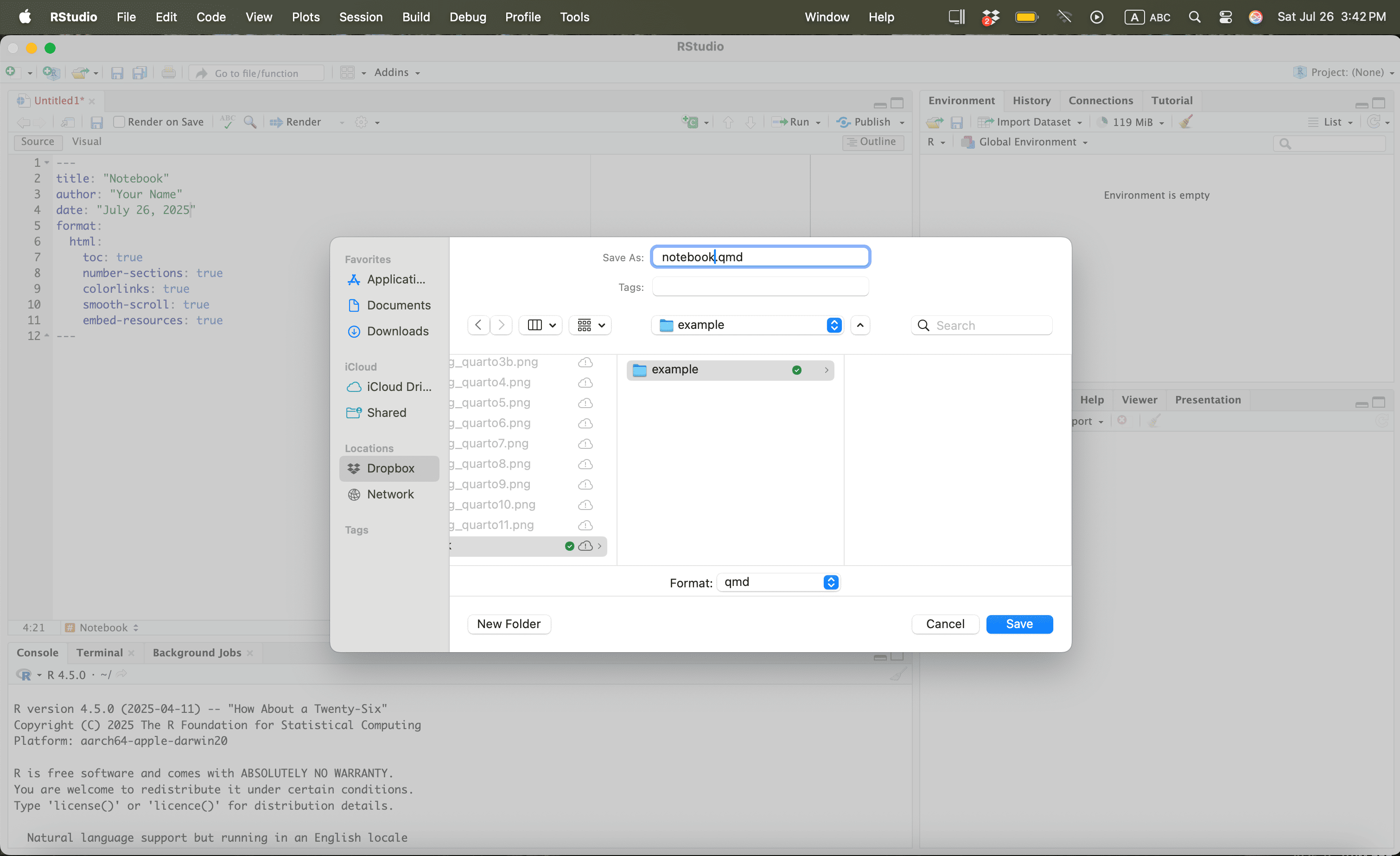
Using R

Using R
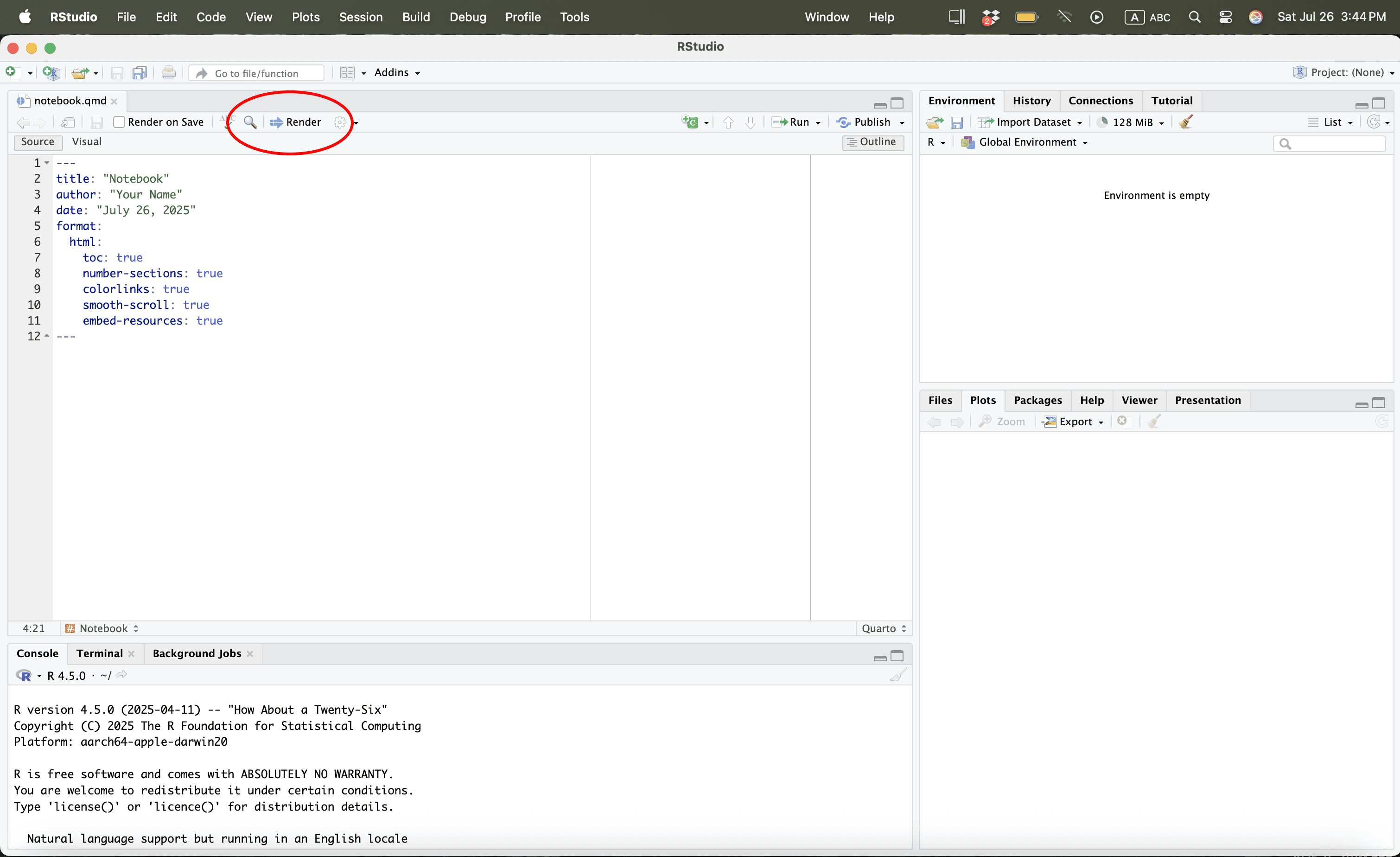
Using R

Using R
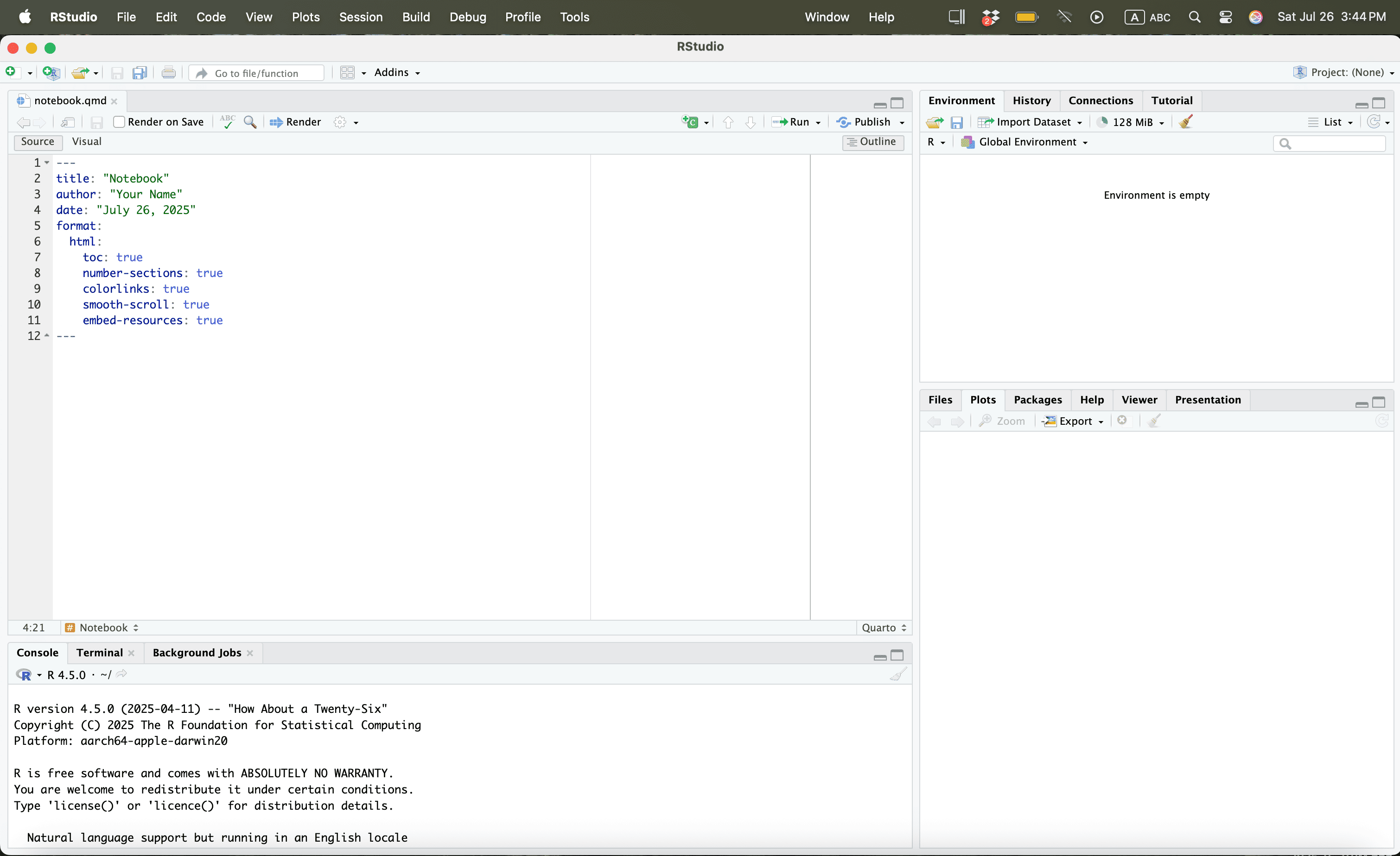
Using R
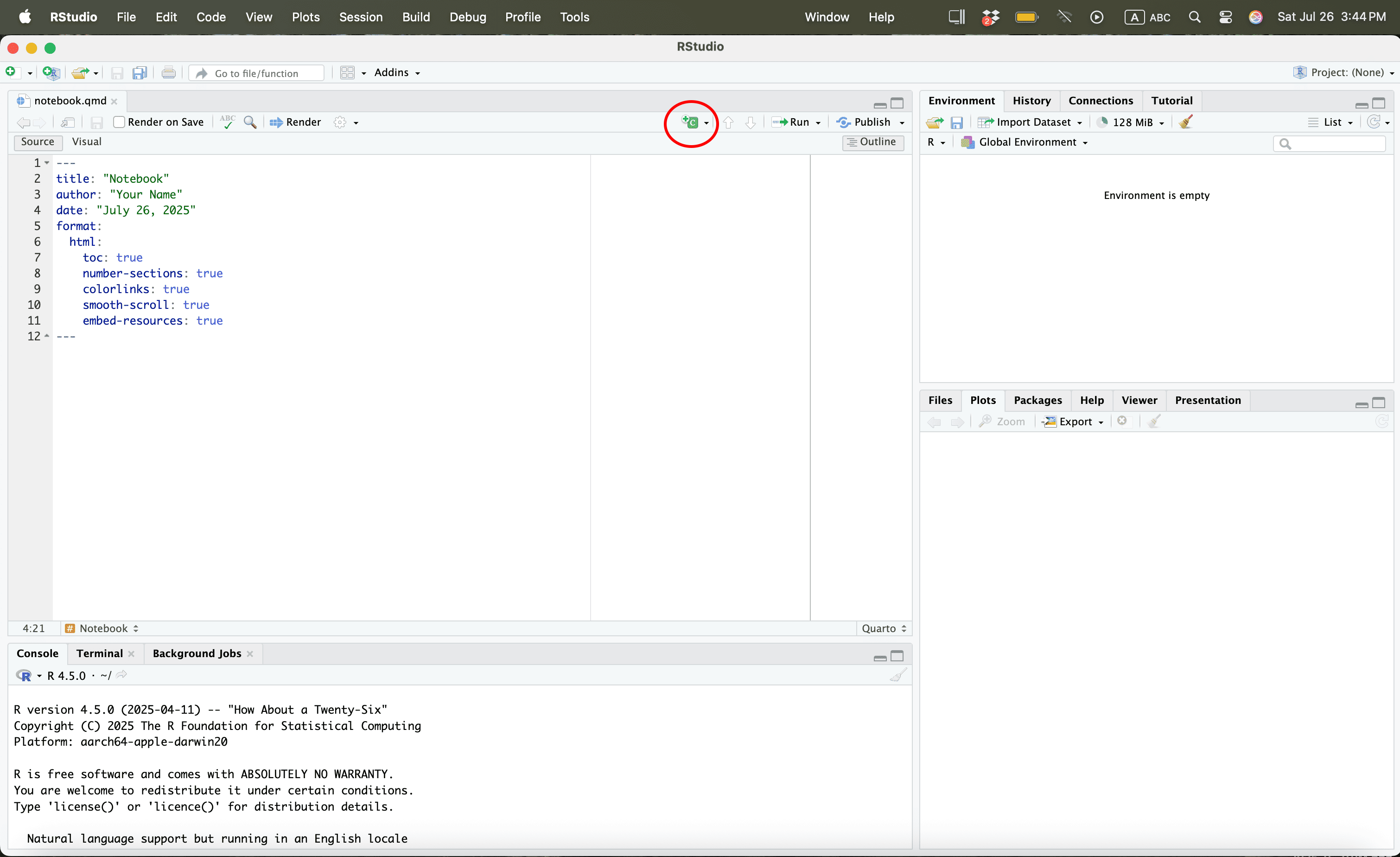
Using R
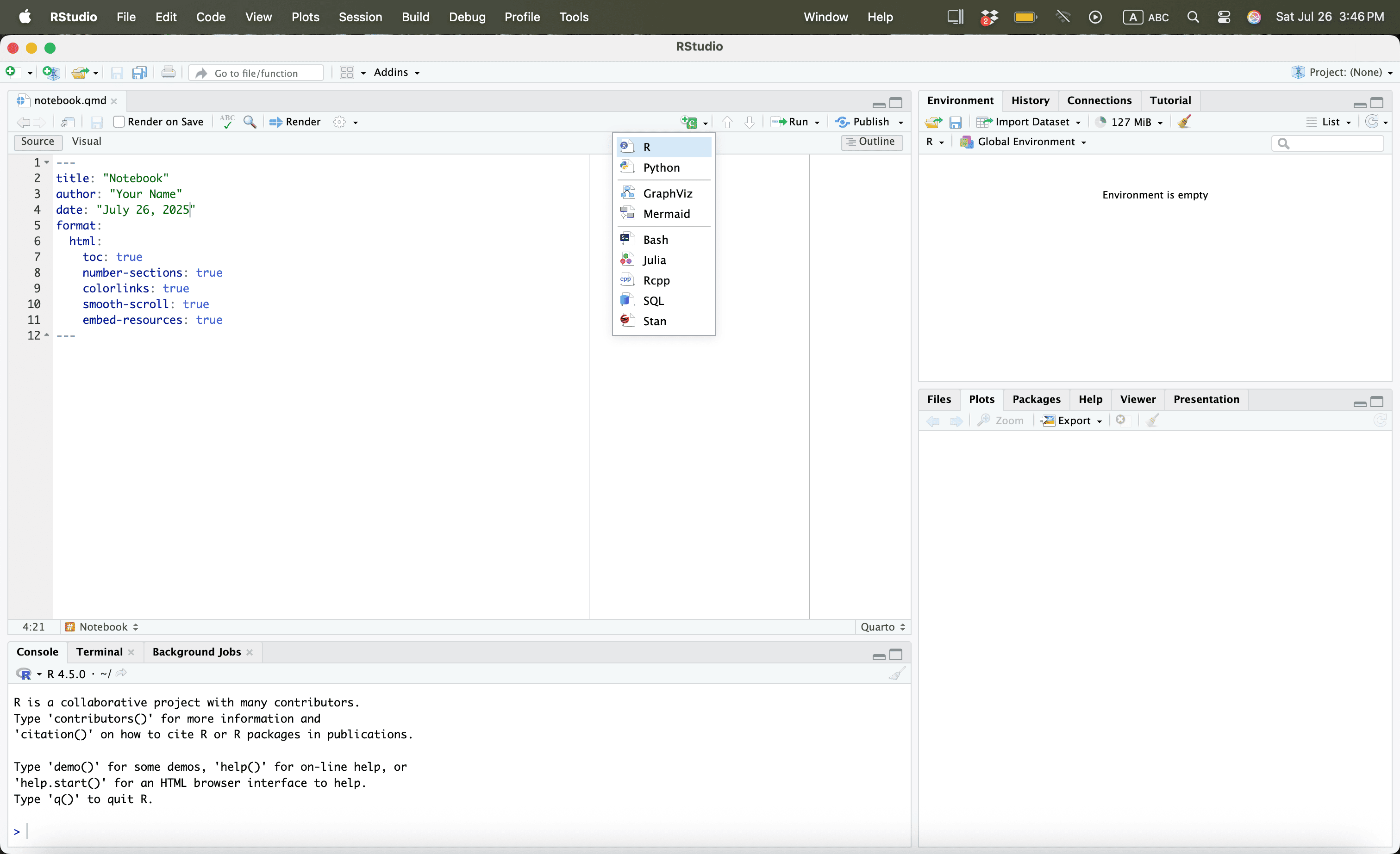
Using R
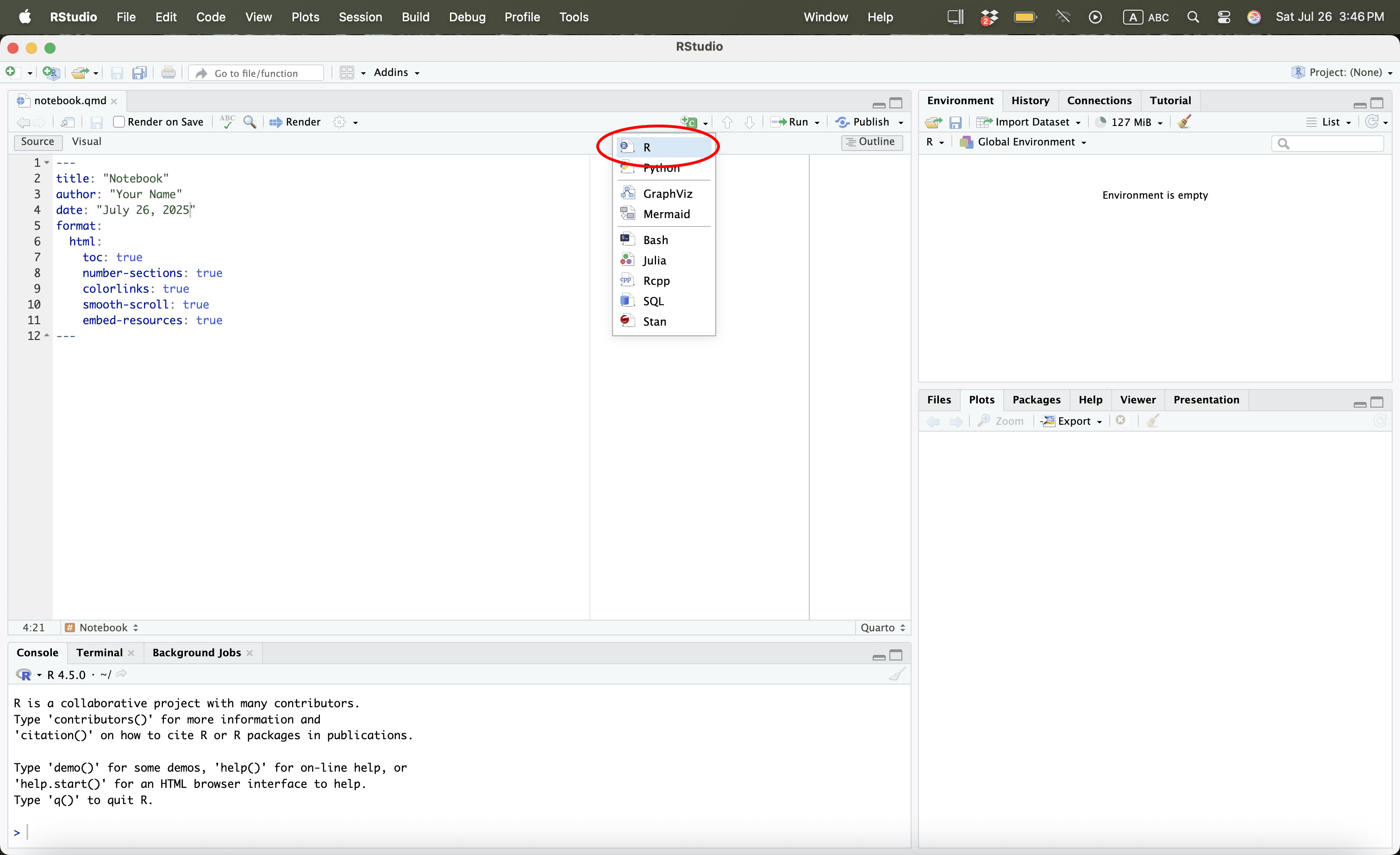
Using R
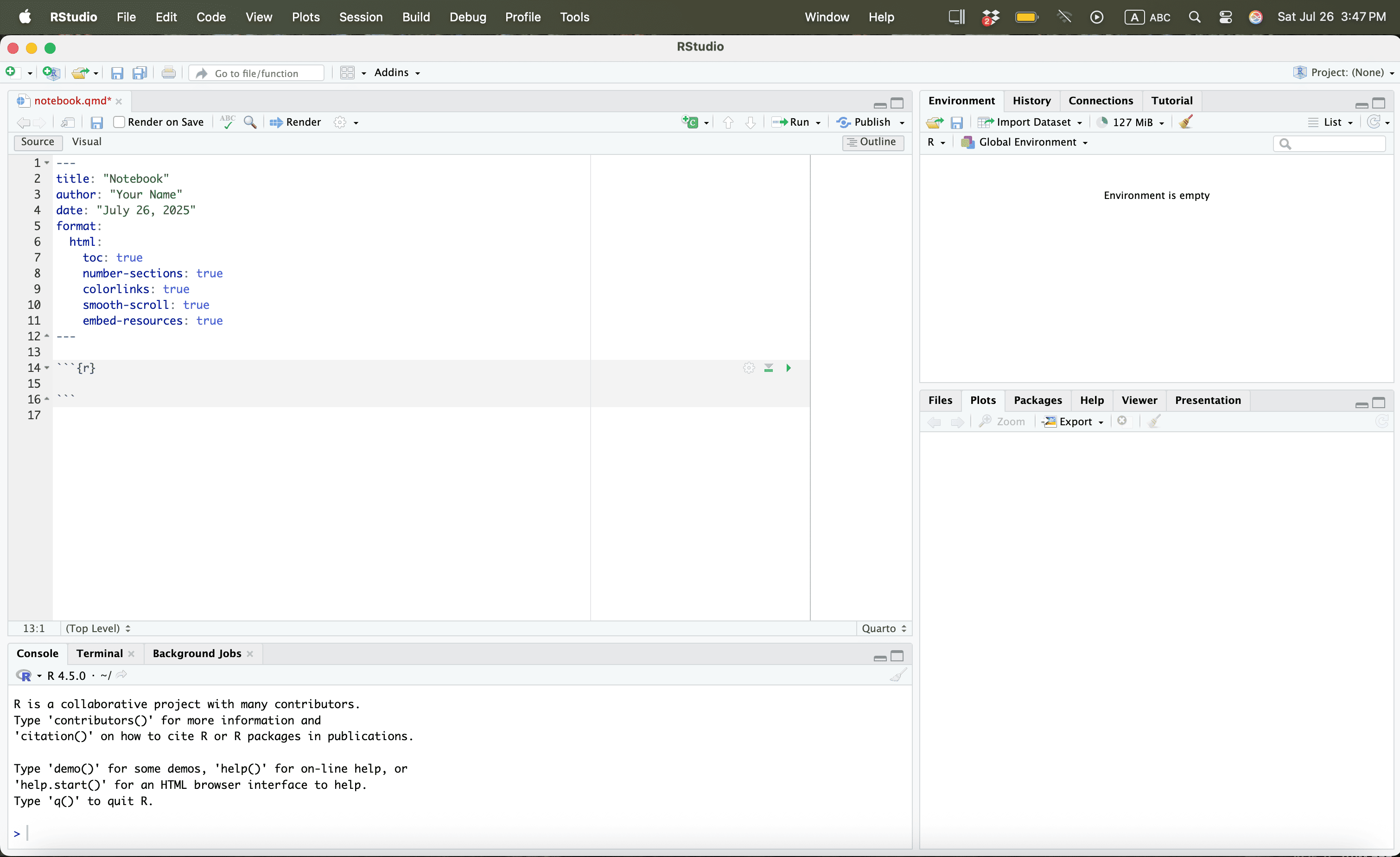
Using R
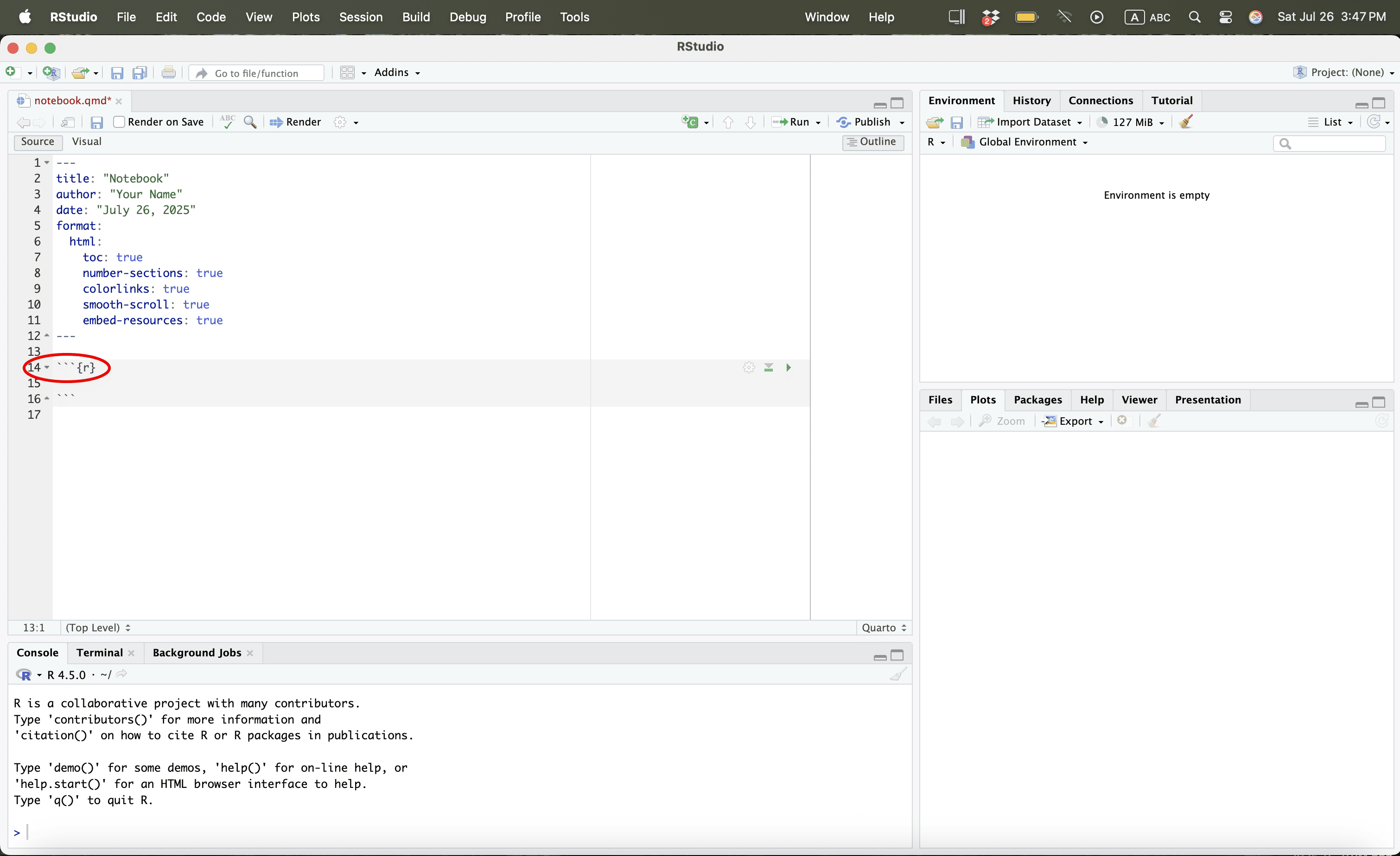
Using R
Using R
Using R
Using R
Using R

Using R
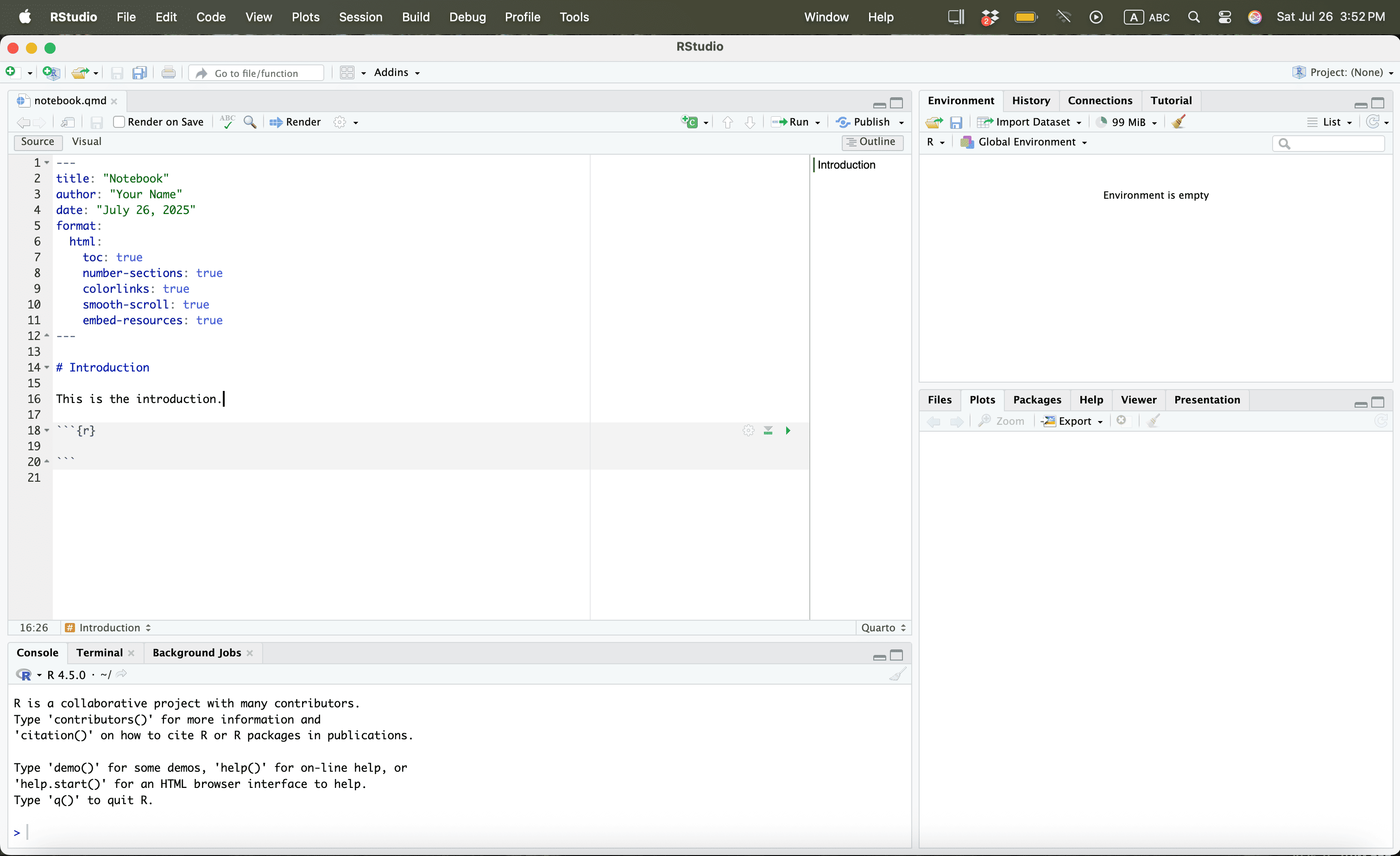
Using R
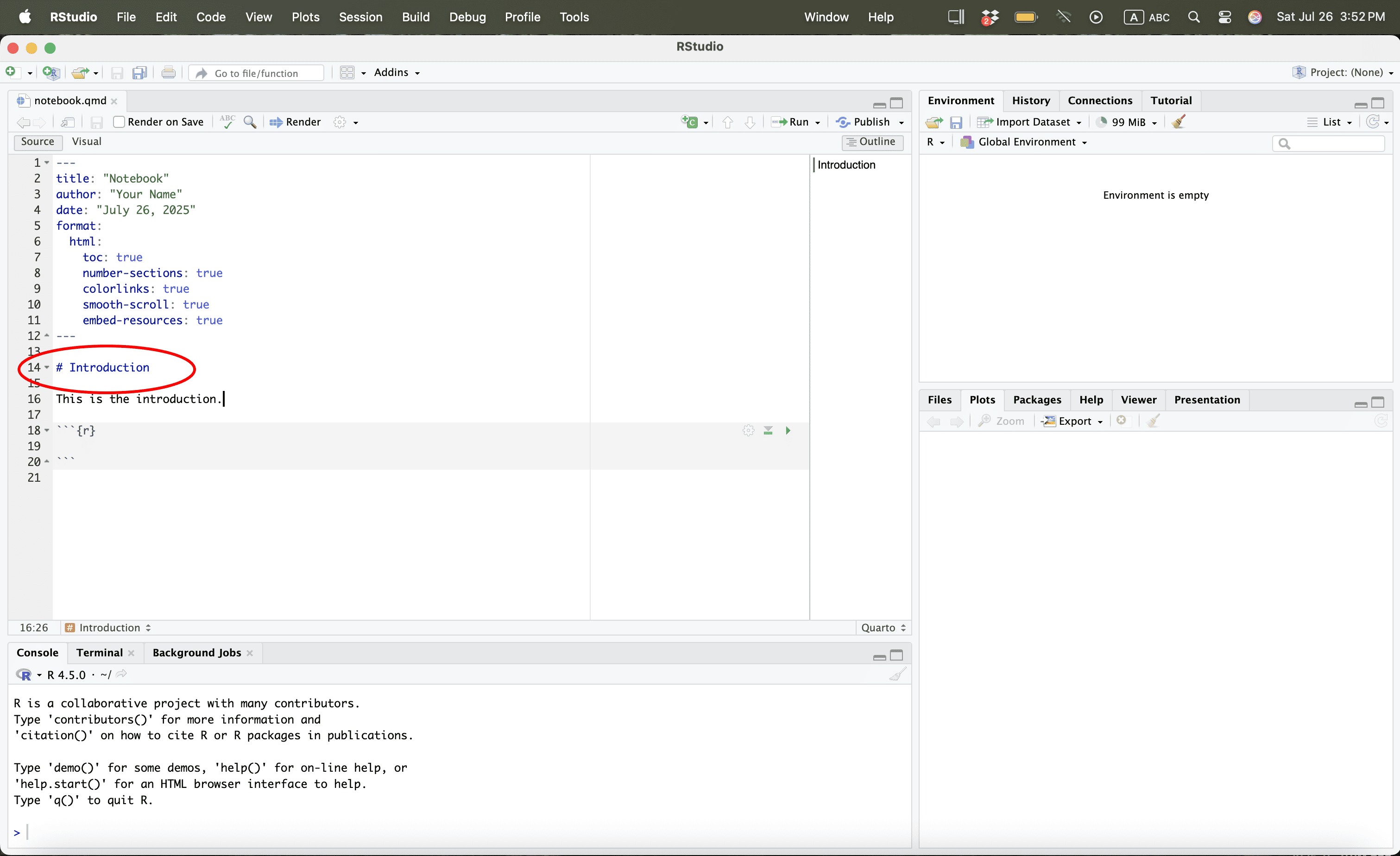
Using R
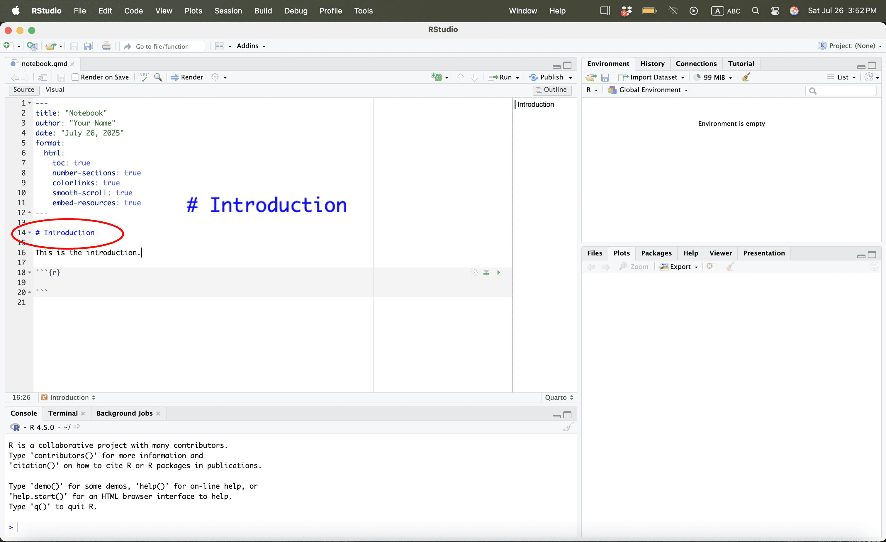
Using R
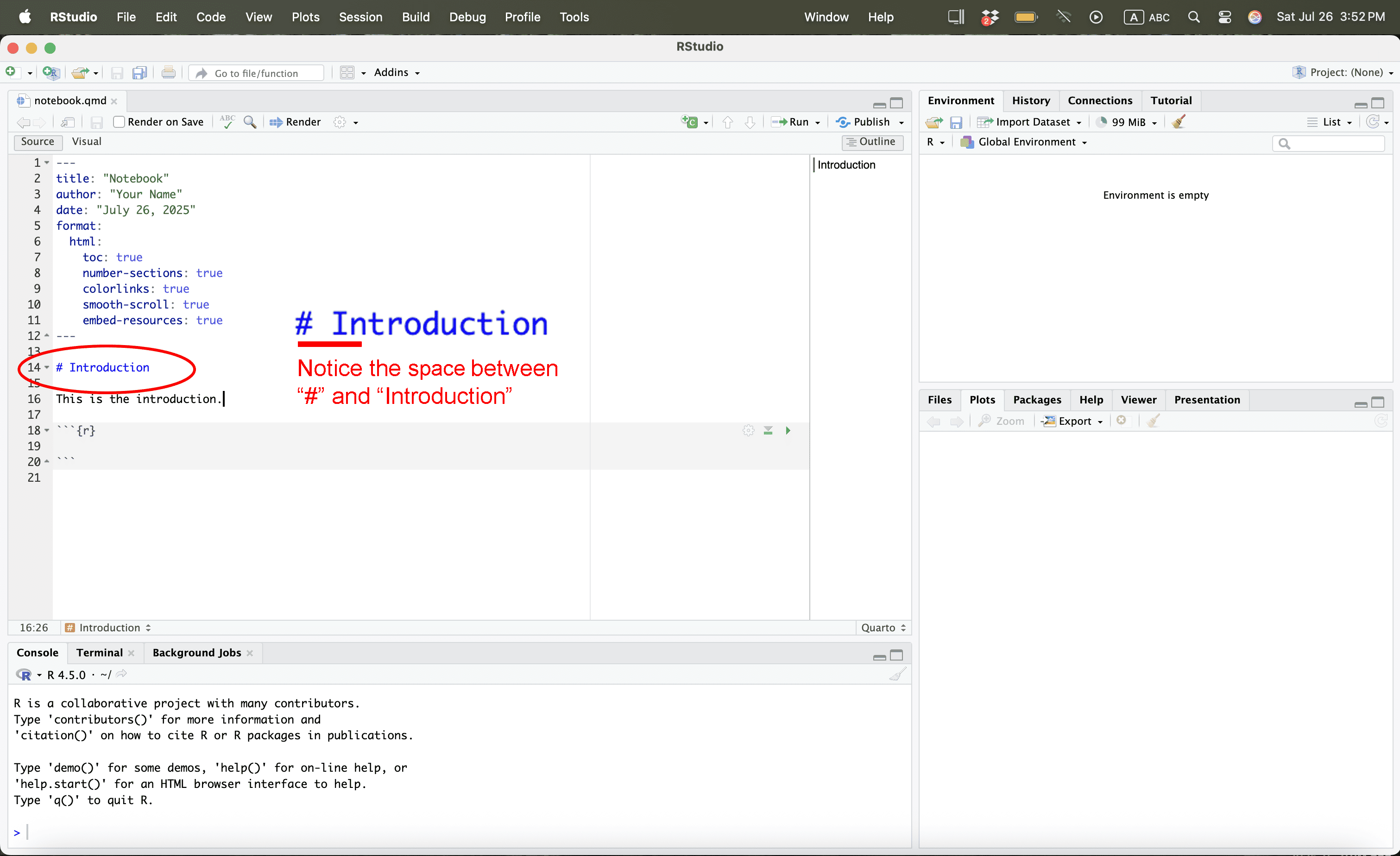
Opening the File
We first remove what we had previously
Opening a File
Download the following datasets from Dropbox:
Place them in your working directory or folder.
Opening the File
To get the file path we simply go to the relevant folder
Opening the File
Once we have the path, we can now read the files:
# Defining Paths
file_path <- "/Users/bgpopescu/Library/CloudStorage/Dropbox/john_cabot/teaching/research_workshop/lecture8/data/"
# Use file.path() to construct full path
life_expectancy_df <- read.csv(file.path(file_path, "life-expectancy.csv"))
urbanization_df <- read.csv(file.path(file_path, "share-of-population-urban.csv"))
What We Want to Do
Explanation
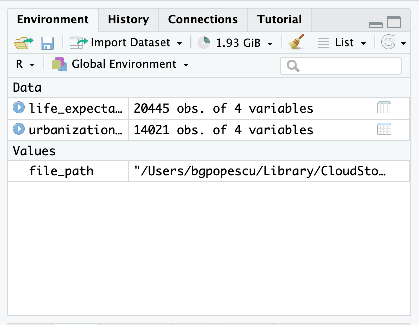
These are our datasets
Doing it
Calculating Average by Country Code
This is what this looks like in code for life_expectancy_df2:
Cleaning the Data
Removing Countries with Strange Labels, Left Merge, Removing NA Values
We will now perform a left join to combine urbanization data with life expectancy data based on Code.
Histograms
What Is a Histogram?
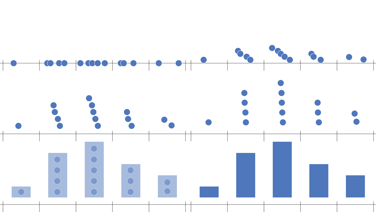
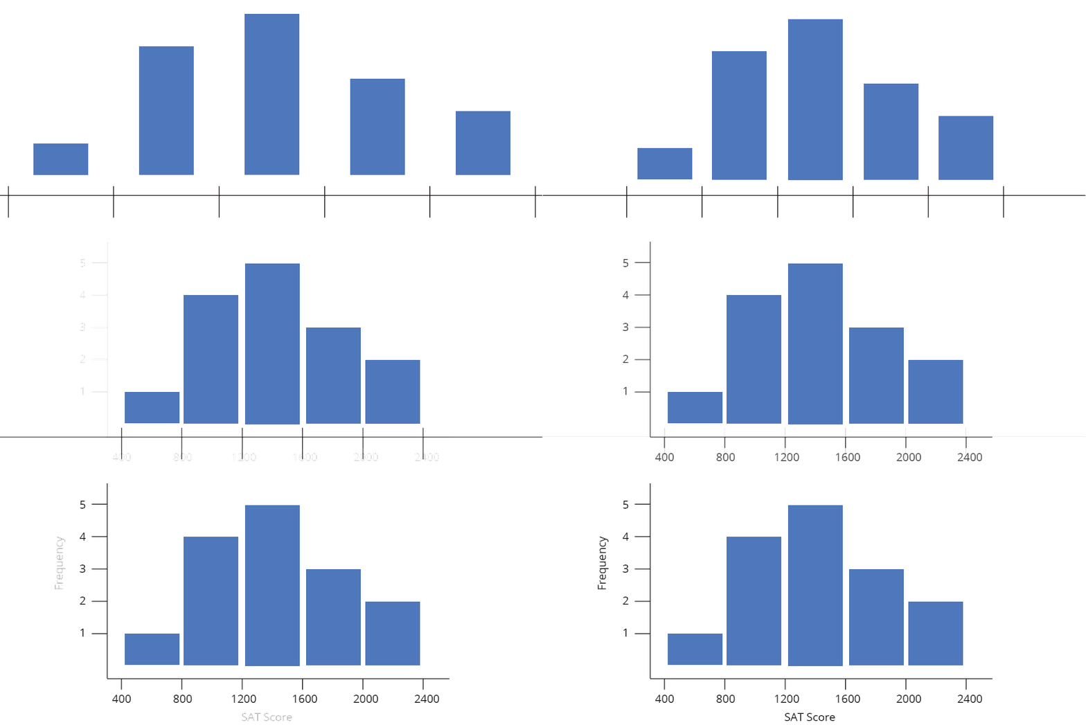
A histogram is a type of bar chart that shows the distribution of numerical data.
It breaks the range of values into intervals (called bins) and counts how many values fall into each bin.
It helps us answer:
- What does the data look like?
- Where are most values concentrated?
Histograms
Example – Student Test Scores
| SAT Score Range | Number of Students |
|---|---|
| 400–800 | 1 |
| 800–1200 | 4 |
| 1200–1600 | 5 |
| 1600–2000 | 3 |
| 2000–2400 | 2 |
Histograms
Example – Student Test Scores
| SAT Score Range | Number of Students |
|---|---|
| 400–800 | 1 |
| 800–1200 | 4 |
| 1200–1600 | 5 |
| 1600–2000 | 3 |
| 2000–2400 | 2 |

Histograms
Example – Student Test Scores
| SAT Score Range | Number of Students |
|---|---|
| 400–800 | 1 |
| 800–1200 | 4 |
| 1200–1600 | 5 |
| 1600–2000 | 3 |
| 2000–2400 | 2 |
Histograms
Example – Student Test Scores
| SAT Score Range | Number of Students |
|---|---|
| 400–800 | 1 |
| 800–1200 | 4 |
| 1200–1600 | 5 |
| 1600–2000 | 3 |
| 2000–2400 | 2 |
Creating a Bar Plot from a Frequency Table
Step1: Rounding the values
Creating a Bar Plot from a Frequency Table
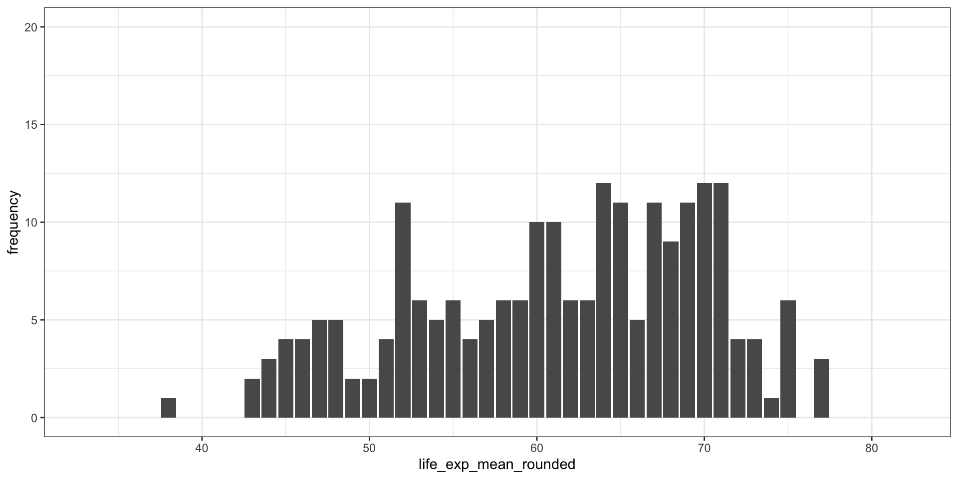
Step2: Creating a frequency table
38 43 44 45 46 47 48 49 50 51 52 53 54 55 56 57 58 59 60 61 62 63 64 65 66 67
 1  2  3  4  4  5  5  2  2  4 11  6  5  6  4  5  6  6 10 10  6  6 12 11  5 11
68 69 70 71 72 73 74 75 77
9 11 12 12 4 4 1 6 3 Creating a Bar Plot from a Frequency Table
Step2: Creating a frequency table
Creating a Bar Plot from a Frequency Table
Step2: Creating a frequency table
Inspecting the new dataframe
Creating a Bar Plot from a Frequency Table
Step3: Creating the Barplot
Creating a Bar Plot from a Frequency Table
Step4: Creating a Histogram using geom_histogram
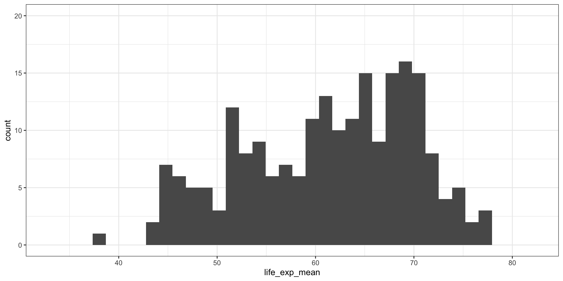
Creating a Bar Plot from a Frequency Table
Step4: Creating a Histogram using geom_histogram
This is how we can control the bin size: 50
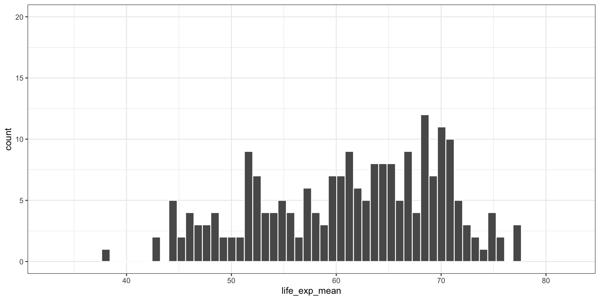
Creating a Bar Plot from a Frequency Table
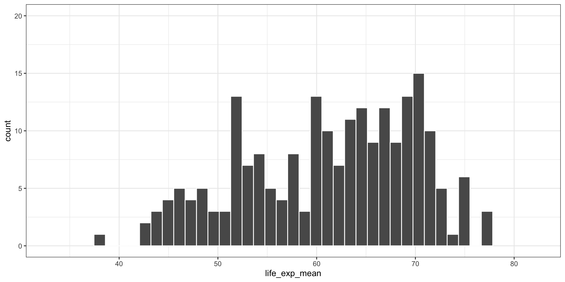
Step4: Creating a Histogram using geom_histogram
This is how we can control the bin size: 35
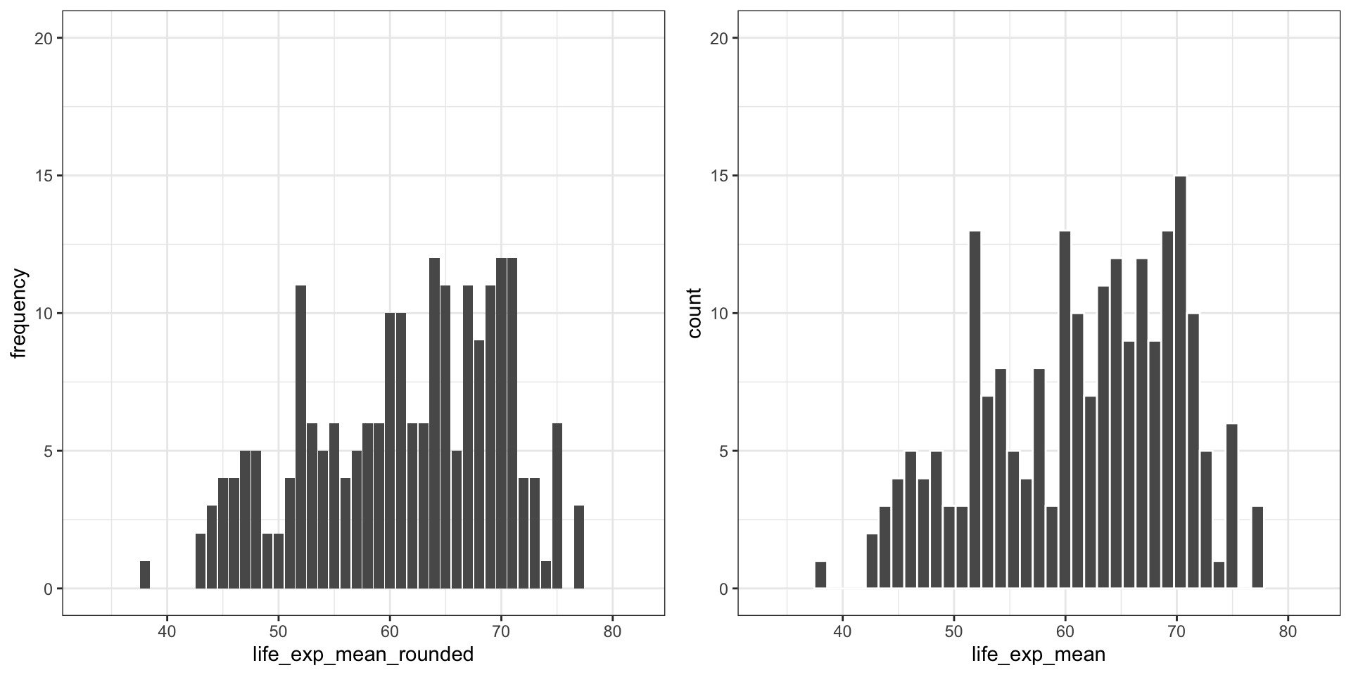
Creating a Bar Plot from a Frequency Table
This is how we put them side by side
Mapping the Measures of Central Tendency
Calculating Mean
- The mean describes the average value of a variable.
- It is calculated as:
\[ \bar{x} = \frac{x_1 + x_2 + \dots + x_n}{n} = \frac{\sum x_i}{n} \]
Mapping the Measures of Central Tendency
Calculating Mean
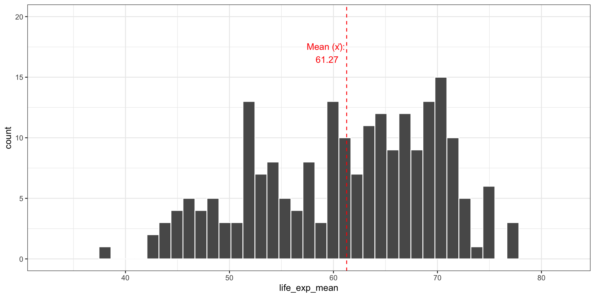
In your case, we can calculate the mean for all the values in life expectancy
[1] 61.26972mean_label <- paste("Mean (x̄):\n", round(life_exp_mean, 2))
y_coord<-17
fig5_b<-ggplot(data = merged_data2, aes(x=life_exp_mean))+
geom_histogram(bins = 35, col="white")+
geom_vline(xintercept=life_exp_mean, linetype='dashed', col = 'red')+
annotate(geom="text",
x=life_exp_mean-2,
y=y_coord,
label=mean_label,
color="red")+
theme_bw()+
coord_cartesian(xlim = c(min(merged_data2$life_exp_mean)-5,
max(merged_data2$life_exp_mean)+5),
ylim = c(0, 20))
fig5_bMapping the Measures of Central Tendency
Calculating Mean
In your case, we can calculate the mean for all the values in life expectancy
Mapping the Measures of Central Tendency
Central Tendency: Median
- The median is the middle value in a dataset ordered from smallest to largest.
- It splits the dataset into two equal halves.
- If the number of observations is odd:
- Median = middle number
- Example:
Data = [1, 3, 7] → Median = 3
- Median = middle number
- If the number of observations is even:
- Median = average of the two middle values
- Example:
Data = [1, 3, 5, 7] → Median = ( = 4)
- Median = average of the two middle values
Mapping the Measures of Central Tendency
Central Tendency: Median
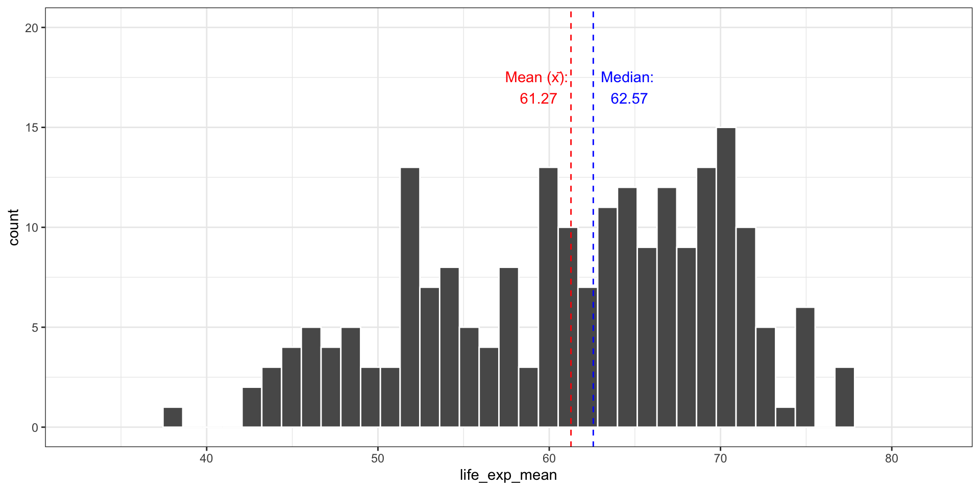
In your case, we can calculate the median for all the values in life expectancy
[1] 62.57153mean_label <- paste("Mean (x̄):\n", round(life_exp_mean, 2))
median_label <- paste("Median:\n", round(life_exp_median, 2))
y_coord<-17
fig5_b <- ggplot(data = merged_data2, aes(x = life_exp_mean)) +
geom_histogram(bins = 35, col = "white") +
geom_vline(xintercept = life_exp_mean, linetype = "dashed", color = "red") +
geom_vline(xintercept = life_exp_median, linetype = "dashed", color = "blue") +
annotate("text", x = life_exp_mean - 2, y = y_coord, label = mean_label, color = "red") +
annotate("text", x = life_exp_median + 2, y = y_coord, label = median_label, color = "blue") +
theme_bw()+
coord_cartesian(xlim = c(min(merged_data2$life_exp_mean)-5,
max(merged_data2$life_exp_mean)+5),
ylim = c(0, 20))
fig5_bMapping the Measures of Central Tendency
Central Tendency: Median
In your case, we can calculate the median for all the values in life expectancy
Mapping the Measures of Central Tendency
Central Tendency: Median and Boxplot
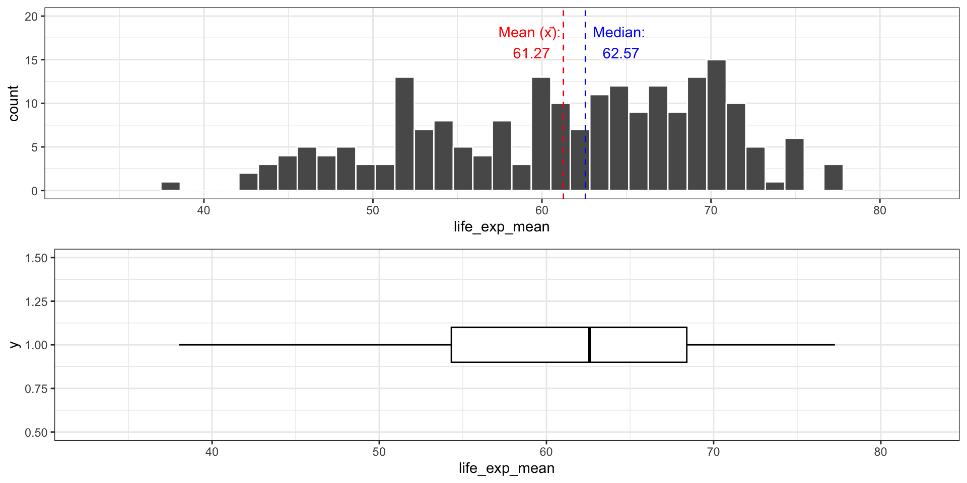
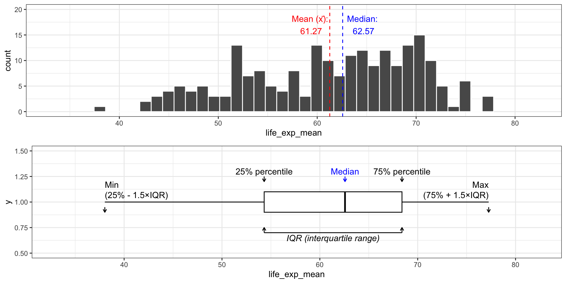
Another way to do this is through a boxplot
Mapping the Measures of Central Tendency
Central Tendency: Median and Boxplot
Another way to do this is through a boxplot
Measures of Dispersion
Common Measures
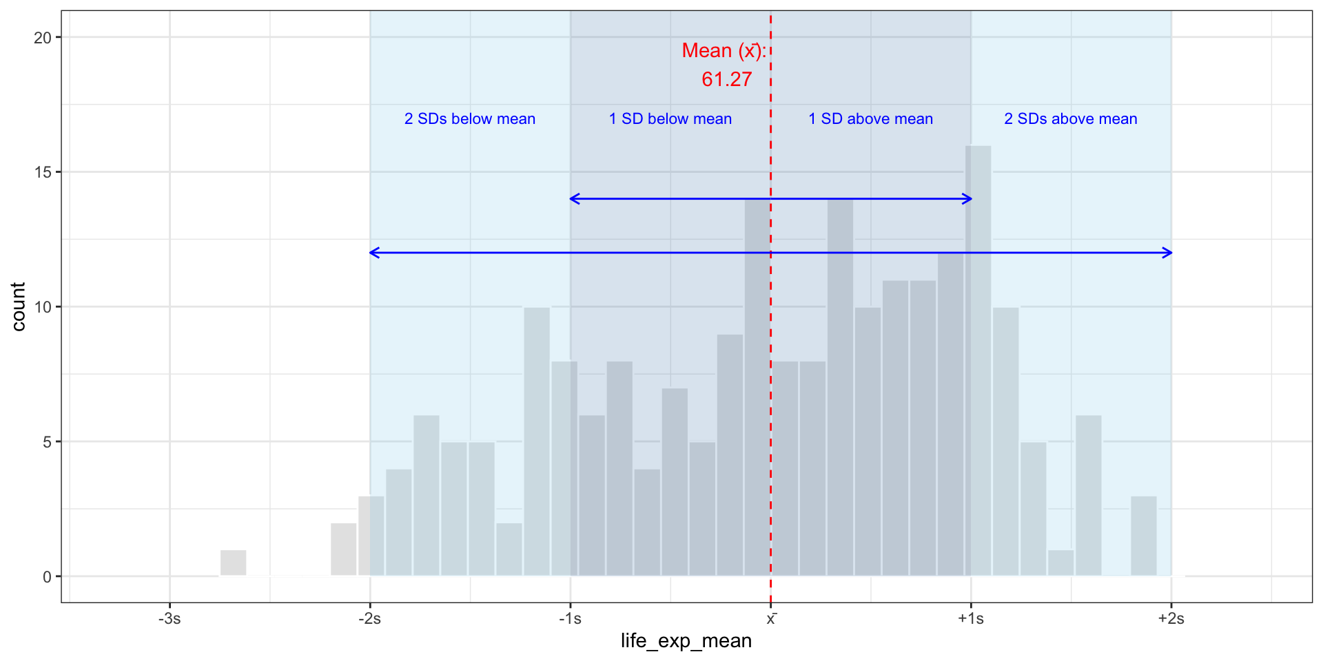
- Standard Deviation:
\[s = \sqrt{s^2}\] (Gives average distance from the mean)
Mapping the Measures of Dispersion
Standard Deviation
Mapping the Measures of Dispersion
Standard Deviation
This is how we create the graph.
median_label <- paste("Median:\n", round(life_exp_median, 2))
y_coord<-17
# Histogram with SD-based axis
fig5_b <- ggplot(data = merged_data2, aes(x = life_exp_mean)) +
  geom_histogram(bins = 35, col = "white") +
  geom_vline(xintercept = life_exp_mean, linetype = "dashed", color = "red") +
#  geom_vline(xintercept = median(life_expectancy_df$Life.expectancy.at.birth..historical., na.rm = TRUE), linetype = "dashed", color = "blue") +
  annotate("text", x = life_exp_mean - 2, y = y_coord, label = mean_label, color = "red") +
#  annotate("text", x = life_exp_median + 2, y = y_coord, label = median_label, color = "blue") +
  scale_x_continuous(breaks = sigma_breaks, labels = sigma_labels) +
  theme_bw()+
    coord_cartesian(xlim = c(min(merged_data2$life_exp_mean)-5,
                    max(merged_data2$life_exp_mean)+5),
           ylim = c(0, 20))

fig5_b
Mapping the Measures of Dispersion
Standard Deviation
This is how we can visualize the standard deviations.
Conclusion
Histograms show the shape of a continuous variable’s distribution
Bar plots visualize frequencies of discrete or grouped values
Mean and median describe central tendency
A big gap between them often signals skew
Standard deviation shows how spread out the values are
Popescu (JCU): Visualizing Data Distributions in R