Dplyr and Basic Visualization
Merging Data, Scatterplots
Background
Dplyr and Basic Visualization
Today, we’ll learn how to:
- Load and inspect real-world datasets
- Clean and prepare data for analysis
- Use
dplyrto group and summarize values - Join datasets using a common key
- Create and customize scatterplots using
ggplot2
Using R
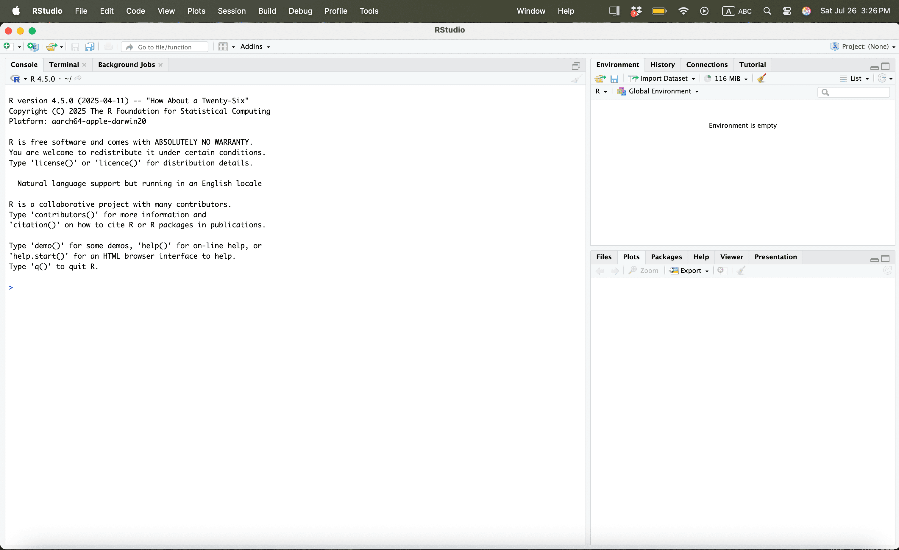
Using R
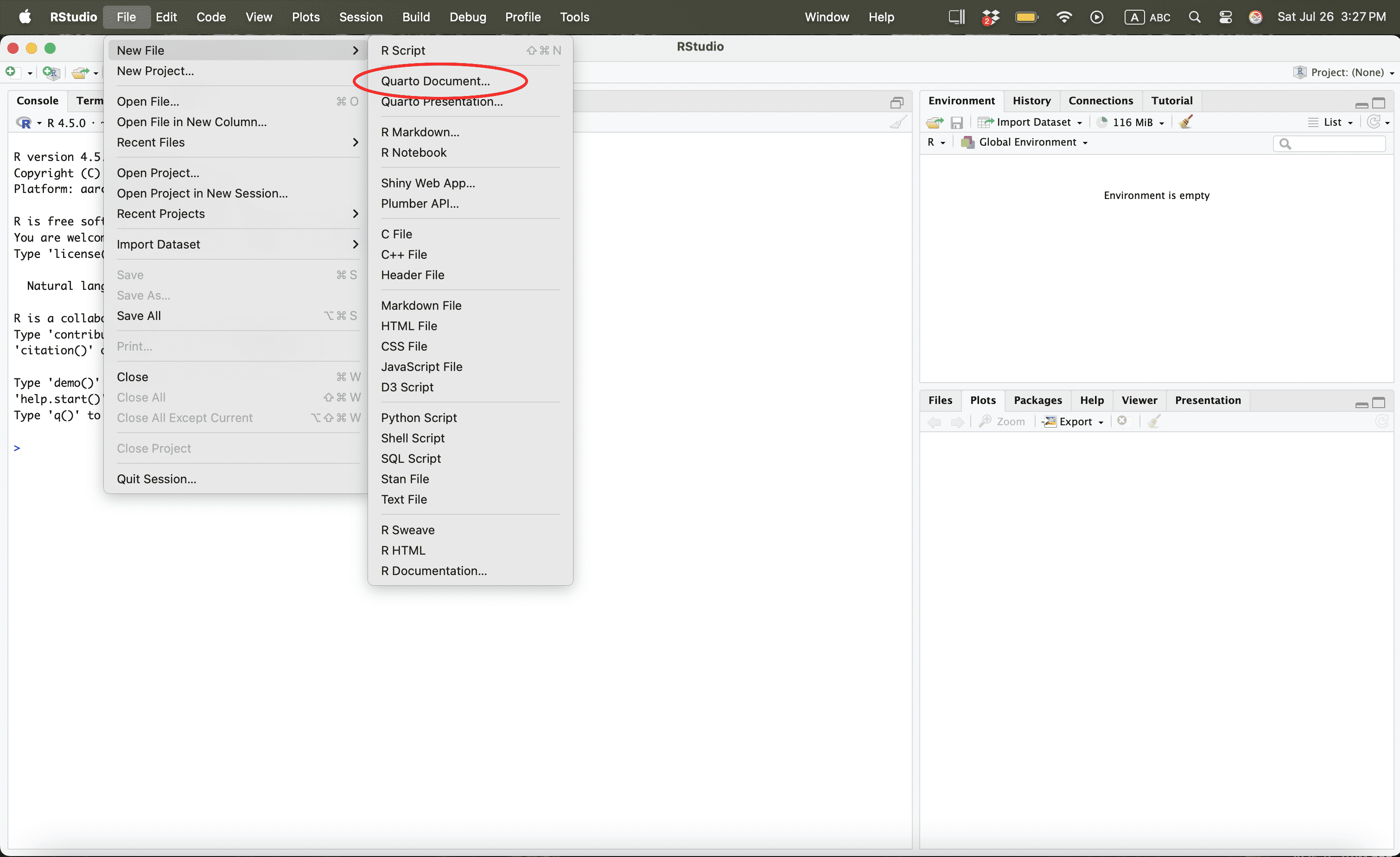
Using R
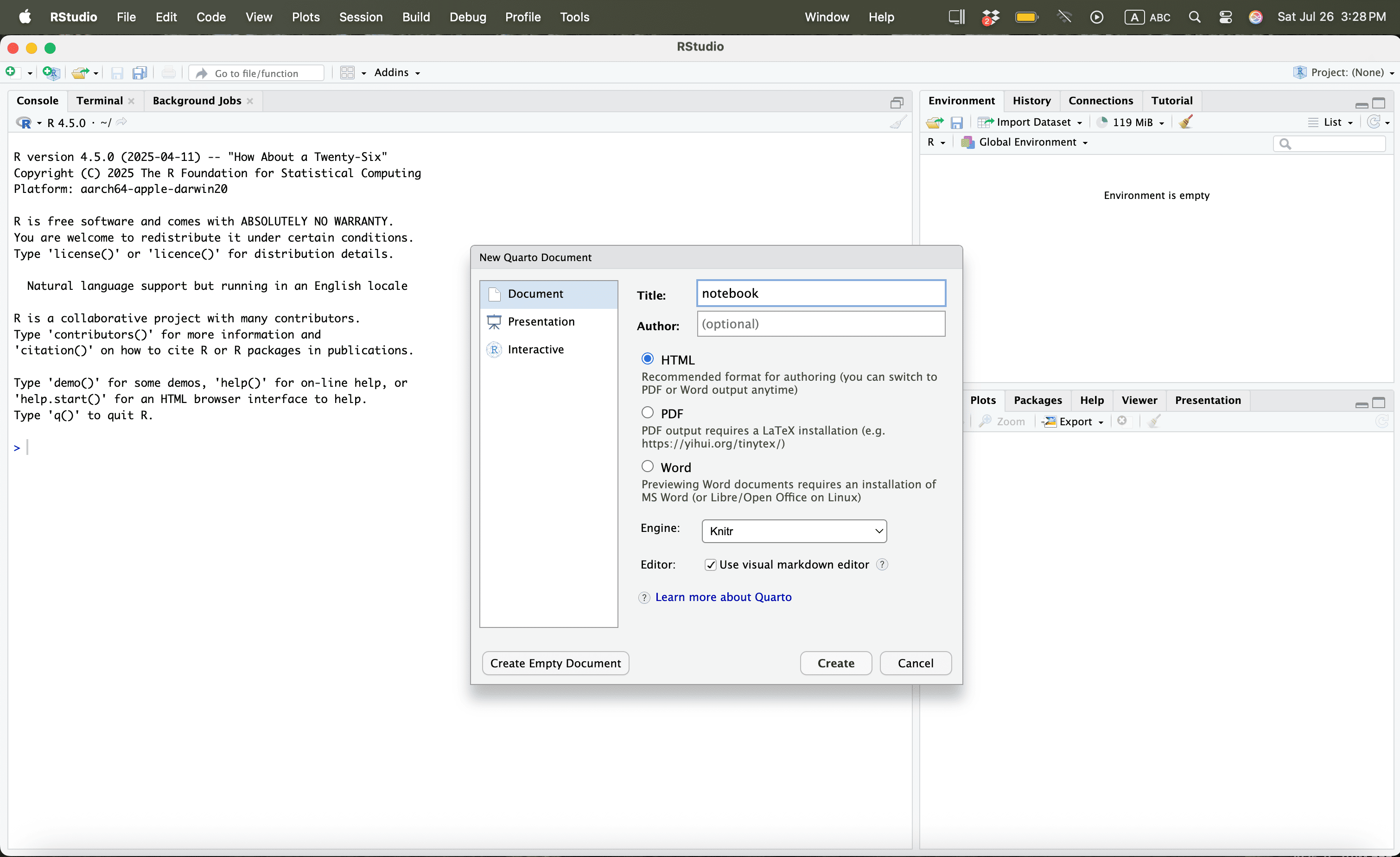
Using R
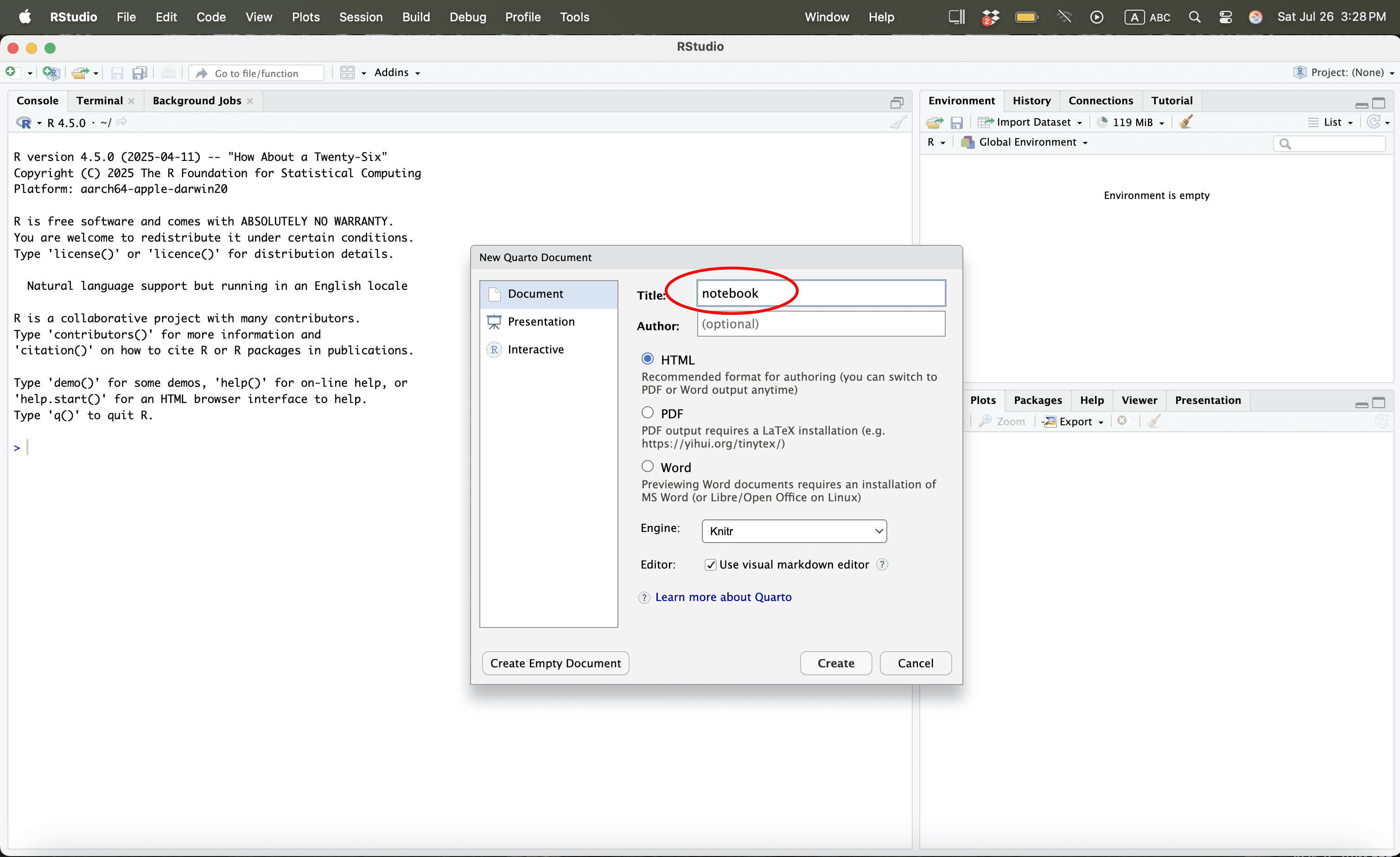
Using R
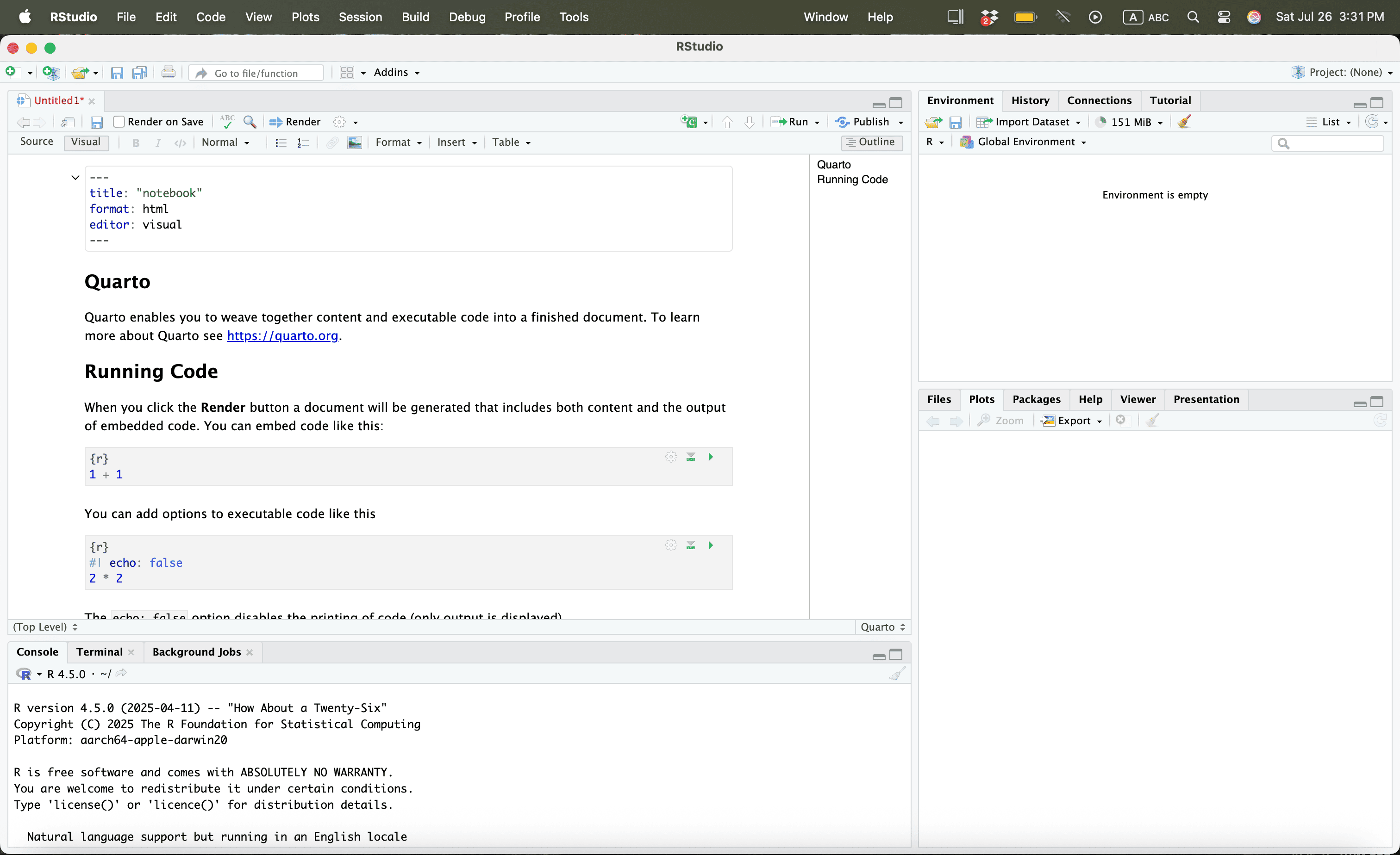
Using R
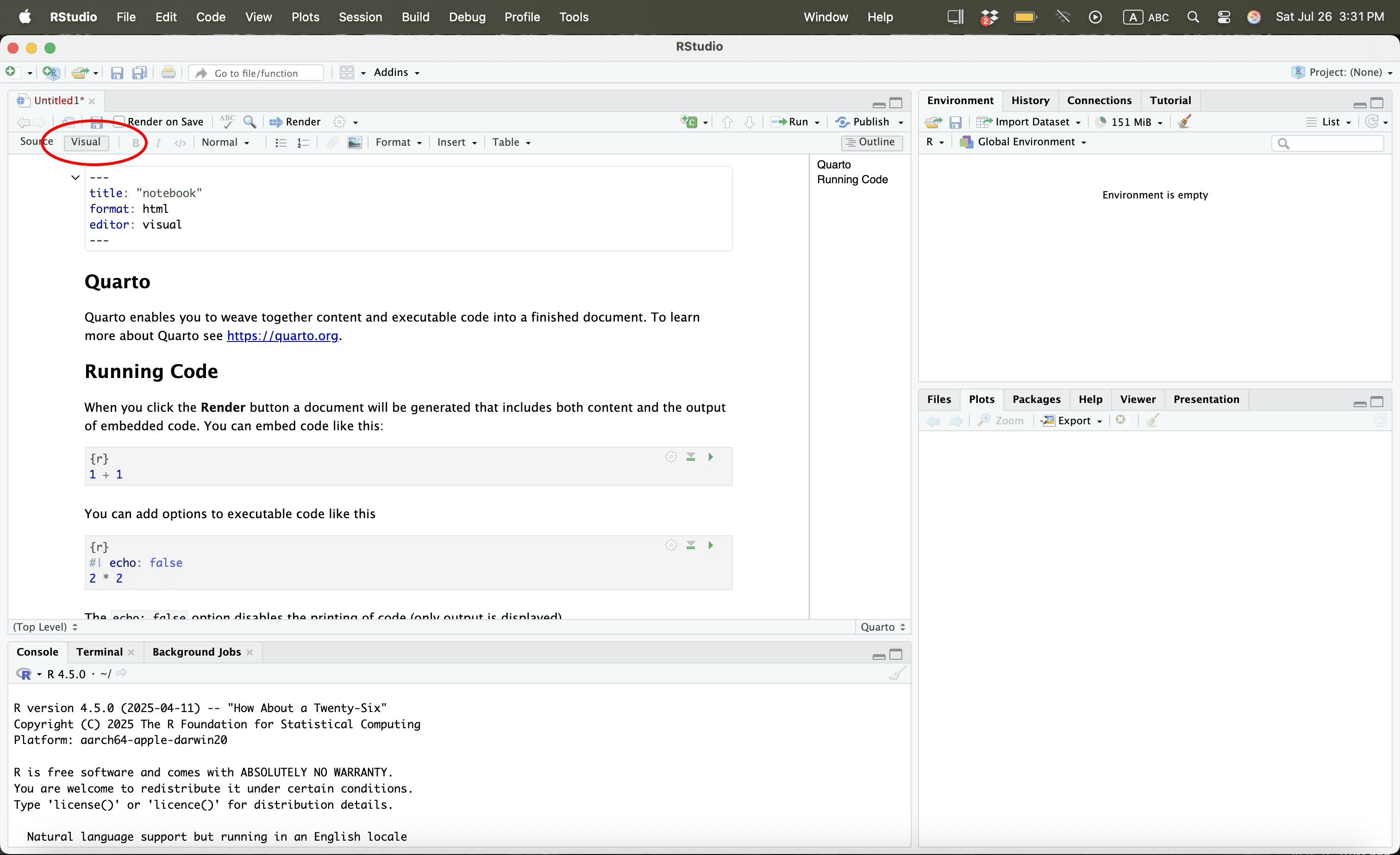
Using R
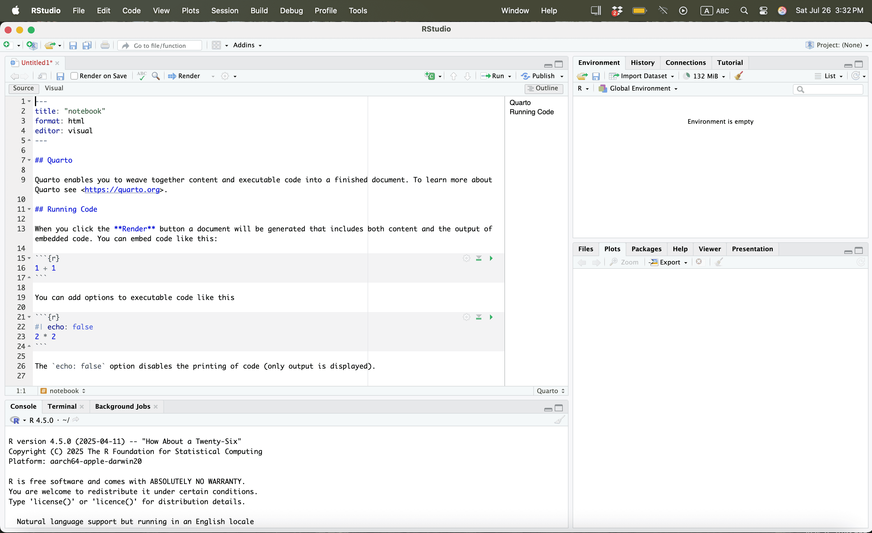
Using R
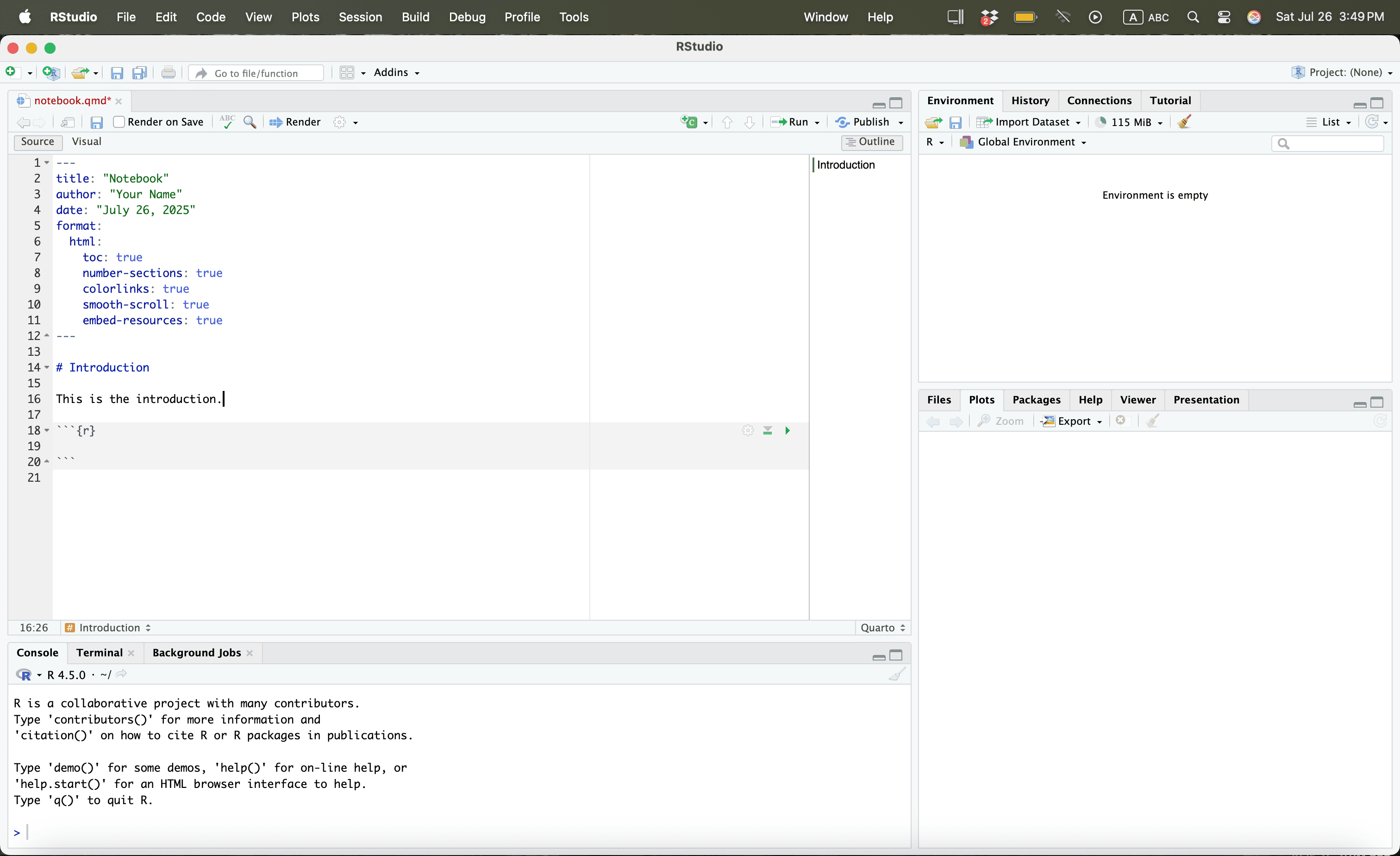
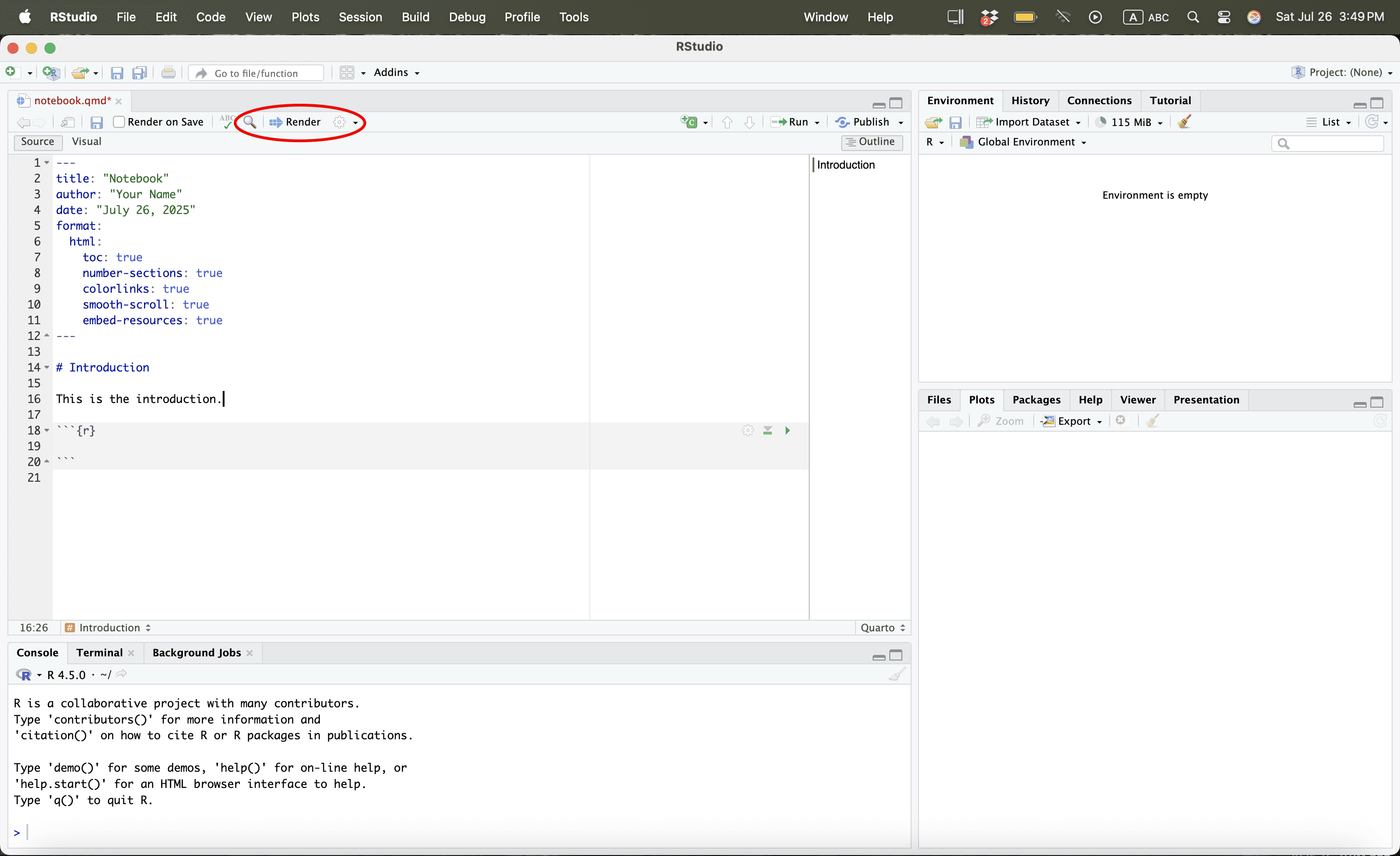
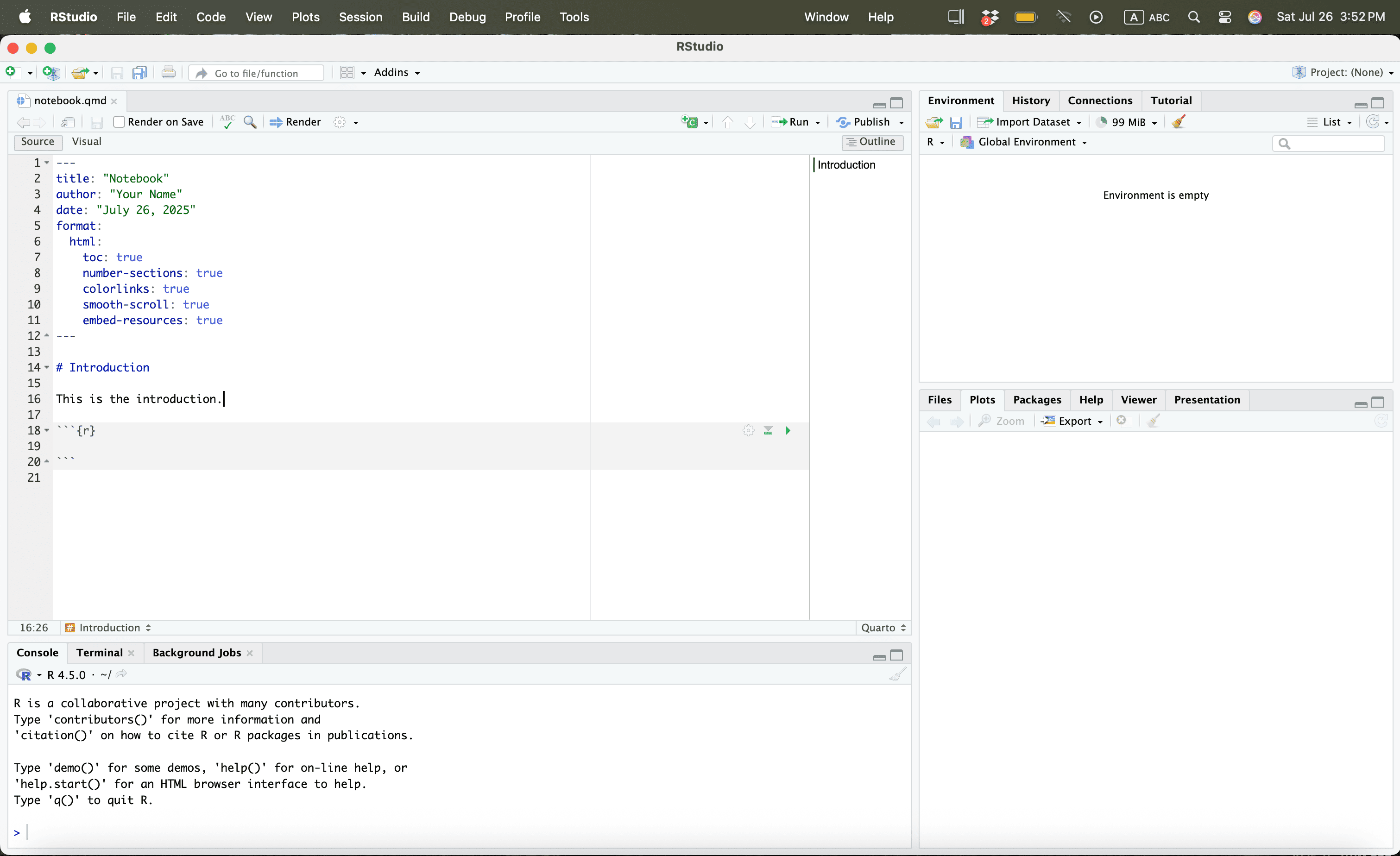
Press CMD + A or Ctrl + A and then Press Delete
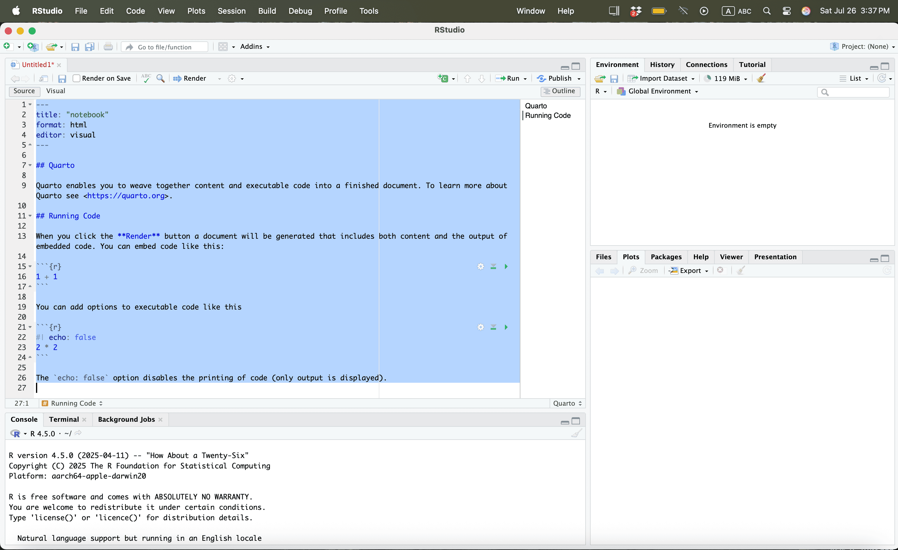
Using R
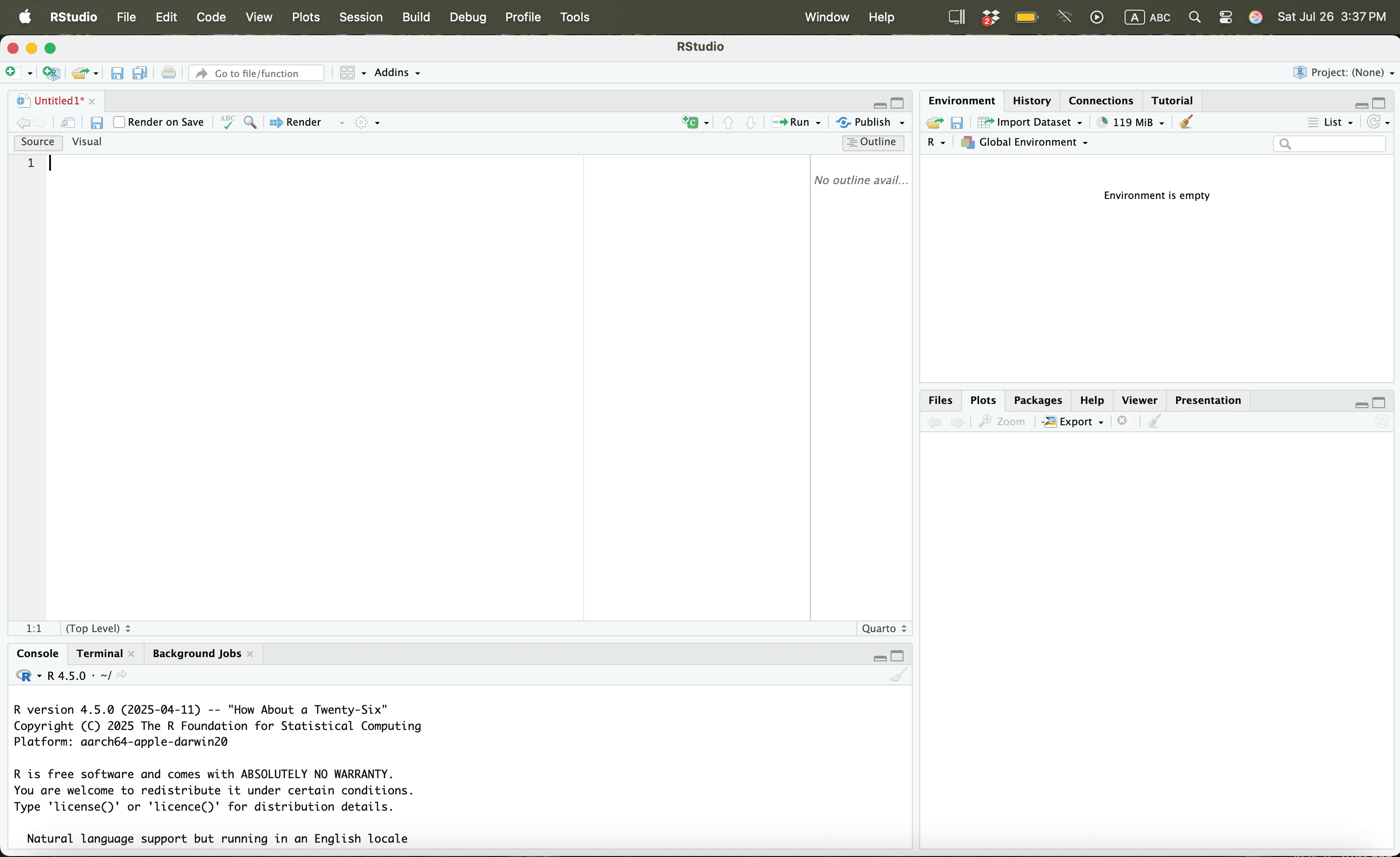
Using R
Then type:
Using R

Using R
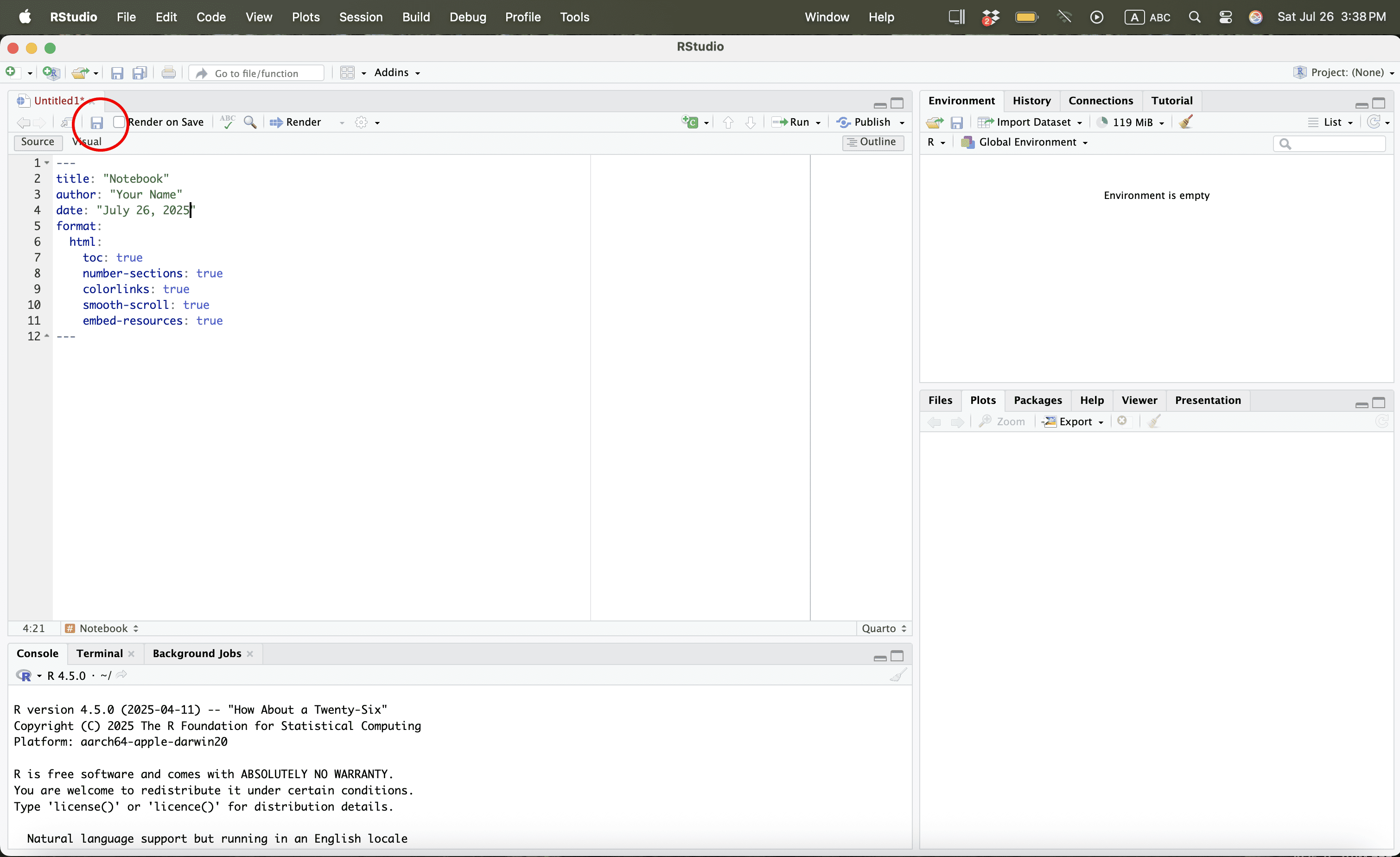
Using R
Using R
Using R
Using R
Using R
Using R

Using R

Using R
Using R
Using R
Using R
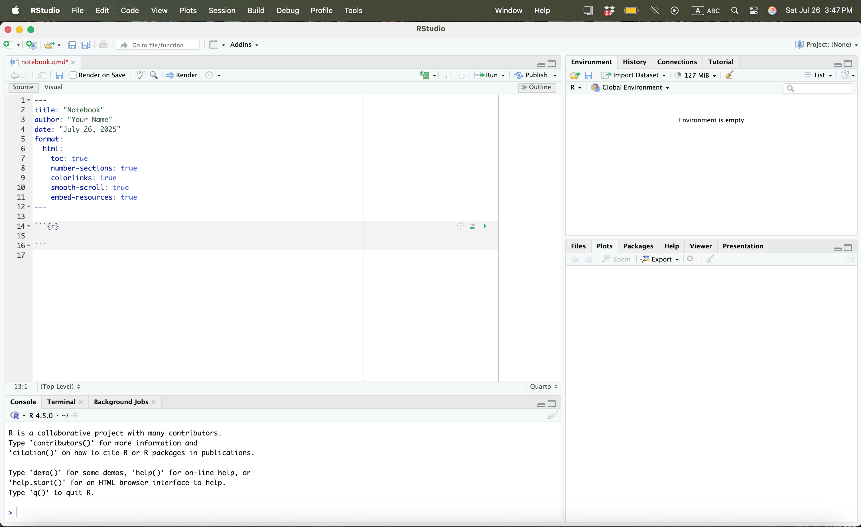
Using R
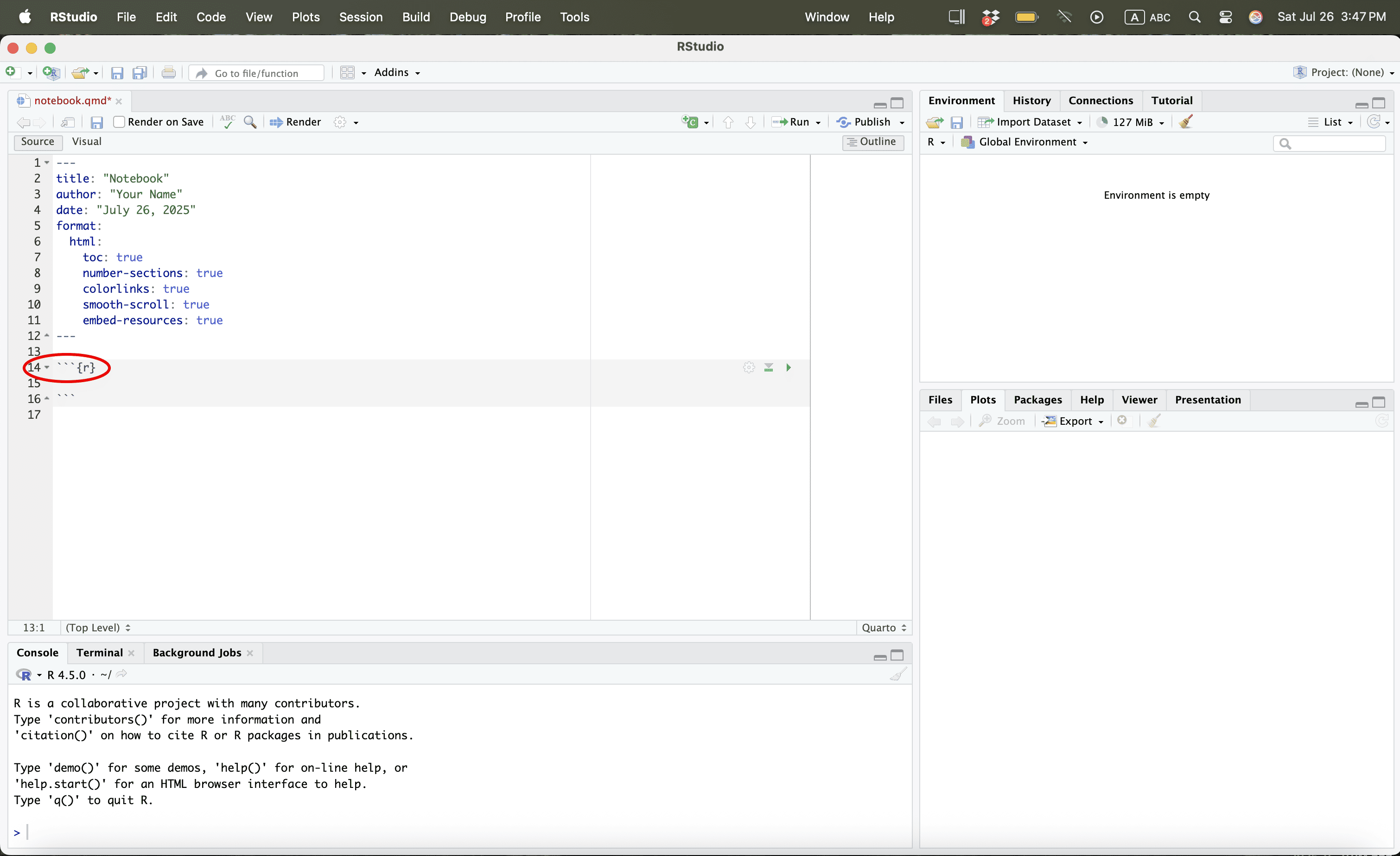
Using R
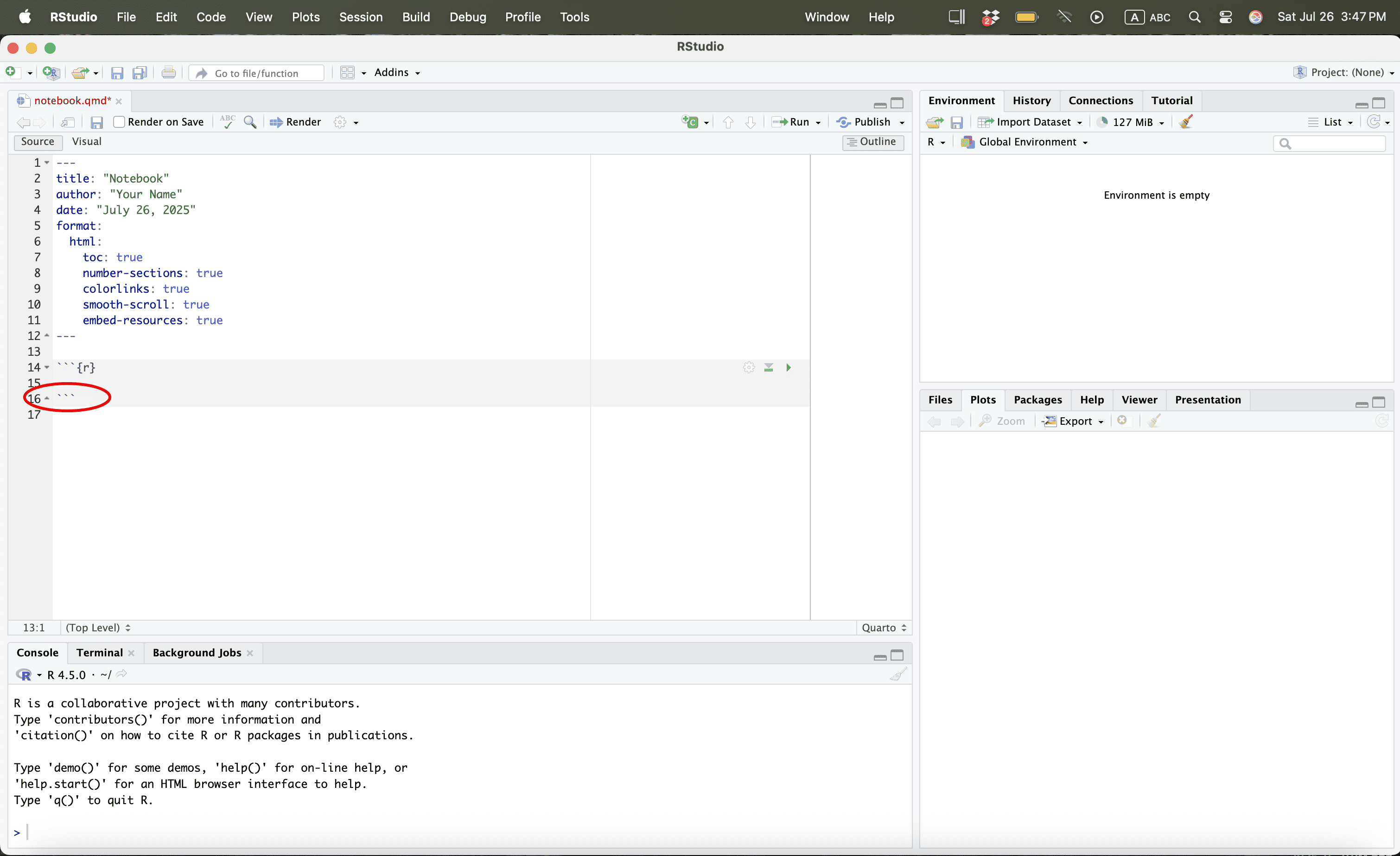
Using R
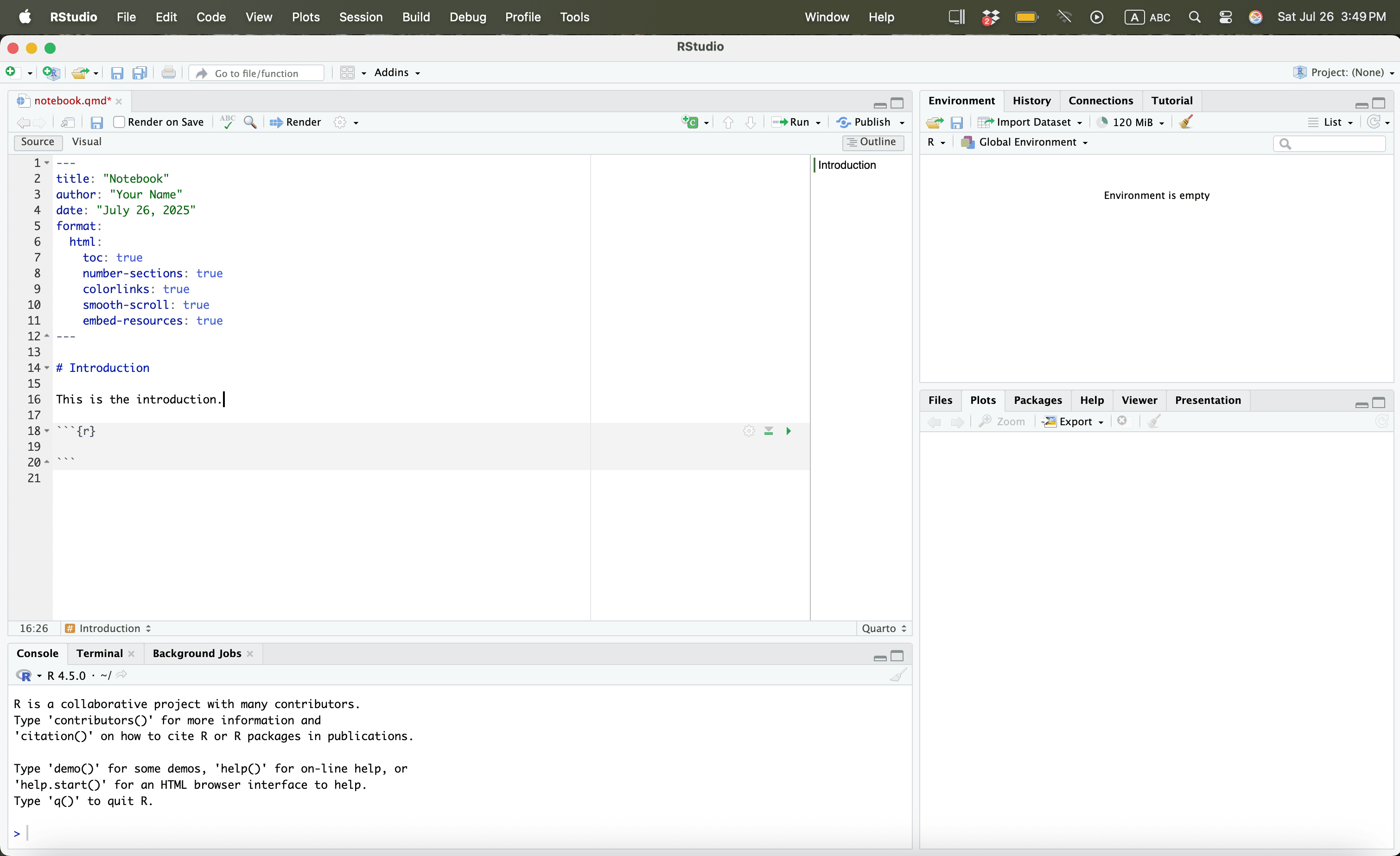
Using R
Using R
Using R
Using R
Using R
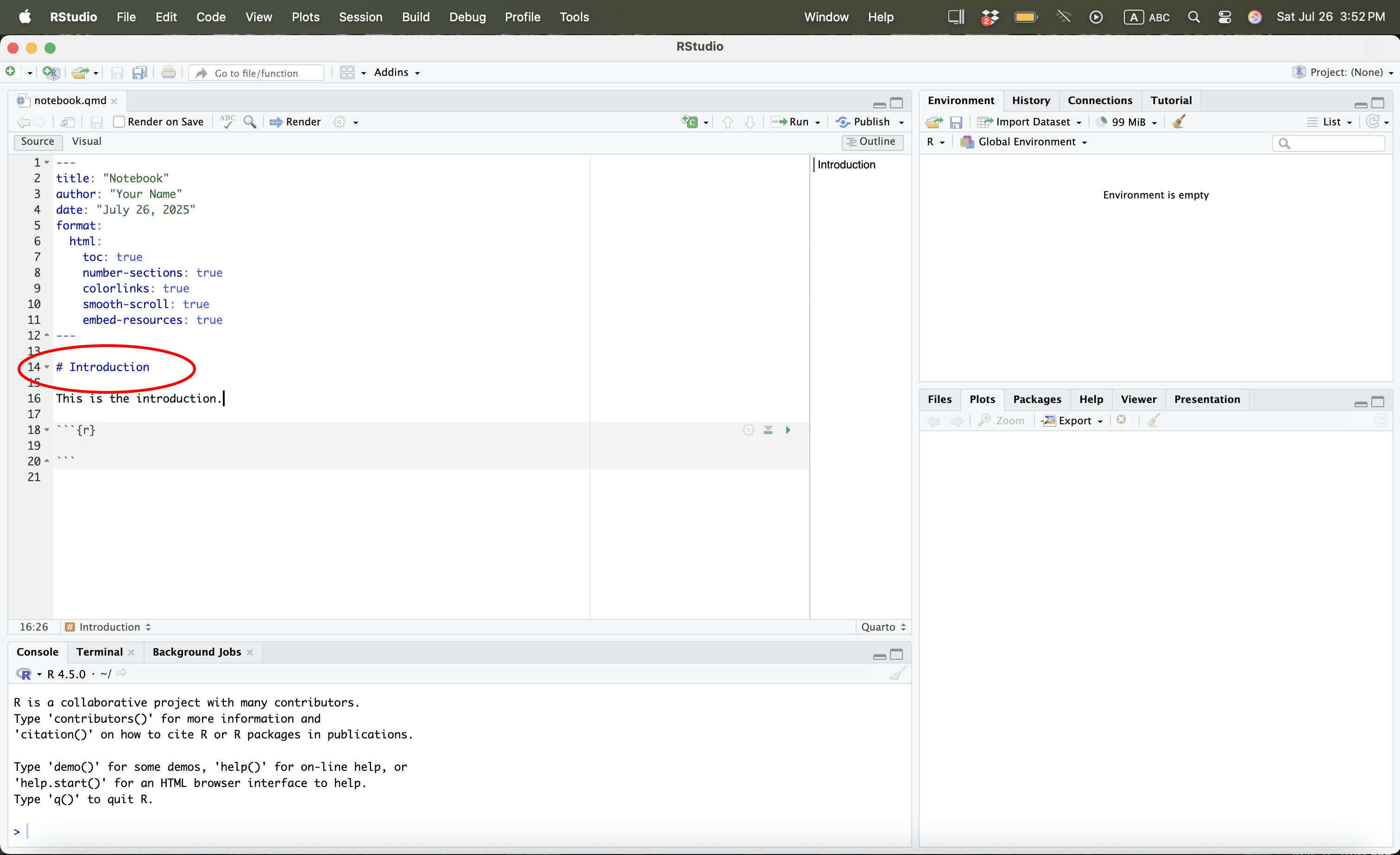
Using R
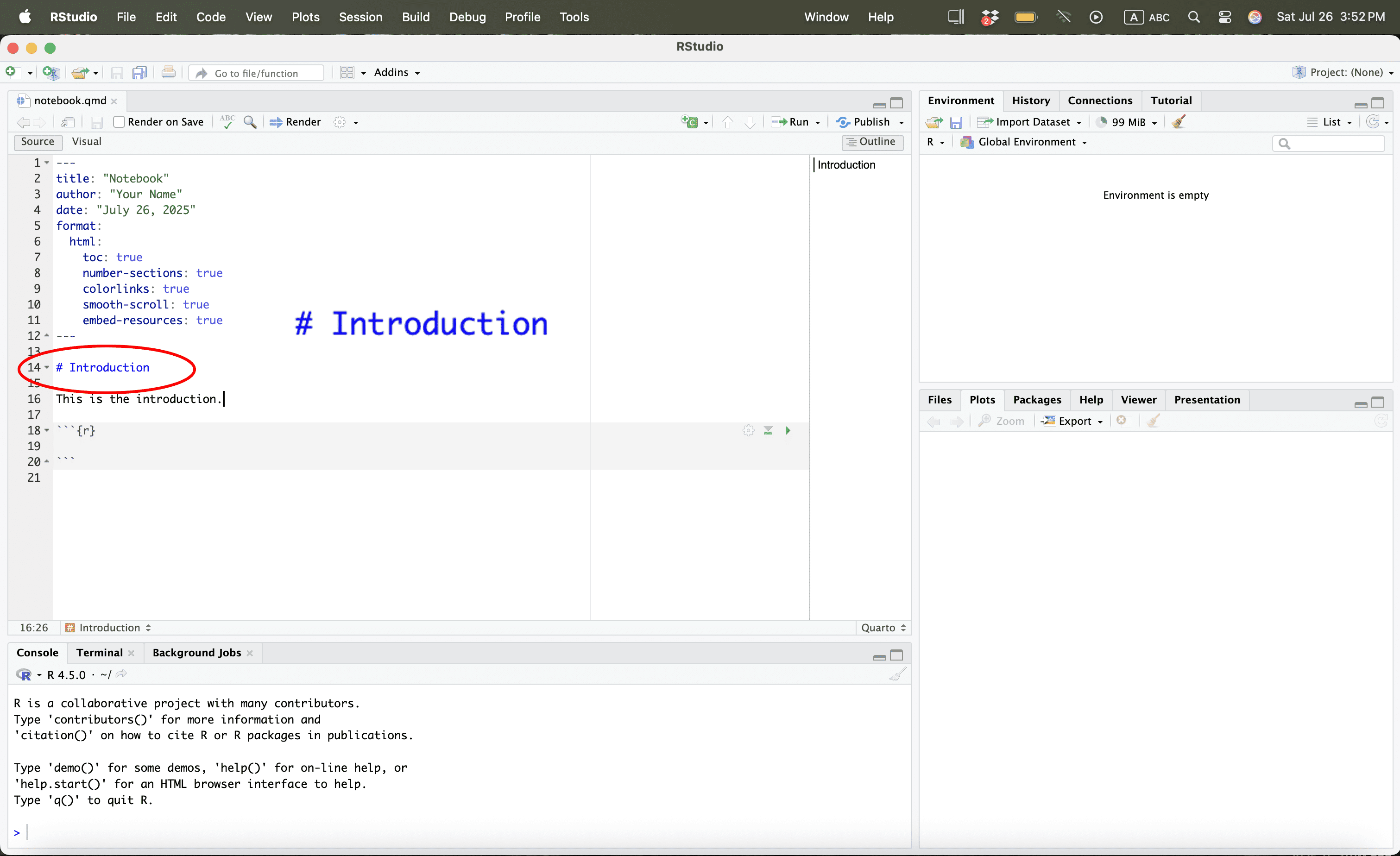
Using R
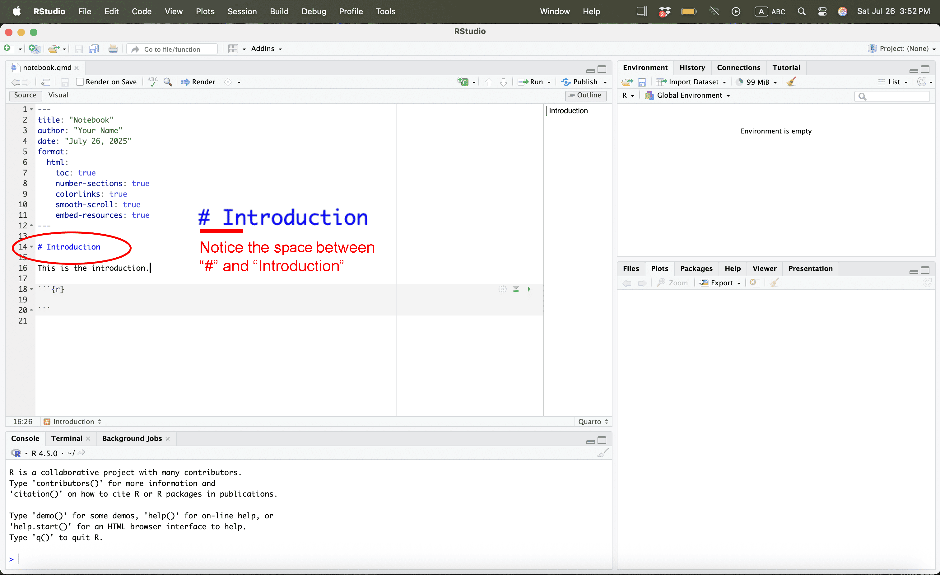
Opening the File
We first remove what we had previously
Opening a File
Download the following datasets from Dropbox:
Place them in your working directory or folder.
Opening the File
To get the file path we simply go to the relevant folder
Opening the File
Once we have the path, we can now read the files:
# Defining Paths
file_path <- "/Users/bgpopescu/Library/CloudStorage/Dropbox/john_cabot/teaching/research_workshop/lecture7/data/"
# Use file.path() to construct full path
life_expectancy_df <- read.csv(file.path(file_path, "life-expectancy.csv"))
urbanization_df <- read.csv(file.path(file_path, "share-of-population-urban.csv"))
What We Want to Do
Explanation
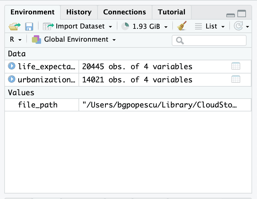
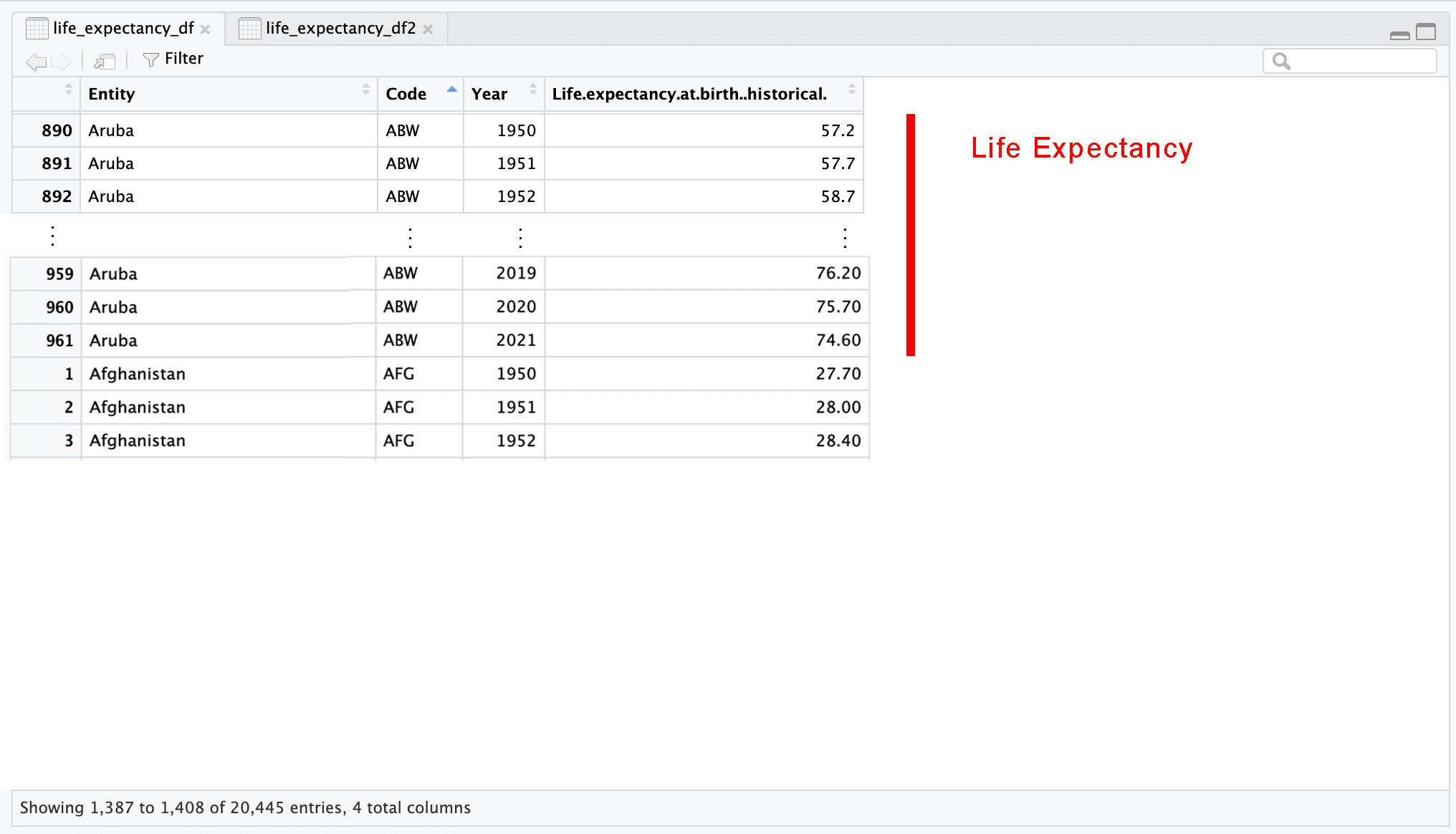
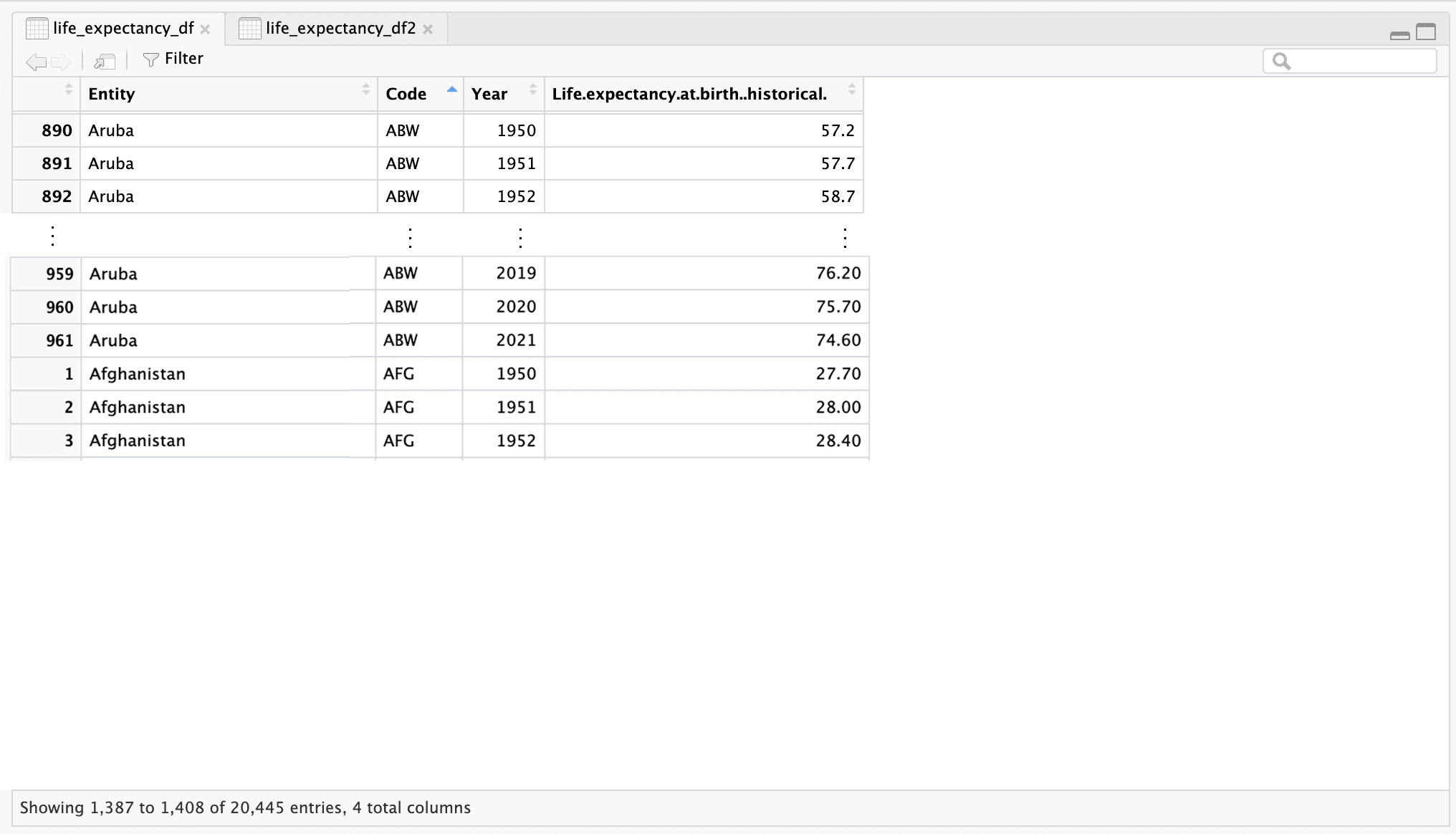
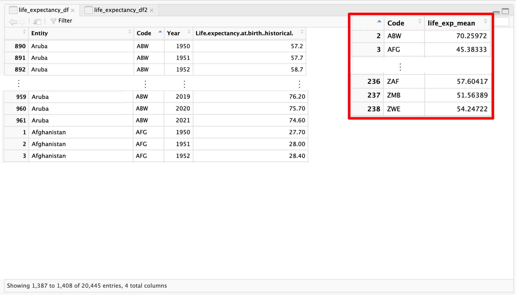
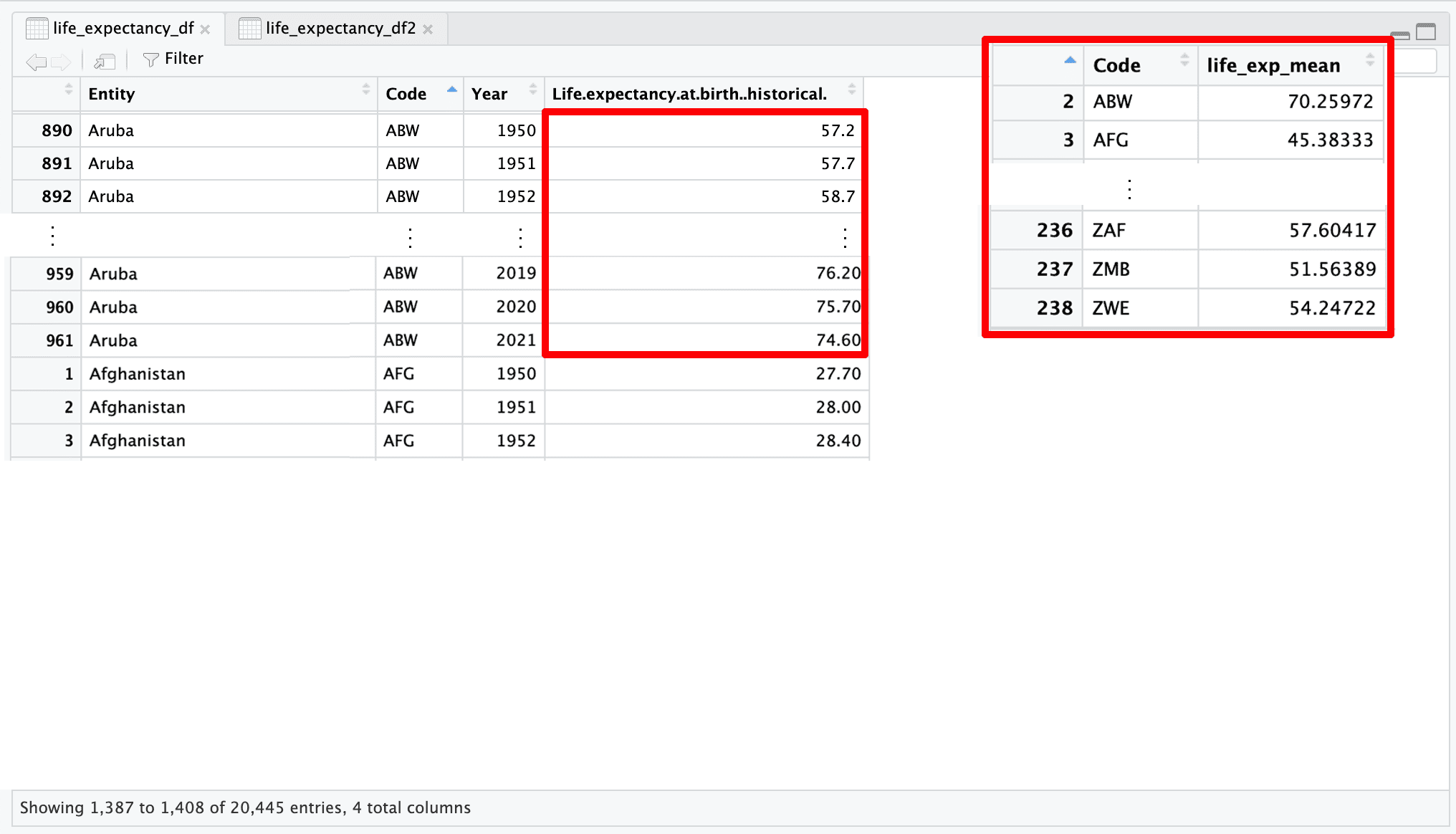
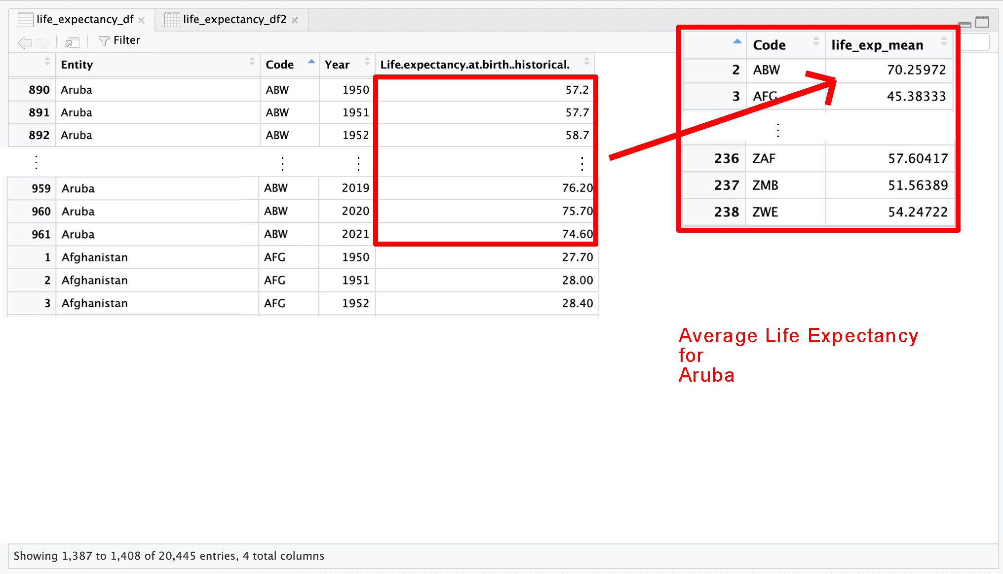
These are our datasets
Measures of Central Tendency
- When we collect data, we often want to summarize it with a single number.
- Measures of central tendency tell us what a “typical” or “central” value looks like.
What Are Measures of Central Tendency?
- Mean: the arithmetic average
- Median: the middle value
- (and also the mode: the most frequent value — used less often in quantitative analysis)
What We Want to Do
Explanation
These are our datasets

What We Want to Do
Explanation
These are our datasets
What We Want to Do
Explanation
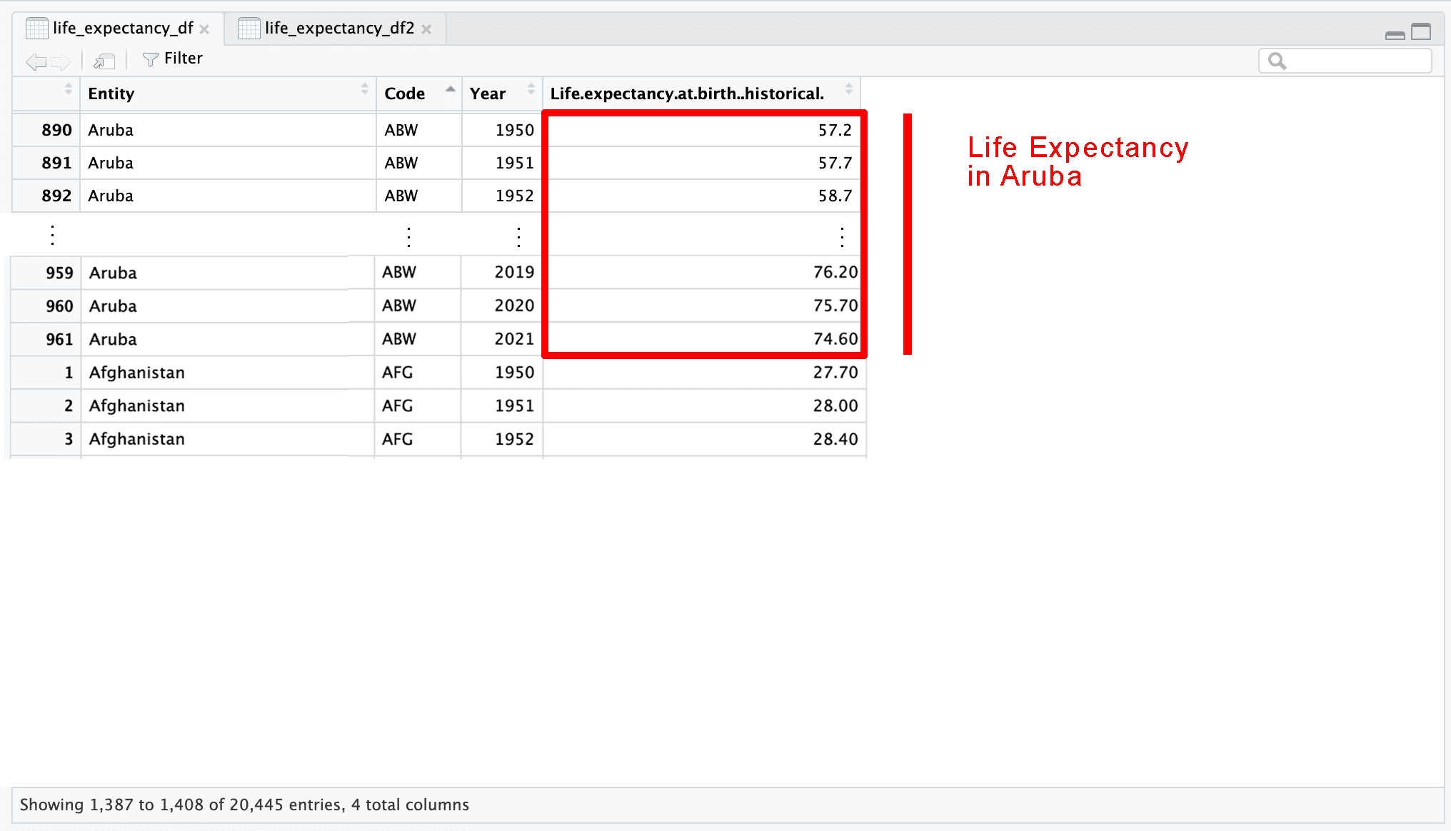
These are our datasets
What We Want to Do
Explanation
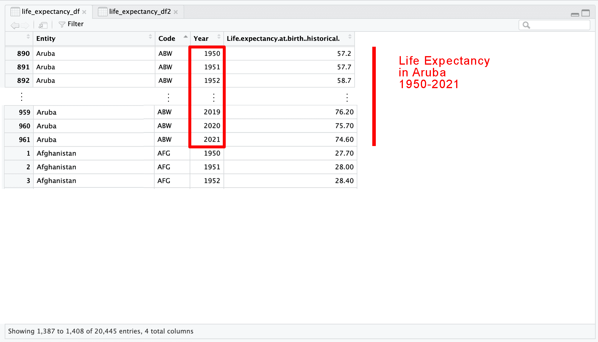
These are our datasets
What We Want to Do
Explanation
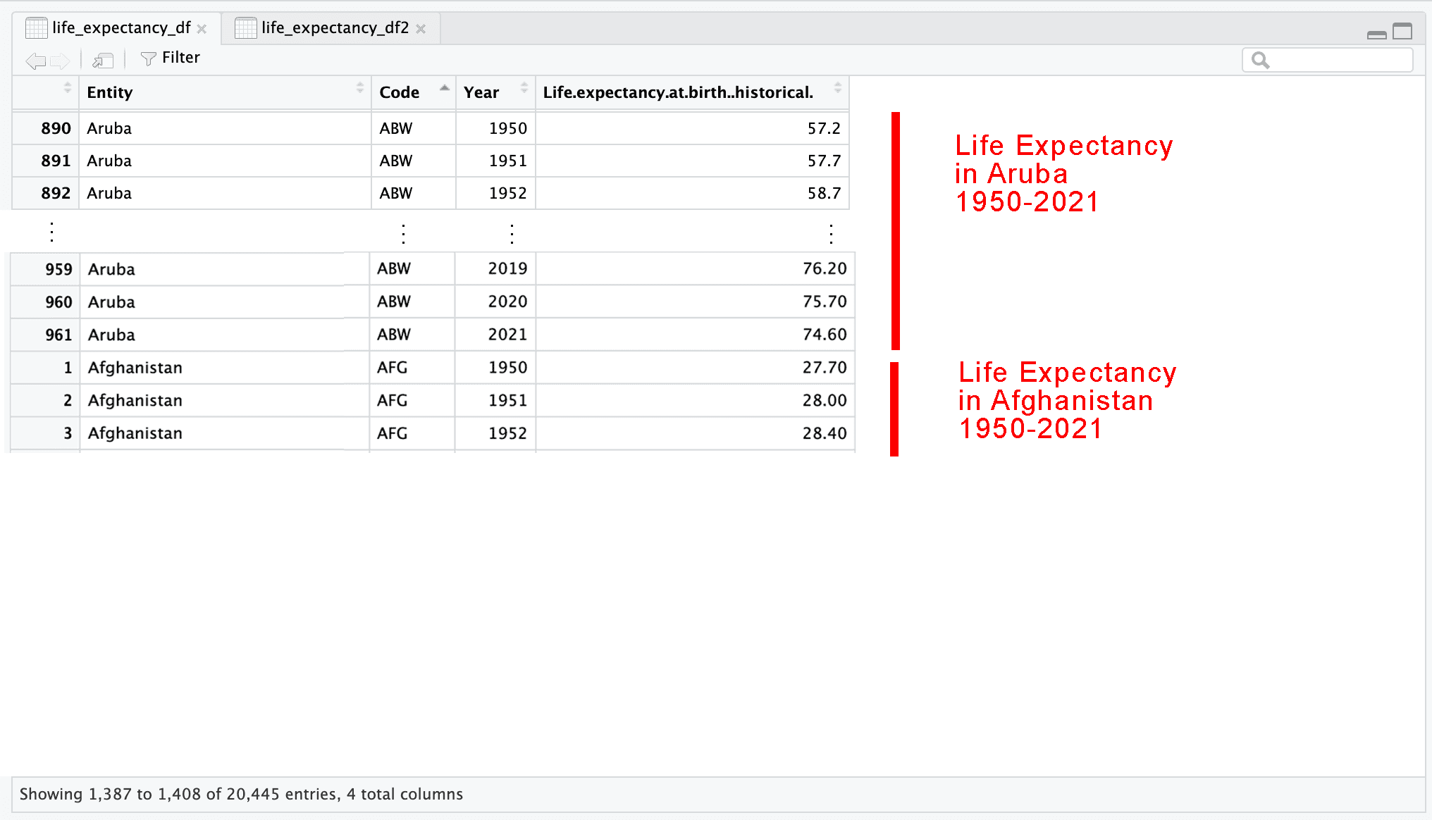
These are our datasets
What We Want to Do
Explanation
These are our datasets
What We Want to Do
Explanation
These are our datasets
What We Want to Do
Explanation
These are our datasets
What We Want to Do
Explanation
These are our datasets
What We Want to Do
Explanation
These are our datasets
What We Want to Do
Explanation
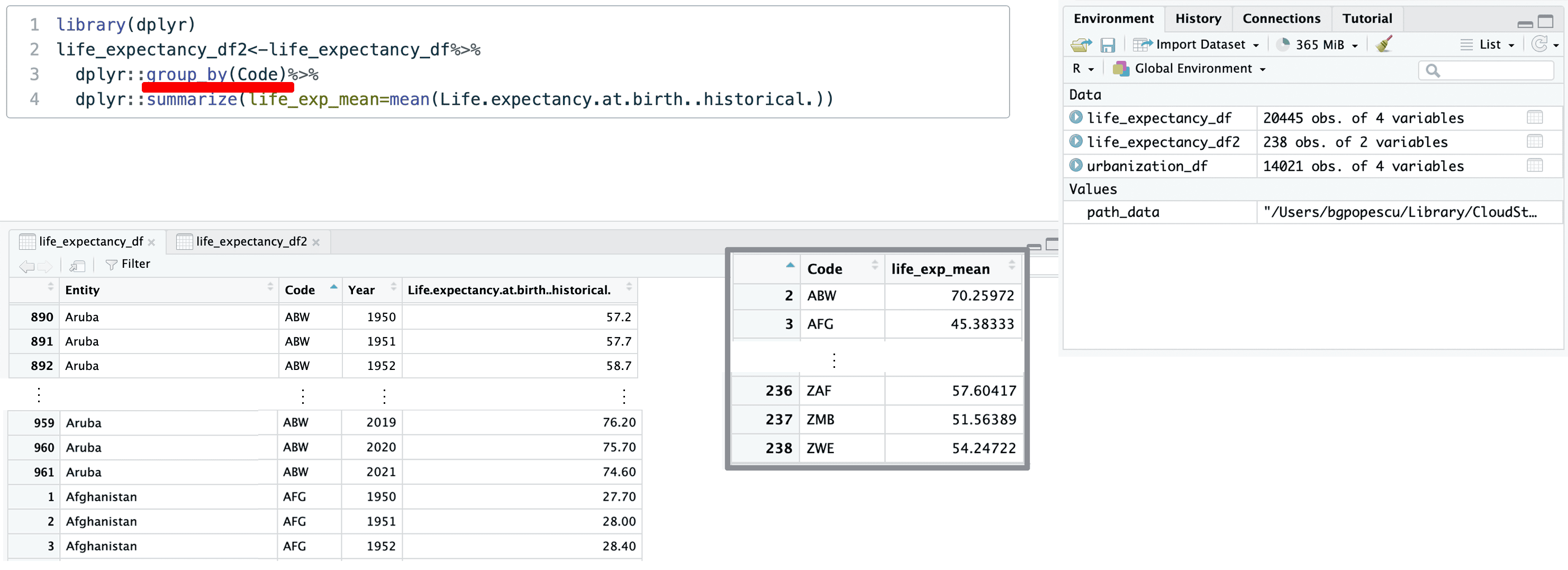
This is what this looks like in code:
Note that %>% is called a pipe operator.
It allows you you “pipe” an object forward to a function.
You may also sometimes encounter the |> sign.
It has the same role.
What We Want to Do
Explanation
You could also write:
instead of:
The reason for including dplyr:: is because other libraries have functions like group_by.
Not including the library name can lead to unexpected behavior.
What We Want to Do
Explanation
Finally, we can also write this, if we have NAs:
This allows us to ignore the NA values that might exist within a variable.
For simplicity, we will not include the na.rm=TRUE code.
What We Want to Do
Explanation
What We Want to Do
Explanation
What We Want to Do
Explanation
What We Want to Do
Explanation
What We Want to Do
Explanation
What We Want to Do
Explanation
What We Want to Do
Explanation
What We Want to Do
Explanation
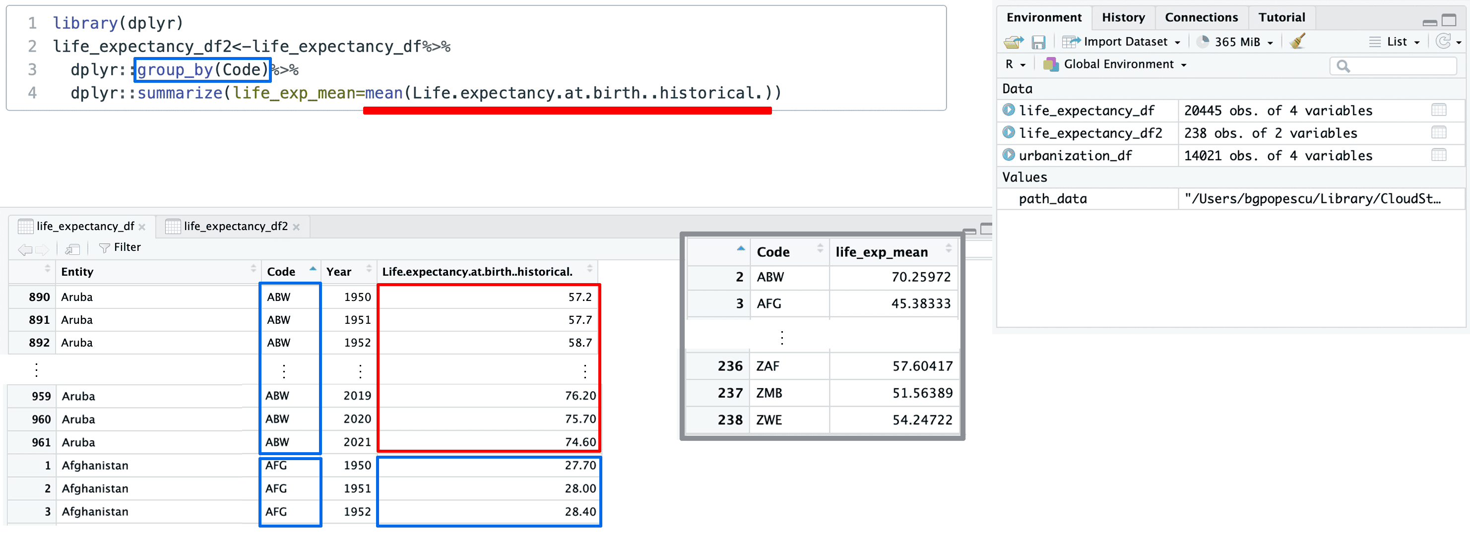
What We Want to Do
Explanation
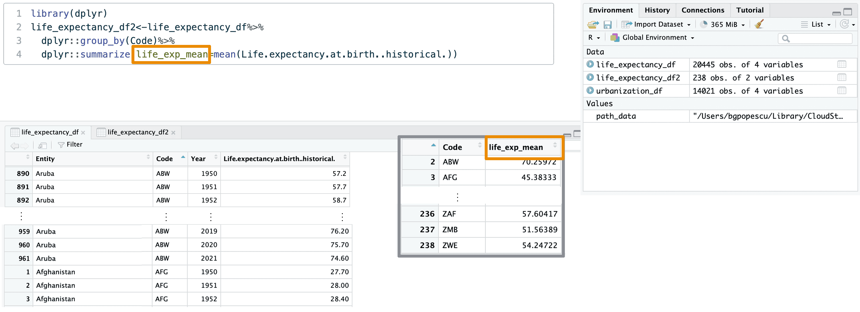
Calculating Mean
- The mean describes the average value of a variable.
- It is calculated as:
\[ \bar{x} = \frac{x_1 + x_2 + \dots + x_n}{n} = \frac{\sum x_i}{n} \]
- The mean uses all values in the dataset or in a group
- Note: \(\sum x_i\) is the sigma summation notation
Calculating Mean
Not resistant to outliers
- Extreme values can pull the mean up or down
- Example:
Dataset = [10, 11, 12, 13, 100]
Mean = 29.2 (misleading!)
- Great for symmetric distributions, less reliable for skewed ones
- One extreme value (100) drastically raises the mean, even though most values are in the low teens.
Calculating Mean
In your case, we can calculate the mean for all the values in life expectancy
Central Tendency: Median
- The median is the middle value in a dataset ordered from smallest to largest.
- It splits the dataset into two equal halves.
- If the number of observations is odd:
- Median = middle number
- Example:
Data = [1, 3, 7] → Median = 3
- Median = middle number
- If the number of observations is even:
- Median = average of the two middle values
- Example:
Data = [1, 3, 5, 7] → Median = ( = 4)
- Median = average of the two middle values
Central Tendency: Median
Resistant to outliers:
- Unlike the mean, the median is not pulled by extreme values.
- Example:
Data = [1, 3, 5, 7, 100] →
Median = 5, while Mean = 23.2
Calculating Median
In your case, we can calculate the median for all the values in life expectancy
Measures of Dispersion
Intro
- Central tendency tells us the center of a distribution…
- But what about spread?
Why Dispersion Matters
- Two datasets can have the same mean but very different variability
- Measures of dispersion tell us how spread out the values are
Measures of Dispersion
Common Measures
- Range:
\[\text{Range} = \text{Max} - \text{Min}\]
- Variance:
\[s^2 = \frac{1}{n - 1} \sum_{i=1}^{n} (x_i - \bar{x})^2\]
where:
- \(y_i\) stands for the ith value
- \(\bar{x}\) is the population mean of the variable
- n - is the population size
Measures of Dispersion
Common Measures
- Standard Deviation:
\[s = \sqrt{s^2}\] (Gives average distance from the mean)
Calculating Range
In your case, we can calculate the range for all the values in life expectancy
Calculating Range
Thus, the difference is 74.5.
Calculating Variance
This is how we calculate the variance
This is how we calculate the standard deviation
What We Want to Do
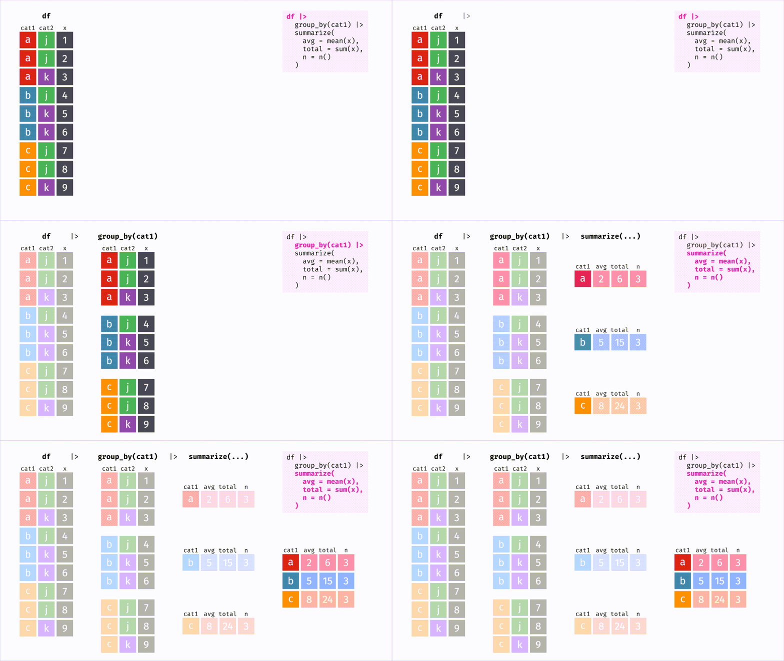
Recap Dplyr Functions: group_by and summarize
Doing it
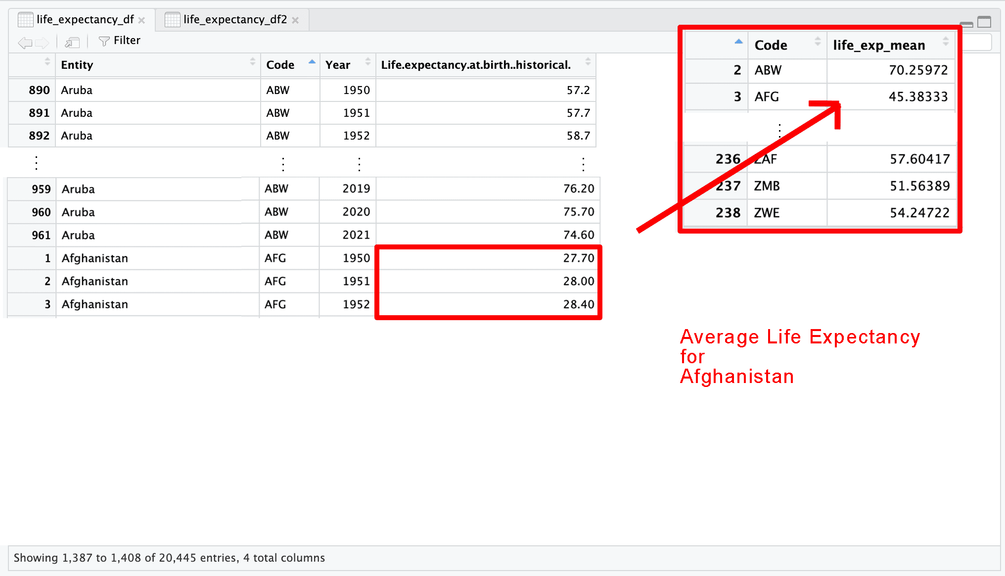
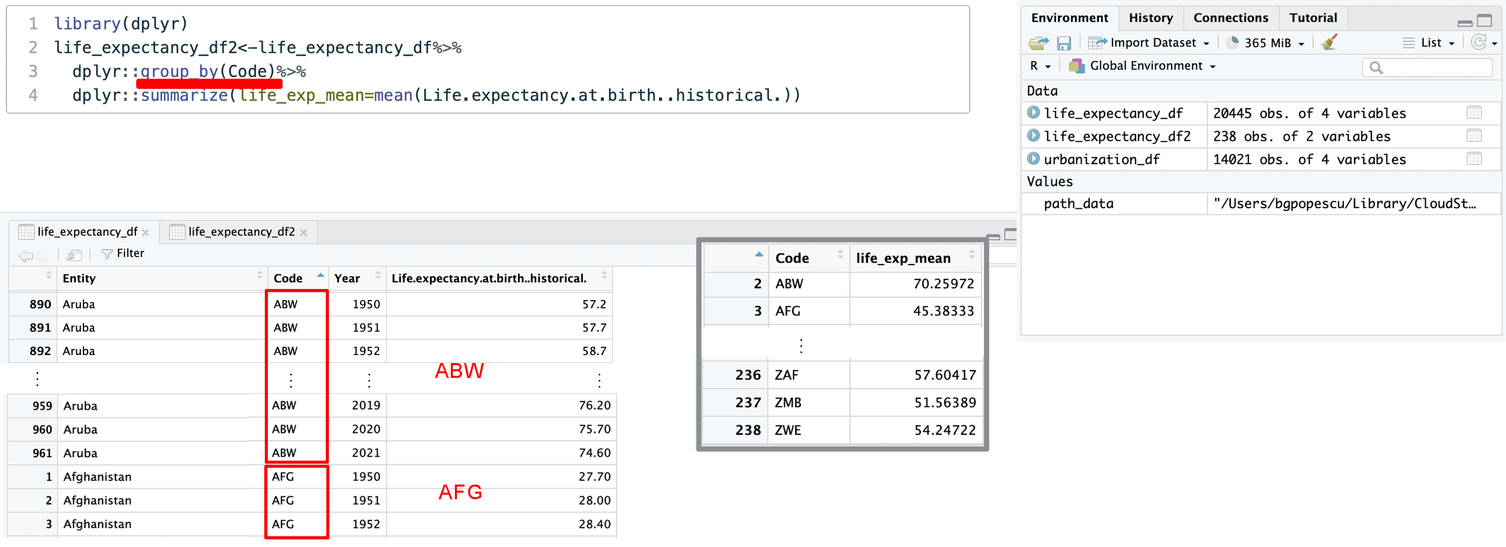
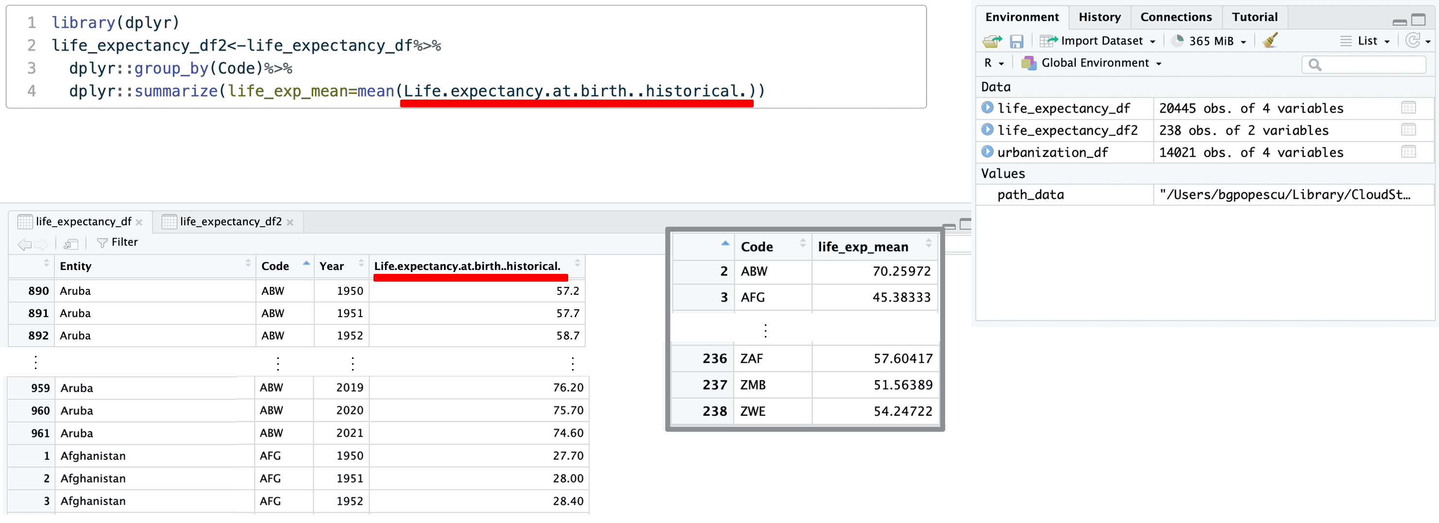
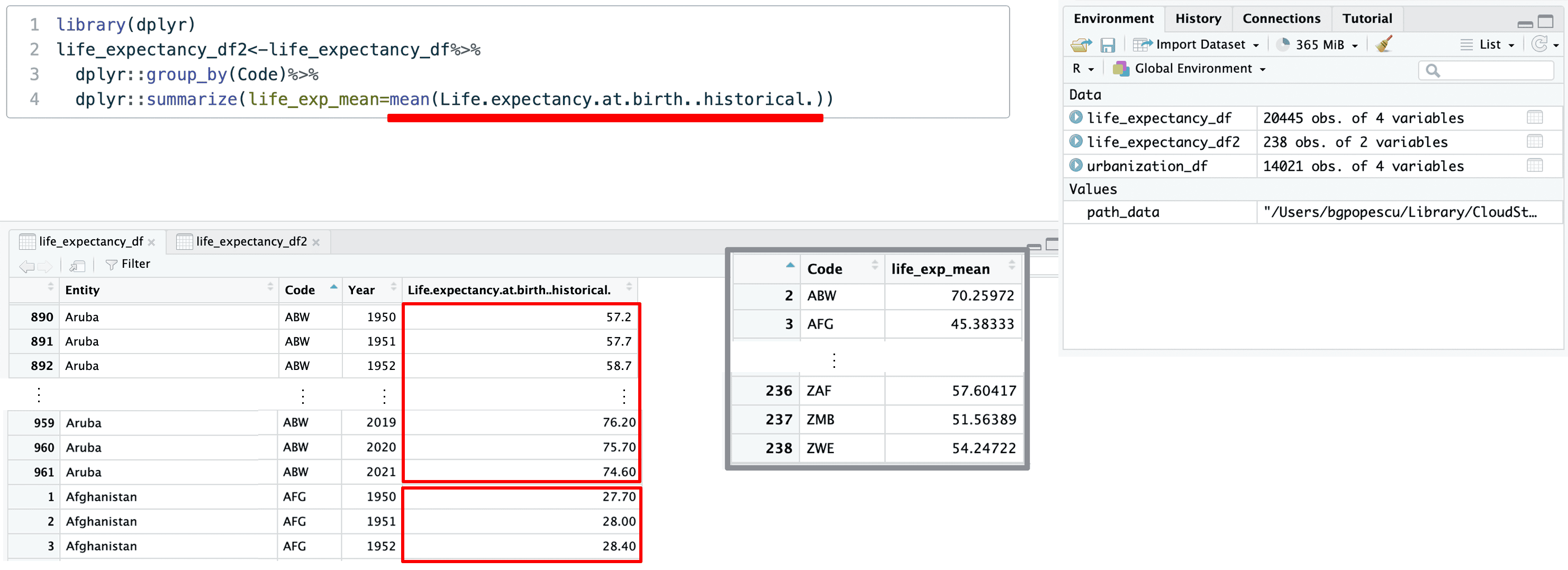
1. Calculating Average by Country Code
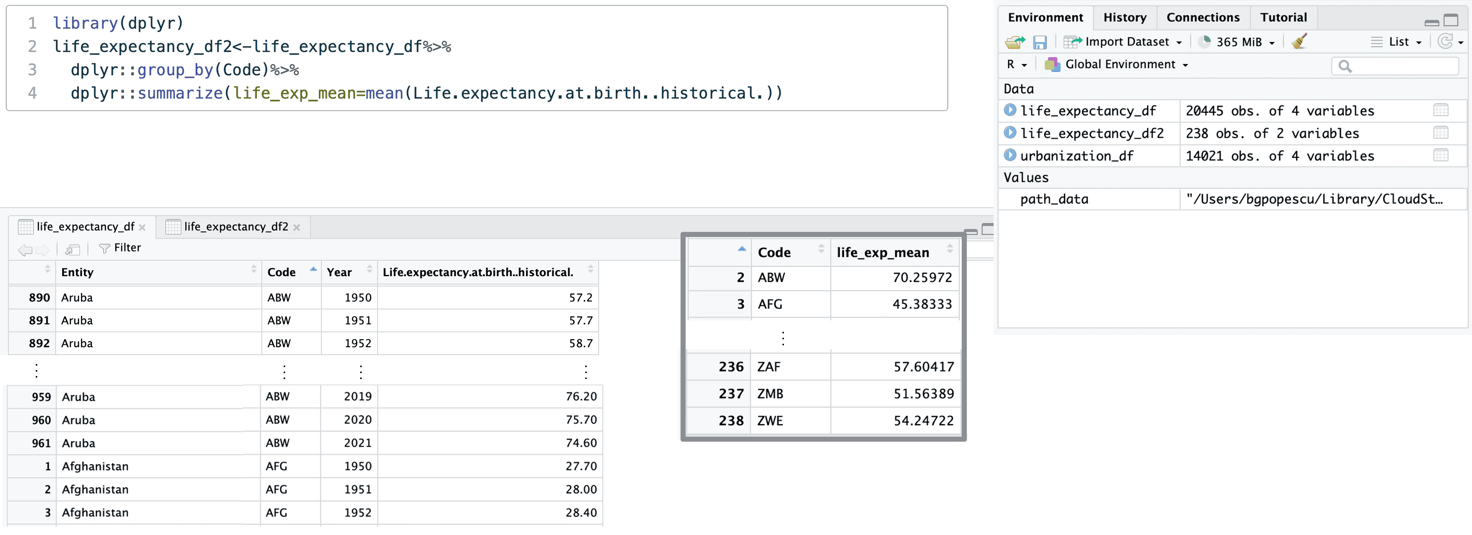
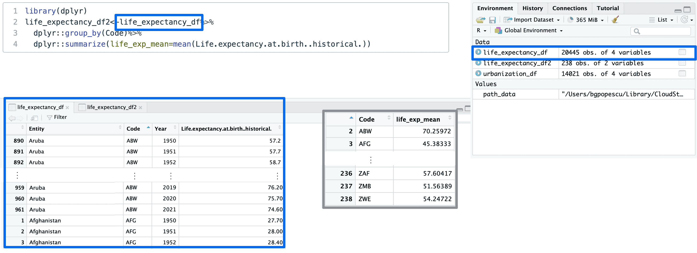
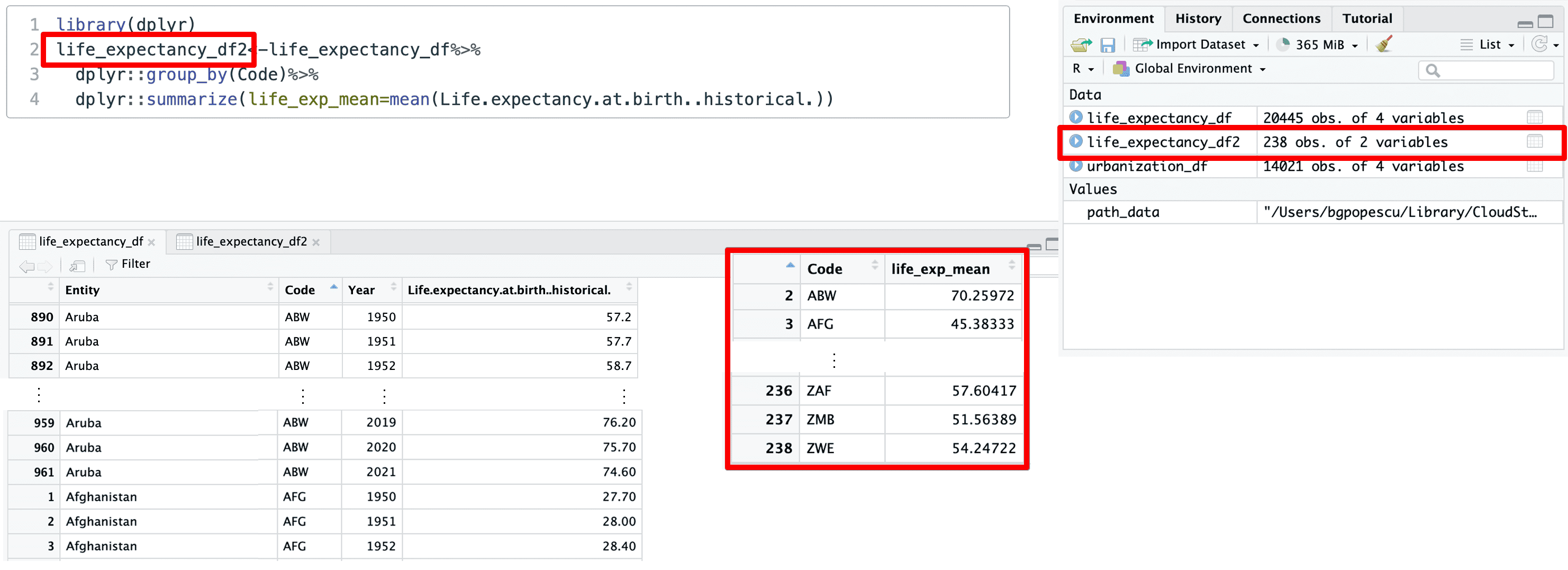
This is what this looks like in code for life_expectancy_df2:
Doing it
2. Inspect the first entries
This is how we inspect the first entries for life_expectancy_df2:
This corresponds to the first three entries of the dataframe:

Doing it
2. Inspect the first entries
This is how we inspect the first entries for life_expectancy_df2:
This corresponds to the first three entries of the dataframe:

Doing it
2. Inspect the first entries
This is how we inspect the first entries for urbanization_df2:
This corresponds to the first three entries of the dataframe:

Doing it
2. Inspect the first entries
This is how we inspect the first entries for urbanization_df2:
This corresponds to the first three entries of the dataframe:

Doing it
2. Inspect the first entries
We notice the country codes.
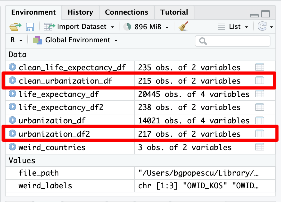
  [1] ""         "ABW"      "AFG"      "AGO"      "AIA"      "ALB"
  [7] "AND"      "ARE"      "ARG"      "ARM"      "ASM"      "ATG"
 [13] "AUS"      "AUT"      "AZE"      "BDI"      "BEL"      "BEN"
 [19] "BES"      "BFA"      "BGD"      "BGR"      "BHR"      "BHS"
 [25] "BIH"      "BLR"      "BLZ"      "BMU"      "BOL"      "BRA"
 [31] "BRB"      "BRN"      "BTN"      "BWA"      "CAF"      "CAN"
 [37] "CHE"      "CHL"      "CHN"      "CIV"      "CMR"      "COD"
 [43] "COG"      "COK"      "COL"      "COM"      "CPV"      "CRI"
 [49] "CUB"      "CUW"      "CYM"      "CYP"      "CZE"      "DEU"
 [55] "DJI"      "DMA"      "DNK"      "DOM"      "DZA"      "ECU"
 [61] "EGY"      "ERI"      "ESH"      "ESP"      "EST"      "ETH"
 [67] "FIN"      "FJI"      "FLK"      "FRA"      "FRO"      "FSM"
 [73] "GAB"      "GBR"      "GEO"      "GGY"      "GHA"      "GIB"
 [79] "GIN"      "GLP"      "GMB"      "GNB"      "GNQ"      "GRC"
 [85] "GRD"      "GRL"      "GTM"      "GUF"      "GUM"      "GUY"
 [91] "HKG"      "HND"      "HRV"      "HTI"      "HUN"      "IDN"
 [97] "IMN"      "IND"      "IRL"      "IRN"      "IRQ"      "ISL"
[103] "ISR"      "ITA"      "JAM"      "JEY"      "JOR"      "JPN"
[109] "KAZ"      "KEN"      "KGZ"      "KHM"      "KIR"      "KNA"
[115] "KOR"      "KWT"      "LAO"      "LBN"      "LBR"      "LBY"
[121] "LCA"      "LIE"      "LKA"      "LSO"      "LTU"      "LUX"
[127] "LVA"      "MAC"      "MAF"      "MAR"      "MCO"      "MDA"
[133] "MDG"      "MDV"      "MEX"      "MHL"      "MKD"      "MLI"
[139] "MLT"      "MMR"      "MNE"      "MNG"      "MNP"      "MOZ"
[145] "MRT"      "MSR"      "MTQ"      "MUS"      "MWI"      "MYS"
[151] "MYT"      "NAM"      "NCL"      "NER"      "NGA"      "NIC"
[157] "NIU"      "NLD"      "NOR"      "NPL"      "NRU"      "NZL"
[163] "OMN"      "OWID_KOS" "OWID_WRL" "PAK"      "PAN"      "PER"
[169] "PHL"      "PLW"      "PNG"      "POL"      "PRI"      "PRK"
[175] "PRT"      "PRY"      "PSE"      "PYF"      "QAT"      "REU"
[181] "ROU"      "RUS"      "RWA"      "SAU"      "SDN"      "SEN"
[187] "SGP"      "SHN"      "SLB"      "SLE"      "SLV"      "SMR"
[193] "SOM"      "SPM"      "SRB"      "SSD"      "STP"      "SUR"
[199] "SVK"      "SVN"      "SWE"      "SWZ"      "SXM"      "SYC"
[205] "SYR"      "TCA"      "TCD"      "TGO"      "THA"      "TJK"
[211] "TKL"      "TKM"      "TLS"      "TON"      "TTO"      "TUN"
[217] "TUR"      "TUV"      "TWN"      "TZA"      "UGA"      "UKR"
[223] "URY"      "USA"      "UZB"      "VAT"      "VCT"      "VEN"
[229] "VGB"      "VIR"      "VNM"      "VUT"      "WLF"      "WSM"
[235] "YEM"      "ZAF"      "ZMB"      "ZWE"
Doing it
2. Inspect the first entries
We notice the country codes.

Doing it
2. Inspect the first entries
We notice the country codes.

Doing it
2. Inspect the first entries
So we have some unusual entries such as:
- “”
- “OWID_KOS”
- “OWID_WRL”.

Doing it
2. Inspect the first entries
Which countries do these codes refer to? We can subset the data to find out.

Doing it
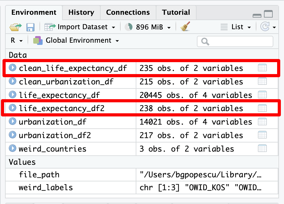
3. Cleaning our dataset
We can now clean the dataset
Doing it
3. Cleaning our dataset
We can now clean the dataset
Doing it
3. Cleaning our dataset
Let’s repeat the procedure for the other dataset
Doing it
3. Cleaning our dataset
Let’s repeat the procedure for the other dataset
Doing it
4. Performing a left join
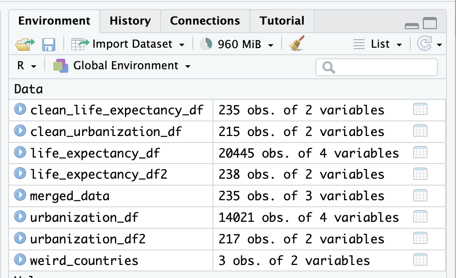
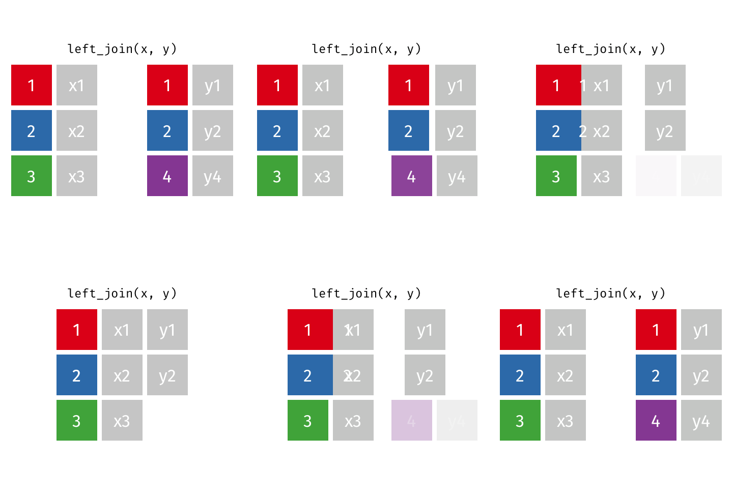
We will now perform a left join to combine urbanization data with life expectancy data based on Code.
Doing it
4. Performing a left join
We will now perform a left join to combine urbanization data with life expectancy data based on Code.
Doing it
4. Performing a left join
We will now perform a left join to combine urbanization data with life expectancy data based on Code.
Doing it
4. Performing a left join
We will now perform a left join to combine urbanization data with life expectancy data based on Code.
Doing it
5. Getting rid of NAs for urbanization
This is how we remove NA values
Doing it
5. Getting rid of NAs for urbanization
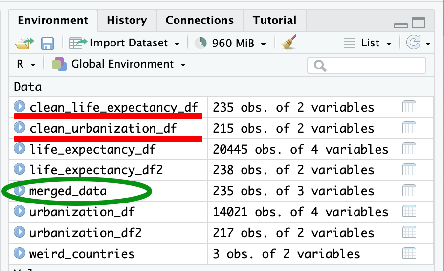
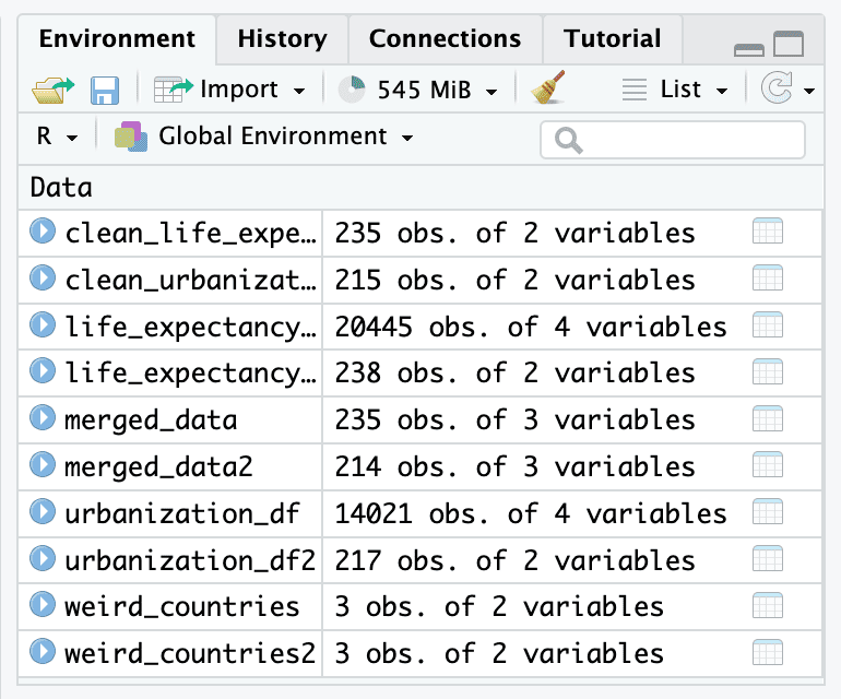
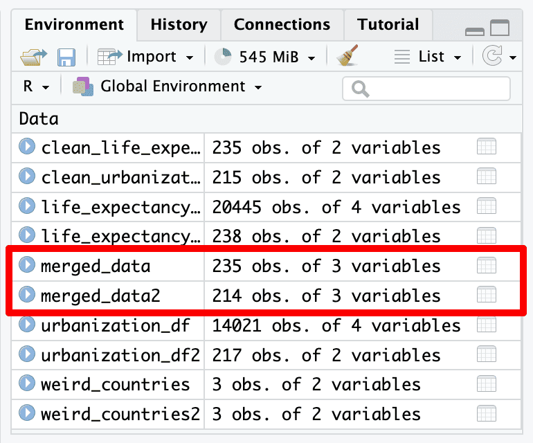
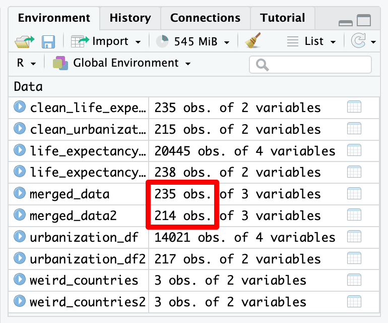
How many countries did we drop?
Doing it
5. Getting rid of NAs for urbanization
How many countries did we drop?
We dropped 21.
Doing it
5. Getting rid of NAs for urbanization
How many countries did we drop?
We dropped 21.
Doing it
5. Getting rid of NAs for urbanization
How many countries did we drop?
We dropped 21.
Doing it
5. Getting rid of NAs for urbanization
What are those countries?
Doing it
5. Getting rid of NAs for urbanization
Let us have a quick look at what these codes mean.
 [1] "Anguilla"                        "Bonaire Sint Eustatius and Saba"
 [3] "Cook Islands"                    "Falkland Islands"
 [5] "French Guiana"                   "Guadeloupe"
 [7] "Guernsey"                        "Jersey"
 [9] "Martinique"                      "Mayotte"
[11] "Montserrat"                      "Niue"
[13] "Reunion"                         "Saint Helena"
[15] "Saint Martin (French part)"      "Saint Pierre and Miquelon"
[17] "Taiwan"                          "Tokelau"
[19] "Vatican"                         "Wallis and Futuna"
[21] "Western Sahara"
Doing it
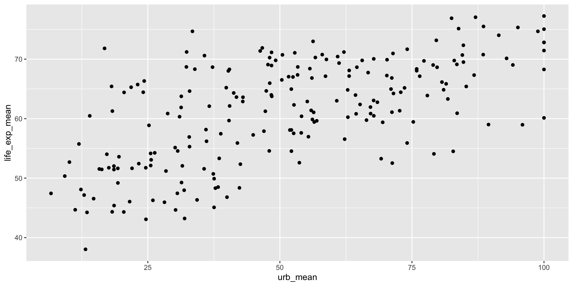
6. Creating a Scatterplot
ggplot2 is one of the most elegant and most versatile graphing libraries in R
Before we use ggplot we need to install and load the library:
Doing it
6.Creating a Scatterplot
Now, you have to load the package
Note: this has to be ggplot2, not ggplot.
Doing it
6.Creating a Scatterplot
Doing it
7. Saving our first plot
Within your working folder, create a sub-folder called “graphs”
In this case, the working folder is the folder “lab” which is inside the “week3” folder.
I then created another folder, called “graphs” to keep things organized.

Doing it
7. Saving our first plot

Next copy and paste the life-expectancy.csv from “data” to “graphs”
Doing it
7. Saving our first plot
Next copy and paste the life-expectancy.csv from “data” to “graphs”

Doing it
7. Saving our first plot
Figure out the path of the “graphs” folder by using file.choose()
Doing it
7. Saving our first plot
Figure out the path of the “graphs” folder by using file.choose()

Doing it
7. Saving our first plot
Figure out the path of the “graphs” folder by using file.choose()

Doing it
7. Saving our first plot
Figure out the path of the “graphs” folder by using file.choose()

Doing it
7. Saving our first plot
Figure out the path of the “graphs” folder by using file.choose()

Doing it
7. Saving our first plot
Figure out the path of the “graphs” folder by using file.choose()

Doing it
7. Saving our first plot
Figure out the path of the “graphs” folder by using file.choose()

Doing it
7. Saving our first plot
Setting the working directory
Relative Path Option
Doing it
7. Saving our first plot
Once you figured out the path, delete file.choose() and the life-expectancy.csv
ggplot options
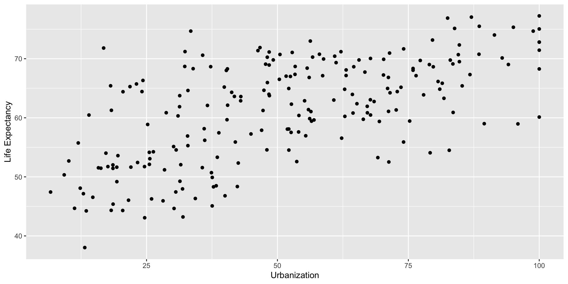
1. Improving X and Y axis labels
ggplot options
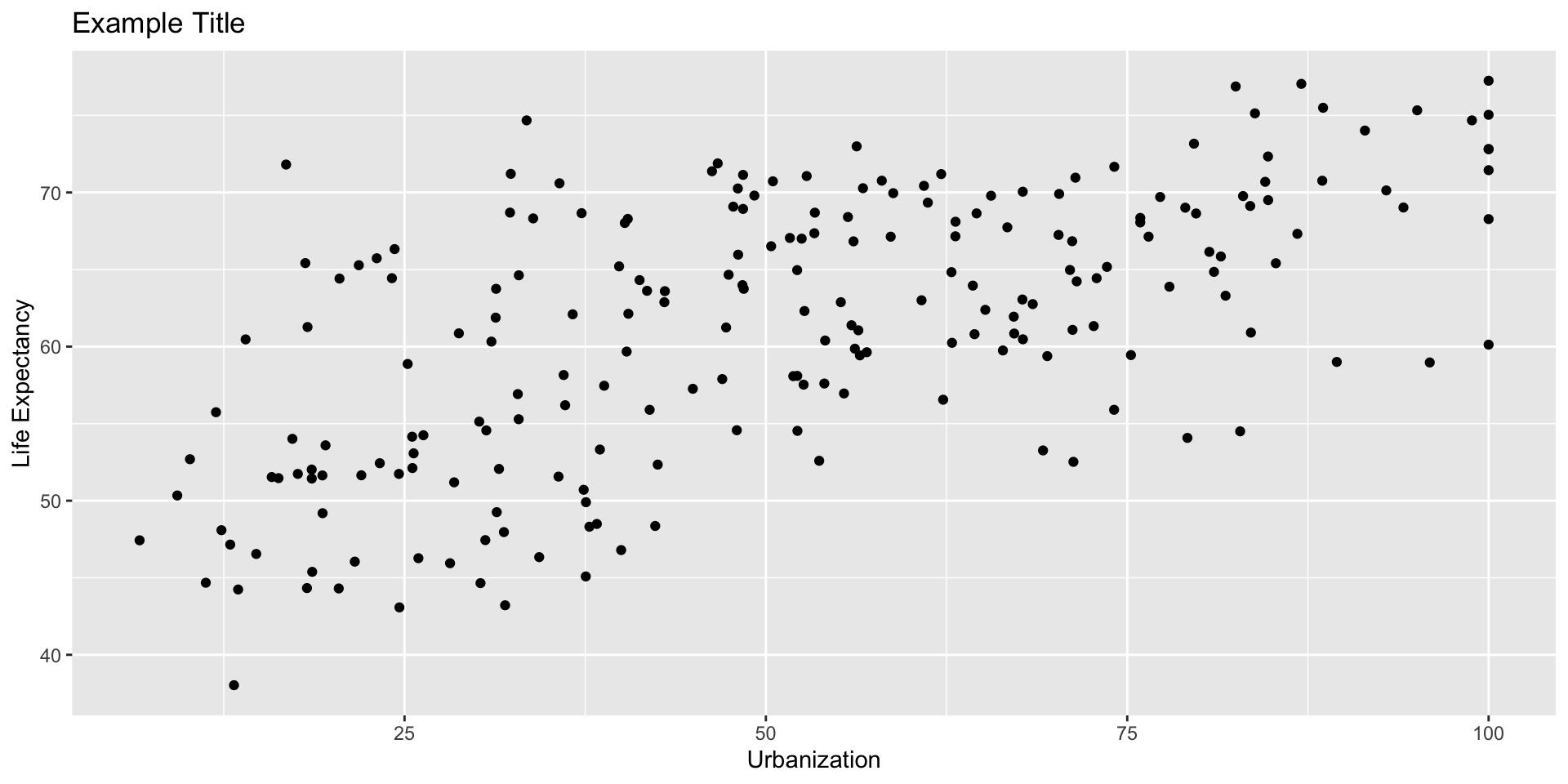
2. Adding a Title
ggplot options
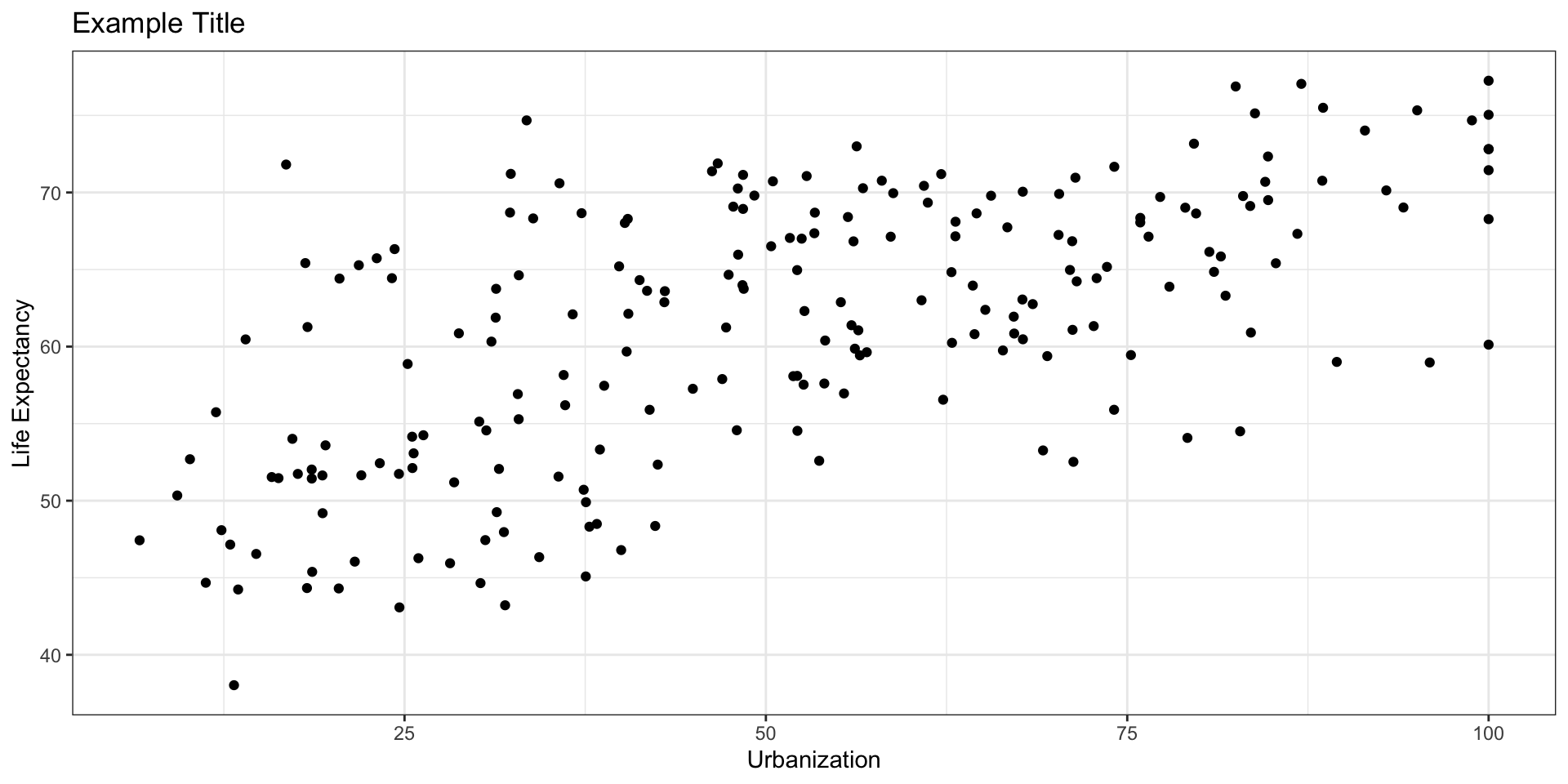
3. Getting rid of the grey background
ggplot options
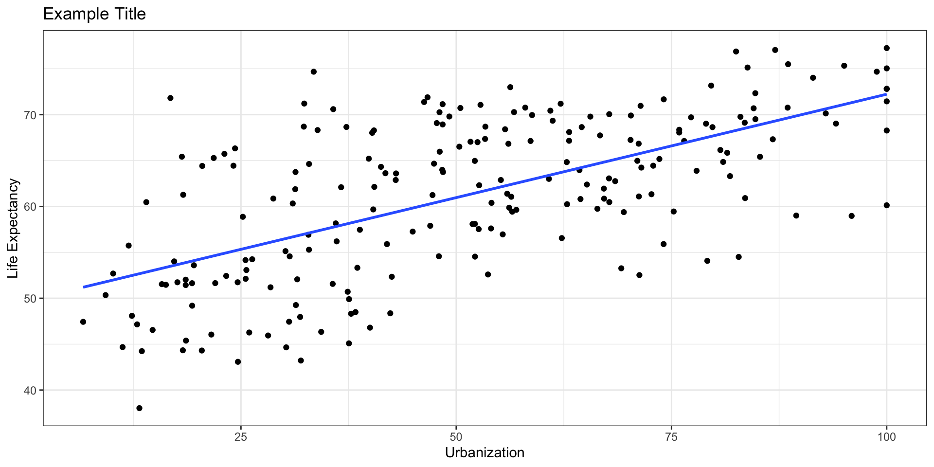
4. Fitting a line
ggplot options
5. Fixing the X and Y axis to particular values
fig3 <- ggplot(merged_data2, mapping = aes(x=urb_mean, y=life_exp_mean)) +
  geom_point()+
  xlab("Urbanization") + ylab("Life Expectancy")+
  ggtitle("Example Title")+
  theme_bw()+
  geom_smooth(method = "lm", se=FALSE)+
  scale_x_continuous(breaks=seq(0, 100, by = 20), limits = c(0,100))+
  scale_y_continuous(breaks=seq(0, 100, by = 20), limits = c(0,100))
fig3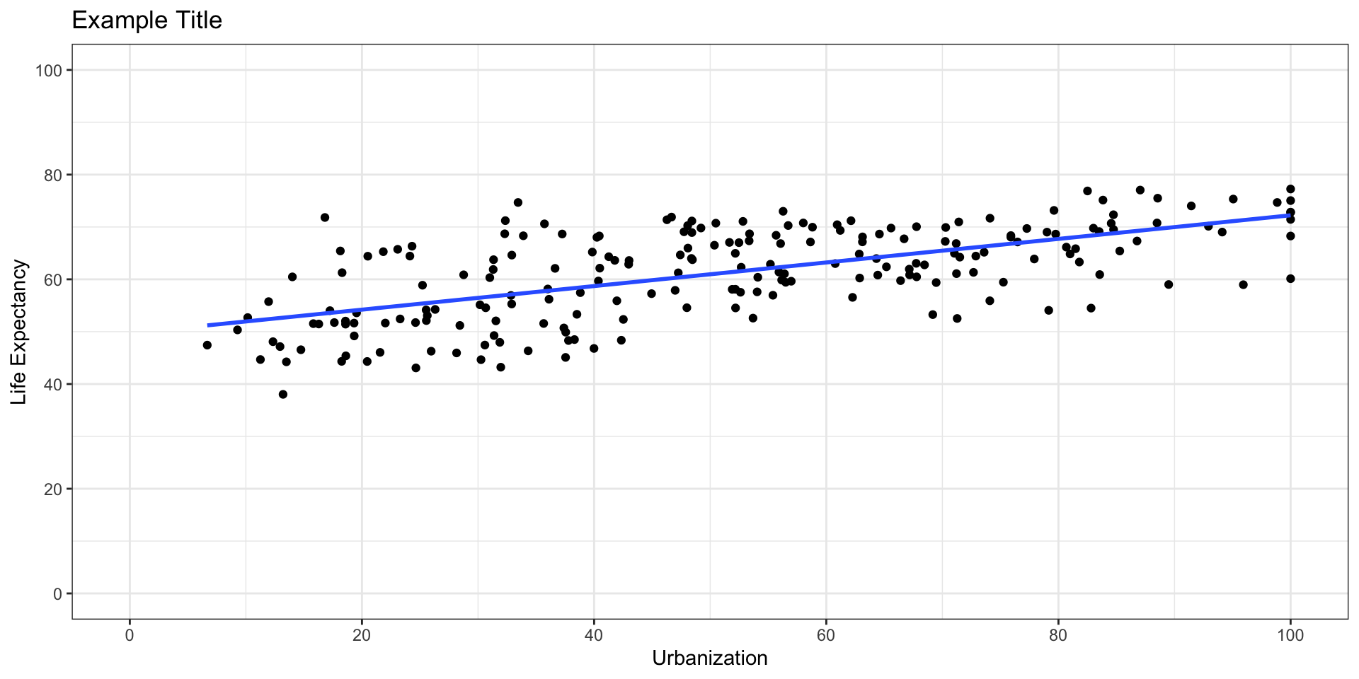
ggplot options
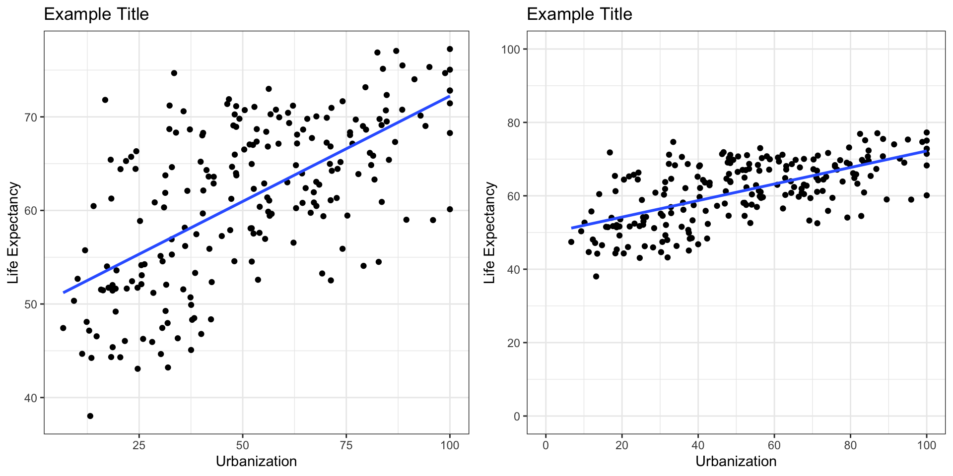
6. Two Graphs Side by Side
ggplot options
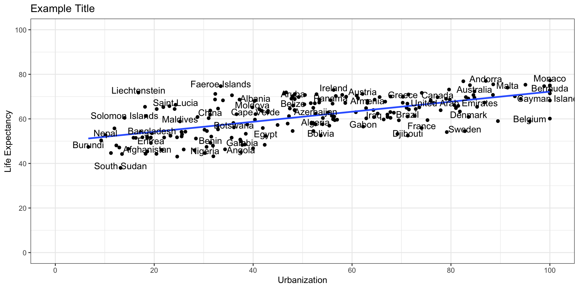
7. Labelling the Data
There are many ways of labeling the data in ggplot. But let us try a simple way.
First let us do a quick left join so that we keep the original country names
ggplot options
7. Labelling the Data
fig3 <- ggplot(merged_data3, mapping = aes(x=urb_mean, y=life_exp_mean)) +
  geom_point()+
  xlab("Urbanization") + ylab("Life Expectancy")+
  ggtitle("Example Title")+
  theme_bw()+
  geom_smooth(method = "lm", se=FALSE)+
  scale_x_continuous(breaks=seq(0, 100, by = 20), limits = c(0,100))+
  scale_y_continuous(breaks=seq(0, 100, by = 20), limits = c(0,100))+
  geom_text(aes(label = Entity),
            size = 4,
            check_overlap = TRUE,
            position = position_nudge(y = 1))
fig3
ggplot options
7. Labelling the Data
ggplot options
7. Labelling the Data
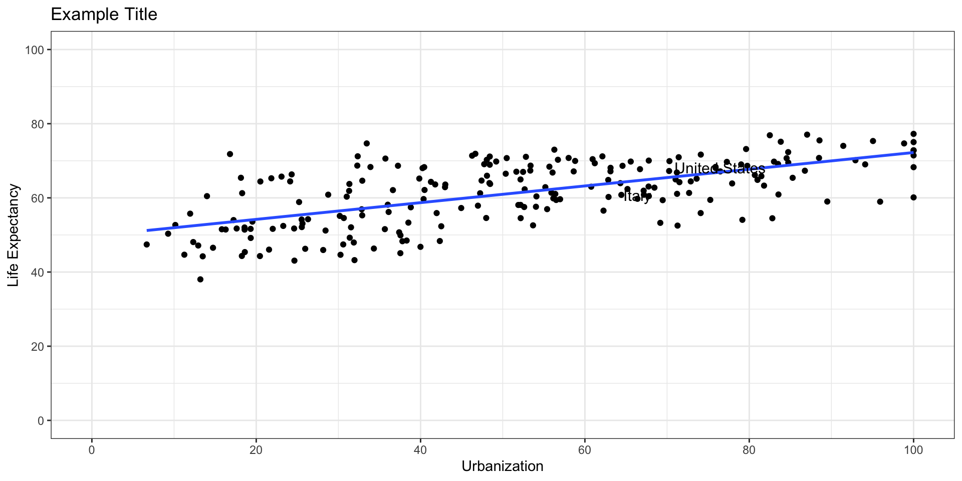
What if we wanted to do selective labeling? Let’s say, we just want to label Italy and the US. How could we do that?
ggplot options
7. Labelling the Data
fig4 <- ggplot(merged_data3, mapping = aes(x=urb_mean, y=life_exp_mean)) +
  geom_point()+
  xlab("Urbanization") + ylab("Life Expectancy")+
  ggtitle("Example Title")+
  theme_bw()+
  geom_smooth(method = "lm", se=FALSE)+
  scale_x_continuous(breaks=seq(0, 100, by = 20), limits = c(0,100))+
  scale_y_continuous(breaks=seq(0, 100, by = 20), limits = c(0,100))+
  geom_text(aes(label = Entity),
            size = 4,
            check_overlap = TRUE,
            position = position_nudge(y = 1),
            data = italy_us_df)
fig4
ggplot options
7. Labelling the Data
This does not work so well
ggplot options
7. Labelling the Data
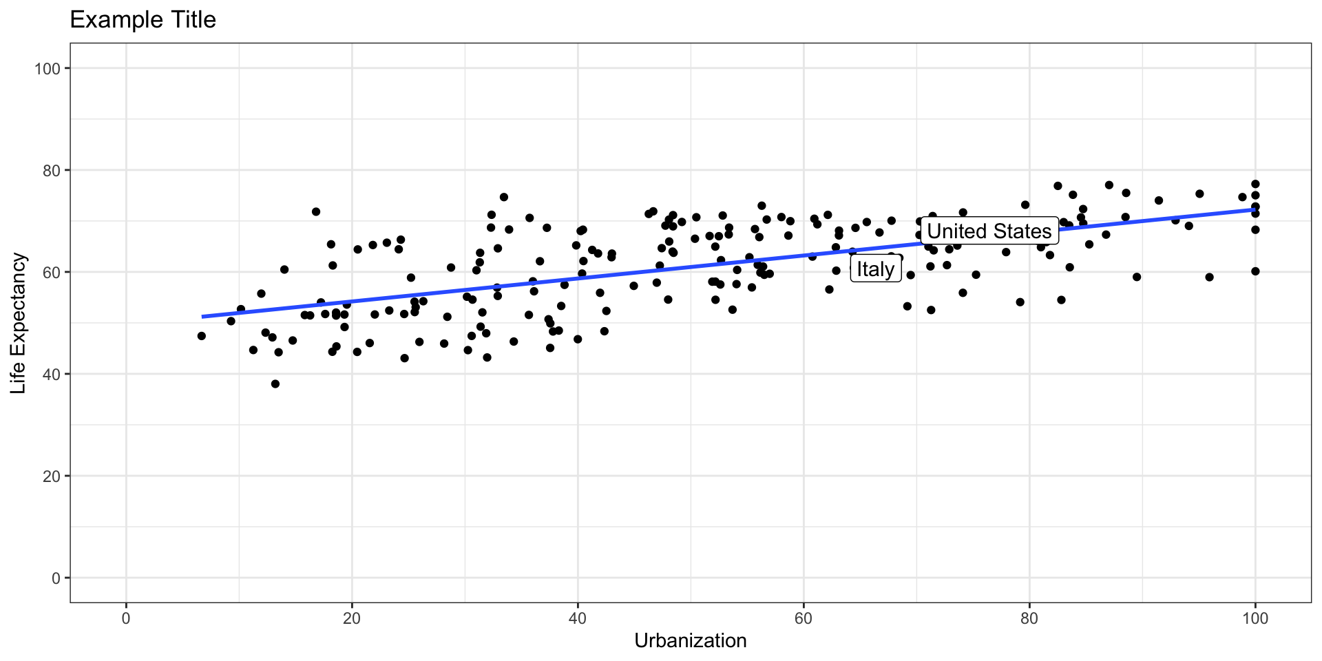
The better way is called geom_label.
fig4 <- ggplot(merged_data3, mapping = aes(x=urb_mean, y=life_exp_mean)) +
  geom_point()+
  xlab("Urbanization") + ylab("Life Expectancy")+
  ggtitle("Example Title")+
  theme_bw()+
  geom_smooth(method = "lm", se=FALSE)+
  scale_x_continuous(breaks=seq(0, 100, by = 20), limits = c(0,100))+
  scale_y_continuous(breaks=seq(0, 100, by = 20), limits = c(0,100))+
  geom_label(aes(label = Entity),
            size = 4,
            position = position_nudge(y = 1),
            data = italy_us_df)
fig4
ggplot options
7. Labelling the Data
The better way is called geom_label.
ggplot options
7. Labelling the Data
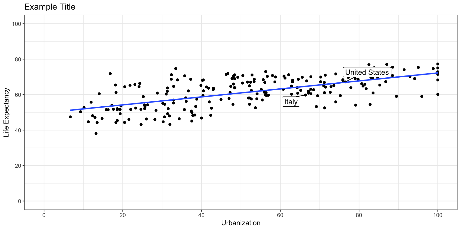
But which one is Italy and which one is the US?
library(ggrepel)
fig4 <- ggplot(merged_data3, mapping = aes(x=urb_mean, y=life_exp_mean)) +
  geom_point()+
  xlab("Urbanization") + ylab("Life Expectancy")+
  ggtitle("Example Title")+
  theme_bw()+
  geom_smooth(method = "lm", se=FALSE)+
  scale_x_continuous(breaks=seq(0, 100, by = 20), limits = c(0,100))+
  scale_y_continuous(breaks=seq(0, 100, by = 20), limits = c(0,100))+
  geom_label_repel(box.padding = 0.5,
    aes(label = Entity),
            size = 4,
            data = italy_us_df)
fig4
ggplot options
7. Labelling the Data
But which one is Italy and which one is the US?
Conclusion
- We used
dplyrto group, summarize, and clean data
- We merged datasets with
left_join()
- We built scatterplots using
ggplot2
- We customized labels, titles, themes, and axes
Popescu (JCU): Merging Data, Scatterplots
