| Group | Before | After |
|---|---|---|
| Control | A - not treated | B - not treated |
| Treatment | C - not treated | D - treated |
Differences in Differences
How to measure a policy’s impact with data
Why we care about causality
Question:
What if I tell you that countries with more doctors have more deaths?
Does that mean doctors cause deaths?
Very likely not.
One answer could be that sick countries hire more doctors.
So what we really want is to know:
- What would have happened without the doctors?
That’s the causal effect.
Why observational data makes this tricky
In science we love experiments:
- One group gets the new policy or medicine
- One group doesn’t
- We compare outcomes
But in social science, we can’t usually flip a switch and say,
- You get democracy; you don’t
- You get higher wages; you don’t.
So we rely on observational data — things that happened naturally — and we look for smart ways to mimic experiments.
Two clever tricks
When we can’t run a real experiment, we can use:
- Difference-in-Differences (DiD): compares how things changed over time in a treated group vs. a comparison group.
- Regression Discontinuity (RD): compares units just above and below a cutoff (like an exam score or age rule).
Today we’ll learn DiD.
One DiD Example
Minimum Wage and Number of Jobs
Does raising minimum wage increase the number of jobs? (Card and Krueger, 1994)
What happened?
- In 1992, New Jersey raised the minimum wage from $4.25 → $5.05 per hour.
- Nearby Pennsylvania kept its wage the same.
- Researchers compared fast-food restaurants in both states.
One DiD Example
Step 1 – Just New Jersey
Before the change: 20.44 jobs per restaurant: \(\text{New Jersey}_{\text{Before}} = 20.44\)
After the change: 21.03 jobs per restaurant: \(\text{New Jersey}_{\text{After}} = 21.03\)
\[ \Delta = \text{Change in NJ} = 21.03 - 20.44 = 0.59 \]
Question: Did raising the minimum wage cause this +0.59 increase?
Not necessarily! Maybe all restaurants were hiring more people that year for other reasons — for example, the economy improved or a new mall opened.
One DiD Example
Step 2 – Bring in a Comparison
To figure out what would have happened without the law, Card and Krueger compared New Jersey to Pennsylvania
- a nearby state where the minimum wage didn’t change.
- Pennsylvania (after): 21.17 jobs per restaurant
- New Jersey (after): 21.03 jobs per restaurant
\[ \text{Pennsylvania}_{\text{After}} = 21.17\\ \text{New Jersey}_{\text{After}} = 21.03\\ \Delta = 21.03 - 21.17 = -0.14 \]
One DiD Example
Step 2 – Bring in a Comparison
\[ \text{Pennsylvania}_{\text{After}} = 21.17\\ \text{New Jersey}_{\text{After}} = 21.03\\ \Delta = 21.03 - 21.17 = -0.14 \]
Is that causal?
No — this only looks after the policy.
New Jersey and Pennsylvania could be very different kinds of states (population, economy, etc.).
We need to look at both before and after, in both states, to see the real effect.
Framework
Difference-in-Differences Table
We’re estimating the average effect on the treated group—how much the treated group changed because of the policy, beyond what would have happened without it.
Framework
Difference-in-Differences Table
| Group | Before | After | Δ (After - Before) |
|---|---|---|---|
| Control | A - not treated | B - not treated | B - A |
| Treatment | C - not treated | D - treated | D - C |
Δ (After - Before) = within-unit change
Framework
Difference-in-Differences Table
| Group | Before | After | Δ (After - Before) |
|---|---|---|---|
| Control | A - not treated | B - not treated | B - A |
| Treatment | C - not treated | D - treated | D - C |
| Δ (Treatment - Control) | C - A | D - B |
Δ (After - Before) = within-unit change
Δ (Treatment - Control) = across-group change
Framework
Difference-in-Differences Table
| Group | Before | After | Δ (After - Before) |
|---|---|---|---|
| Control | A - not treated | B - not treated | B - A |
| Treatment | C - not treated | D - treated | D - C |
| Δ (Treatment - Control) | C - A | D - B | (D - C) - (B - A) |
Δ (After - Before) = within-unit change
Δ (Treatment - Control) = across-group change
Framework
Difference-in-Differences Table
| Group | Before | After | Δ (After - Before) |
|---|---|---|---|
| Control | A - not treated | B - not treated | B - A |
| Treatment | C - not treated | D - treated | D - C |
| Δ (Treatment - Control) | C - A | D - B | (D - B) - (C - A) |
Δ (After - Before) = within-unit change
Δ (Treatment - Control) = across-group change
Framework
Difference-in-Differences Table
| Group | Before | After | Δ (After - Before) |
|---|---|---|---|
| Control | A 23.33 |
B 21.17 |
B − A −2.16 |
| Treatment | C 20.44 |
D 21.03 |
D − C 0.59 |
| Δ (Treatment − Control) | C − A −2.89 |
D − B −0.14 |
(0.59 − −2.16) or (−0.14 − −2.89) |
Δ (After - Before) = within-unit change
Δ (Treatment - Control) = across-group change
Framework
Difference-in-Differences Table
| Group | Before | After | Δ (After - Before) |
|---|---|---|---|
| Control | A 23.33 |
B 21.17 |
B − A −2.16 |
| Treatment | C 20.44 |
D 21.03 |
D − C 0.59 |
| Δ (Treatment − Control) | C − A −2.89 |
D − B −0.14 |
2.75 or 2.75 |
Δ (After - Before) = within-unit change
Δ (Treatment - Control) = across-group change
We’re estimating the average effect on the treated group—how much the treated group changed because of the policy, beyond what would have happened without it.
Card and Krueger
Controversy
Conventional wisdom (in economics)
Raising the minimum wage reduces employment due to higher labor costs.
Card & Krueger’s finding:
After New Jersey raised the minimum wage, employment increased slightly at fast-food restaurants compared to Pennsylvania.
Methodological innovation:
They used a natural experiment with a difference-in-differences approach — unusual at the time for labor economics.
Differences in Differences
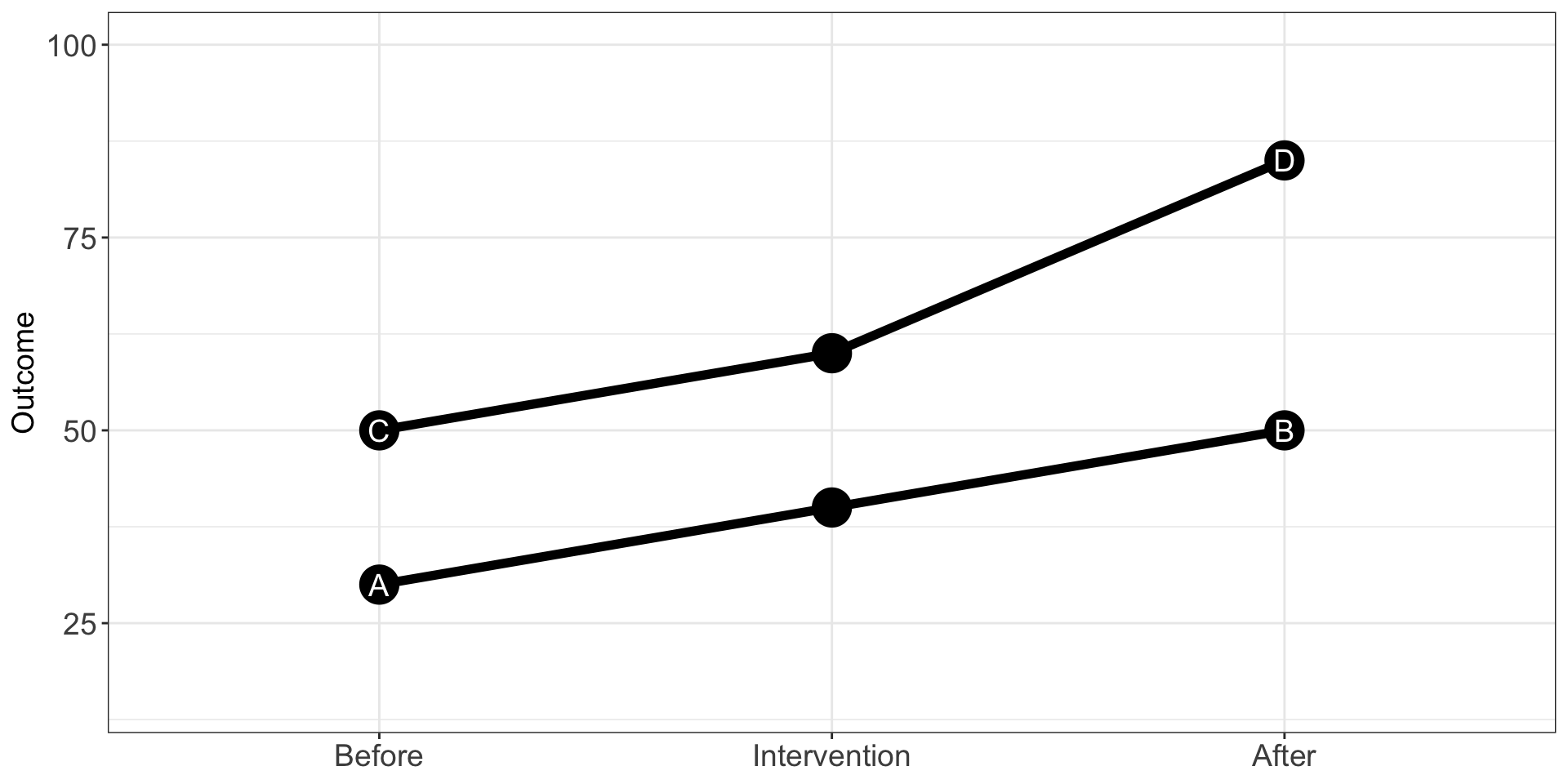
Differences in Differences
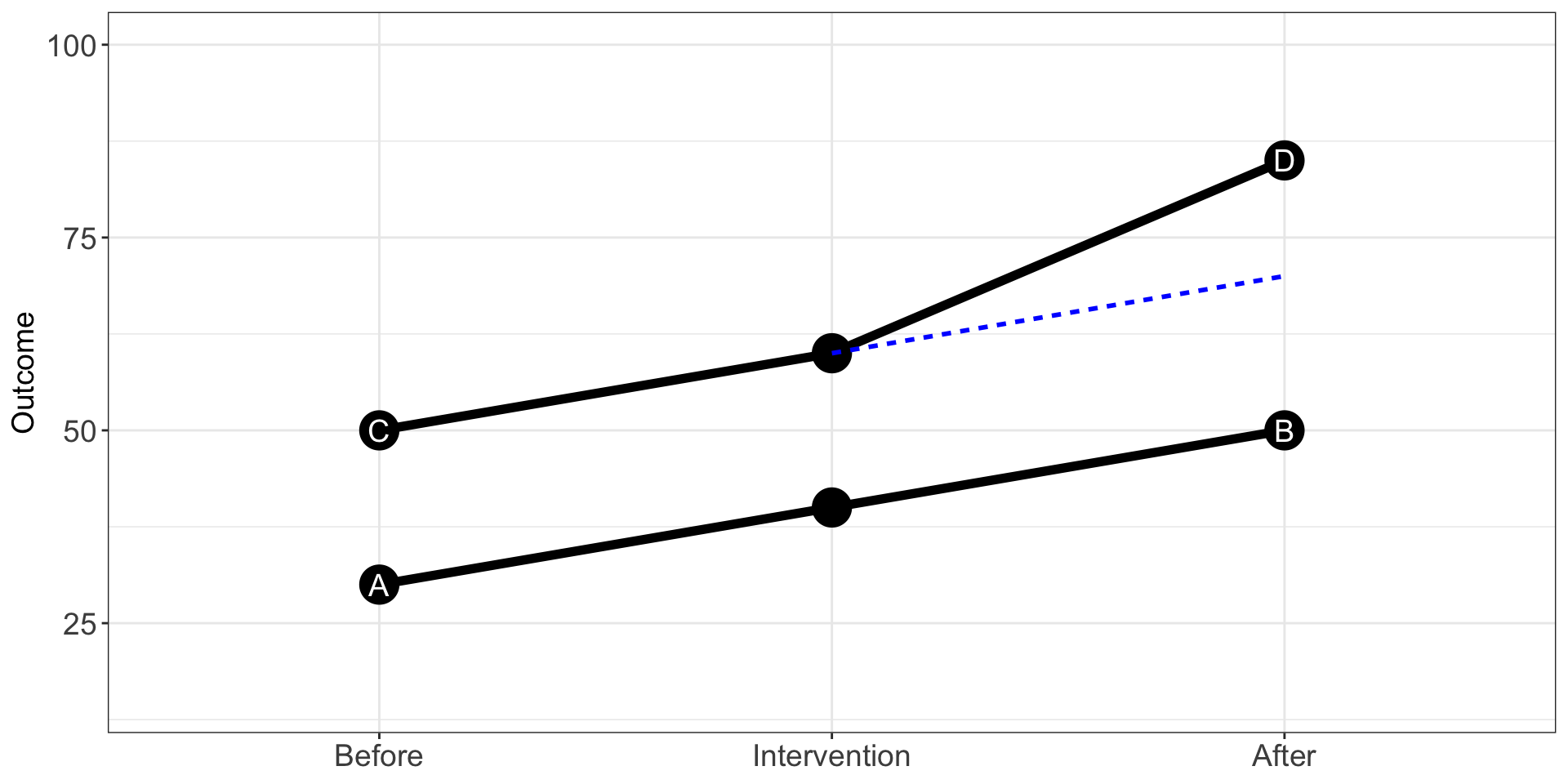
Differences in Differences
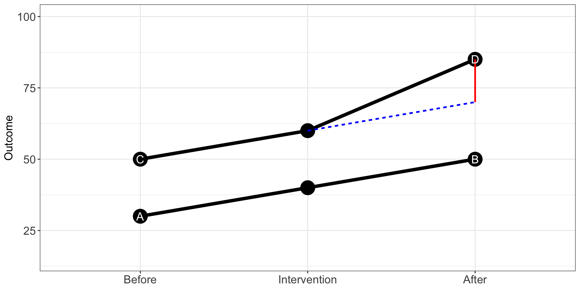
Differences in Differences
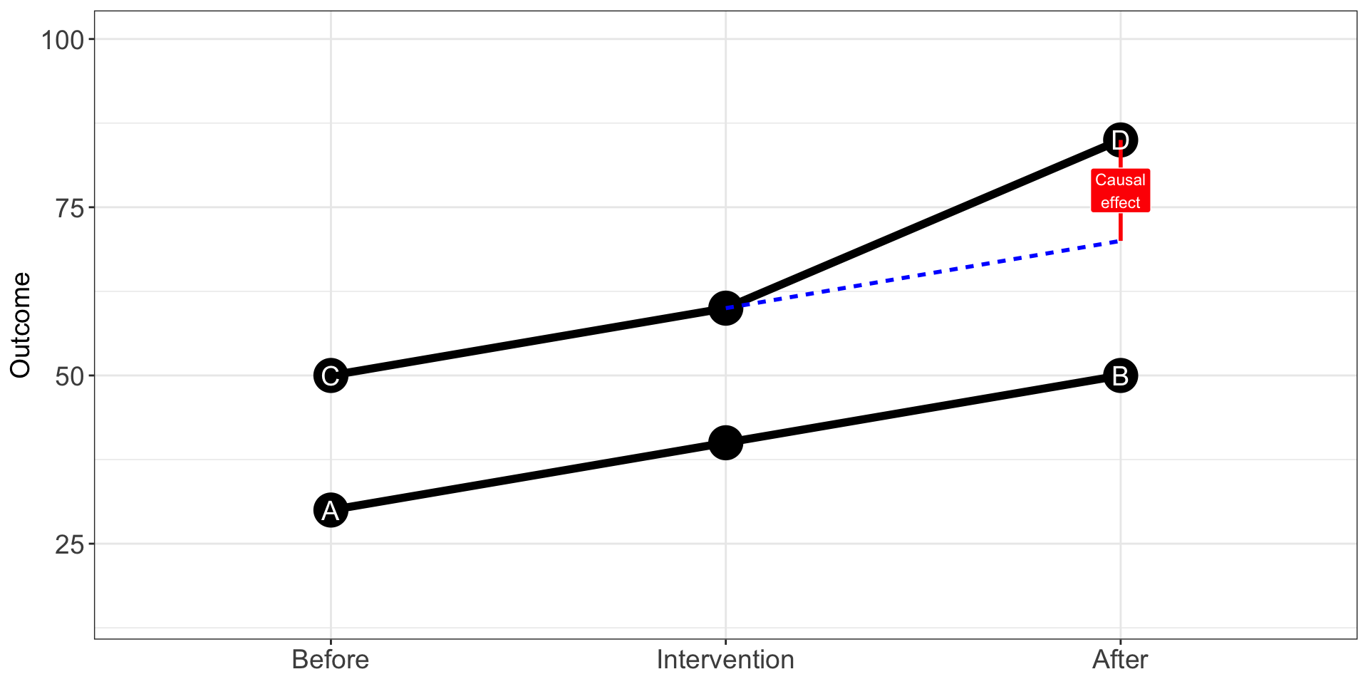
Differences-in-Differences
The way we can estimate the causal effect is by running the following model:
1. Model
\[ Y_{it} = \beta_0 + \color{blue}{\beta_1 \cdot \text{Group}_i} + \color{purple}{\beta_2 \cdot \text{Time}_t} + \color{red}{\beta_3 \cdot (\text{Group}_i \times \text{Time}_t)} + \epsilon_{it} \]
Where:
-Group = 1 if this is the treatment group
-Time = 1 if this is the period after intervention
-β₀ – mean of the control group in the pre-treatment period
-β₁ – the increase in outcome across groups
-β₂ – the increase in outcome within groups
-β₃ – the Differences-in-Differences
Framework for Causal Effects
1. Model
\[ Y_{it} = \beta_0 + \color{blue}{\beta_1 \cdot \text{Group}_i} + \color{purple}{\beta_2 \cdot \text{Time}_t} + \color{red}{\beta_3 \cdot (\text{Group}_i \times \text{Time}_t)} + \epsilon_{it} \]
| Group | Before | After | Δ (After − Before) |
|---|---|---|---|
| Control | β₀ | β₀ + β₂ | β₂ |
| Treatment | β₀ + β₁ | β₀ + β₁ + β₂ + β₃ | β₂ + β₃ |
| Δ (Treatment − Control) | β₁ | β₁ + β₃ | β₃ |
\(\Delta\) within units − \(\Delta\) across groups = Difference-in-differences = causal effect
Assumptions
Diff-in-Diff Assumption: Parallel Trends Assumption
The treatment and the control group have the same trends prior to the intervention.
We assume that the treatment group would have changed like the control group in the absence of the treatment.
If the policy hadn’t happened, the treated group would have followed the same trend as the control group
We can’t prove this, but we can make it more believable with pre-policy data and context
Timing
Sometimes, units receive treatment at different times, so this can distort our estimates.
Assumptions
Diff-in-Diff Assumptions
This is an example where the parallel trends assumption holds

Assumptions
Diff-in-Diff Assumptions
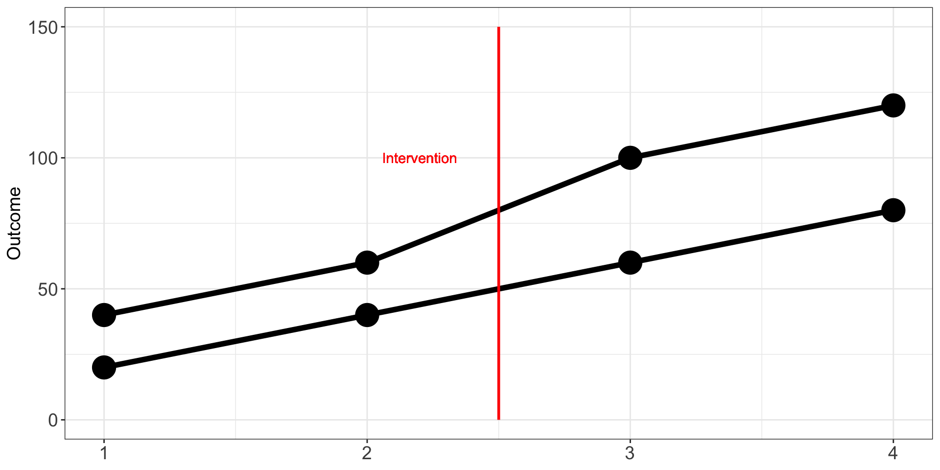
Another example where parallel trends hold is the following:
Assumptions
Diff-in-Diff Assumptions
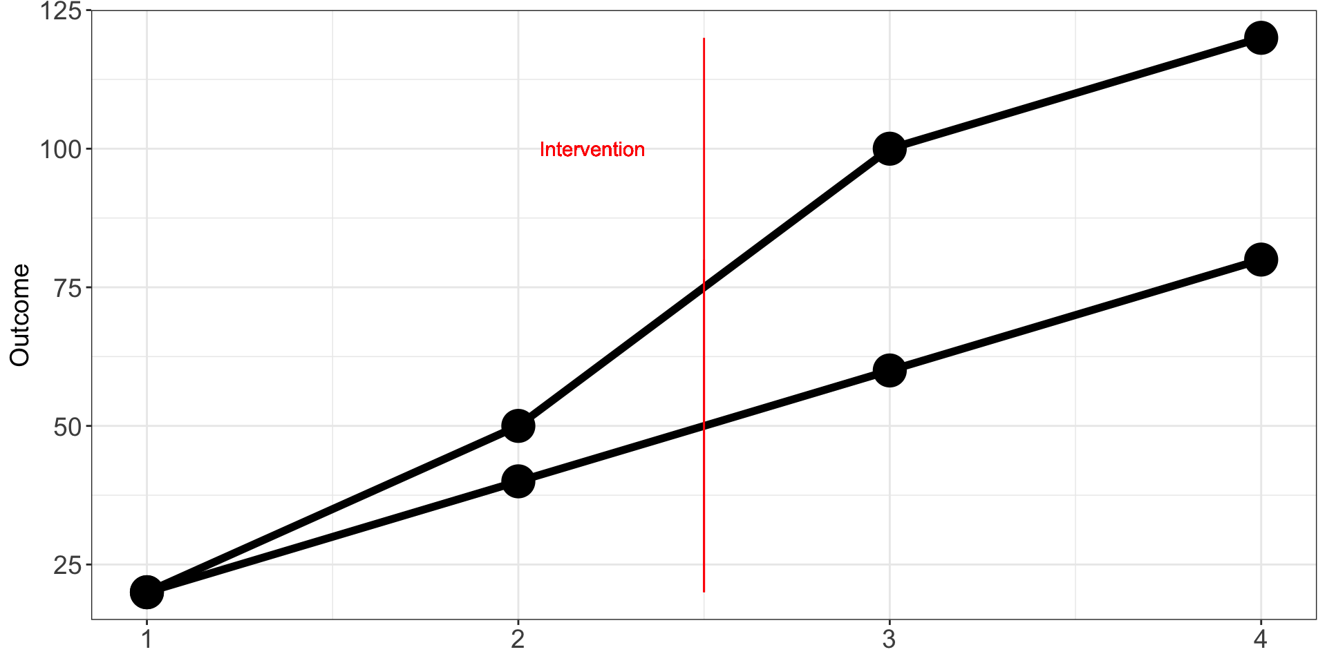
An example where the parallel trend is violated, is the following:
Assumptions
Diff-in-Diff Assumptions
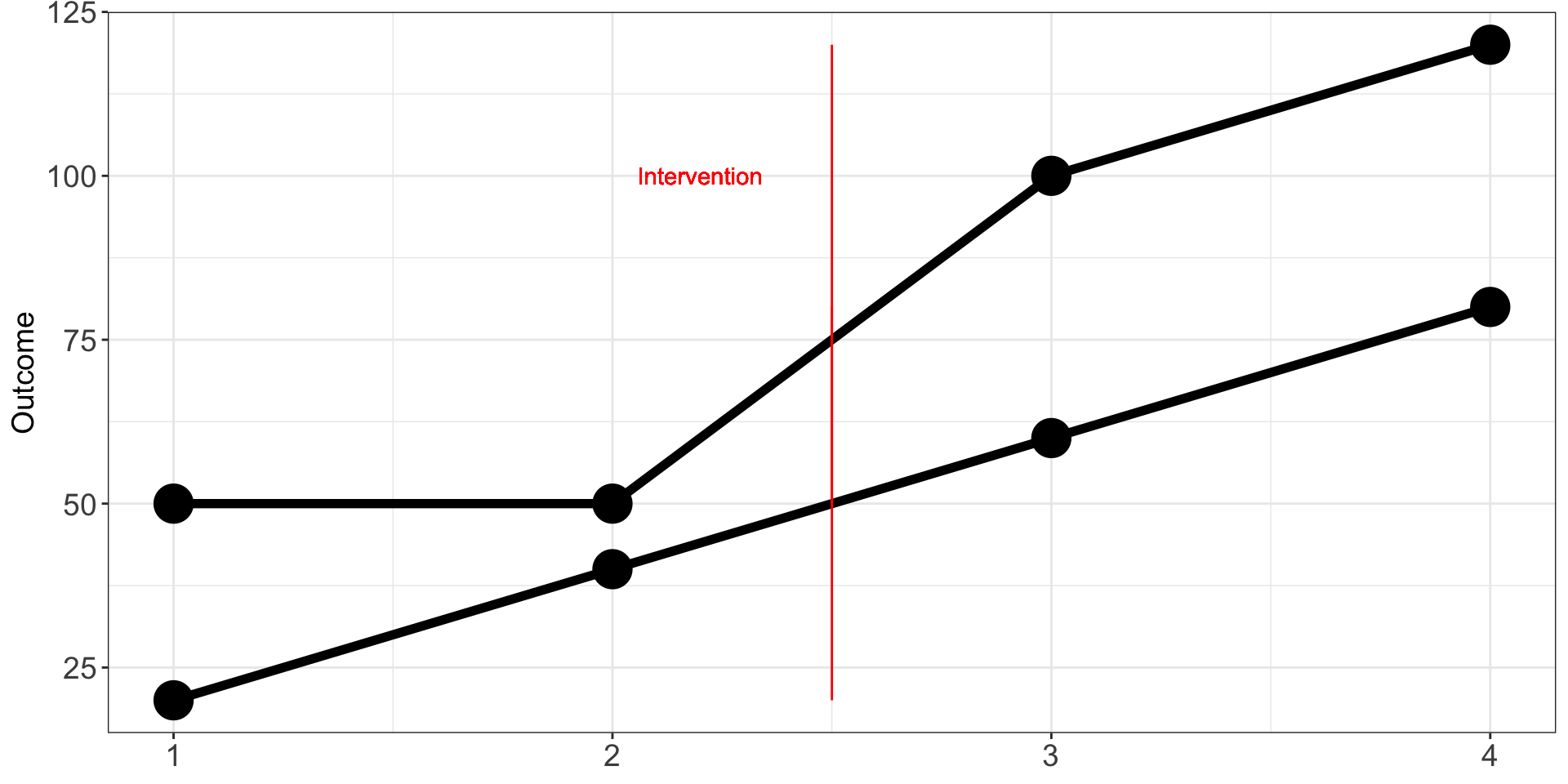
Another example where the parallel trend is violated, is the following:
Treatment Timing
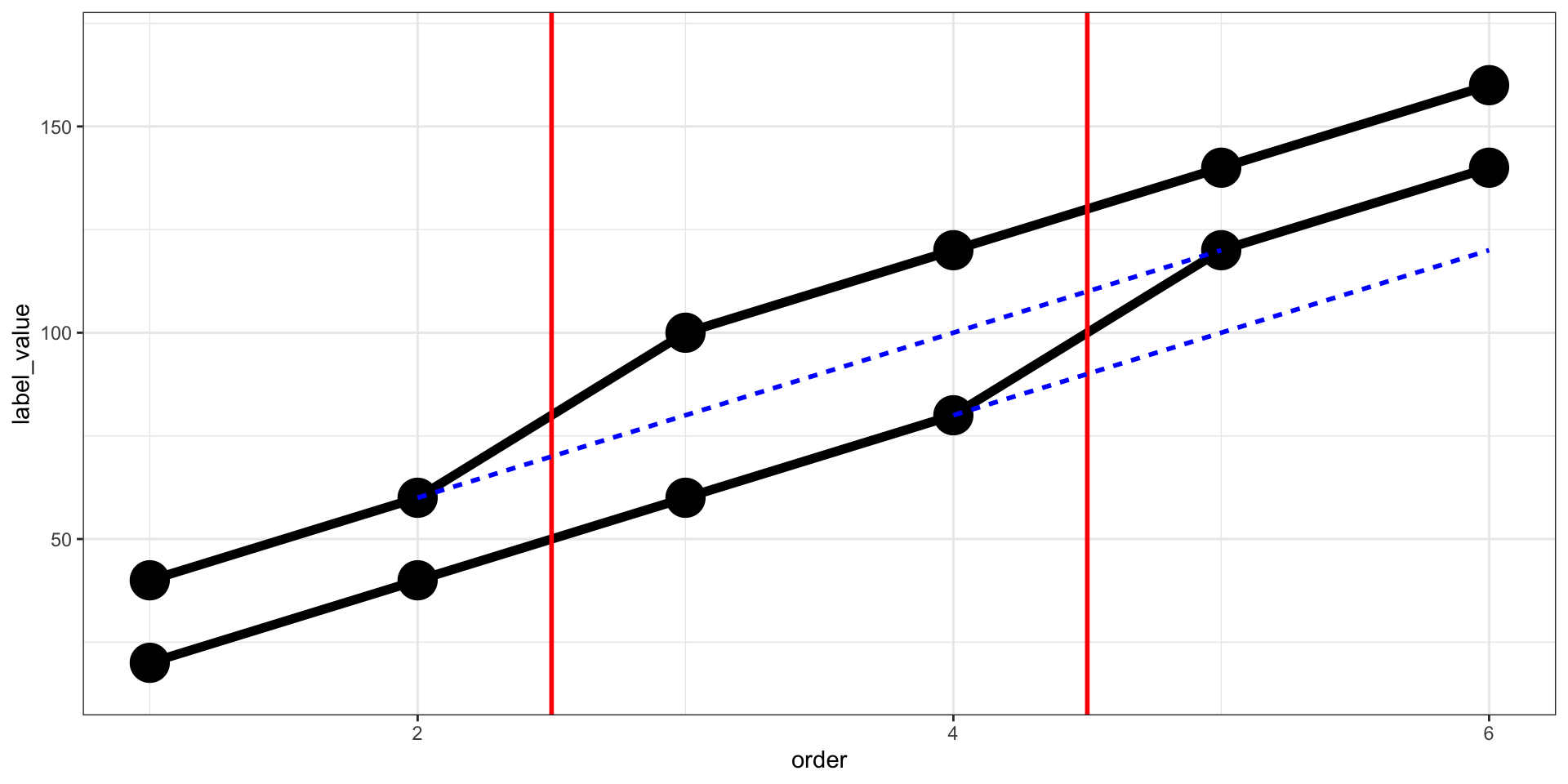
Units can receive observations at different times which can distort our estimate:
Treatment Timing
Units can receive observations at different times which can distort our estimate:
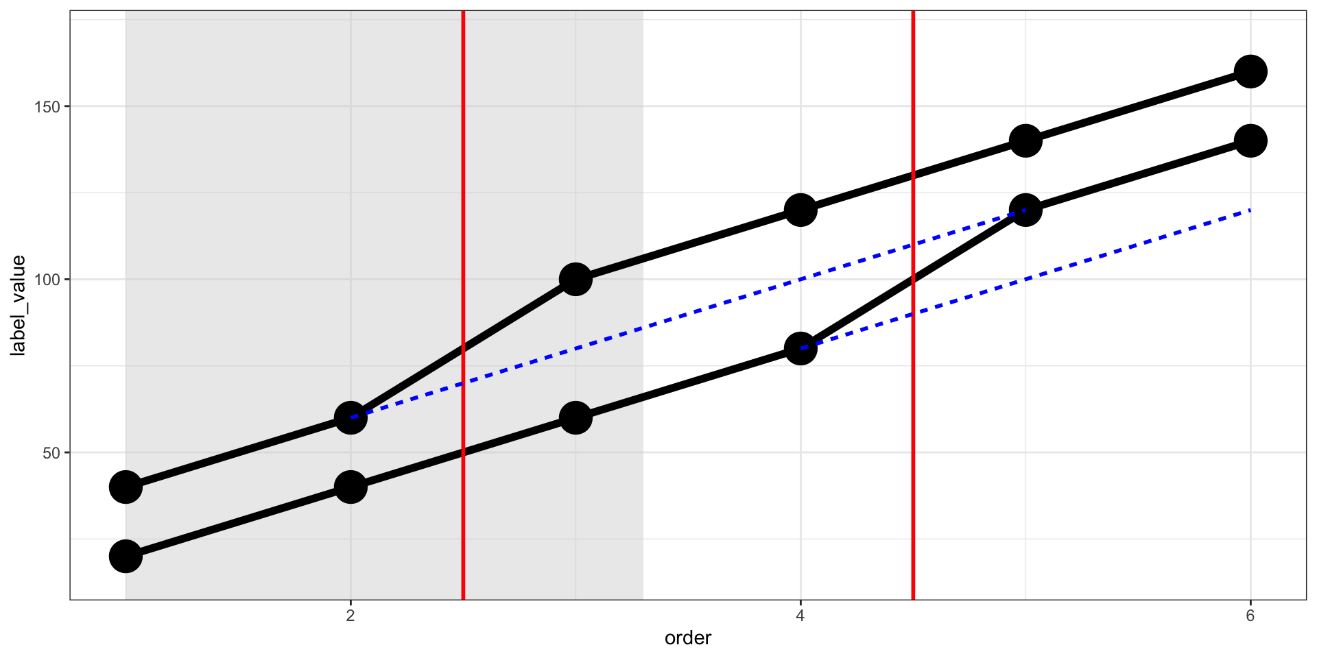
Treatment Timing
Units can receive observations at different times which can distort our estimate:
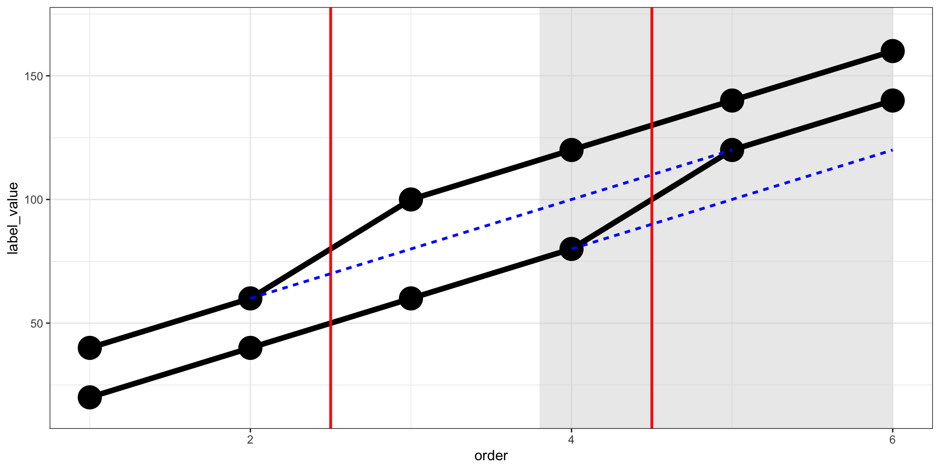
Treatment Timing
If groups adopt at different times, the simple DiD can mislead.
There are versions that handle this better (cohort-wise comparisons like Sun & Abraham or Callaway & Sant’Anna).
Scenario
This is based on made-up data.
World Bank wants to reduce the risk of malaria in Malawi by providing insecticide-treated bed nets.
So they provided insecticide-treated bed nets only to city B from 2017 to 2020.
The World Bank selected 24 individuals (over 3 years) from city B and they want to investigate whether receiving such nets has any effect on people’s risk of malaria.
Scenario
Show the code
Rows: 8,000
Columns: 10
$ year         <int> 2013, 2014, 2015, 2016, 2017, 2018, 2019, 2020, 2013, 201…
$ income       <dbl> 1284.551, 1285.832, 1285.997, 1285.157, 1286.313, 1287.24…
$ age          <int> 33, 34, 35, 36, 37, 38, 39, 40, 51, 52, 53, 54, 55, 56, 5…
$ sex          <chr> "Woman", "Woman", "Woman", "Woman", "Woman", "Woman", "Wo…
$ malaria_risk <dbl> 36.26529, 35.10382, 73.17664, 28.98390, 51.18721, 51.9071…
$ id           <int> 1, 1, 1, 1, 1, 1, 1, 1, 2, 2, 2, 2, 2, 2, 2, 2, 3, 3, 3, …
$ lat          <dbl> -11.27476, -11.27476, -11.27476, -11.27476, -11.27476, -1…
$ lon          <dbl> 34.03006, 34.03006, 34.03006, 34.03006, 34.03006, 34.0300…
$ after        <int> 0, 0, 0, 0, 0, 1, 1, 1, 0, 0, 0, 0, 0, 1, 1, 1, 0, 0, 0, …
$ city         <chr> "City A", "City A", "City A", "City A", "City A", "City A…
Scenario
The shapefiles for the region are downloadable.
Here is the location of the individuals.
Show the code
panel_2013<-subset(diff_data, year==2013)
min_lon_x<-min(panel_2013$lon)
max_lon_x<-max(panel_2013$lon)

min_lat_y<-min(panel_2013$lat)
max_lat_y<-max(panel_2013$lat)
error<-2

error<-0.05
map_2013<-ggplot() +
  geom_sf(data = mwi1_lab, fill=NA, color = "blue", linewidth = 0.9)+
  geom_point(data = panel_2013, aes(x=lon, y=lat, color = city, size = malaria_risk), alpha=0.1)+
    scale_radius(limits = c(0, NA), range = c(0, 5))+
  theme_bw()+
  labs(x = "Longitude", y="Latitude")+
  ggtitle("The Three Districts Selected in Nkhata Bay, Malawi\n Location of 1000 Individuals\n For the Experiment, 2013")+
    theme(axis.text.x = element_text(size=14),
        axis.text.y = element_text(size=14),
        axis.title=element_text(size=14),
        plot.title = element_text(hjust = 0.5),
        #Legend.position values should be between 0 and 1. c(0,0) corresponds to the "bottom left"
        #and c(1,1) corresponds to the "top right" position.
        legend.box.background = element_rect(fill='white'),
        legend.background = element_blank(),
        legend.text=element_text(size=12))+
      coord_sf(xlim = c(min_lon_x-3*error, max_lon_x+3*error), ylim = c(min_lat_y-error, max_lat_y+error), expand = FALSE)+
      ggspatial::annotation_scale(location = 'tr')

map_2013<-reposition_legend(map_2013, 'bottom left')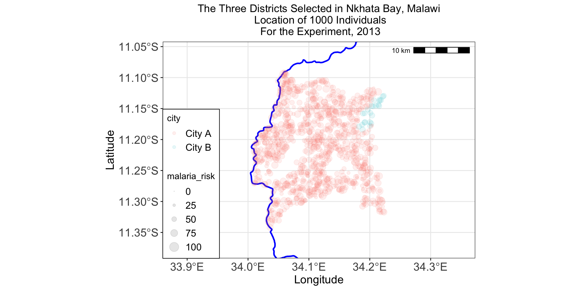
Summary statistics
Before we conduct any analysis, it is important to get a sense of our data
| Unique | Missing Pct. | Mean | SD | Min | Median | Max | Histogram | |
|---|---|---|---|---|---|---|---|---|
| year | 8 | 0 | 2016.5 | 2.3 | 2013.0 | 2016.5 | 2020.0 |  |
| income | 8000 | 0 | 1249.9 | 160.6 | 836.3 | 1246.8 | 1710.7 |  |
| age | 87 | 0 | 32.3 | 16.0 | 1.0 | 31.0 | 87.0 |  |
| malaria_risk | 8000 | 0 | 48.9 | 12.7 | 0.0 | 49.0 | 100.0 |  |
| id | 1000 | 0 | 500.5 | 288.7 | 1.0 | 500.5 | 1000.0 |  |
| lat | 1000 | 0 | -11.2 | 0.1 | -11.3 | -11.2 | -11.1 |  |
| lon | 1000 | 0 | 34.1 | 0.1 | 34.0 | 34.1 | 34.2 |  |
| after | 2 | 0 | 0.4 | 0.5 | 0.0 | 0.0 | 1.0 |  |
| N | % | |||||||
| sex | Man | 3224 | 40.3 | |||||
| Woman | 4776 | 59.7 | ||||||
| city | City A | 7808 | 97.6 | |||||
| City B | 192 | 2.4 |
Estimating the Difference
So, we are interested in the causal effect of the program - \(\beta_3 (\text{Group}_i \times \text{Time}_t)\).
\[ Y_{it} = \beta_0 + \beta_1 \text{Group}_i + \beta_2 \text{Time}_t + \beta_3 (\text{Group}_i \times \text{Time}_t) + \epsilon_{it} \]
Or
\[ \color{green}{\text{Malaria Risk}_{it}} = \beta_0 + \color{blue}{\beta_1 \text{City B}_i} + \color{purple}{\beta_2 \text{Year}_t} + \color{red}{\beta_3 (\text{City B}_i \times \text{Time}_t)} + \epsilon_{it} \]
Estimating the Difference
\[ \color{green}{\text{Malaria Risk}_{it}} = \beta_0 + \color{blue}{\beta_1 \text{City B}_i} + \color{purple}{\beta_2 \text{Year}_t} + \color{red}{\beta_3 (\text{City B}_i \times \text{Time}_t)} + \epsilon_{it} \]
Show the code
| (1) | |
|---|---|
| + p < 0.1, * p < 0.05, ** p < 0.01, *** p < 0.001 | |
| (Intercept) | 50.629*** |
| (0.179) | |
| cityCity B | 3.071** |
| (1.155) | |
| after | -4.532*** |
| (0.292) | |
| cityCity B × after | -7.623*** |
| (1.886) | |
| Num.Obs. | 8000 |
| R2 | 0.034 |
4. Interpretation?
Before 2017, City B had about 3 points higher malaria risk than City A.
After 2017, malaria risk in City A fell by about 4.5 points.
And after 2017, malaria risk in City B fell by an additional 7.6 points compared to City A — that’s the causal effect of the program.
Event-Study Plot
Show the code
library("lemon")
plot_data <- diff_data %>%
  group_by(year, city) %>%
  summarize(mean_risk = mean(malaria_risk),
            se_risk = sd(malaria_risk) / sqrt(n()),
            upper = mean_risk + (1.96 * se_risk),
            lower = mean_risk + (-1.96 * se_risk))

plot_data <- diff_data %>%
  group_by(year, city) %>%
  summarize(mean_risk = mean(malaria_risk),
            se_risk = sd(malaria_risk) / sqrt(n()),
            upper = mean_risk + (1.96 * se_risk),
            lower = mean_risk + (-1.96 * se_risk))

mean_risk<-ggplot(plot_data, aes(x = year, y = mean_risk, color = city)) +
  geom_vline(xintercept = 2017.5) +
  geom_errorbar(aes(ymin = lower, ymax = upper),
                size = 1, width = 0,
                position=position_dodge(width=0.04))+
  geom_line() +
  geom_point(size = 2, position=position_dodge(width=0.04))+
  labs(x = "Year", y = "Malaria Risk")+
  scale_y_continuous(breaks = (seq(40, 57, by = 3)),
                    limits = c(40, 57))+
  scale_x_continuous(breaks = (seq(2013, 2020, by = 1)),
                     limits = c(2012, 2021))+
  theme_bw() +
  theme(legend.position.inside = c(1, 0),
        #Legend.position values should be between 0 and 1. c(0,0) corresponds to the "bottom left"
        #and c(1,1) corresponds to the "top right" position.
        legend.box.background = element_rect(fill='white'),
        legend.background = element_blank())
#Repositioning legend
mean_risk<-reposition_legend(mean_risk, 'bottom left')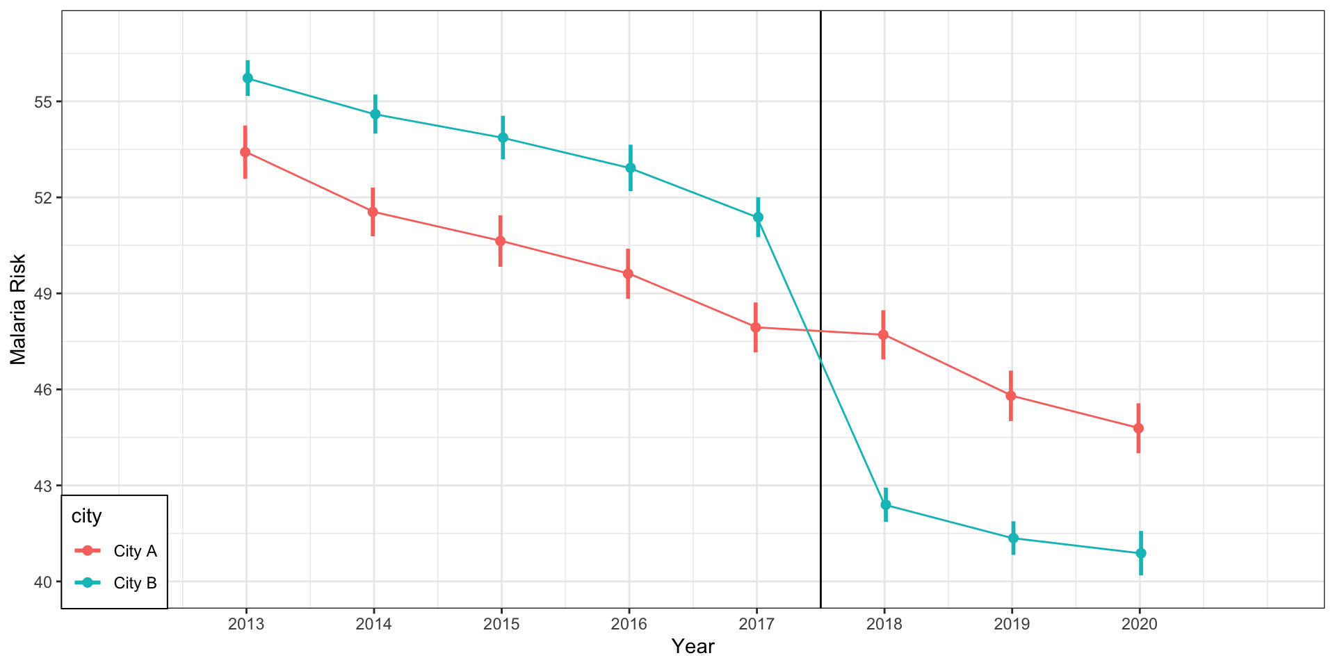
Conclusion
- Goal: estimate a causal effect when experiments aren’t possible.
- Idea: compare changes over time in a treated group to changes in a similar control group.
- Estimate: \[\text{DiD}=(D-C)-(B-A)\] — extra change in treated because of the policy.
- Key assumption (Parallel Trends): without the policy, treated and control would have followed the same trend.
- Regression view: \(Y_{it}=\beta_0+\beta_1\text{Group}_i+\beta_2\text{Time}_t+\color{red}{\beta_3(\text{Group}_i\times\text{Time}_t)}+\epsilon_{it}\)
\(\beta_3\) is the DiD effect.
Popescu (JCU): Differences in Differences